The network for creativity
Join 1.25M professional creatives like you
Connect with clients, get discovered, and run your business 100% commission-free
Creatives on Contra have earned over $150M and we are just getting started
Back to feedPost
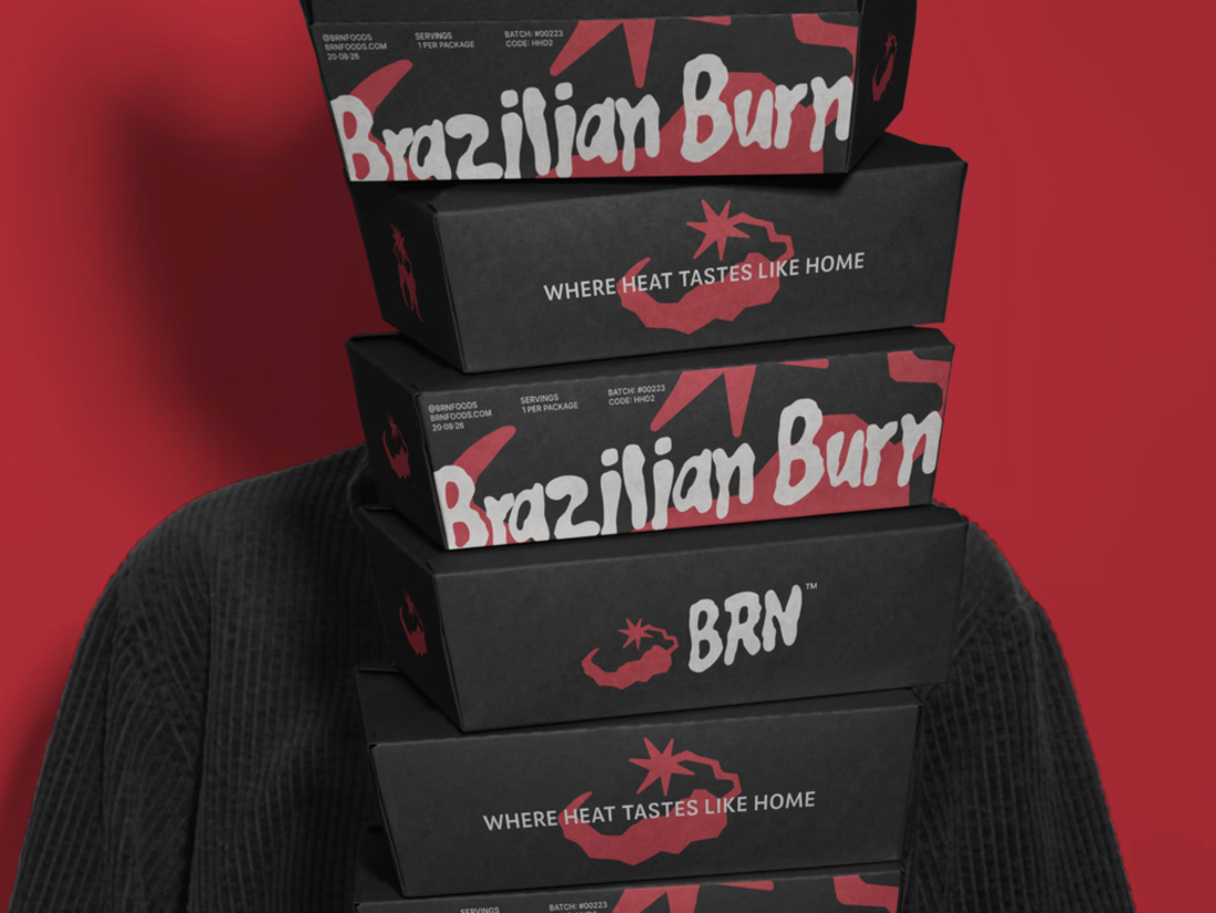
Brazilian Burn translates the warmth of Brazilian cooking into a brand identity built around fire, flavour and belonging.
The project connects brand strategy with a visual language rooted in the ember. Expressive lettering, a compact BRN signature and a palette of ember red, bone white and charcoal carry that idea across packaging, campaigns and digital applications.
The full case study is now on Contra, documenting the strategic foundation, creative direction and design decisions behind the identity.
Explore the full Brazilian Burn case study below

The raw, expressive brush lettering on 'Brazilian Burn' brings out that authentic wood-fired, smoky grit instantly. Pairing charcoal black boxes with ember red and bone white accents gives the takeaway packaging serious shelf presence!

Thanks, Kishan! That raw, smoky feel was exactly what I wanted to bring through. Glad the lettering and colors carry it across!

Great packaging design 🎉🎉
The network for creativity
Join 1.25M professional creatives like you
Connect with clients, get discovered, and run your business 100% commission-free
Creatives on Contra have earned over $150M and we are just getting started




Related posts

Another very cool brand Identity project I got to work on this year for Elio Mortgage.
Bringing warmth and love to a brand that is usually cold and stressful. Elio are doing things differently to make mortgages easier to deal with. We made a brand that felt more approachable.
Full case study here:

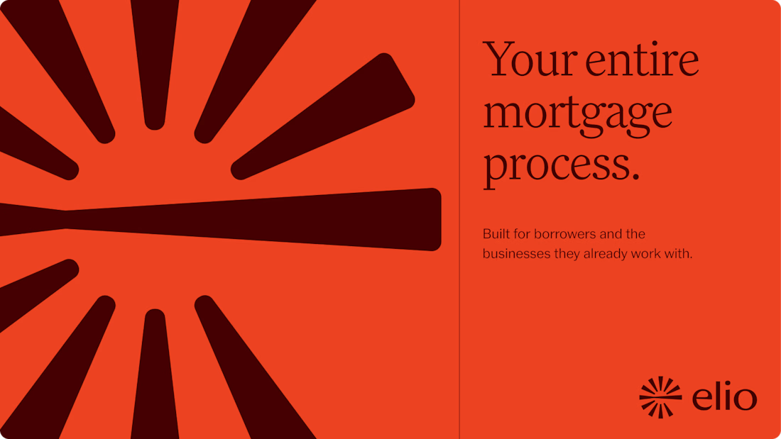
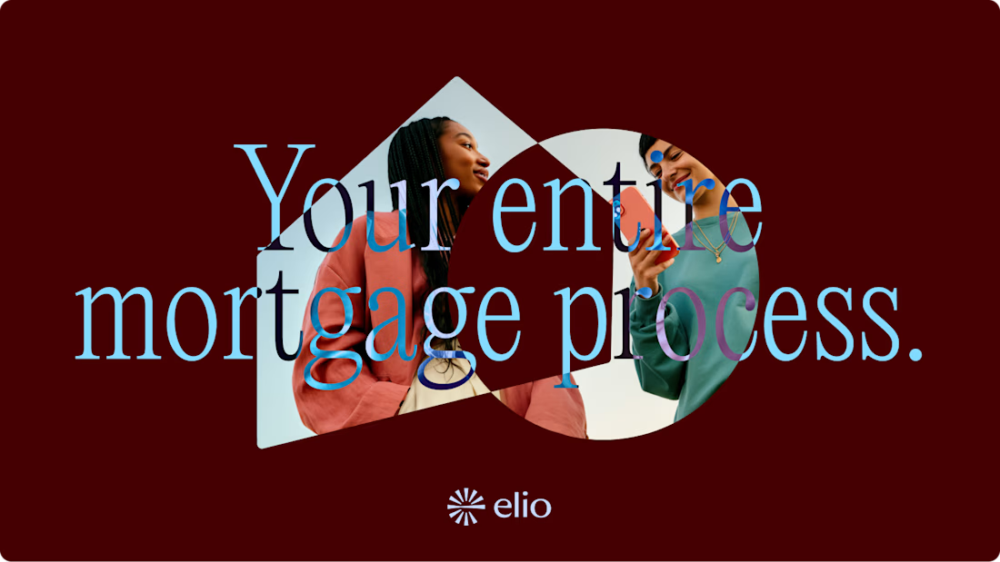
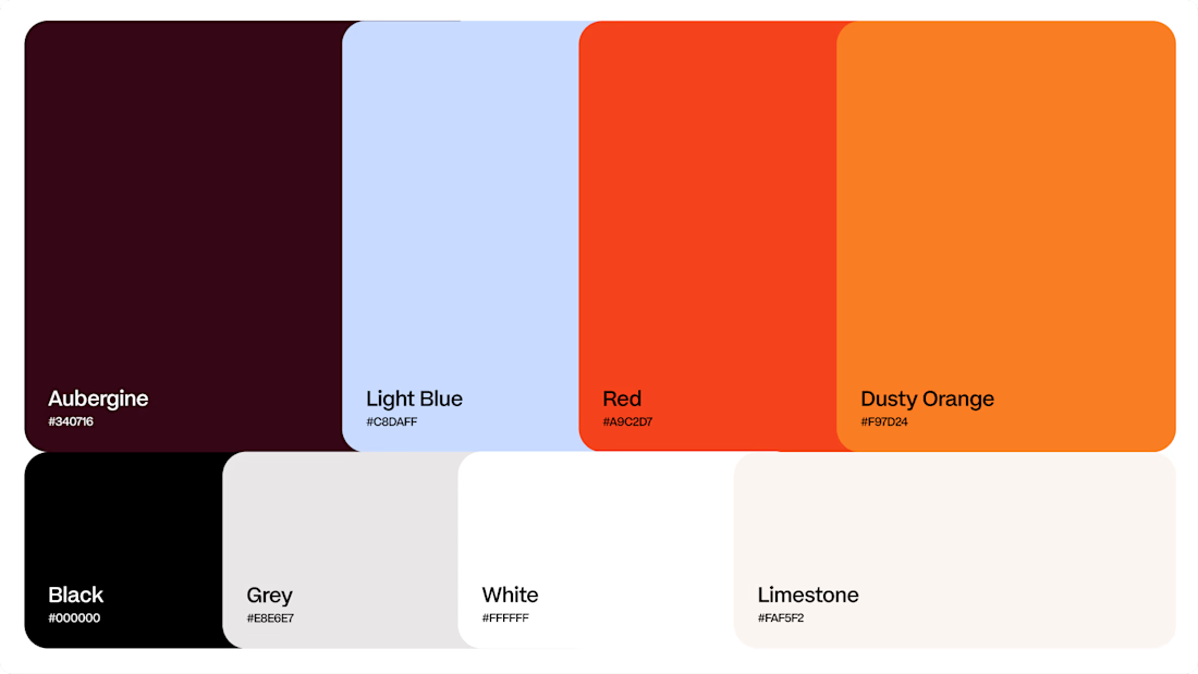
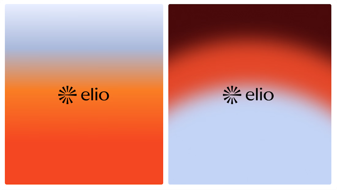

Warm, approachable identity for stressful mortgages.

Landing page, 3D visuals and icons for IPO-FX, a pre-IPO investment platform: a complex fintech product made clear at first glance.

Love this design!
This year we rebranded a 28 year old studio that builds immersive experiences for Netflix, Bloomberg, LEGOLAND etc.
Seeper’s work was world class. But their brand hadn’t kept up with it, so people were judging them as a dated studio before they ever saw what they do.
And they knew it... but when you’ve built something for that long, letting go of the logo you started with is hard.
So we gave them two options -> keep the logo and refresh the rest, or start again from scratch.
They went ALL in.
The new identity launched at a major international industry event and people kept telling them it was the best stand they’d seen. Within weeks, senior people in their industry were saying they were “worth taking notice of now.”
Their marketing director put it like this: “We’ve gone from being seen as a dated studio to a serious creative force in the industry.”
Same work as before... people just see it completely differently now.
If your business has outgrown your brand, DM me “REBRAND”.


Impressive! How did you start working with them?
