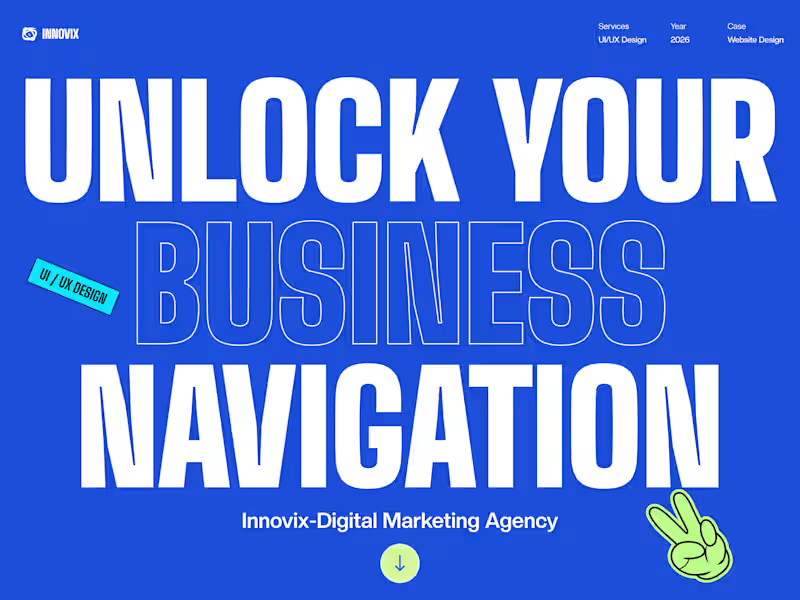
UI/UX Designer passionate about human-centered design

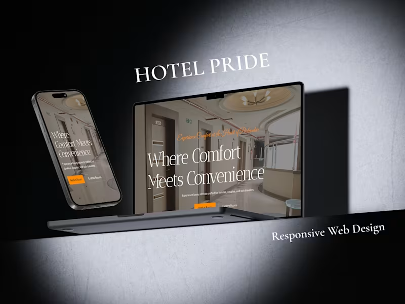
Hotel Pride — Hospitality Website Design
A modern hotel website designed to create a seamless and welcoming digital experience for guests.
Hotel Pride is a UI/UX project focused on presenting the hotel’s rooms, amenities, services, and overall experience through a clean and visually engaging interface. The design aims to make it easy for users to explore the property, compare room options, discover amenities, and take the next step toward booking their stay.
The project focuses on:
• Intuitive navigation and information hierarchy
• Clean, hospitality-focused visual design
• Room discovery and comparison
• Clear presentation of amenities and services
• Responsive web experience
• Strong calls-to-action throughout the journey
The goal was to combine visual appeal with usability, creating a digital experience that feels premium, trustworthy, and effortless for potential guests.
Tools: Figma, Framer
Role: UI/UX Designer
Type: Hotel Website / Hospitality UX
link - https://www.behance.net/gallery/254556809/Hotel-Pride-Responsive-Web-Design?platform=direct
0
43


Product Designer & Researcher
Product Designer & Researcher


Website design & development | Graphic & UI/UX Designer

Website design & development | Graphic & UI/UX Designer



Design and Development Partner For Startups (A.I Powered)


Design and Development Partner For Startups (A.I Powered)

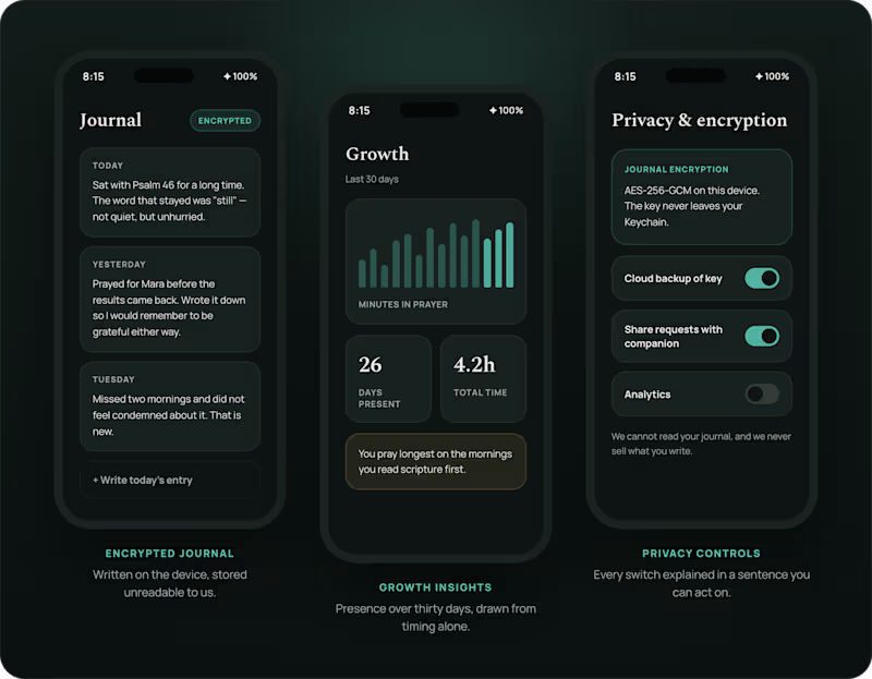
A prayer app that measures presence, not streaks.
Prayer Guide is a free daily-prayer companion: scripture, guided prayers, a focus timer, an encrypted journal, and people to pray with. Designed end to end and shipped to both stores.
Role: Product design & build
Platform: iOS & Android
The problem
Habit apps borrow their mechanics from fitness tracking: streaks, badges, notifications that escalate when you slip. Applied to prayer, those mechanics turn a practice into a performance, and a missed day into guilt.
The other failure is privacy. People write their most vulnerable thoughts into a journal, and most apps store that text in plain sight.
The approach
Slow the interface down. One verse and one guided prayer a day, a timer that counts breaths rather than reps, and no red badge for a day you missed. Every feature is free, so nothing sits behind a paywall when someone needs it.
The journal encrypts on the device before it syncs. Prayer requests stay readable only so they can be shared with a chosen companion.
Outcome
Live on both stores, free, with a thousand people praying daily
https://prayerguide.thedigitalninjatech.com/
1
87

Strategic Brand & Design Studio

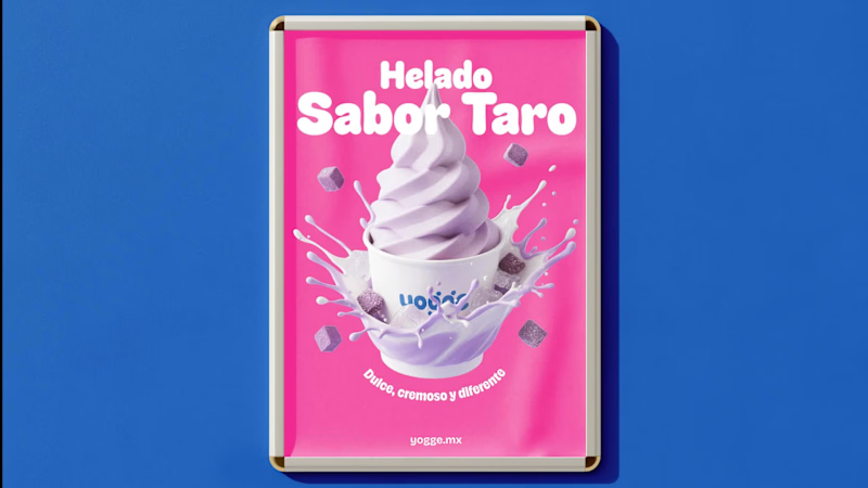
Helping a 25+ year established company in the south of Mexico take its first step into the digital world.
For this project, Graceful Studio designed a simple and accessible website for Consorcio Las Américas, focused on strengthening their online presence, building trust, and helping new customers discover their services more easily.
A reminder that sometimes the most effective digital solutions are the ones built with clarity, simplicity, and real business needs in mind.
Check it out (https://contra.com/p/ZAm6LYXs-website-design-for-consorcio-las-americas)
1
19
358


Senior UX UI Product Designer & CEO ⚡ B2B SaaS, EdTech, AI
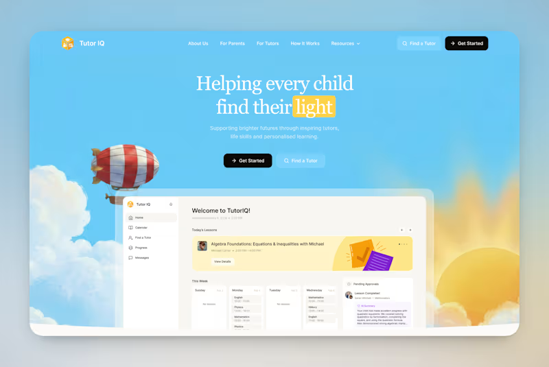
Your votes are in! Here's the final TutorIQ website ☀️
Thank you to all 20 of you who voted on the two concepts 🏄🏼♀️ It was close: 55% chose light and playful and 45% chose softer and calmer.
The final version mixes the two moods. Its bright colors are from the playful first concept. From the second one, it took the serif headline and the product preview on the first screen.
Quick context: TutorIQ is an AI tutoring platform for UK families. It matches each child with a tutor based on how they learn. Our task was a website that attracts parents and tutors before the platform launches.
Every parent comes with one question: 'Is this the right place for my child?' So the first screen answers it with the product itself. Parents see the lesson schedule and the AI summary they get after each lesson.
Now it's your turn 👇🏻 What would you keep from this version? And what would you change?
4
12
469

Brand identity & Framer websites for startups
- 1x
- Hired
- 23
- Followers
Brand identity & Framer websites for startups