BearGlow Skincare Brand Development
Grace Pereda @ Graceful Studio
Project Overview
BearGlow Skincare Products is a gender-neutral skincare brand developed for a modern audience ranging from teenagers to people in their mid-30s. The visual identity was designed to feel clean, fresh, and minimal, with a soft pastel color system to stand out in the current skincare market. The brand balances playful youthfulness with a sophisticated tone, making it accessible to a wide demographic regardless of gender.
Creative Approach
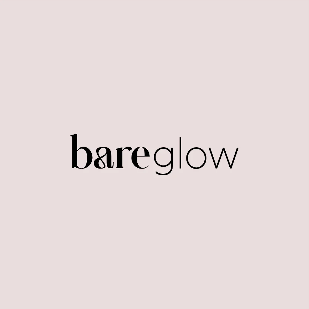
The name “BearGlow” plays on the contrast between “bare” (natural, minimal) and “glow” (radiant, fresh). To visually express this, I created a typographic logo where “Bear” appears in a bold font, while “Glow” uses a thinner typeface. This subtle visual tension reflects the brand’s identity: strong yet soft, modern yet approachable. The logo is used in solid black, keeping it versatile and timeless, and is shown against a neutral background color (#EADCBB)—a pale pink-beige tone that helps center the entire brand palette in warmth and minimalism.
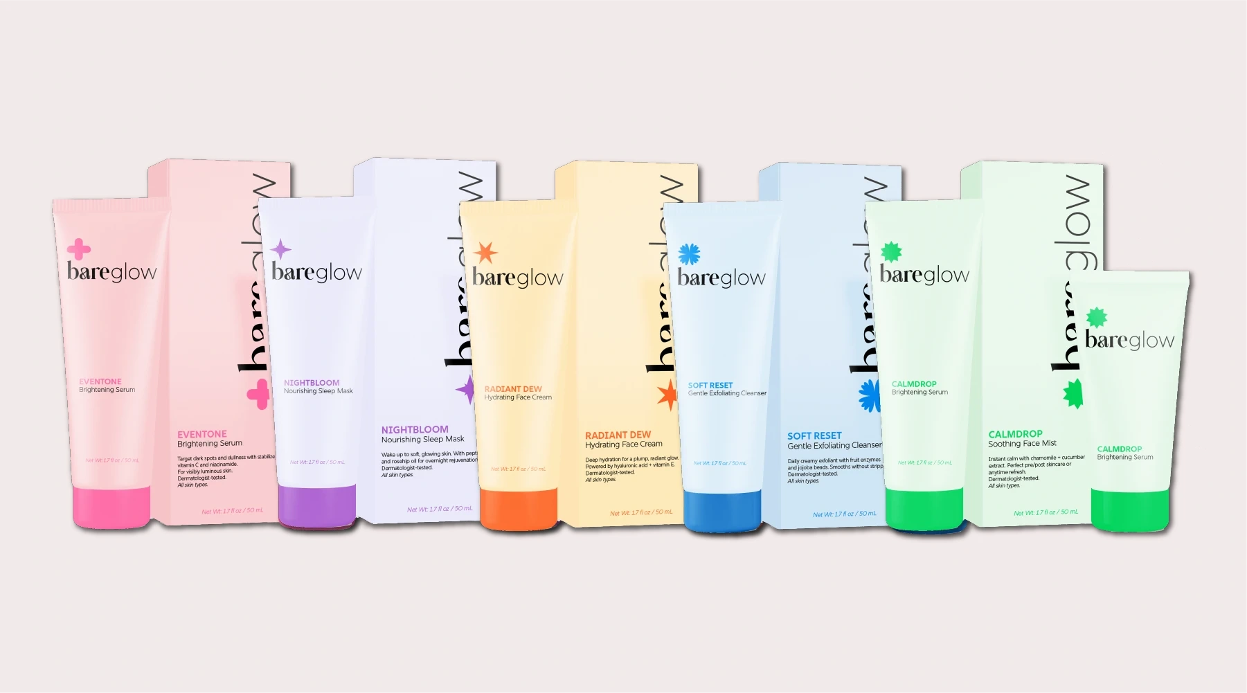
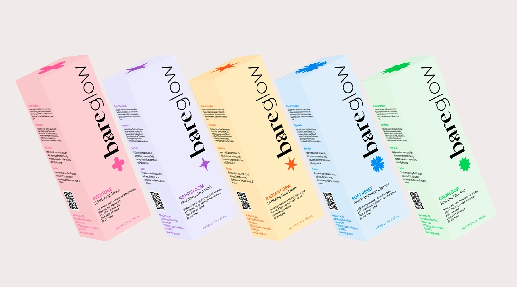
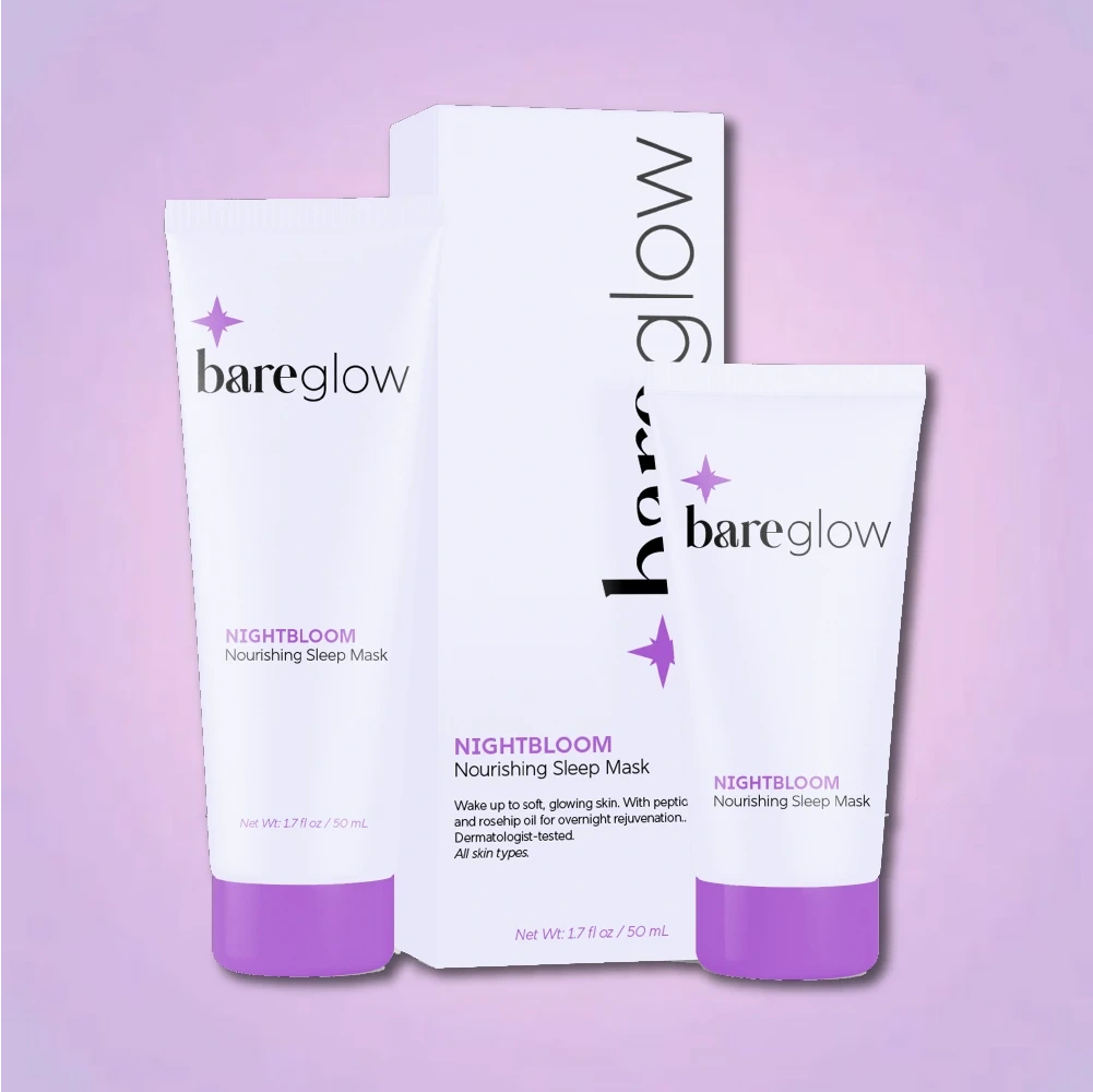
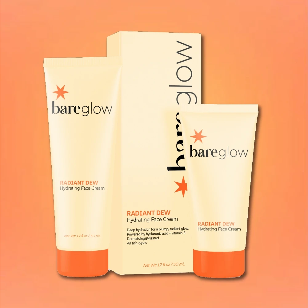
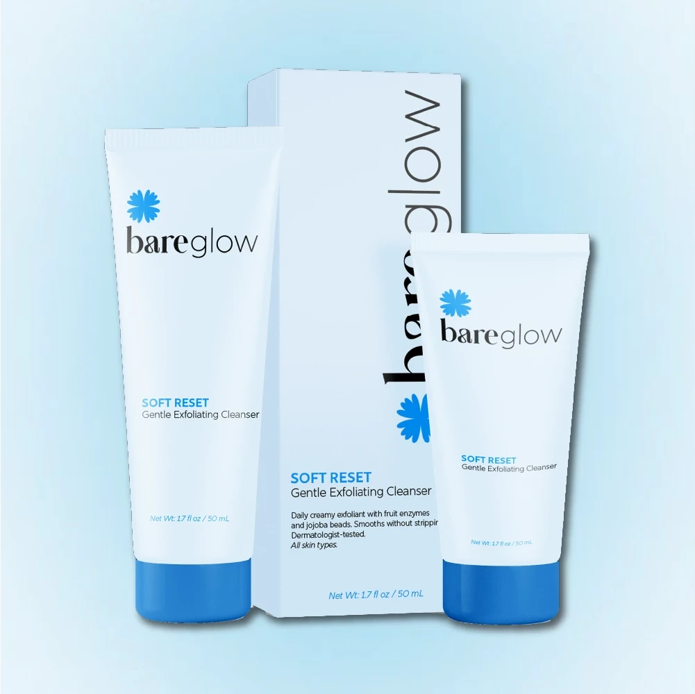
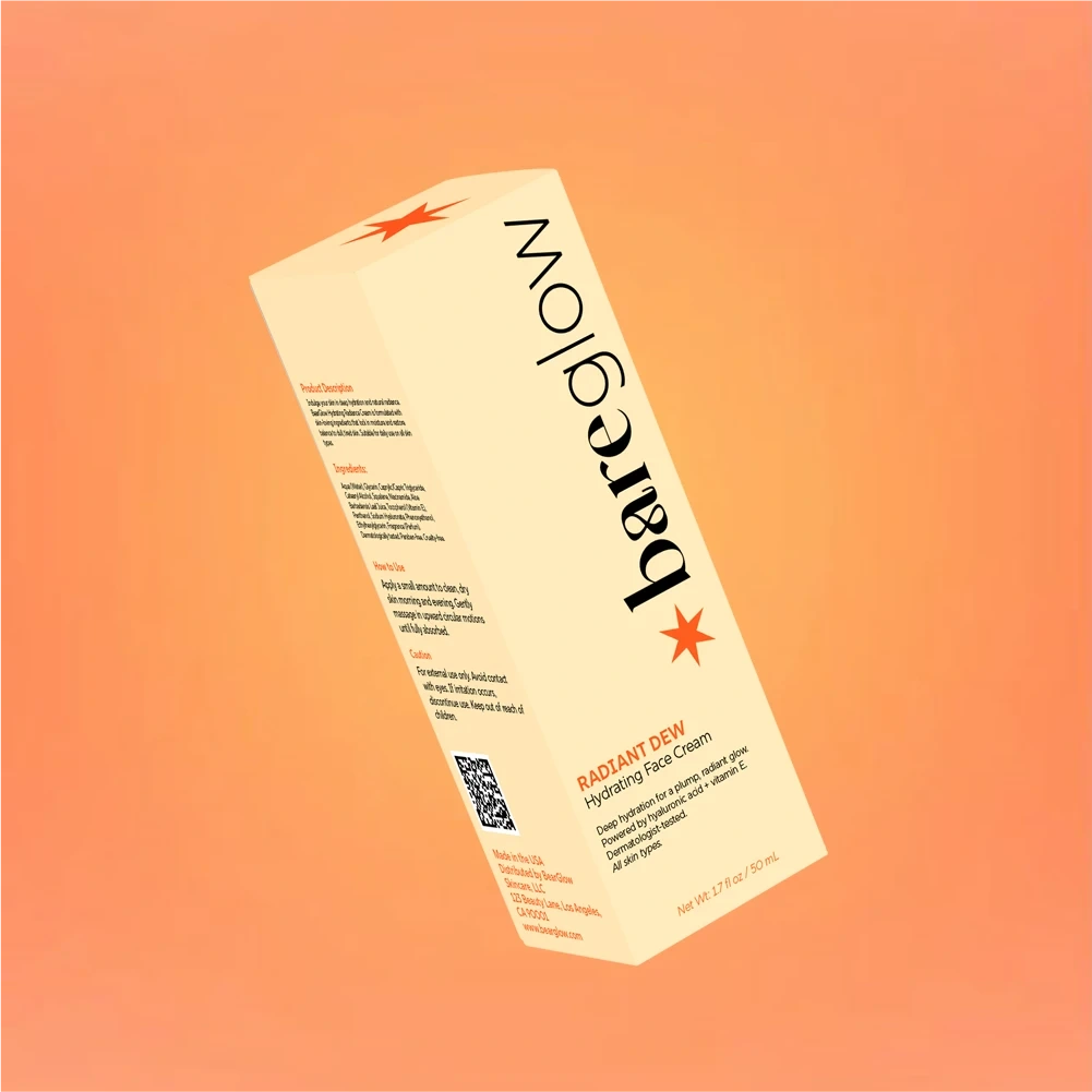
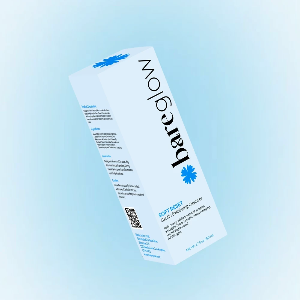
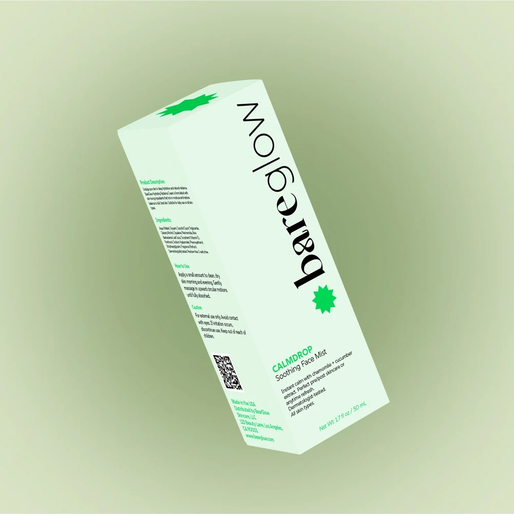
Packaging Design
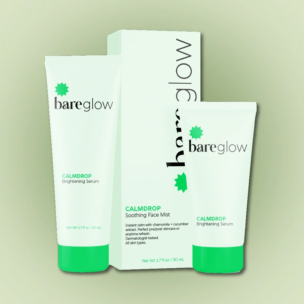
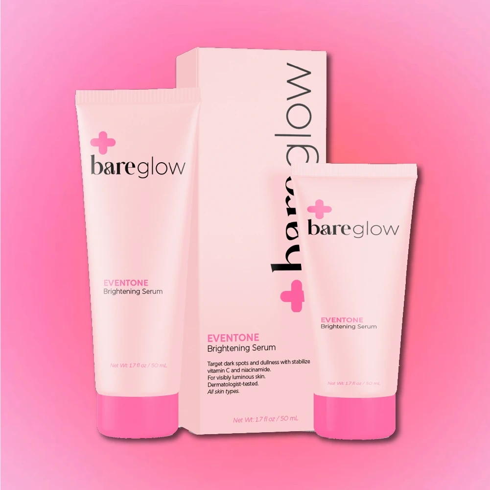
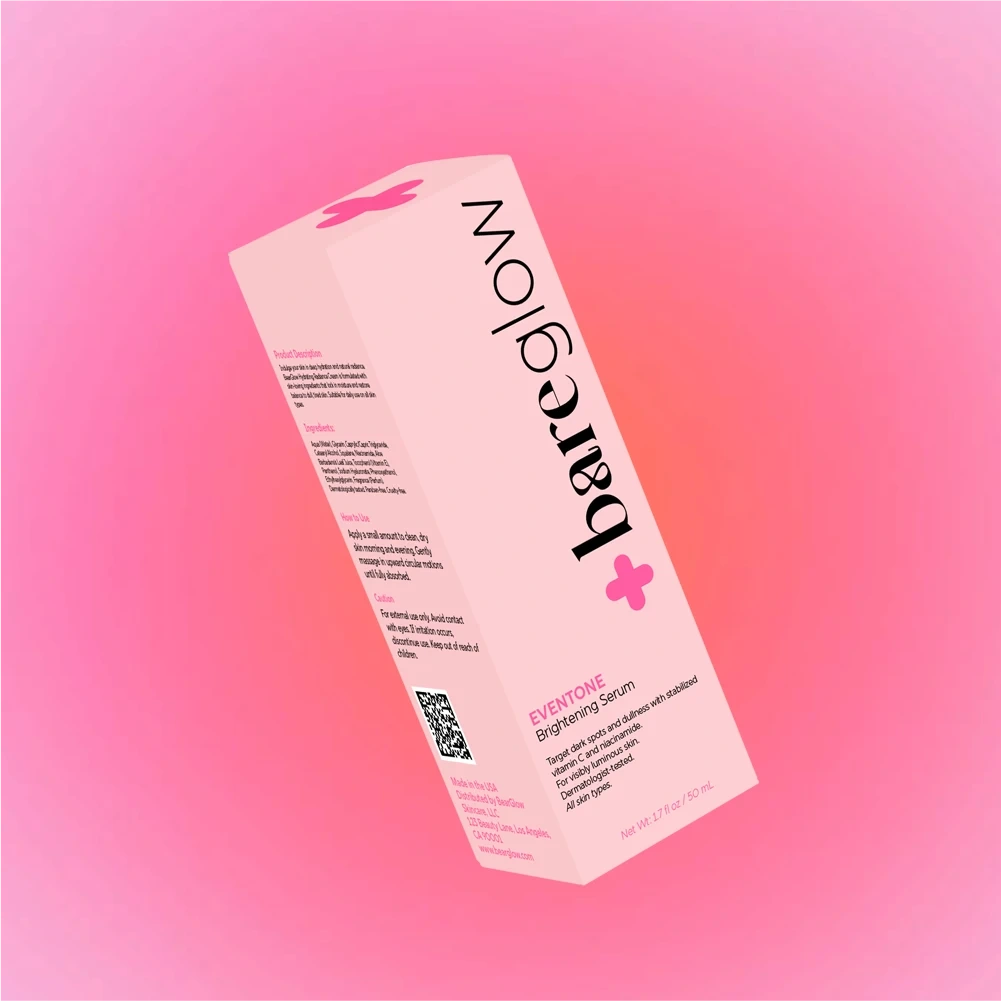
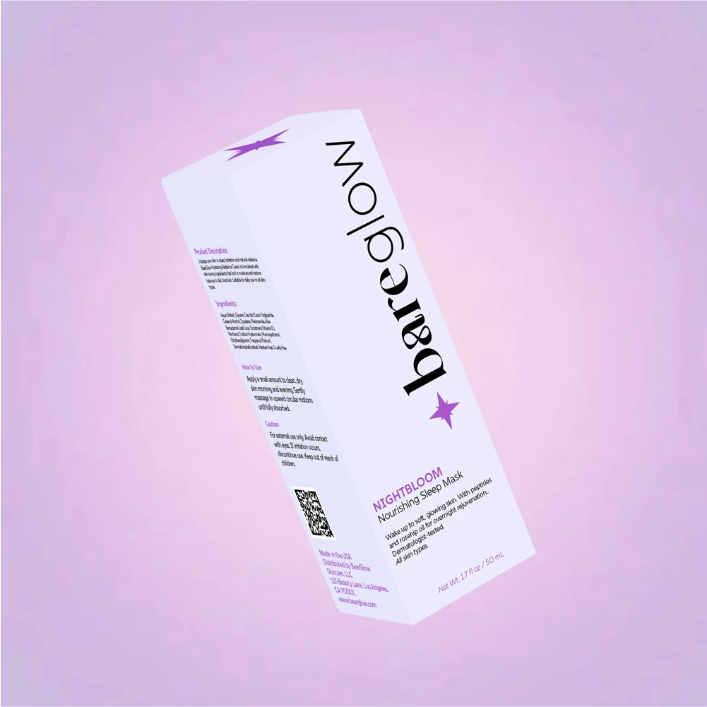
The packaging system includes tubes and boxes, each coordinated by product-specific pastel tones. These soft tones reflect the function or mood of each cream while reinforcing the gentle, clean look of the brand. The designs rely heavily on negative space and a clear hierarchy, with minimal decorative elements to maintain a premium yet inviting feel. The goal was to create products that could stand confidently on retail shelves while also feeling personal and beautiful enough for display in a skincare routine at home.
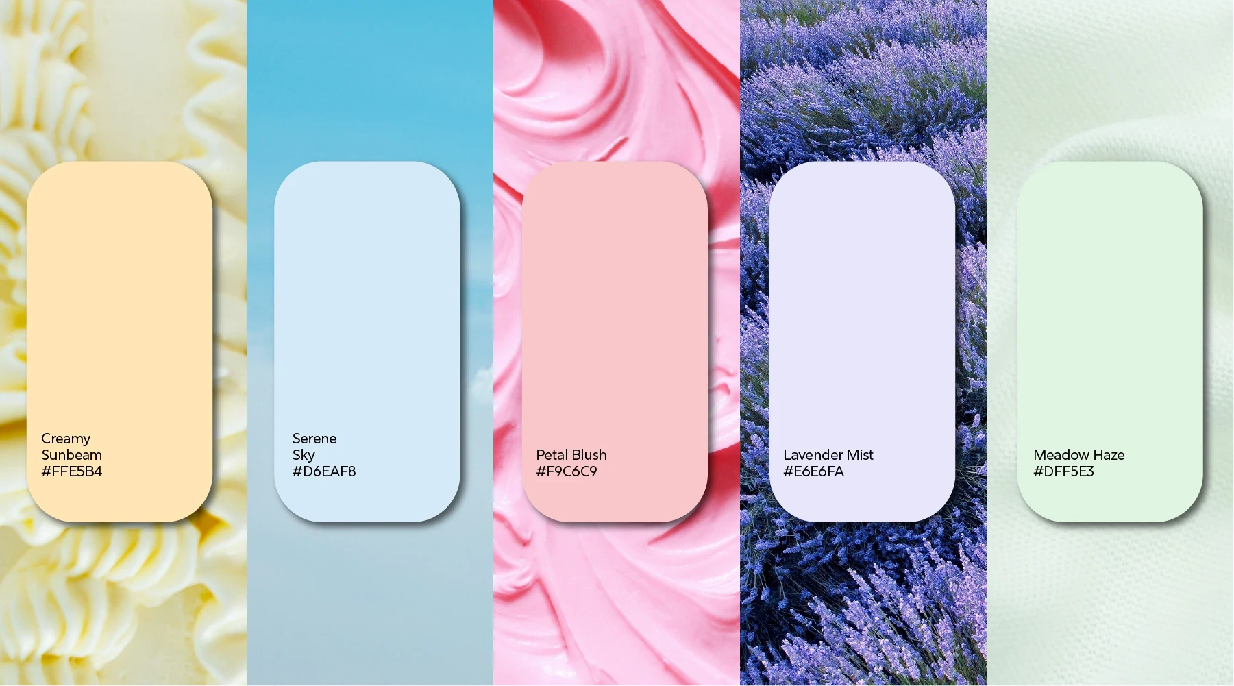
Product Line & Color System
Radiant Dew — Creamy Sunbeam #FFE5B4
Soft Reset — Serene Sky #D6EAF8
Even Tone — Petal Blush #F9C6C9
Night Bloom — Lavender Mist #E6E6FA
Calm Drop — Meadow Haze #DFF5E3
These names and tones were selected to evoke an emotional connection with the customer, while still feeling gender-neutral and aligned with modern skincare aesthetics.
My Role
I led the project from concept to final execution. This included naming, branding, logo design, color strategy, typography selection, packaging concept, and mockups. I began with research into current trends in skincare branding, focusing on what appeals to both Gen Z and millennial audiences. I explored how color could play a leading role in visual identity, especially in contrast to the often all-white or overly clinical look of competitors. I sketched initial logo ideas by hand, tested various font pairings, and developed a scalable brand system that could evolve with future product launches.
Outcome
The final result is a fully realized skincare brand that feels confident, gentle, and modern. BearGlow stands out through its unique use of color, simplicity, and thoughtful branding choices. The system is flexible and consistent, with strong visual cues that reflect product benefits while remaining inclusive and aesthetically appealing. This case study showcases my ability to manage a complete branding and packaging project—from initial concept through to polished presentation.
Like this project
Posted Jun 26, 2025
Developed BearGlow's brand identity, logo, and packaging for a gender-neutral skincare line.
Likes
0
Views
13
Timeline
May 1, 2025 - Jun 25, 2025