Modern Reskin for Seesaw's Prediction App
Stanislav Kotlyarenko
Seesaw: Modern Reskin for a Swipe-Based Prediction App
Project Overview
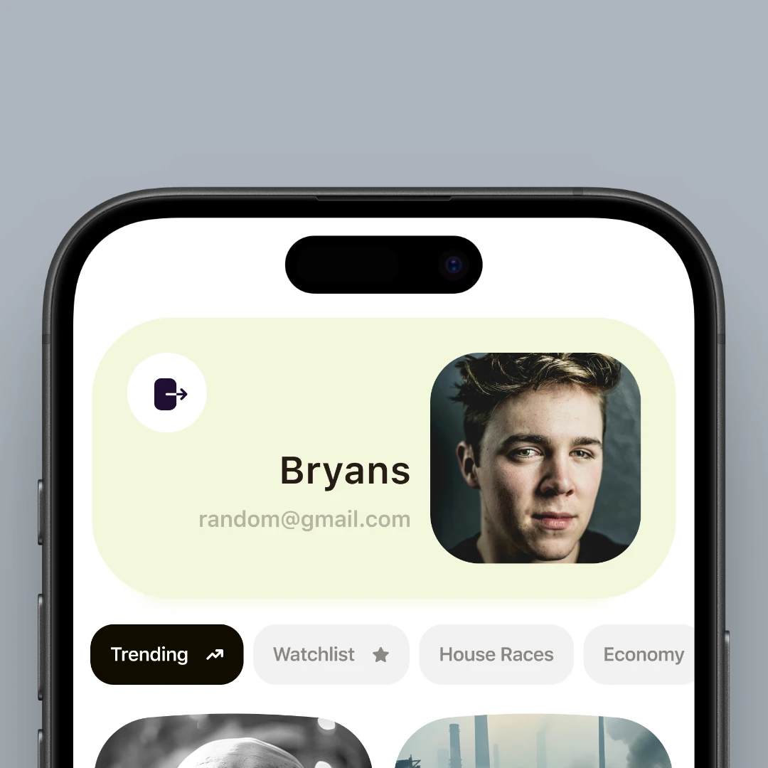
Seesaw is a swipe-style prediction market app where users vote on outcomes by swiping right for “Yes,” left for “No,” or up to “Pass.” My task was to reskin and modernize the existing UI, focusing on visual clarity, soft gradients, and a friendlier tone. The scope included four core screens: Login, Swiping, Profile, and Create Bet. The goal was to deliver a sleek, high-contrast interface with playful color accents and intuitive usability.
Tools Used
✅ Figma – Main tool for layout, prototyping, and component design
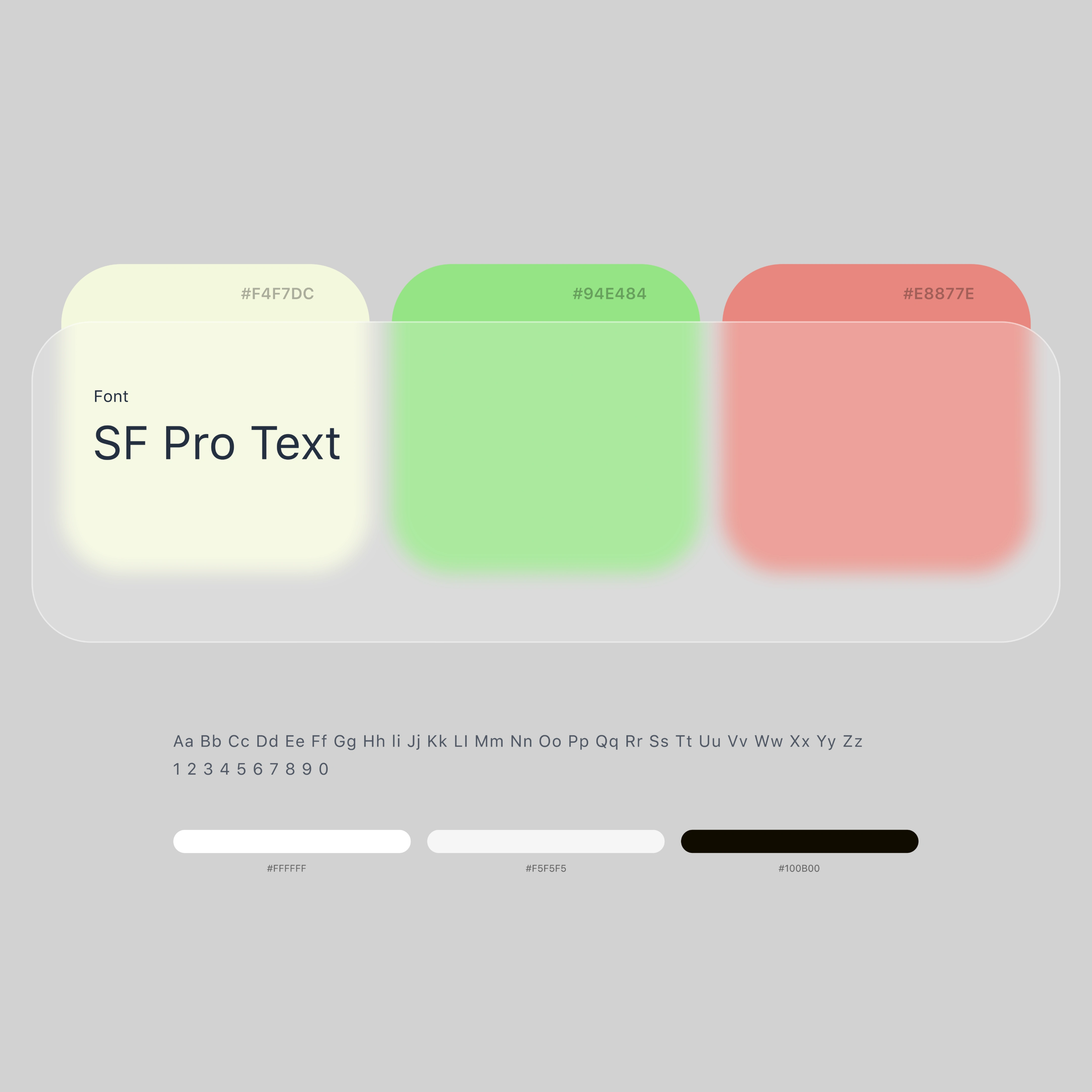
✅ SF Pro Text – For a clean, modern typographic hierarchy
✅ Coolors – For building a soft but engaging palette:
Pale Yellow
#F4F7DCFresh Green
#94E484Warm Coral
#E8877E
The Process
Step 1: Understanding User Behavior
The app’s Tinder-like gesture model meant clarity and speed were key. I focused on bold visuals and simplified interactions that would feel instantly familiar to mobile users.
Step 2: Redesigning the Core Screens
Login Screen: Minimal layout with high-contrast CTA, soft background tones for a welcoming start.
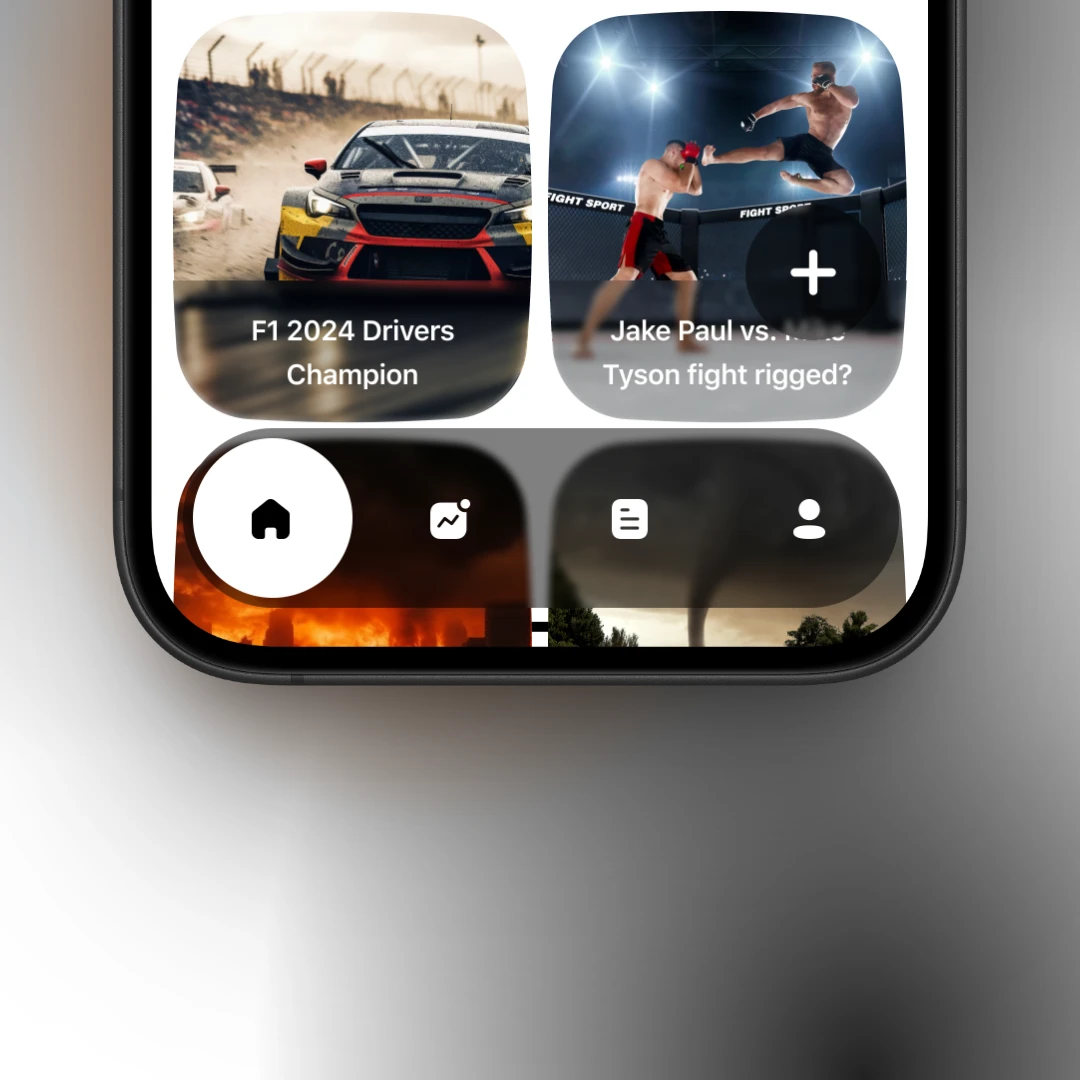
Swiping Screen: Centered around large prediction cards with intuitive icons and swipe gestures. Colors shift subtly based on choice (Yes, No, Pass).
Profile Screen: Rounded elements, personal stats, and saved bets, all organized with a friendly visual rhythm.
Create Bet Screen: Form-style input broken into digestible steps with bright accents and clear structure.
Step 3: Visual Language & Branding
The refreshed look uses soft colors and generous spacing to avoid visual noise. Rounded corners and warm tones make the experience feel lighter and more human. The chosen typeface, SF Pro Text, brings a sense of clarity and tech-forward polish.
Challenges
Translating a swipe mechanic into something that feels modern but not gimmicky
Keeping the color system clear for decision-based UI (Yes, No, Pass)
Making sure each screen feels distinct but part of the same system
Solutions
Used subtle color-coded feedback (green, red, yellow) linked to swipe gestures
Created a simple design system in Figma for icons, buttons, and layouts
Balanced bold interaction elements with calming backgrounds and generous padding
Final Thoughts
This reskin helped transform a functional but outdated UI into something fun, modern, and engaging. It preserves the simplicity of the swipe experience while adding visual polish and better usability. The final result is a clean, mobile-friendly app that feels like a product users would want to return to.
Like this project
Posted Jun 16, 2025
Reskinned and modernized Seesaw's swipe-based prediction app UI.
Likes
0
Views
6
Timeline
Nov 16, 2024 - Nov 22, 2025