
Product Designer | SaaS, Fintech & AI

Product Designer | SaaS, Fintech & AI

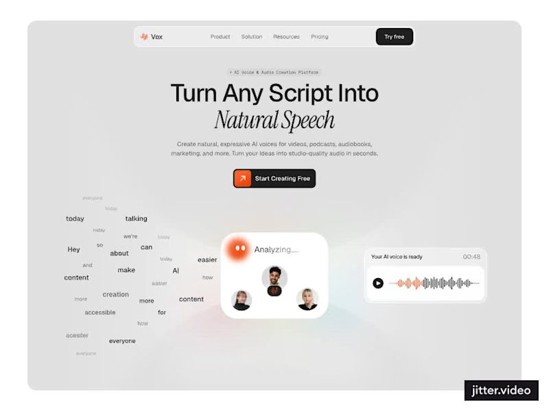
Designed a modern AI Voice SaaS Landing Page.
A soft light interface with gentle color glows, warm orange accents, and elegant italic serif headlines for a calm and creative first impression.
A floating word cloud turning into a voice wave, a language grid, a dark voice gallery with real faces, and use case cards for podcasts, audiobooks, video, and marketing make AI voice creation feel easy to understand. Clean spacing and soft cards keep the whole page light and easy to explore.
3
2
274


Brand Identity & Logo Designer


Senior UX/UI Designer for SaaS & Web Apps

Senior UX/UI Designer for SaaS & Web Apps



B2B SaaS Product Designer for AI & Complex Workflows
- 20
- Followers
B2B SaaS Product Designer for AI & Complex Workflows

Senior UX UI Product Designer & CEO ⚡ B2B SaaS, EdTech, AI
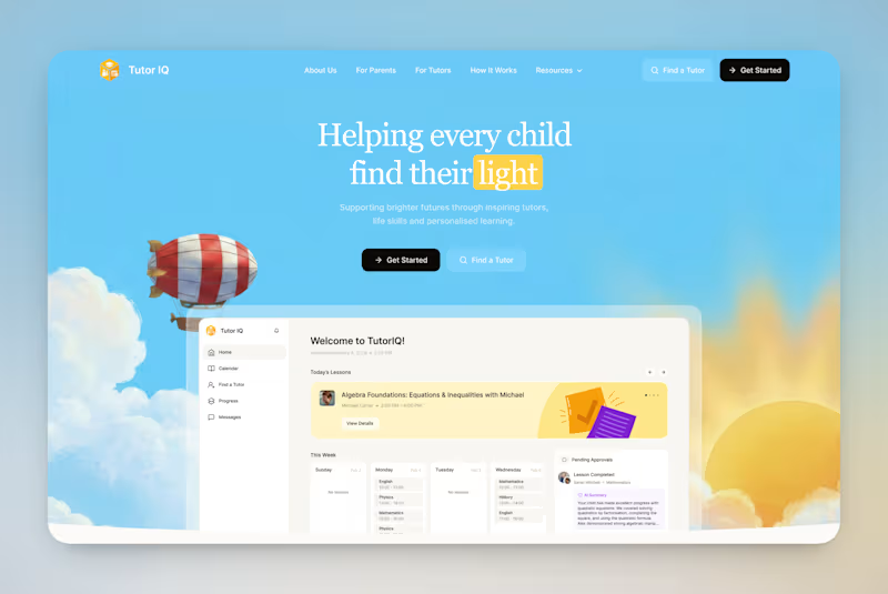
Your votes are in! Here's the final TutorIQ website ☀️
Thank you to all 20 of you who voted on the two concepts 🏄🏼♀️ It was close: 55% chose light and playful and 45% chose softer and calmer.
The final version mixes the two moods. Its bright colors are from the playful first concept. From the second one, it took the serif headline and the product preview on the first screen.
Quick context: TutorIQ is an AI tutoring platform for UK families. It matches each child with a tutor based on how they learn. Our task was a website that attracts parents and tutors before the platform launches.
Every parent comes with one question: 'Is this the right place for my child?' So the first screen answers it with the product itself. Parents see the lesson schedule and the AI summary they get after each lesson.
Now it's your turn 👇🏻 What would you keep from this version? And what would you change?
4
12
478

UX/UI & Product Designer | SaaS | Web | E-comm | B2B | AI
- 122
- Followers
UX/UI & Product Designer | SaaS | Web | E-comm | B2B | AI


Product & UX Designer for B2B SaaS
YaVoy: Research and UX/UI for Rural Ride Sharing
Self-initiated project
Role: Research and UX/UI design
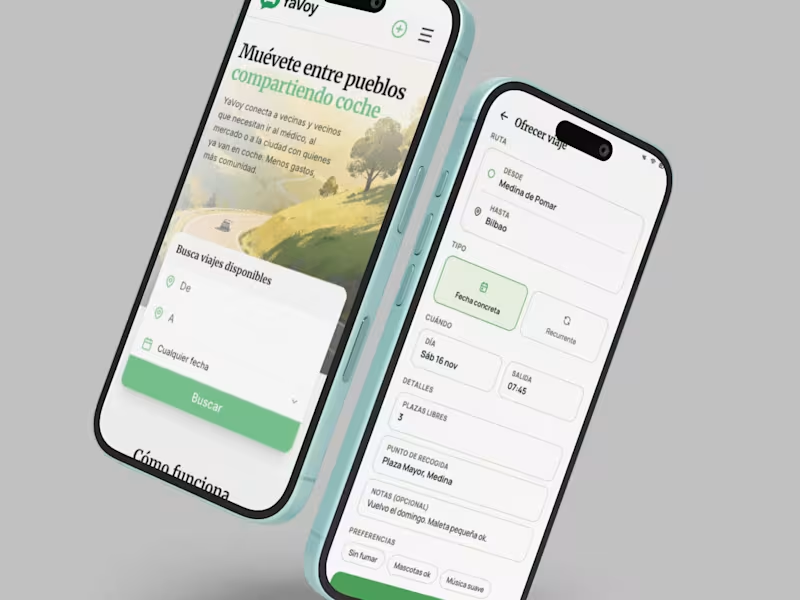
YaVoy is a self-initiated project exploring shared transport between villages in rural Spain. I wanted to design a mobile web experience for neighbours looking for a ride or offering seats on a journey they were already making.
My work covered research, product scope and UX/UI design. Local research in Espinosa and Medina de Pomar informed an approach built around existing community habits, including the use of WhatsApp for coordination.
I mapped two connected journeys: finding a ride and offering a ride. Passengers choose a route and date, browse available journeys and review the driver, pickup point and seats. Drivers enter their route, time and available places before publishing a trip. The interface puts the information needed for a decision close to the action.
A central product decision was to leave payments and private messaging outside the app. Once a passenger finds a suitable journey, coordination continues through WhatsApp. This keeps the concept’s scope concentrated on discovery and ride details, while using a communication channel already familiar to the intended users.
The resulting concept includes passenger and driver flows, mobile interface screens and an explicit handoff to WhatsApp. The project shows how research informs feature scope and how a product’s role changes when designed for a small rural community.
0
44
Making Solar Performance Understandable: Syner Dashboard UX/UI
Client project for Syner
Role: Research and UX/UI design
Syner needed a customer-facing dashboard for people who had installed photovoltaic panels. The design brief focused on helping households understand the value of their installation through energy production, consumption, savings and environmental impact.
My role covered research and UX/UI design. I structured the experience around the questions customers bring to their solar system: whether the installation is working, how much money they are saving and where their generated energy goes.
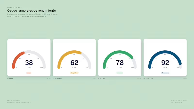
The overview starts with a short daily summary, followed by figures for energy generation, monthly savings, self-consumption and avoided CO₂ emissions. A production chart supports comparison across the day, while the system status area separates operational information from performance figures. An energy flow diagram distinguishes electricity used at home from electricity exported to the grid.
I used information hierarchy, explanatory labels and familiar comparisons to make the technical figures easier to interpret. Navigation separates the overview, savings and return on investment, and performance areas, giving each topic a defined place within the product.
The result was a dashboard design organised around the customer’s understanding of their installation. For Syner, the design was also intended to support the relationship after installation by giving customers a place to review performance, understand savings and consider future maintenance or optimisation needs.
0
49
IberSecurity: From Internal Tool to B2B Product
Client project for Ibersontel Group
Role: Research and UX/UI design, with product identity and developer style guidance
IberSecurity is a B2B security platform developed in-house by Ibersontel Group. The company wanted to offer the software to its clients, with a product identity and an interface suited to people outside the engineering team.
My work covered research and UX/UI design, alongside the product identity and dashboard style guide. The initial work established how the platform would sit within Ibersontel’s wider service offering and which decisions belonged to the brand or the interface. I presented three visual directions to compare different approaches to the product’s identity.
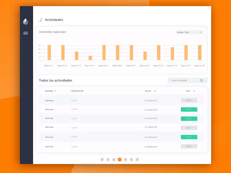
For the dashboard, I organised security information into an overview of devices, events, activity and alerts. Summary cards provide an initial view of the system, while device tables support closer inspection. The interface uses shared navigation, status labels and visual patterns across the platform. The published designs also show activity views and mobile layouts.
The final work combined a product identity, dashboard screens and a style guide for the development team. This gave the client a basis for presenting the platform as a distinct offering and extending the interface across additional screens. The project brought together product definition, interface design and the practical needs of an existing engineering team.
2
97