Epipoli: gift card dashboards, end to end

Valerio Donfrancesco


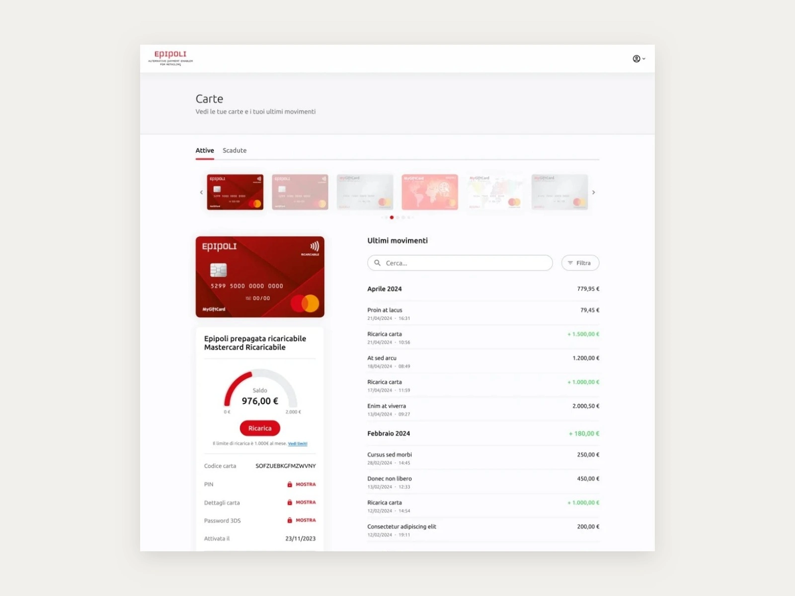
Epipoli is one of Italy's largest gift and loyalty card providers. I designed the B2C and B2B dashboards and the consumer sales sites, end to end: around 500,000 cardholders supported.
The problem
The management dashboards showed every available figure and nothing decisive: corporate clients couldn't read their loyalty programme performance without help from sales, and cardholders kept turning to customer care for steps they should have managed alone.
My role
UX/UI Design Specialist on three connected products: the cardholder area, the business dashboard and the sales sites such as MyGiftCard. Research, information architecture, flows, UI and a shared UI library, plus leaner ways of working between design, marketing and engineering.
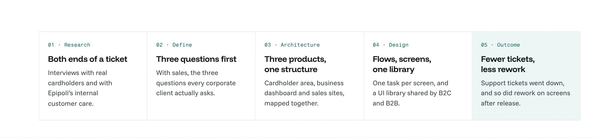
The process, end to end.
Research: the people on both ends of a ticket
I interviewed real cardholders, to see how they actually activate a card, check a balance and top it up, and Epipoli's internal customer care team, who answer when one of those steps goes wrong. Hearing the same journey from both sides showed which moments turned into support requests.
On the business side, I worked with sales on the questions corporate clients kept asking them. That set the brief for all three products: the answer people come for goes first, and every step that produced a ticket either goes or gets its help in place, before the error.
Information architecture: three products, one structure
Each audience got its own product and its own navigation, built from the same components, so a change to the library reaches all three.
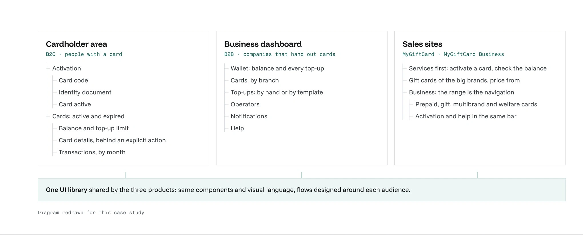
Cardholder area, business dashboard and sales sites, on one shared UI library.
Card activation: one task per screen
Each step asks for one thing: the 16-character card code, then the identity document required by anti-money-laundering rules, then a confirmation that leads straight to the card instead of ending the journey. Help sits next to the field it explains, before any error.
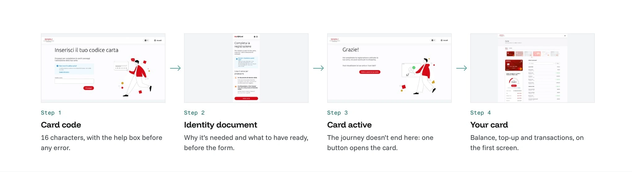
The activation flow, with the real screens.
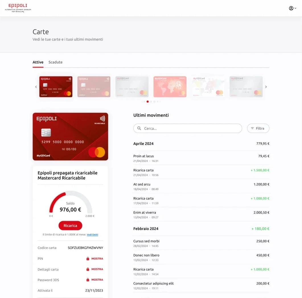
Where the flow ends: balance against the top-up limit, sensitive data behind an explicit action, transactions by month.
B2B dashboard: bulk work, without surprises
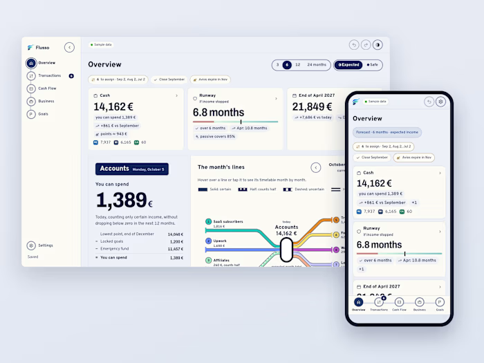
Companies manage the cards they distribute: a wallet with the balance and every top-up, cards by branch, and bulk top-ups by hand or by template. The total stays in view while you work, and cards that can't be topped up stay in the list, disabled, so nothing disappears.
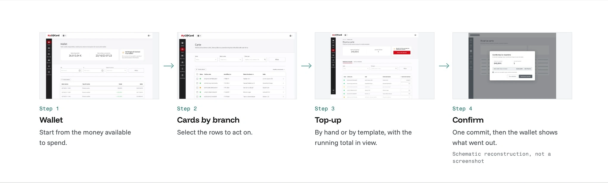
The bulk top-up flow. Step 4 is a schematic reconstruction, not a screenshot.
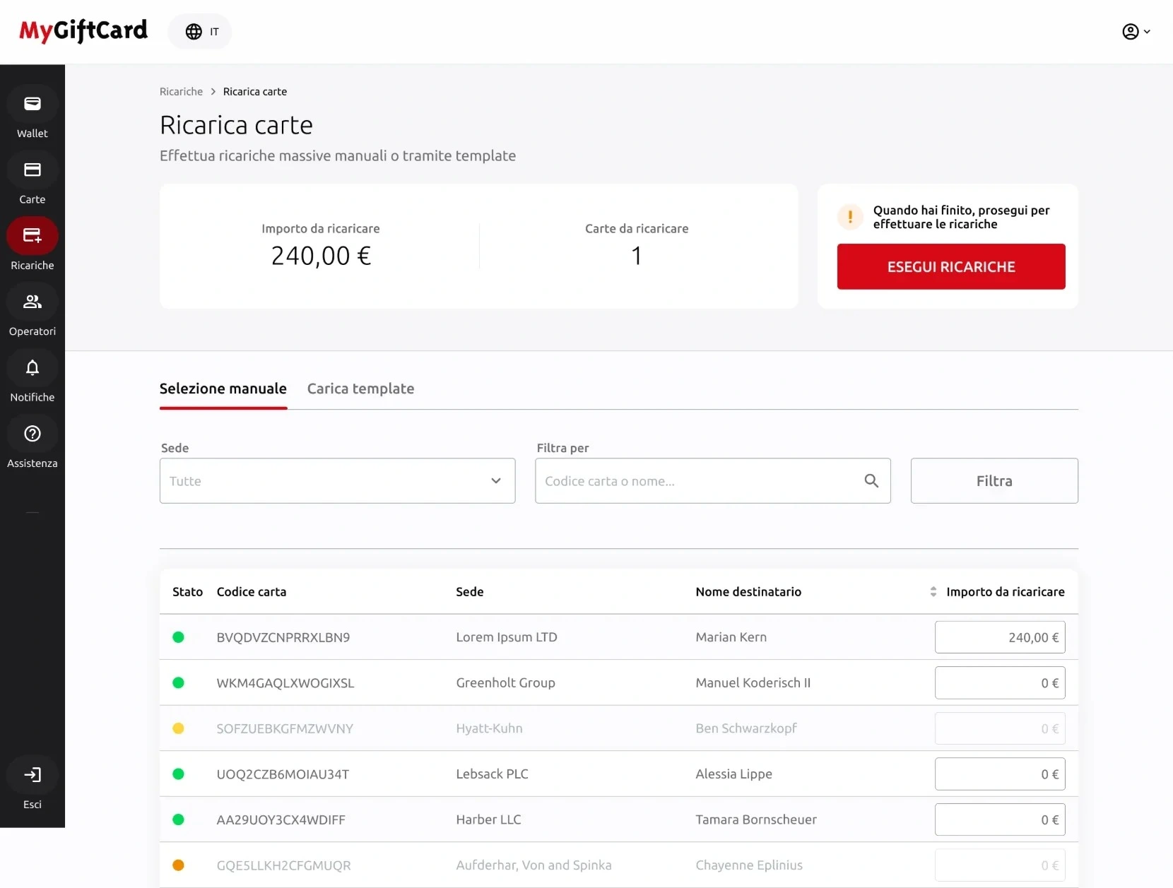
Card top-up: the running total stays in view before you commit.
Sales sites: services first, then the shop
The sales sites share the design system of the dashboards. On MyGiftCard the services people come back for, activating a card or checking the balance, sit above everything else; on MyGiftCard Business the navigation is the product range itself.
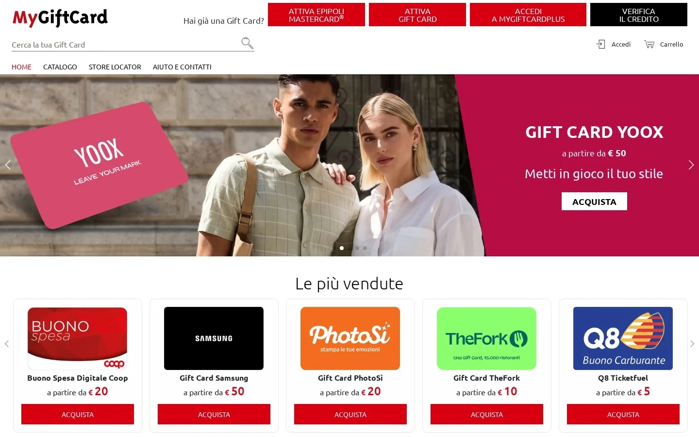
MyGiftCard: search before the catalogue.
Alternatives compared: every figure, or three questions first
How the business dashboard should open, decided with sales and the client. These are design alternatives compared in reviews, not a user test, and side A is a schematic reconstruction of the old dashboards, not a screenshot.
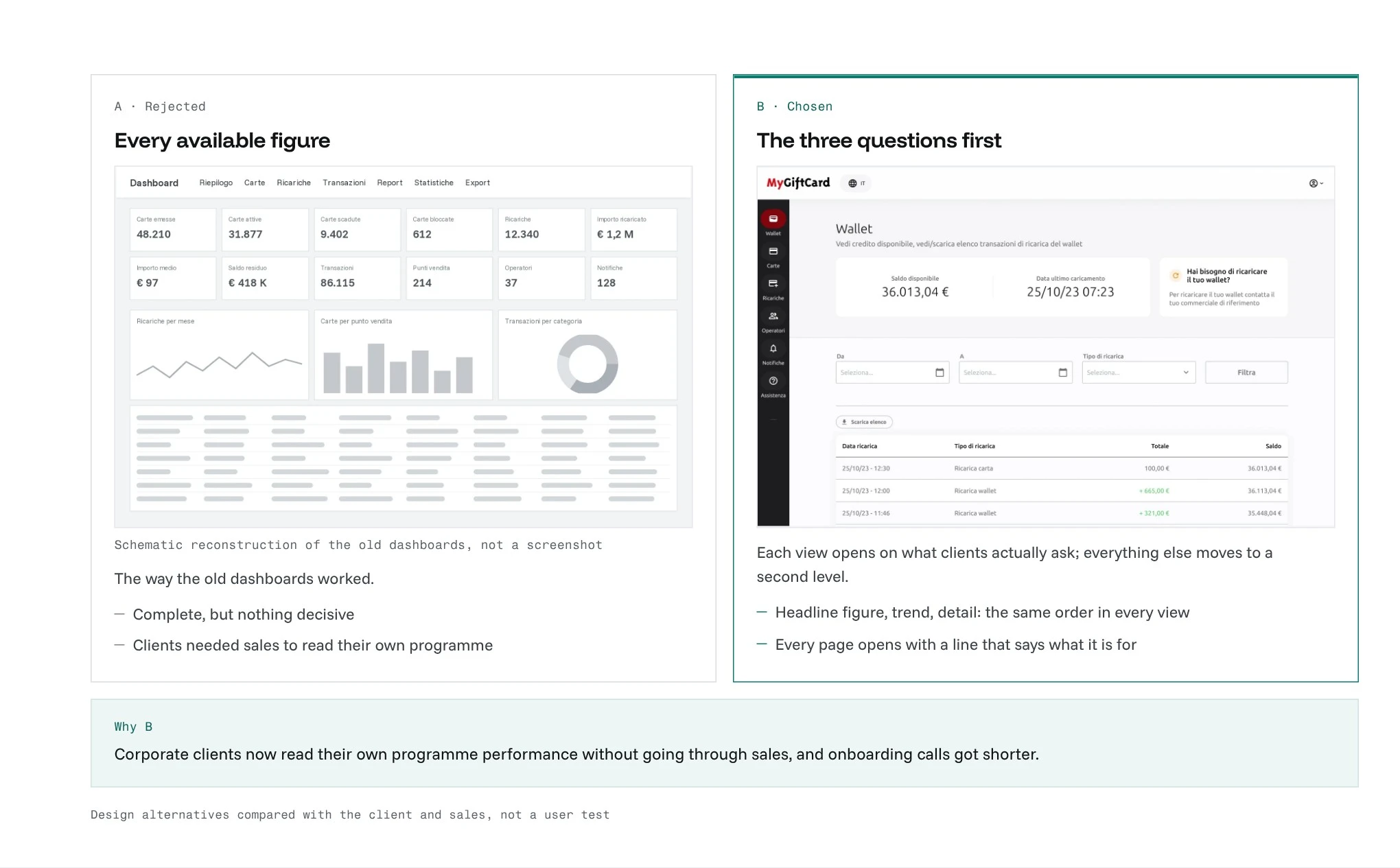
A: every figure, the way the old dashboards worked. B: the three questions first, the version that was built.
Key decisions
Start from the questions, not the data: with sales I worked out the three questions every client asks, and built the dashboard to answer those.
One hierarchy, repeated: headline figure, trend and detail in every view, so learning one screen means learning all of them.
One design system, two experiences: B2C built for choosing fast, B2B for control and reading data.
Outcome
Fewer support tickets and less rework on screens after release. Corporate clients read their own programme performance without going through sales, onboarding calls got shorter, the redesigned product sites convert better than the previous version, and the shared UI library cut new-campaign launch time from weeks to days.
Like this project
Posted Oct 6, 2026
Research with cardholders and customer care, three products on one structure, activation and B2B flows. Fewer tickets, less rework, campaigns in days.