Alma - onboarding flow. 3-step health app setup.

Rajaraman Arumugam


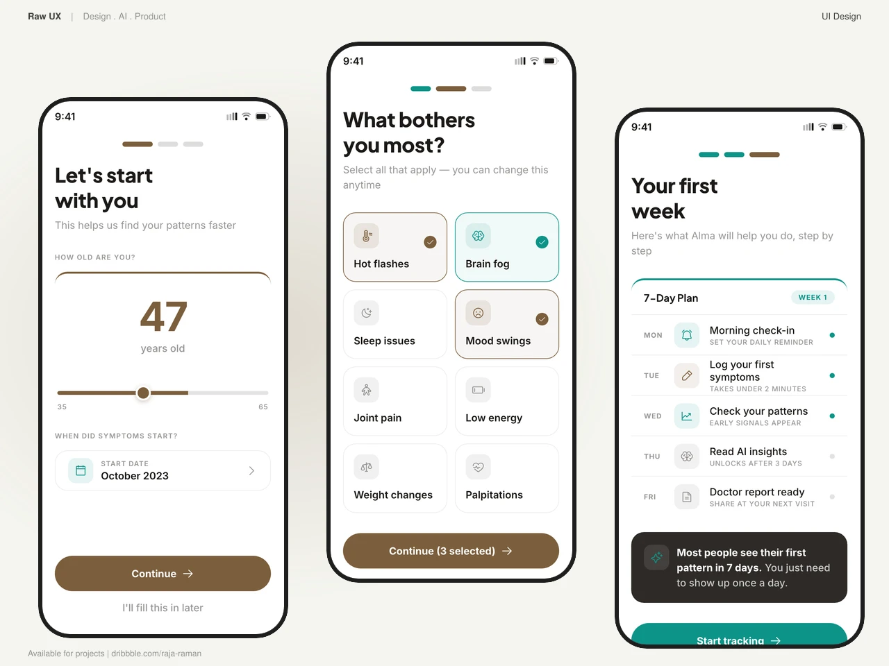
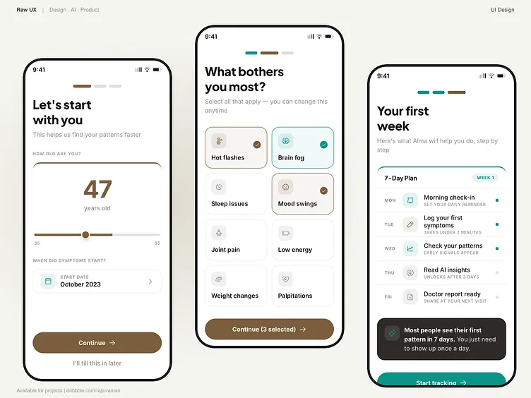
Three screens. Zero medical intake forms.
Most health app onboarding feels like a clinic waiting room. Ten screens of checkboxes, a terms wall, and a loading spinner before you see anything useful.
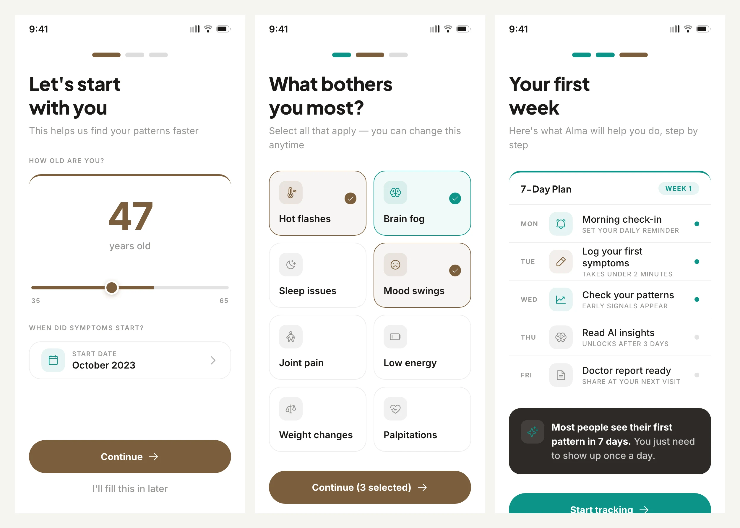
Alma's setup is three taps. Welcome, pick your symptoms, set your rhythm. Done. You're tracking by the second minute.
The goal was to lower the wall between download and first value. Every screen asks one question. Every answer shapes what the app shows you next.
Step by step
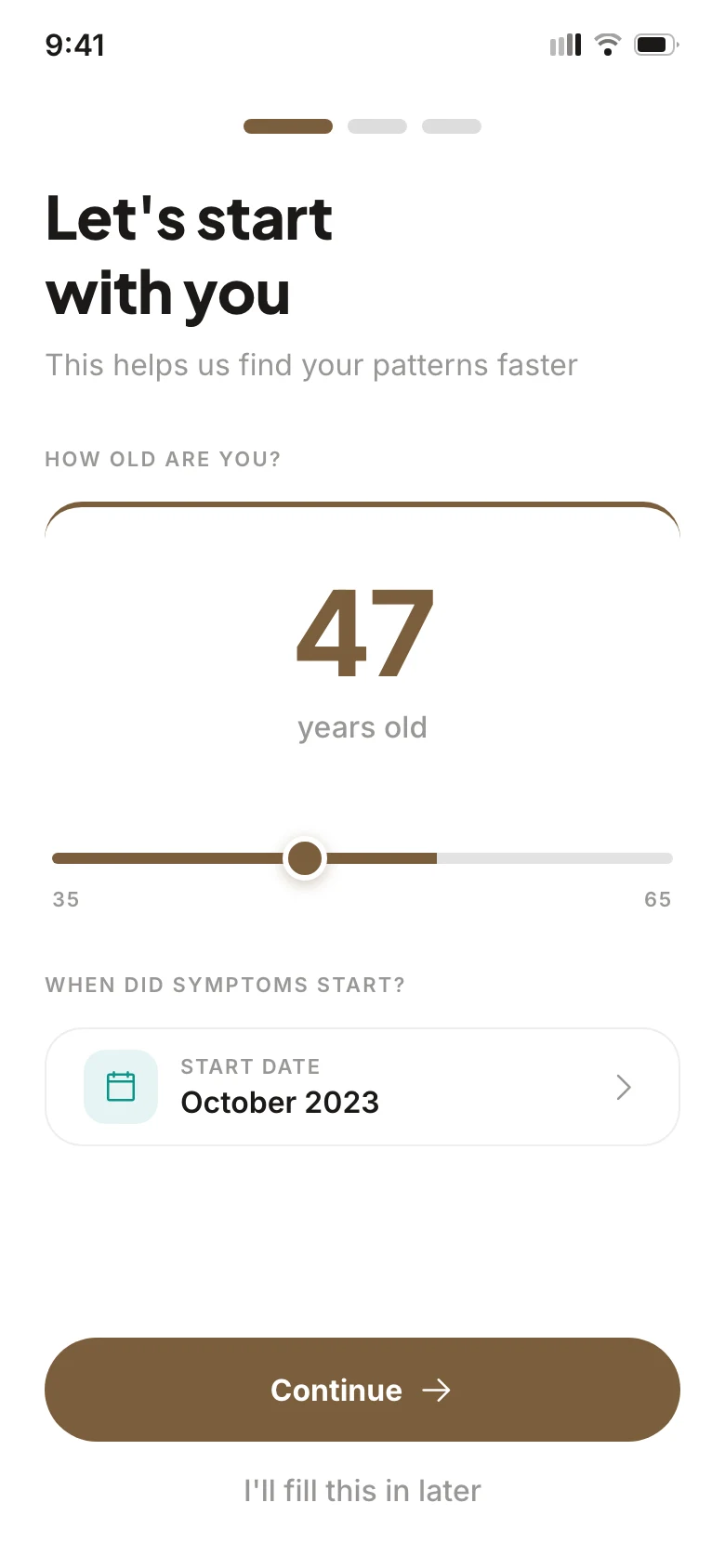

Screen one is the welcome. No feature carousel, no "sign up with Google" gate. A warm headline, a single CTA card in leather brown, and enough breathing room to read it.
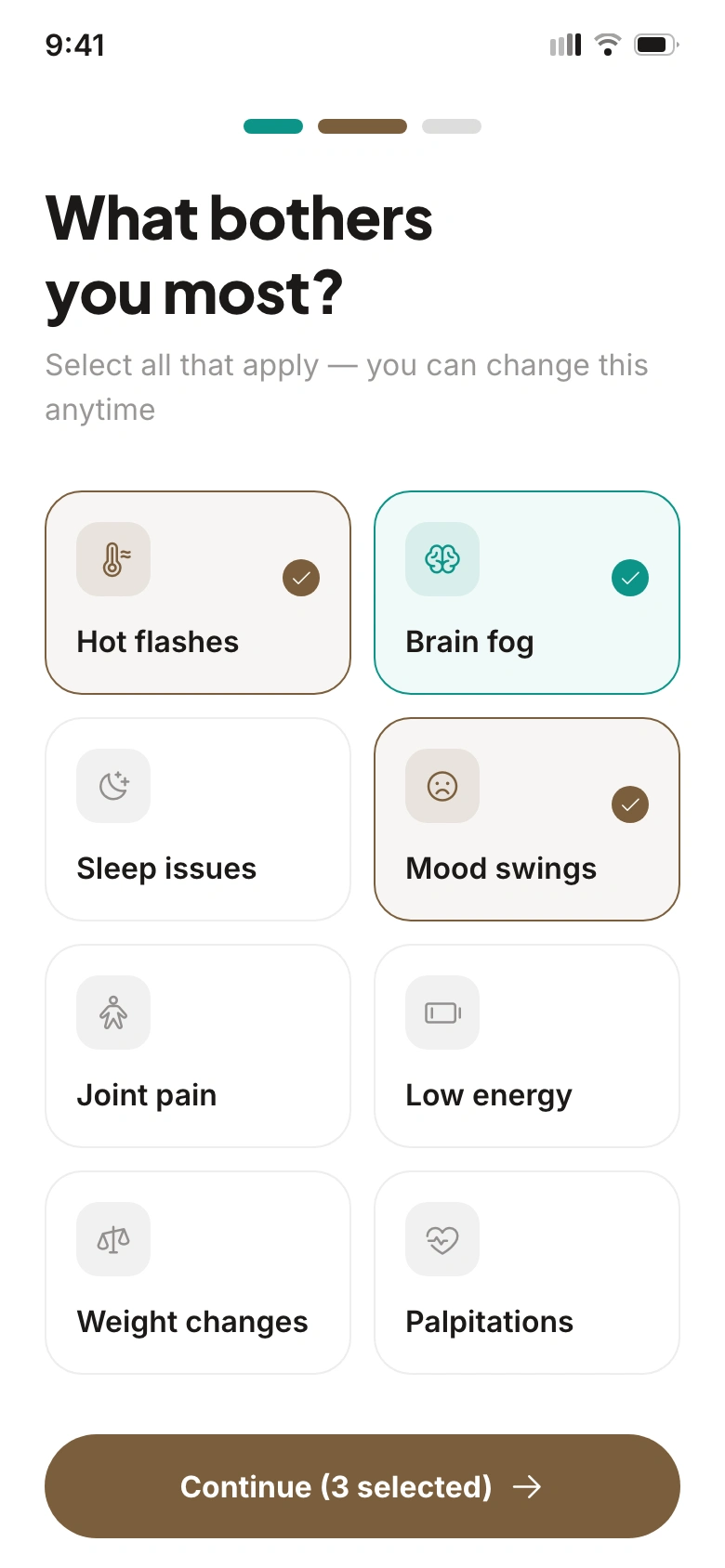
Screen two is symptom selection. Tile grid with multi-select. Hot flashes, brain fog, night sweats, mood shifts, joint pain, fatigue. Users see their experience reflected back. That's the first trust signal: this app was built for exactly this.
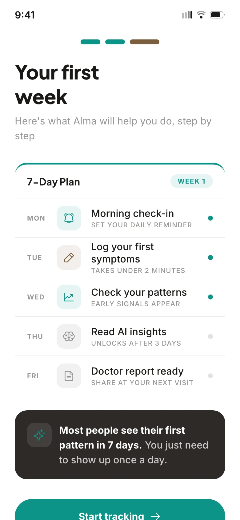
Screen three sets the tracking cadence. Morning check-in, evening log, weekly review. One preference card. Low commitment, high signal. The user picks their rhythm, not ours.
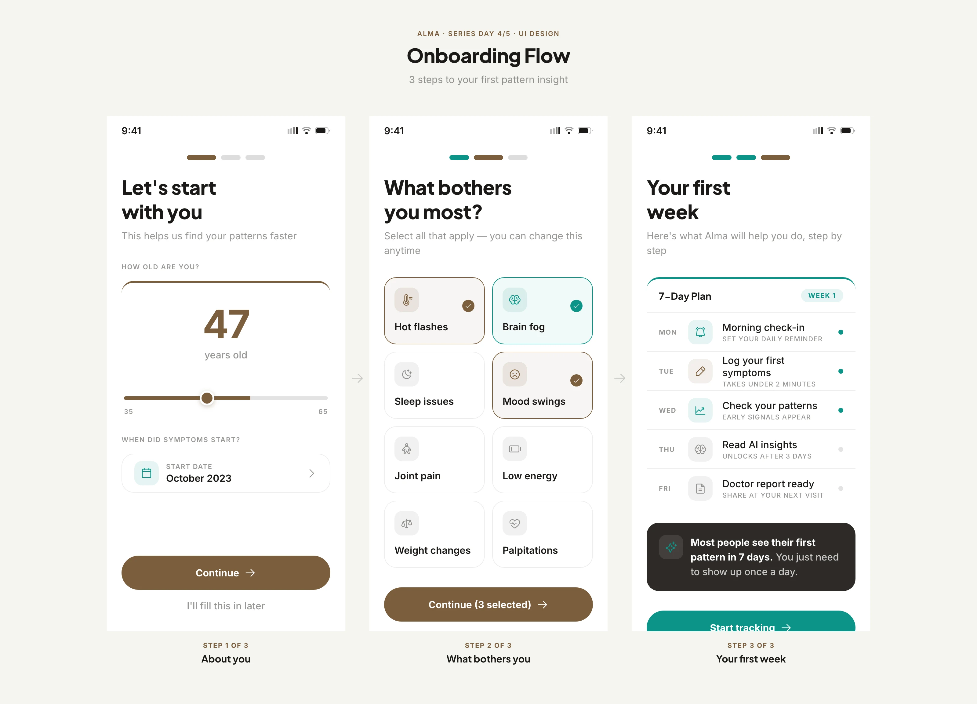
Flow arrows between screens are intentionally light. Just a chevron and a label. The sequence should feel inevitable, not instructional.
Same palette, same type, same warmth as every other Alma screen. Consistency across the product is the quiet part of trust.
How do you approach onboarding for health products?
Raw UX
We design products, interfaces, and design systems for startups and SaaS teams.
Working on a new product? Let's craft the design together.
Like this project
Posted Sep 26, 2026
Three screens. Zero medical intake forms. Most health app onboarding feels like a clinic waiting room. Ten screens of checkboxes, a terms wall, and a loading spinner before you see anything useful. Alma's setup is three taps. Welcome, pick your symptoms, set your rhythm. Done. You're tracking by the second minute. The goal was to lower the wall between download and first value. Every screen asks one question. Every answer shapes what the app shows you next.