


Designing elegant brands & high-end websites

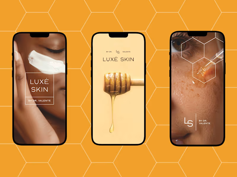



Framer Sites Built to Match Your Brand's Voice
Framer Sites Built to Match Your Brand's Voice


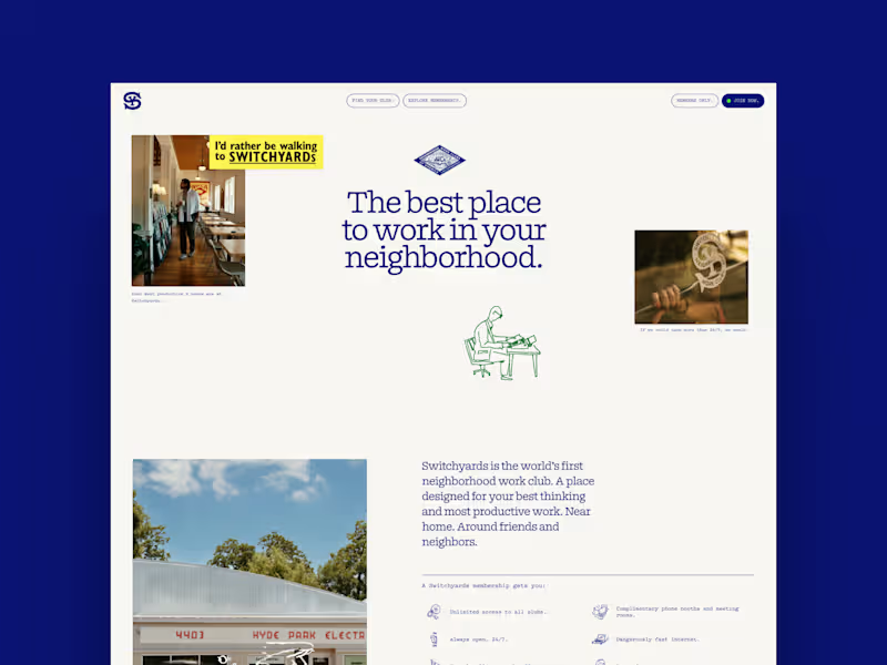
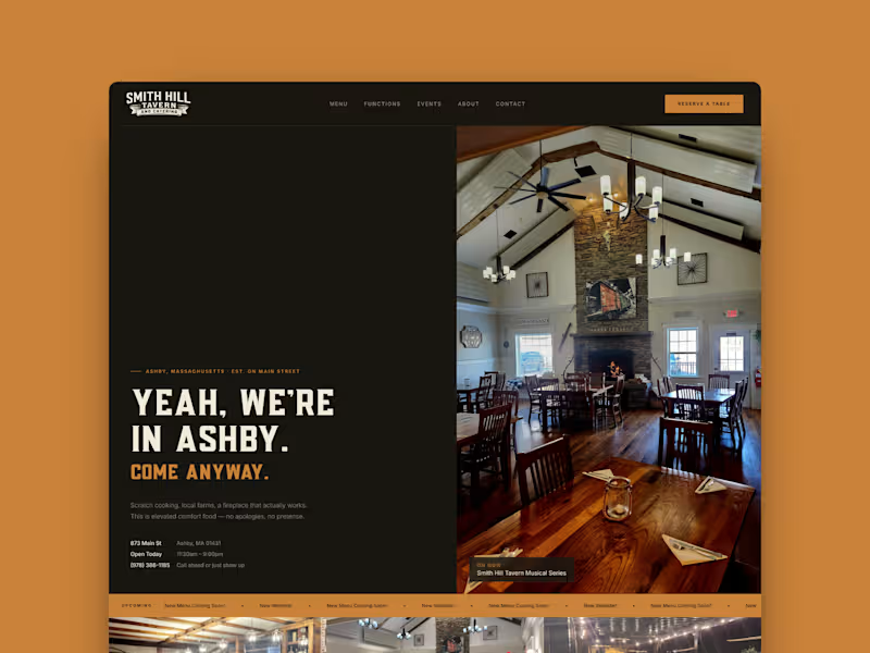

Make your brand standout


Make your brand standout


Creative Director & Branding Expert.
Creative Director & Branding Expert.


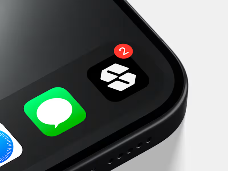
Designing future-proof logos for tech startups.
Designing future-proof logos for tech startups.
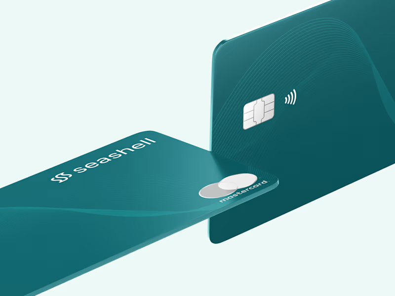



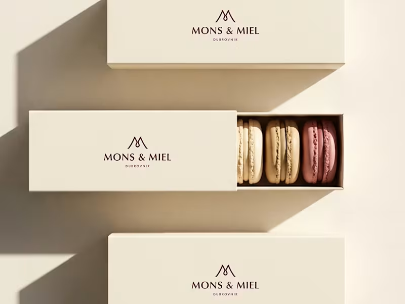
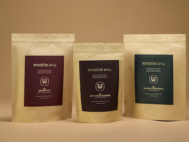
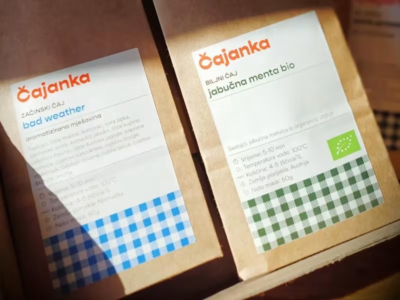
CPG packaging design, strategy & brand identity
CPG packaging design, strategy & brand identity


Brand Designer and Strategist 🪄
Brand Designer and Strategist 🪄

I led a brand refresh for RIC Electronics, a Canadian manufacturer specializing in power and energy solutions.
This wasn’t a total rebrand, it was a refinement. The original logo felt outdated and disconnected from the team, so the goal was to create something that still honoured their roots but reflected who they are now: sharper, stronger, and more aligned.
The result: a cleaner form, refined typography, and a mark with meaning that's built for the people who use it every day!!
24
61
2.9K

The best kind of portfolio update is seeing the work keep working!!
Last year, I helped build the foundation for Sleep or Die (https://contra.com/p/mWXgcXE7-sleep-or-dietm-or-brand-strategy-and-development-web-design?referralExperimentNid=DEFAULT_REFERRAL_PROGRAM&referrerUsername=georgiamashfordcreative), from brand strategy and identity to creative direction and photography.
🤯 Just this week the brand has gone on to receive $1M in funding, and I’ve been seeing accounts with 75K–100K+ followers sharing the brand and some of the photography I created in those early stages.
While the brand has evolved since my initial work with them, it’s a nice reminder that the early stuff matters. The strategy, the visuals, the tone, the way a brand shows up before most people know who they are; it all becomes part of the foundation.
Very grateful to have played a role in getting this one off the ground!!
8
39
3.3K


Editorial Brand & Squarespace Website Designer
Editorial Brand & Squarespace Website Designer


