Čajanka Brand Identity Design
Marta Custic
Čajanka (tea party) A Sip of Nostalgia in a World of Blandness
What if making tea could feel like coming home? That’s the story I set out to tell with Čajanka - a brand brewed from childhood memories, Sunday afternoons at grandma’s table, and the quiet ritual of steeping real tea leaves (never microwaving a sad teabag).
In a market overflowing with sterile minimalism and one-size-fits-all wellness tea brands, Čajanka needed to stand apart - warm, comforting, and full of character. The objective? To bottle up that feeling of simpler times: mismatched retro cups, homemade tablecloths, and the unhurried joy of conversation over a steaming pot.
The challenge was twofold: revive old-school charm without drifting into kitsch or political nostalgia, and craft a visual and verbal identity that feels at once familiar and fresh - a modern tribute to the comforting ritual of tea, made the way it should be.
WHAT THE LOGO MEANS
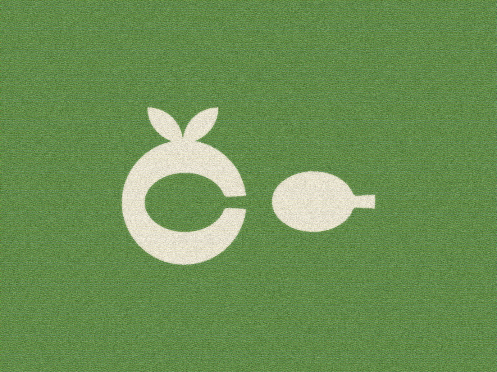
The Story Behind the Logo
At the heart of Čajanka is the letter Č - pronounced “ch”, just like the start of čaj (tea). I brought it to life with a subtle but meaningful twist: a tea leaf delicately shapes the accent, while the negative space inside the C forms a tiny spoon.
It’s simple yet memorable, a nod to homemade tea rituals and classic retro design. One clever mark says it all - leaves, spoon, and a name you won’t forget. Just like the tea: warm, familiar, and always a little special.
THE UNBOXING EXPERIENCE
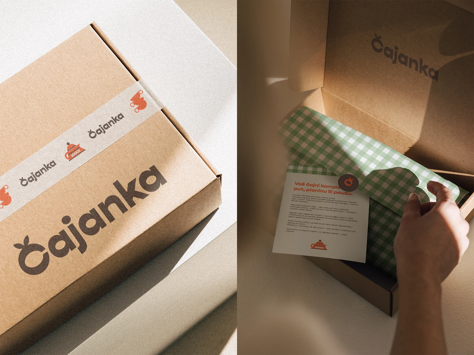
The Unboxing Experience
Opening a box of Čajanka tea should feel like pulling up a chair at your grandmother’s kitchen table. Gingham patterns peek out like her favourite tablecloth - the same one that soaked up laughter, crumbs, and whispered secrets over countless cups of tea.
Inside, nostalgic colour palettes of warm creams, soft browns and gentle pops of red and green instantly wrap you in comfort. Every label and note is set in Gopher, a friendly, retro-inspired typeface that feels as inviting as the tea itself.
No sterile minimalism here - just thoughtful details and a familiar vibe that says: take a breath, pour a cup, stay awhile. It’s more than unboxing tea - it’s unwrapping a memory.
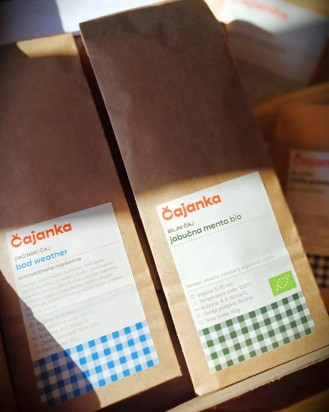
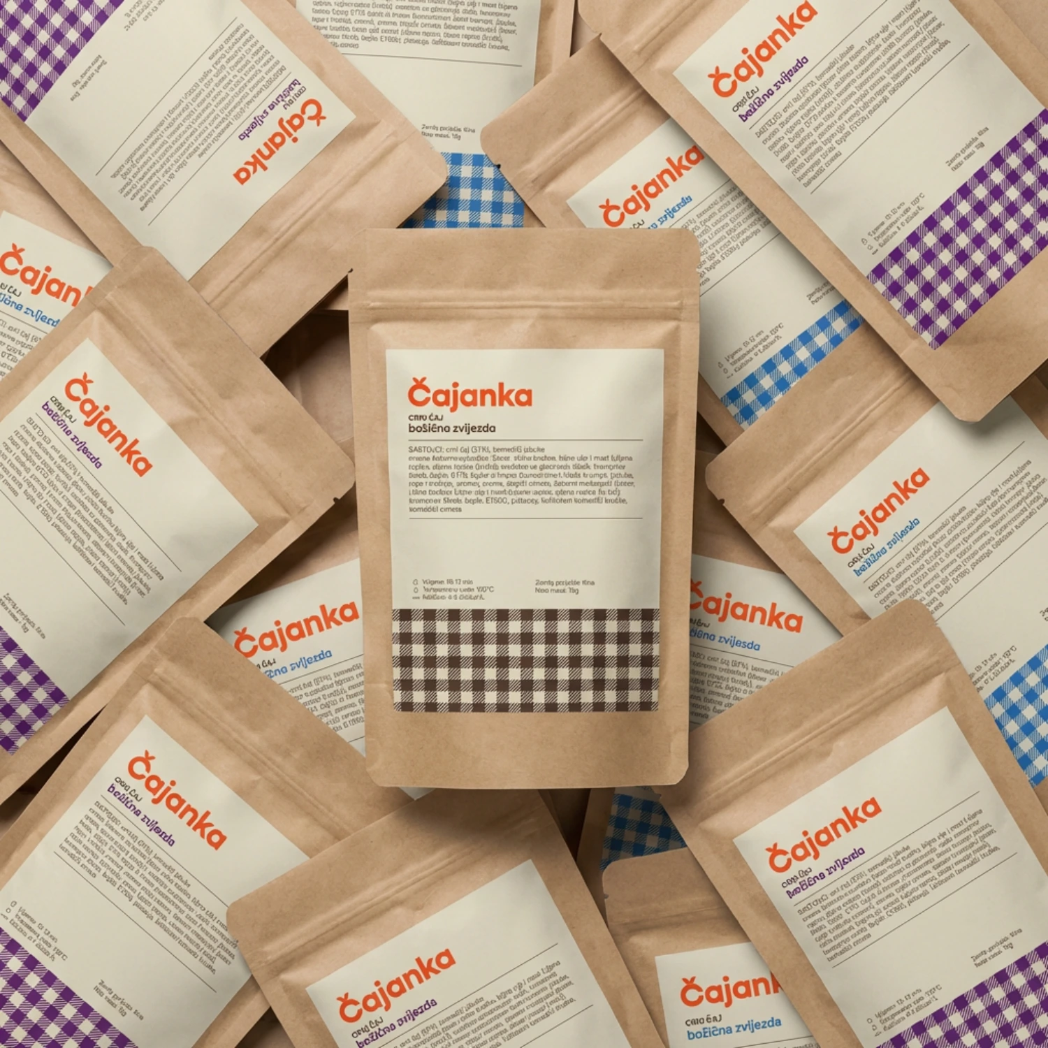
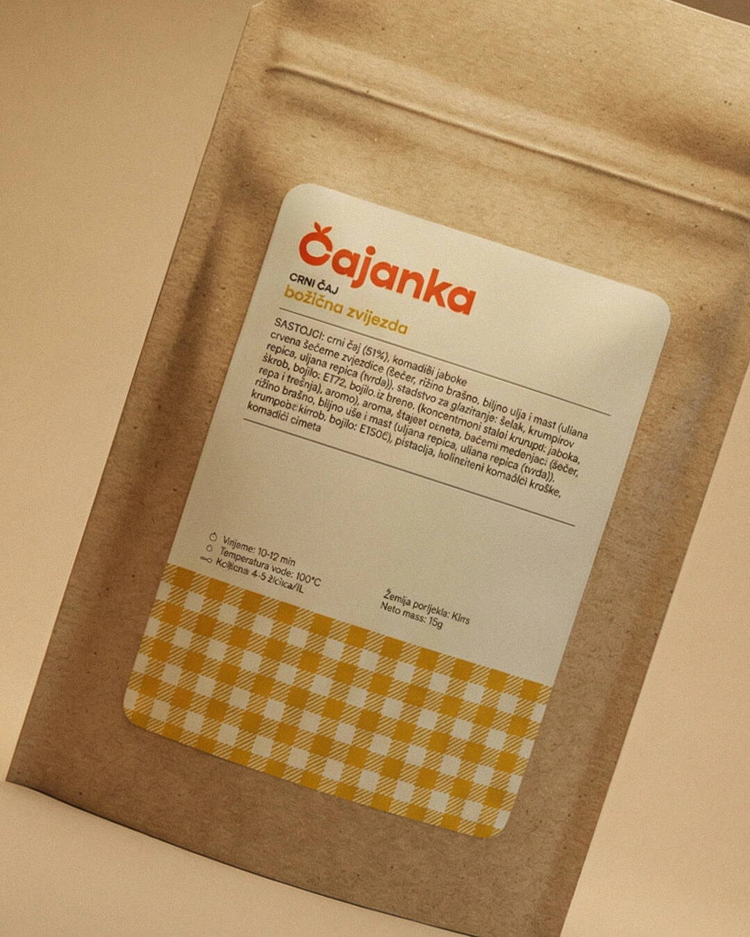
DOYPACK PACKAGING
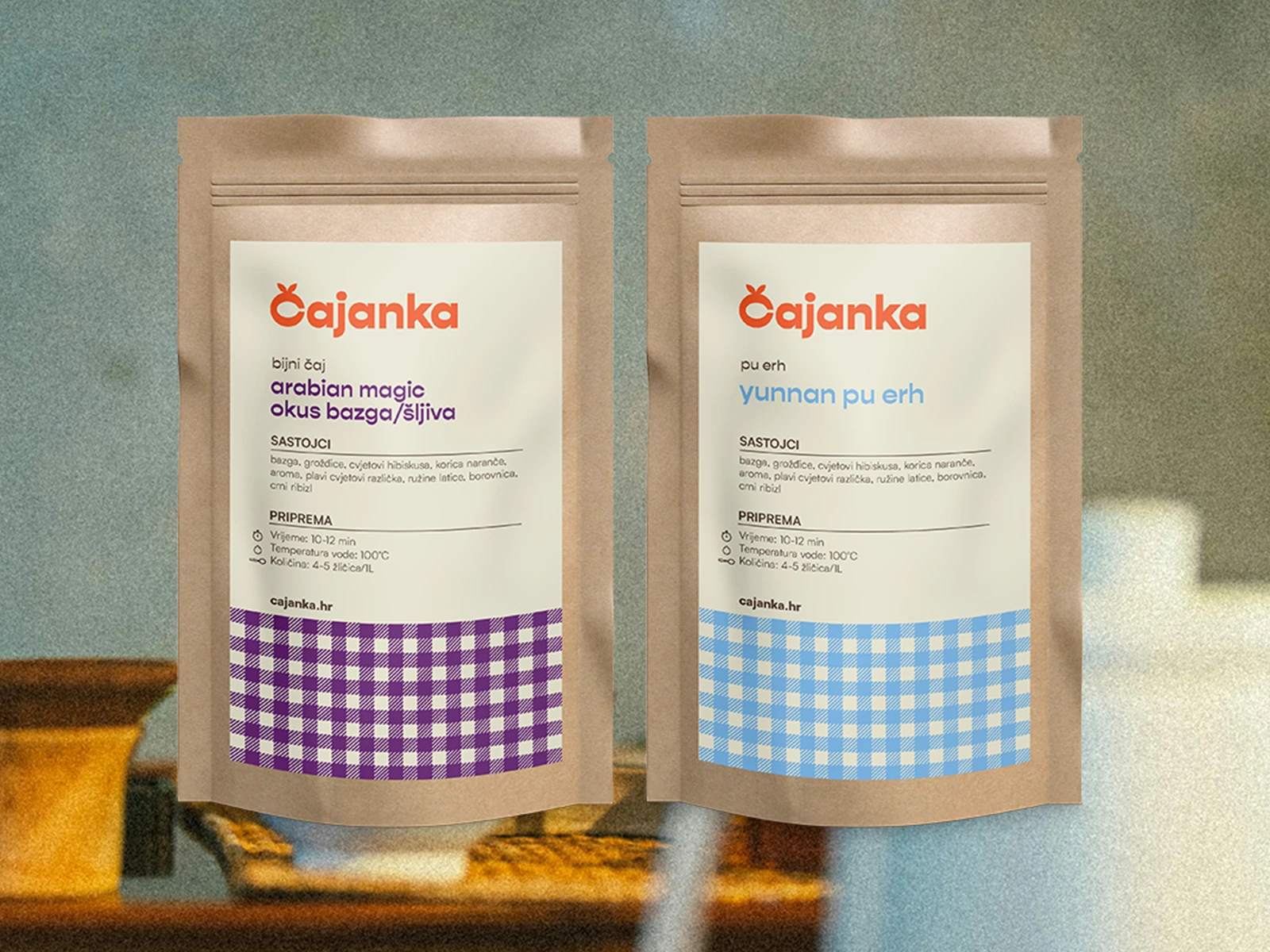
What’s Inside - and How It Works
We kicked things off with doypacks - the perfect blend of practicality and charm for a tea brand with a huge rotating menu. One of the biggest challenges? Čajanka stocks hundreds of teas, and those names and ingredient lists change all the time.
To make life easier (and save them endless back-and-forth emails with a designer), I created Canva-ready, print-friendly templates. Every label can be updated in minutes - from the tea name to the ingredient list - and the team got a simple offboarding tutorial so they feel confident doing it themselves.
And, of course, that signature gingham pattern shows up here too - a subtle nod to grandma’s tablecloth that ties every product back to the heart of the brand. Colour coordinated for each type of tea.
Practical, nostalgic, and empowering — exactly how good packaging should feel.
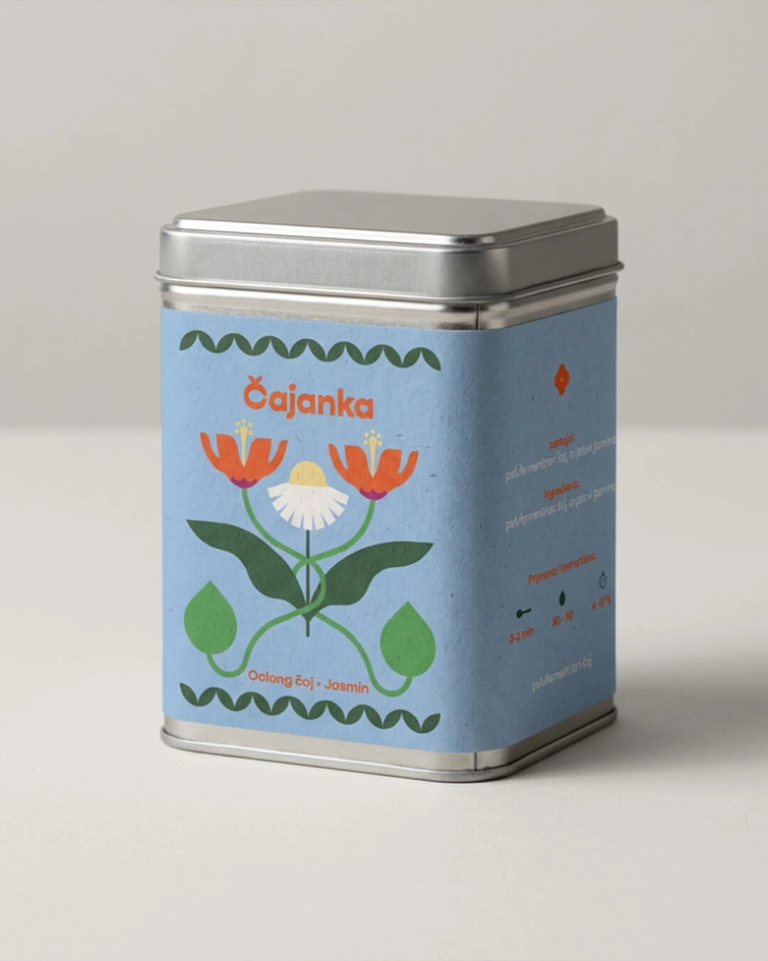
GIFT BOXES
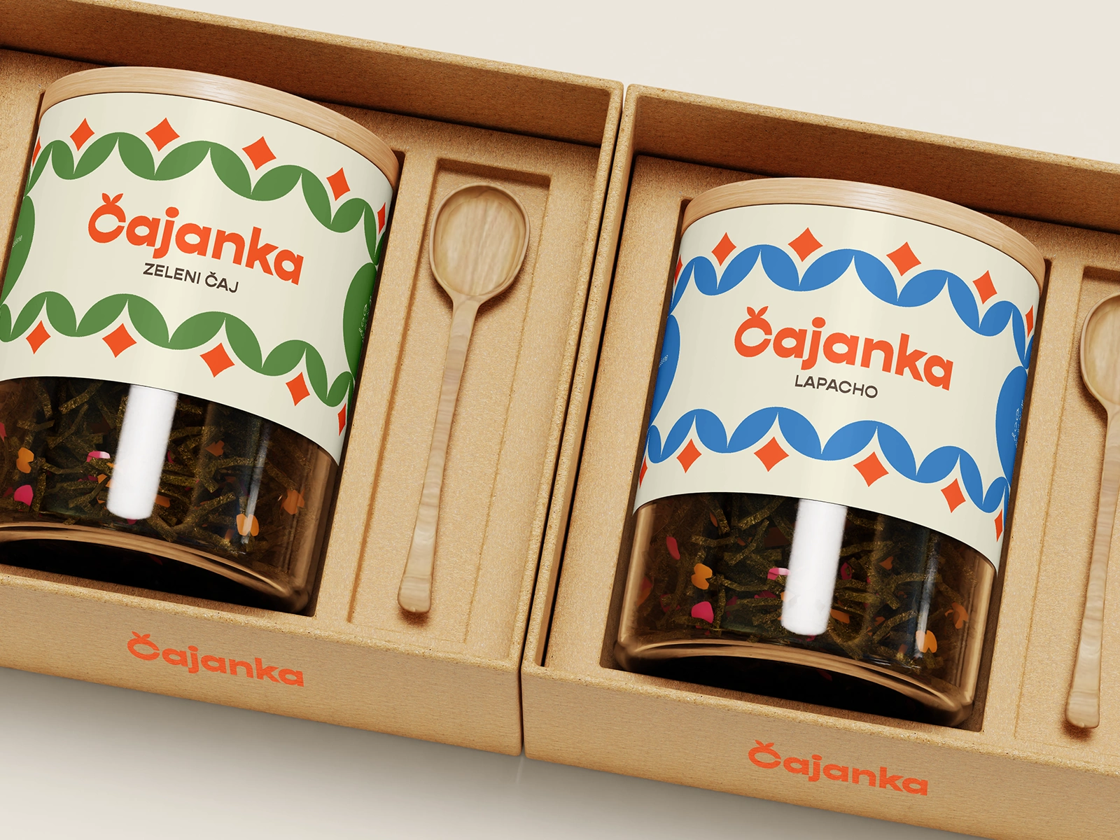
For the Tins, Gift Sets & Wedding Favours
When it comes to gift sets, round tins, and wedding favours, we leaned all the way into that retro charm. A flowing pattern of tea leaves wraps around each tin - it’s warm, nostalgic, and just the right amount of playful.
The idea? Packaging so pretty you actually want to keep it on your kitchen counter, not hide it in the cupboard. It feels special enough for a gift, but familiar enough to reach for every day. A little daily dose of remember when... with every cup.
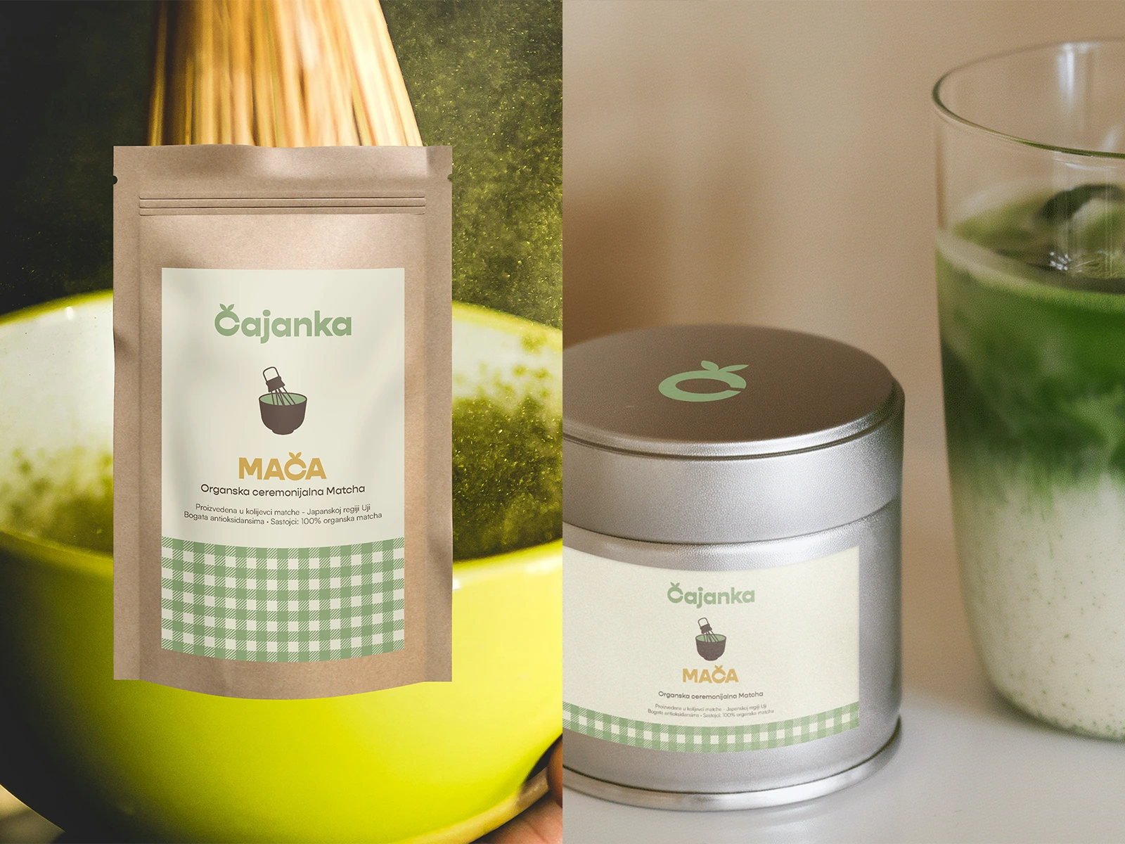
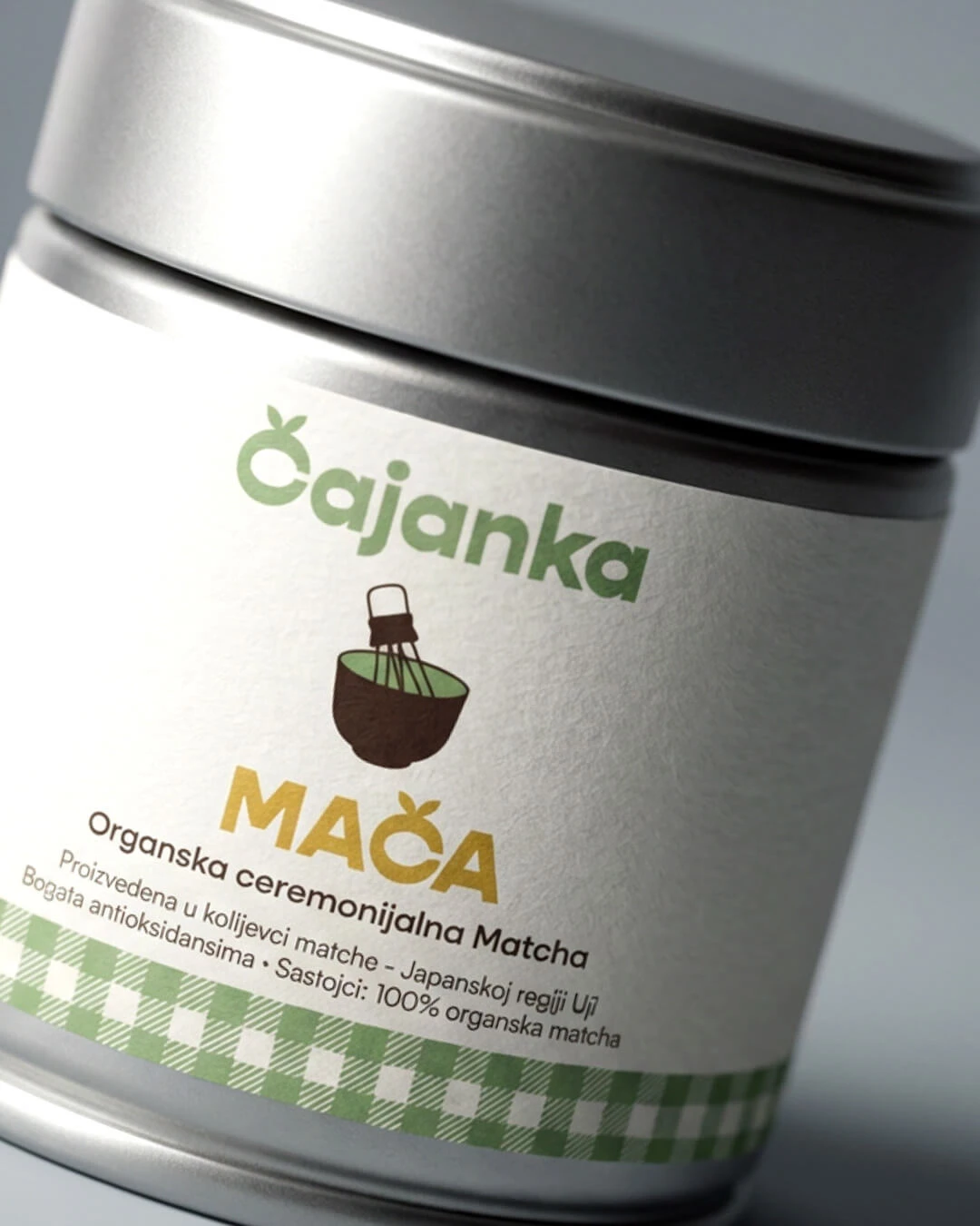
MATCHA
Because Matcha Deserves Its Own Moment
Matcha is truly in a class of its own -so we made sure it stands out while staying true to the Čajanka brand. For this premium ritual, we introduced elegant gold accents to signal quality and care.
A custom matcha whisk and bowl, detailed with a subtle touch of our signature gingham, connect it back to the nostalgic warmth we’re known for. It’s the perfect blend of heritage and a little everyday luxury - because your matcha moment should feel as special as it tastes.
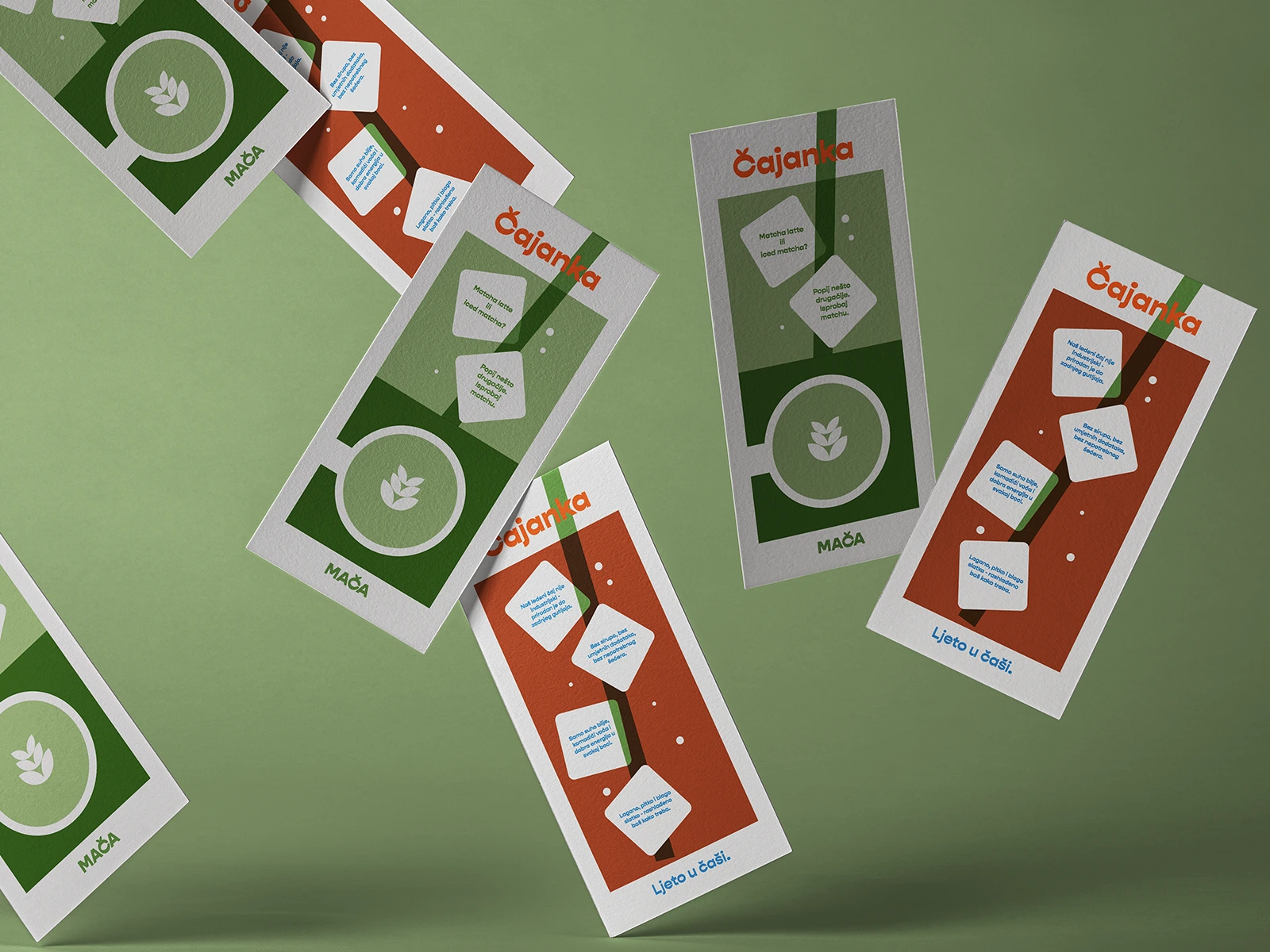
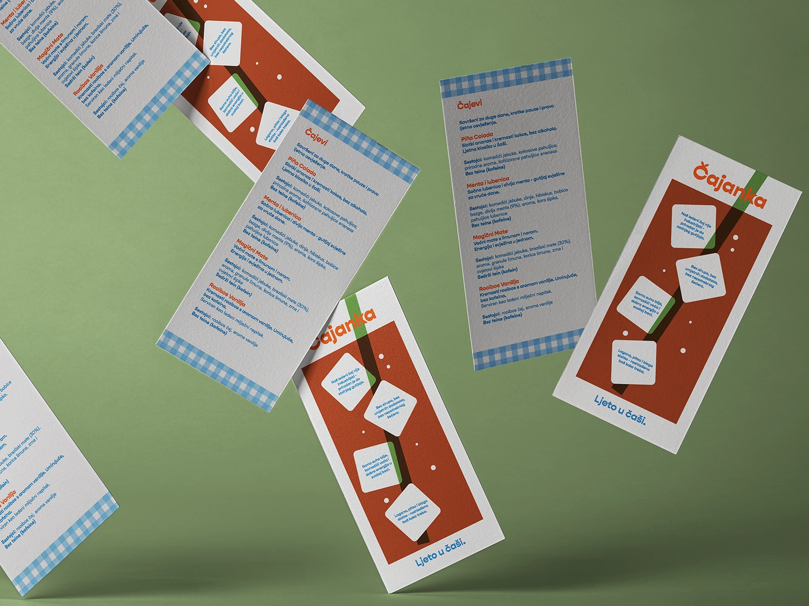
PRINT WORK
Menus Worth Sipping On
Next up: café menus that make people pause, order, and come back for more. The challenge? These little menus sit on busy tables, surrounded by big-brand cups and loud ads (we know who they are, but we won’t name names).
Instead of stock photos and generic layouts, we played with narrow, tall dimensions - purposefully shaped to mimic a refreshing glass of iced tea. Paired with playful retro illustrations, the design feels like you’re already holding your drink before you even order. A small detail, but that’s exactly the point: simple moments, done well.
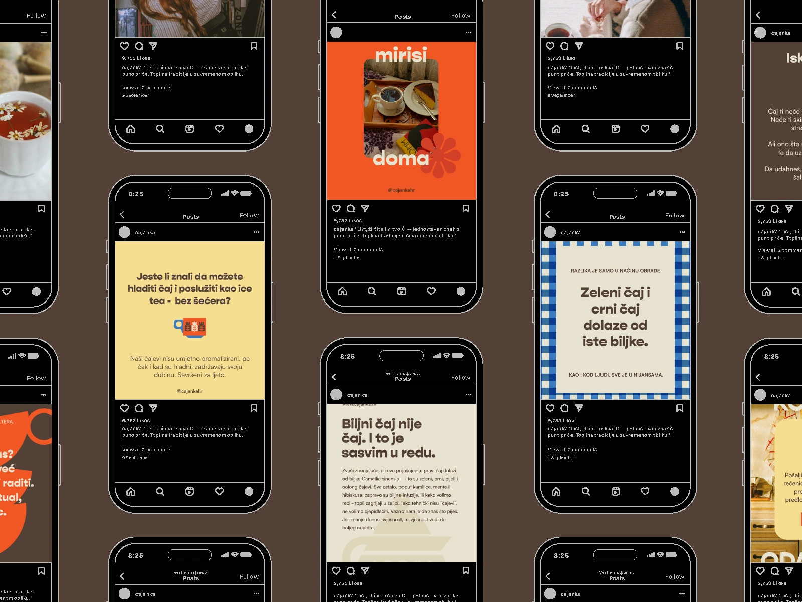
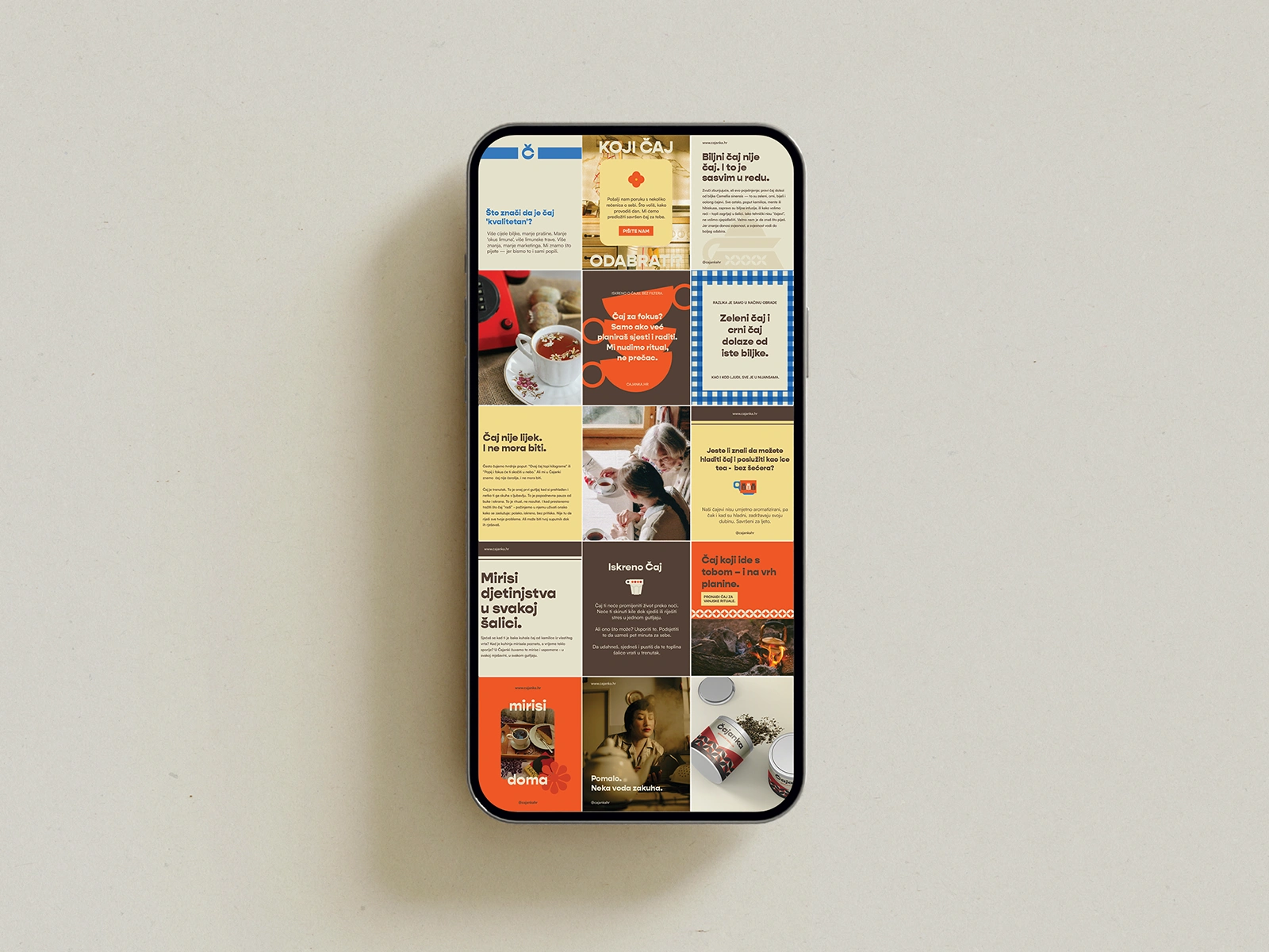
INSTAGRAM CUSTOM TEMPLATES
And Finally - Instagram That Feels Like Home
To tie it all together, we created custom Instagram templates packed with all the good stuff: nostalgic patterns, playful illustrations, and those little brand moments that make Čajanka feel warm and familiar.
Why? Because our goal is always the same - to help clients stand out beautifully in a feed full of sameness and build a community that feels like gathering at grandma’s table. Every post, every story, every scroll... a sip of something comforting and real.
Like this project
Posted Jun 22, 2025
Brand & packaging design that feels like grandma’s table - warm, nostalgic and memorable.
Likes
26
Views
353
Timeline
May 1, 2025 - Jun 18, 2025