Designing elegant brands & high-end websites




Framer Pro Experts | Design & Development Studio


Crafting Intentional Brand & Web Experiences
Crafting Intentional Brand & Web Experiences

Framer Sites Built to Match Your Brand's Voice
Framer Sites Built to Match Your Brand's Voice
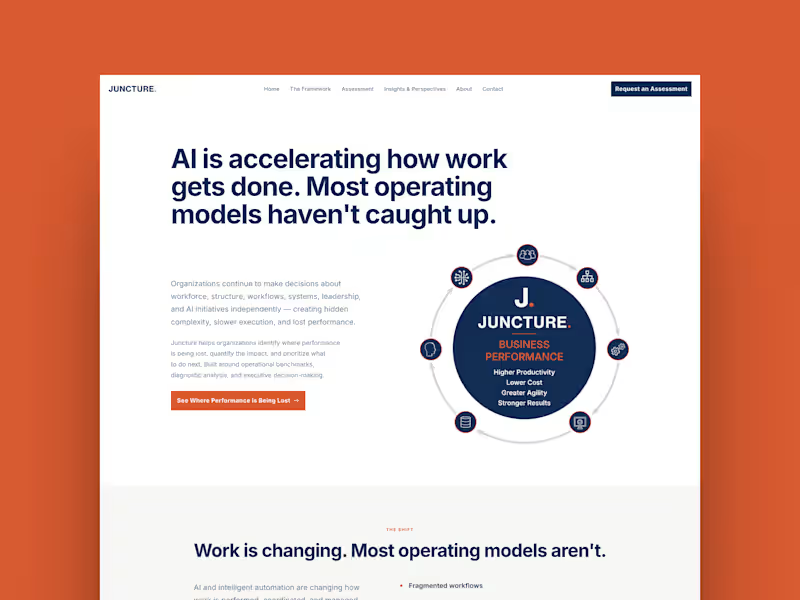
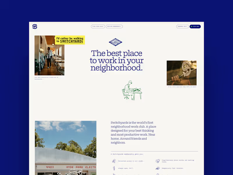
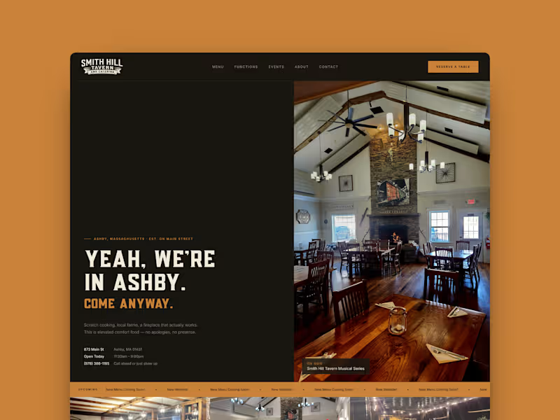

Brand & packaging designer for cosmetic & lifestyle brands

Brand & packaging designer for cosmetic & lifestyle brands
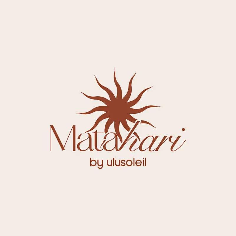
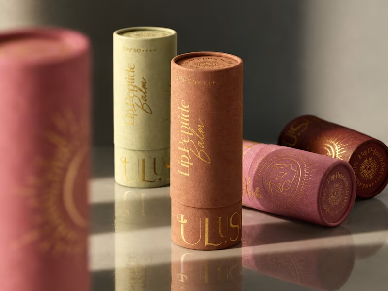
A little packaging design appreciation 🌞
UluSoleil was one of my first big clients, and over time, I helped bring four of their products to life through packaging design.
This lip balm tube was all about balancing a delicate, feminine aesthetic with clear product communication, thoughtful typography, and functional packaging.
I’m still working on the full case study, but I wanted to share a little peek at the process!
More to come ✨
62
110
4.6K
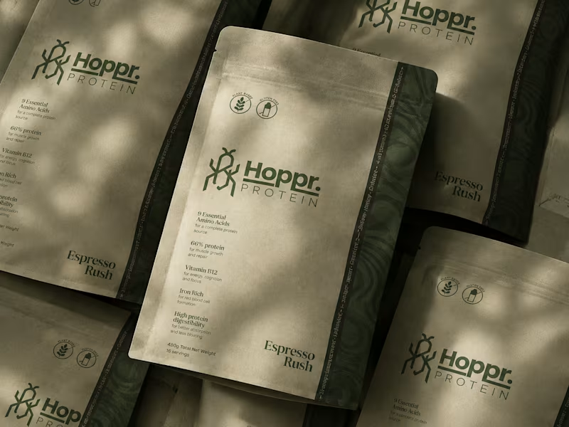
Not every client comes to me for a brand identity and not all my clients are skincare or cosmetic brands.
That was the case with Hoppr, a protein powder brand made from crickets. 🦗 YES, CRICKETS!
Sometimes the logo, colors, and visual system are already there and my job is to bring them to life on packaging and see how far I can push them.
I love projects like this because I get to play with typography, layout, and materials while working within an existing identity.
How much freedom do you think a designer should have when working with an established brand?
17
53
3.7K
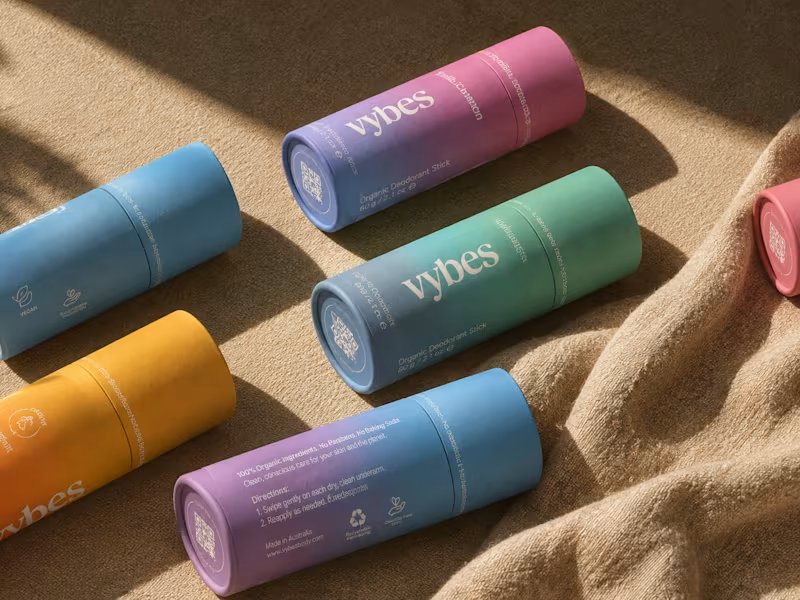
Have you ever designed packaging for a brand that never launched? 👀
Surprisingly, it’s happened to me more times than I expected.
Vybes was an organic deodorant brand from Australia I worked on, designing packaging for a product that, in the end, never made it to market.
It’s a weird feeling putting so much thought into packaging for a product that people will never see on a shelf.
How many unreleased projects are hiding in your folders? 😂
34
84
4K


Creative Director & Brand Producer | Brand Identity
Creative Director & Brand Producer | Brand Identity
It all starts with strategy —
and grows into a visual system.
Our work for Specialty Coffee Cosmetics COCO began with clarity:
defining positioning, tone, and the deeper narrative behind the brand.
From there, the visual language emerged —
not as decoration, but as a natural extension of meaning.
Brand is not what you design first.
It’s what you understand first.
Then you build.
8
47
9.7K


Visual Artist & Storyteller

Visual Artist & Storyteller



Brand Systems & Visual Identity
Brand Systems & Visual Identity
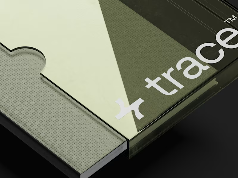
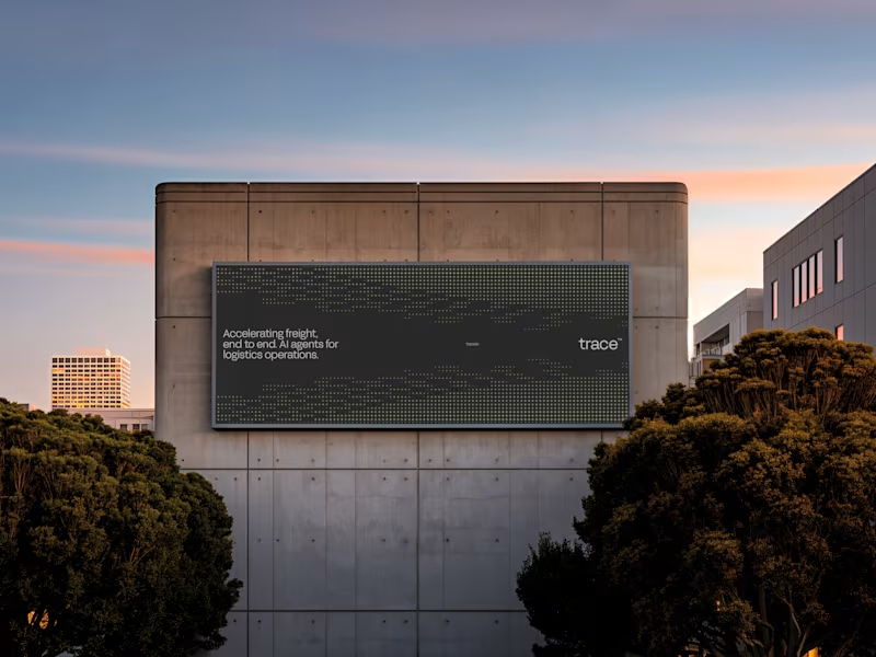
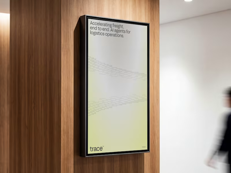
⁕ Full Brand Identity for Trace™
One of the project's greatest challenges was creating an identity that is instantly recognizable and inspires investor confidence, while balancing a futuristic aesthetic with the sense of reliability intrinsic to the brand's values.
The core concept draws inspiration from the cosmos and the brand's drive to transcend boundaries; no matter the distance, the delivery is guaranteed. We translated this visually through patterns forming paths that lead to a destination, a motif that extends to every corner of the visual language.
19
96
5.8K
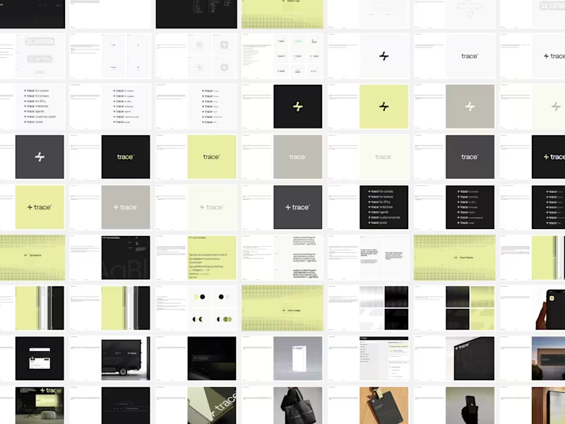
New Brand Guidelines delivered.
While it may seem trivial, this asset remains a key component of our final deliverables for every project. We offer a recommended guide for the proper use of the brand, with various layout options permitted within the visual language. This ensures the brand can expand over time with a truly functional visual system.
We always strive to be as concise as the brand allows, establishing the foundation for its effective use. This empowers the client to make informed decisions and implement each brand element in the ideal scenario with optimal adjustments.
9
39
4.8K