Brand Identity Design for A Swiss B&B

Serena Tyrrell

The Brand
Maison Edelweiss is a bed and breakfast tucked into the Swiss mountains, and it invites guests to slow down and live the way people do in the Alps, with warm rooms, mountain air, and mornings that start without a schedule.
The stay is built around the feeling of being sheltered, so the place feels more like a home you’ve been welcomed into than a hotel you’re passing through, and the quiet around it becomes part of the experience.
The Design
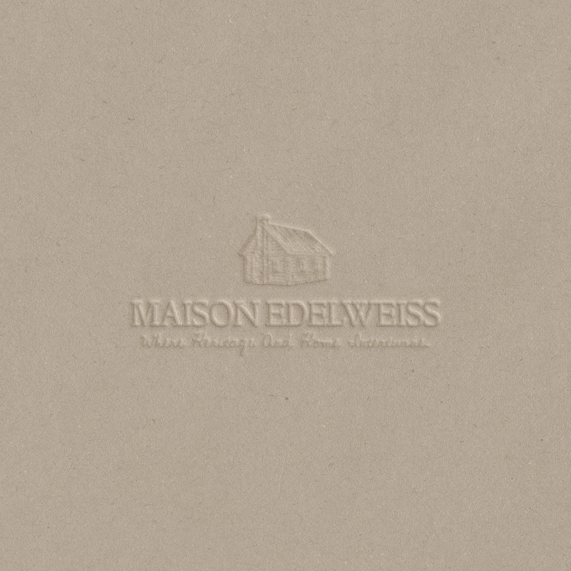
The identity for Maison Edelweiss starts from the material the B&B is built on, which is wood, and because wood is what makes a mountain stay feel warm and protected, it became the source for the textures used throughout the design.
The grain, the slight irregularity, and the soft depth of the material carry across the brand’s printed pieces and digital touchpoints, so guests feel the character of the place before they ever arrive.
The typography was chosen to bring two qualities together, a confident, assertive presence that gives the brand authority and a gentle tenderness that reflects what the B&B does, which is to give people shelter. The letterforms are sturdy enough to feel like they belong on a cabin door, and they’re softened enough to feel welcoming once you’re inside, and that balance keeps the brand from feeling either rigid or overly sentimental.
Services
Brand design
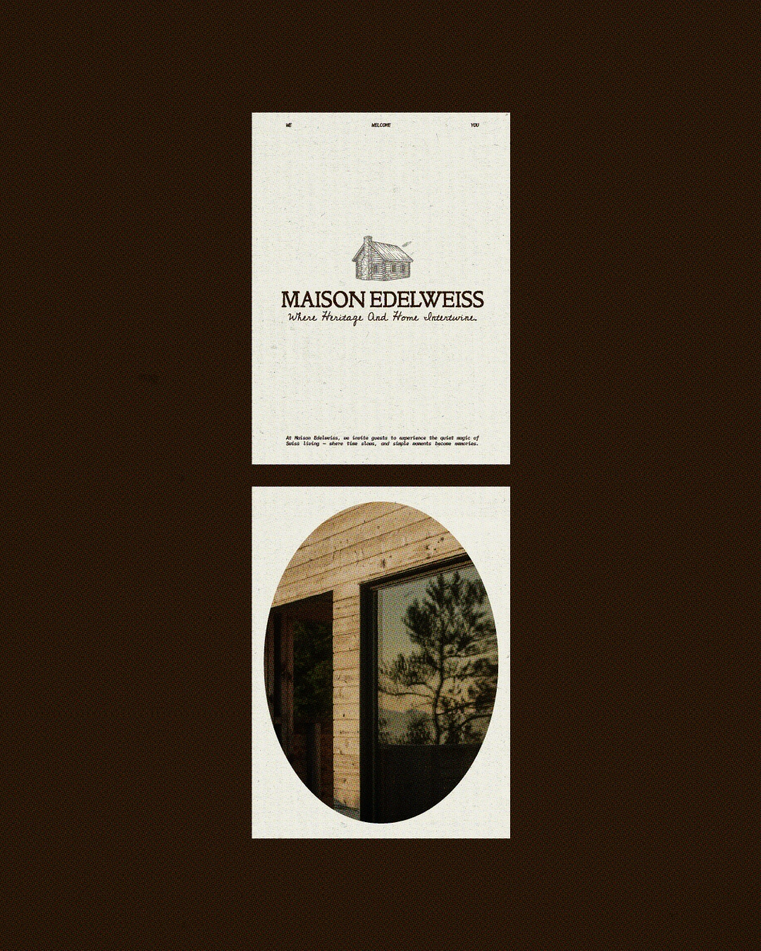
Social marketing materials for Maison Edelweiss
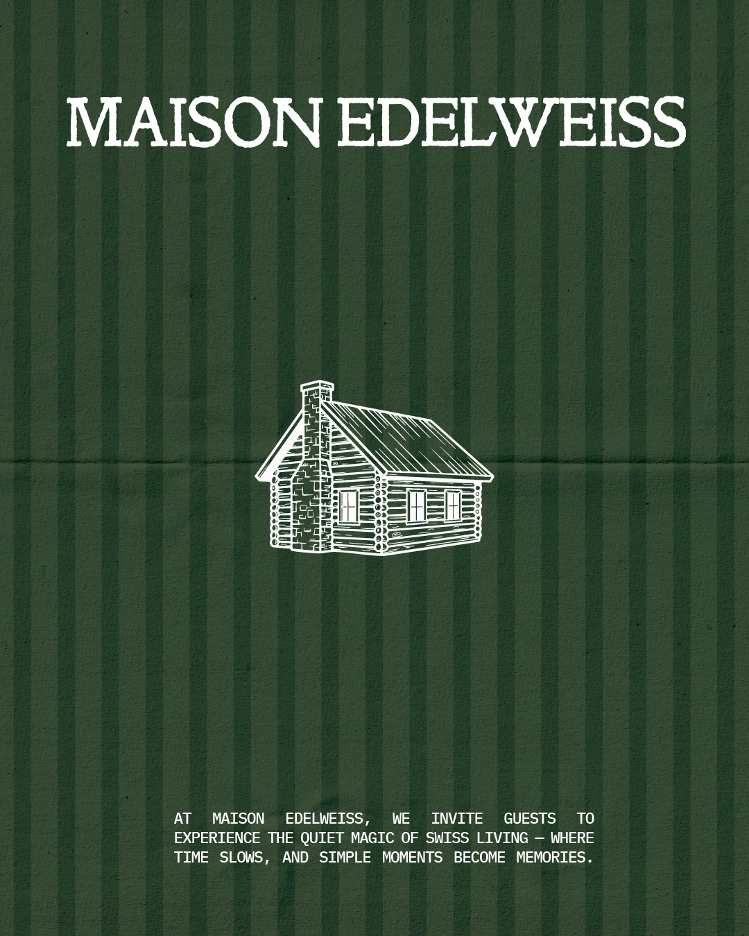
Social marketing materials for Maison Edelweiss
Social marketing materials for Maison Edelweiss
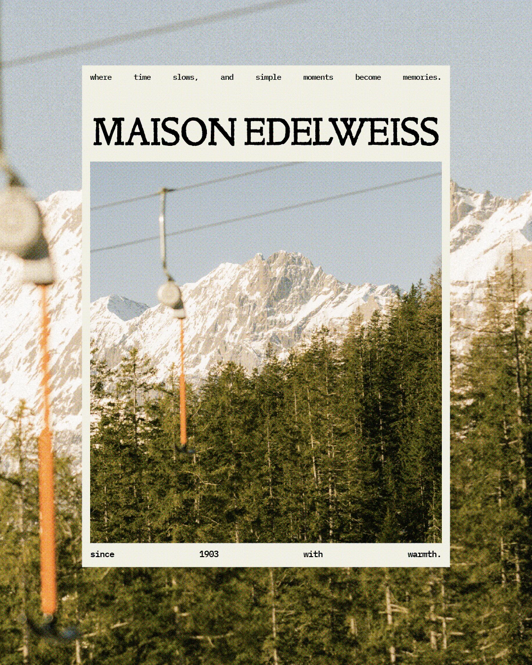
Social marketing materials for Maison Edelweiss
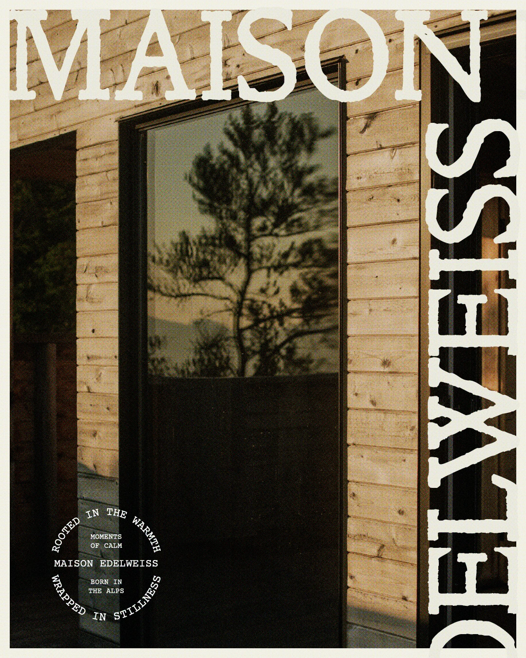
Social marketing materials for Maison Edelweiss
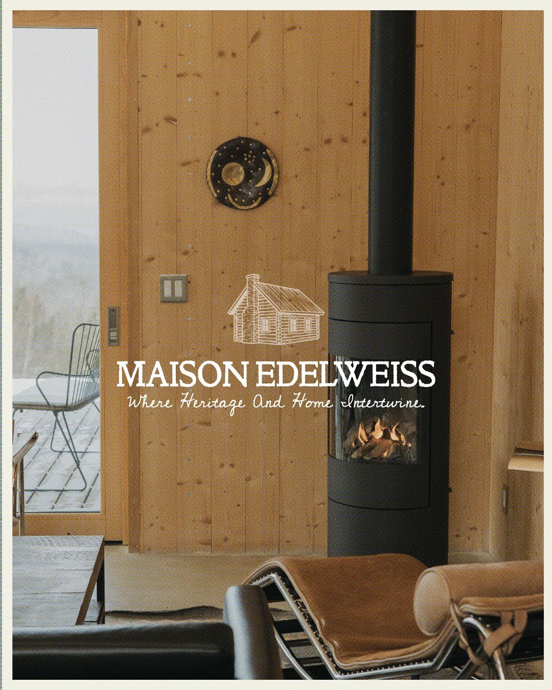
Social marketing materials for Maison Edelweiss
Let's connect!
Like this project
Posted Oct 20, 2026
A wood-inspired identity for a Swiss mountain B&B, pairing textured materials and tender, assertive typography with the shelter of an alpine cabin.
Likes
0
Views
3