Brand Identity For A Skincare Brand

Serena Tyrrell

The Brand
Véra makes skincare with care at every step, and its mission is to support clear, healthy skin while bringing back the glow that skin has when it’s well looked after. Each product is formulated with intention, so a routine stays simple and every step earns its place, and the result is skin that looks fresh, hydrated, and lit from within.
The Design
The identity for Véra was designed to feel dramatic, elegant, and modern, because the products are made to give skin an ultra dewy finish and the brand needed to look as luminous as the results it promises. Skincare identities often lean soft and clinical, so this one takes a bolder direction, with confident contrast and a polished look that gives the brand a clear point of view.
The logo is built on a classic typeface with a dramatic elegance, and it brings an authoritative presence to the identity that reassures customers they’re in expert hands.
The brand icon draws on the aloe vera plant and merges it with the shape of a human head, which ties the product directly to the person using it. Aloe is one of the most hydrating plants known and a key ingredient in Véra's formulas, so the symbol tells the brand’s story at a glance, showing where the hydration comes from and who it’s for.
Because the mark is simple and distinctive, it works as a small detail on packaging, as a social media avatar, and as a standalone stamp of the brand.
Services
Brand design
Label design
Sourcing on brand photography
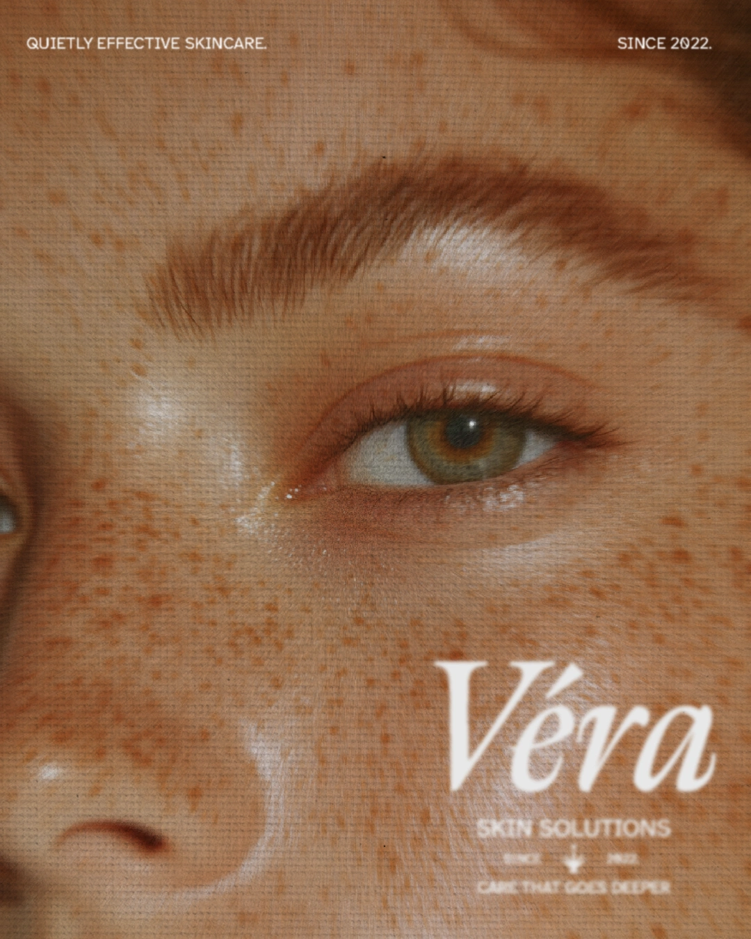
Social media marketing graphic
Social media marketing showreel
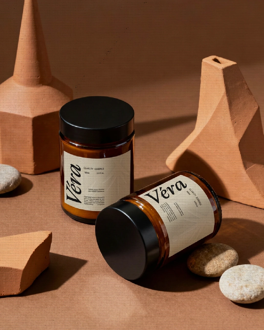
Brand label design
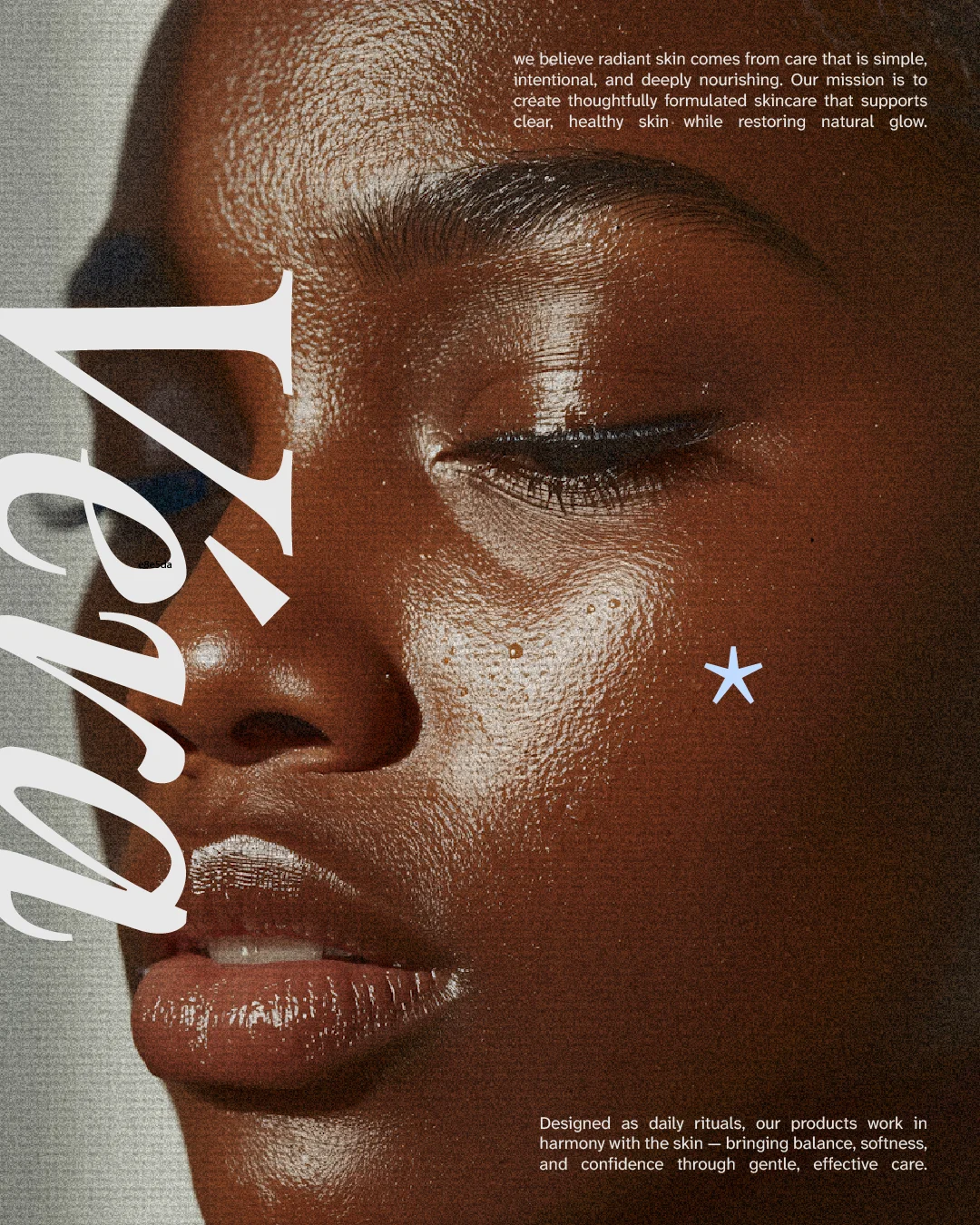
Social media marketing graphic
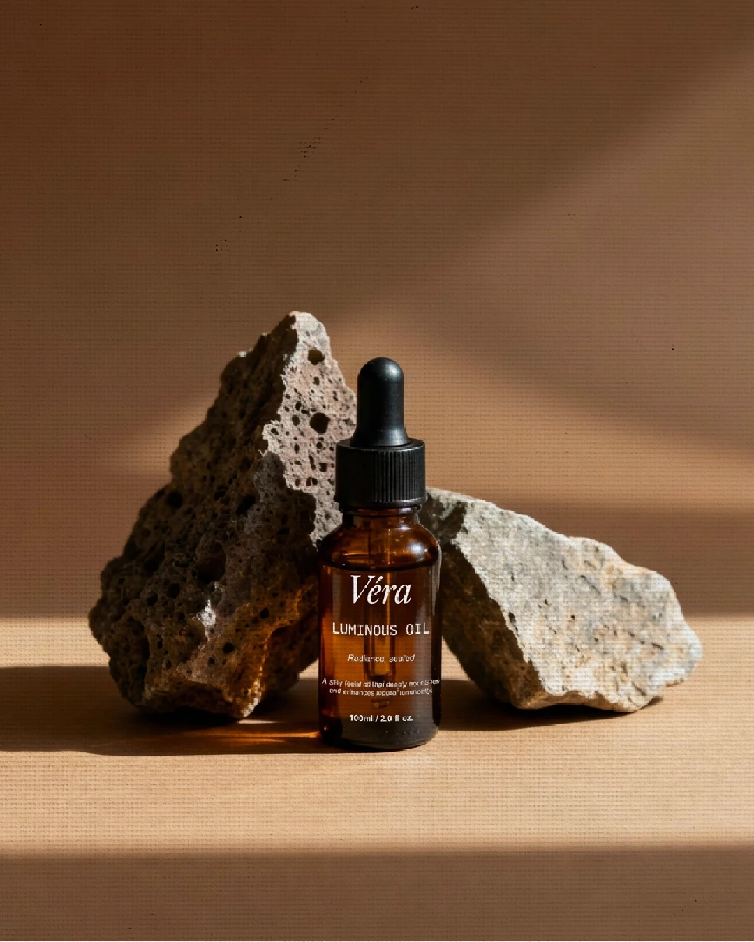
Brand label design
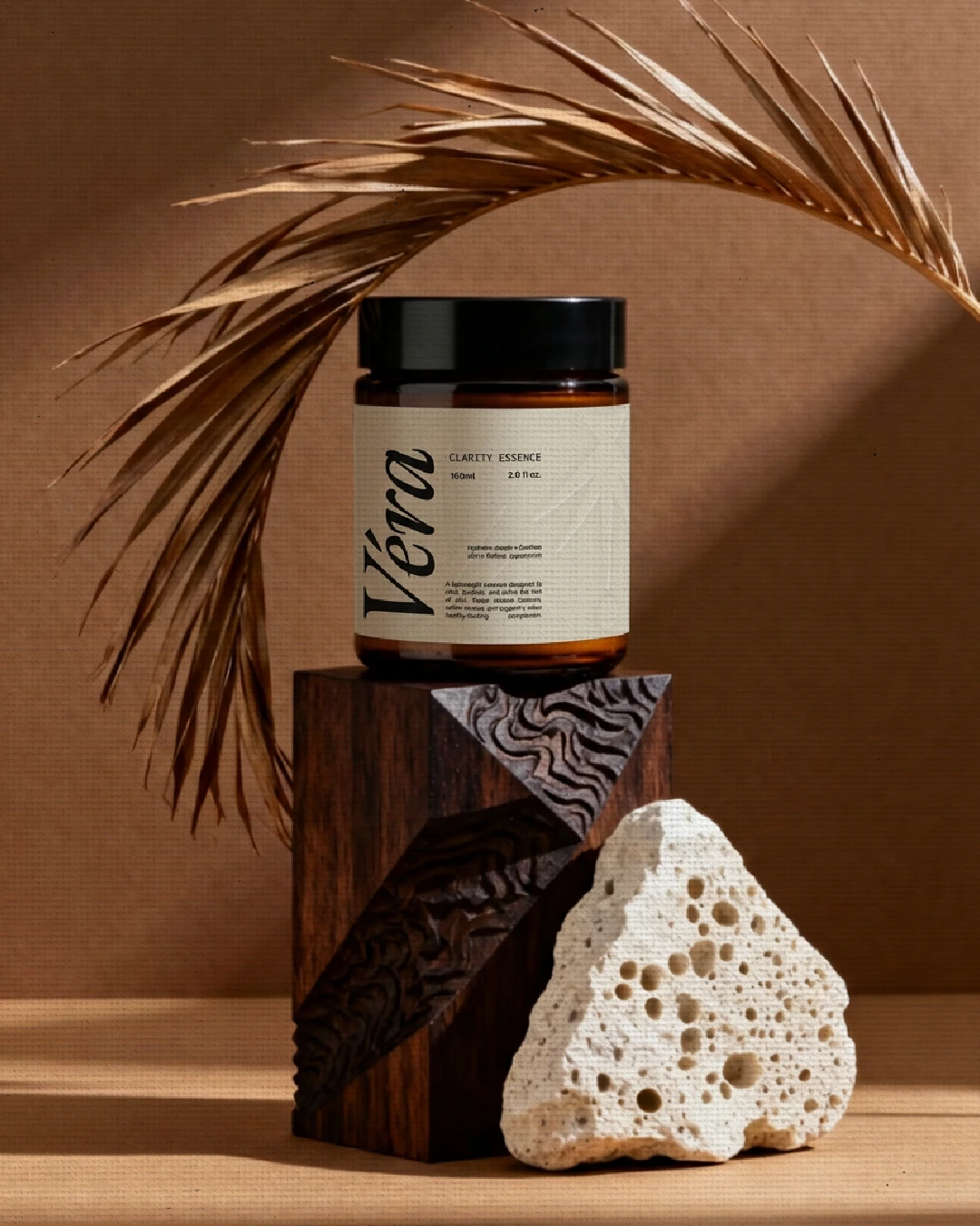
Brand label design
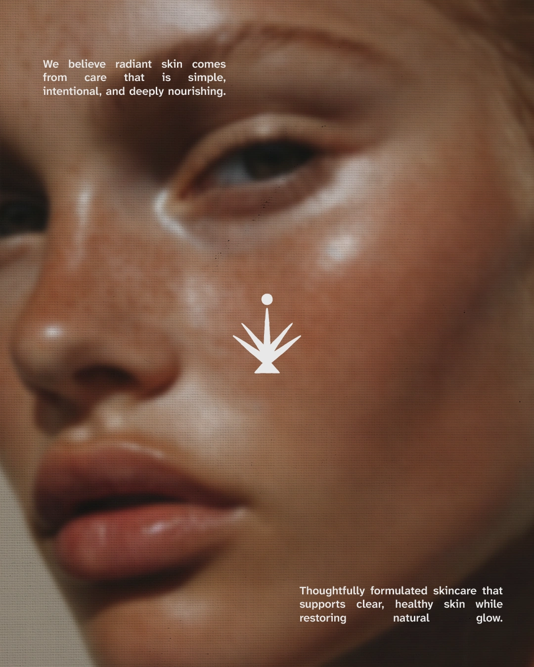
Social media marketing graphic
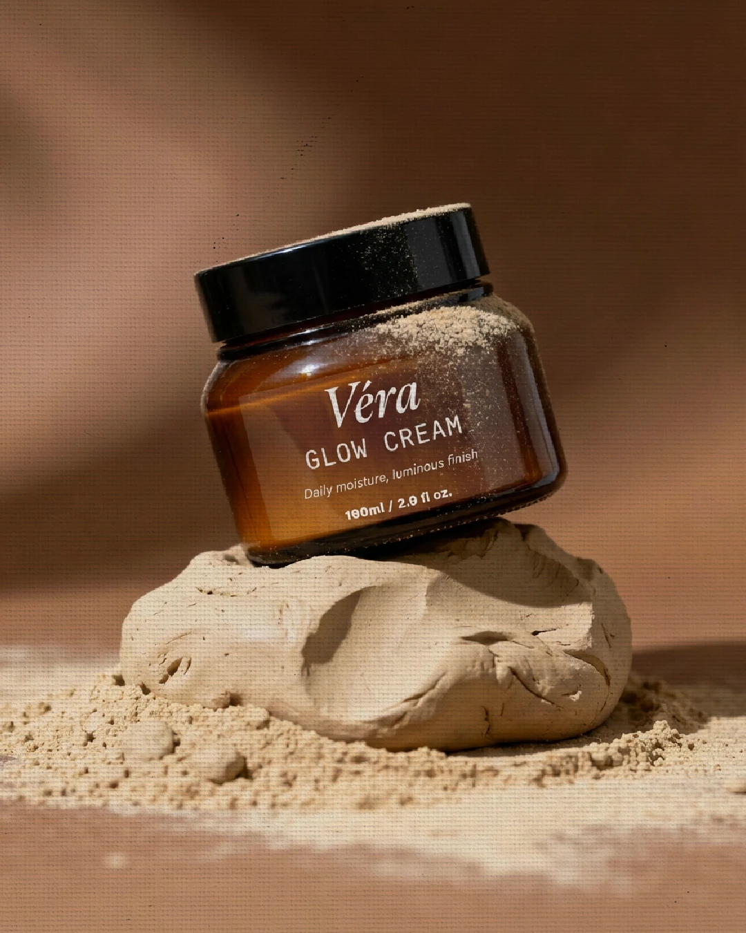
Brand label design
Let's connect!
Like this project
Posted Oct 20, 2026
A dramatic, elegant identity for a skincare brand built around dewy, glowing skin, pairing an authoritative classic typeface with an icon representing aloe vera
Likes
0
Views
2