

Editorial Brand & Squarespace Website Designer

Editorial Brand & Squarespace Website Designer

For this design, I brought the Studio Kalili website to life using Squarespace's Finish Layer by layering in subtle animation across the page to turn a static layout into something that feels considered and dynamic without overwhelming the content.
The most intentional use of Finish Layer is the two-image interaction illustrating the core idea behind the studio's work: closing the gap. One image enters from the left, the other from the right, moving quickly at first and then easing as they meet in the center — fast enough to catch attention, slow enough to let the reader stay with the copy.
From there, hover states on buttons, text, and large images, plus scroll-triggered entrances, guide the eye down the page and give every interactive element a small, deliberate moment of response.
Squarespace's Finish Layer was used to add polished interactions across the website, creating a more dynamic browsing experience. Each interaction supports the overall experience while preserving the calm, editorial character of the Studio Kalili brand.
View the Website design (https://www.studiokalili.com/)
View the LinkedIn social post (https://www.linkedin.com/posts/studiokalili_squarespace-webdesign-squarespacechallenge-activity-7486227627586985984-xTF2?utm_source=share&utm_medium=member_desktop&rcm=ACoAAC0qqAIBrHjQpLqMtnXAZ6GpFg1uZwP7LTs)
14
37
2.2K


Designer & Art Director


Impactful illustration and brand design rooted in craft ✨
- $5k+
- Earned
- 2x
- Hired
- 80
- Followers
Impactful illustration and brand design rooted in craft ✨



Branding & Packaging Designer for Standout Brands


Remember my Cnnbis client - Valentine is coming up, and they wanted some event assets. No brief, no copy, just the events. Sometimes having no set rules makes me write great puns and design lovely assets. Which one is your favourite?
3
4
586

I love a great mockup, but I see the same ones pop up over and over again. Designers know when a mockup is great, so we jump on it! To counteract that overuse, I've been creating my own mockups with MJ & Nano Banana. These are some of my favourites.
Prompts: A small white plastic jar of cream is placed on top of moss and rocks, with a light grey and beige background. The product photography uses studio lighting and high-resolution photography, with a soft focus and soft shadows. Neutral colours are used, with nature-inspired imagery of organic forms and earthy tones, including green and green flowers.
Obviously, the words/text are not it yet, but I go in and edit the raw file after anyways ;)
3
12
670

Senior Designer focused on insight-driven solutions.
- 39
- Followers
Senior Designer focused on insight-driven solutions.

Editorial design project showcasing the portfolio of French-based interior architect Olga Yanchuk.
Full case study here: https://www.behance.net/gallery/239538495/Olga-Yanchuk-Interior-Design-Editorial-2025
0
199

A sophisticated editorial design project showcasing the portfolio of French-based interior architect Olga Yanchuk.
This 42-page publication celebrates a refined collection of residential projects completed between 2018-2025, spanning locations from Moscow to Perpignan.
The design employs custom-crafted grid systems that respond organically to each project's unique visual narrative.
Full case study coming soon...
7
22
422




Marketing & Ad Designer for SaaS, DTC & B2B

Marketing & Ad Designer for SaaS, DTC & B2B
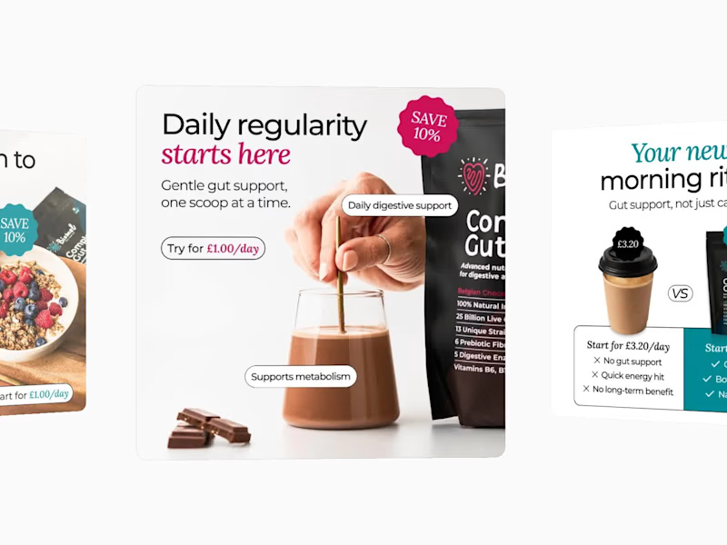

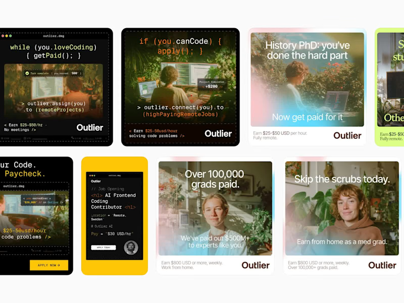


Email Designer, Social Media & Marketing Strategy
- $50k+
- Earned
- 9x
- Hired
- 5.0
- Rating
- 491
- Followers
Email Designer, Social Media & Marketing Strategy


