Contra - A professional network for the jobs and skills of the future
Discover
Sign Up
Post a job
Sign Up
Log In
Filters
Projects
People
Filters
Featured
Web developers
Content creators
Graphic designers
Product designers
AI developers
Motion designers
Social media marketers
Animators
Video editors
Projects we love
Projects we love
Standout projects making waves around the web
View more
Message
8
Maia Anderson Rembert
pro
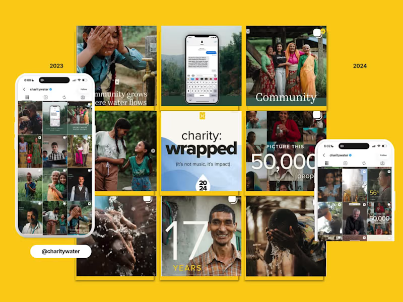
charity: water EOYG Organic Campaign Social Strategy
8
190
Message
19
Oleksandra Marchenko
pro
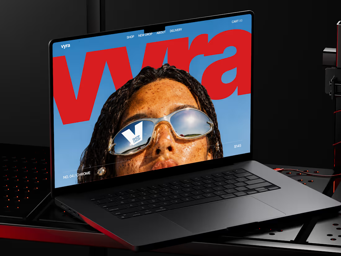
🕶️ Web design for eyewear e-commerce website | Hyperactive
19
275
Message
11
Val Guerra
pro
Explainer video for Paper
1
11
203
Message
12
Robin Holesinsky
pro
Atom.money: Brand Identity for a Regulated Fintech Platform
12
106
Web design projects using Framer
Framer
The best modern websites built on the leading web design tool, Framer
View more
Message
6
Studio Ilker
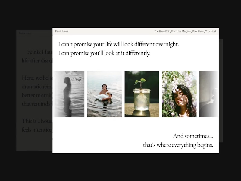
Feinix Haus Website
6
112
Framer is the leading tool for building websites, fast
Hire experts
Message
6
Creative Capital
pro
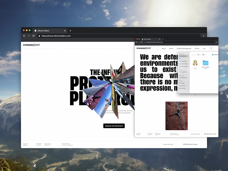
Sthorm Riders Framer Website Design
3
6
62
Message
10
Diego Colino - Vítrea Studio
max
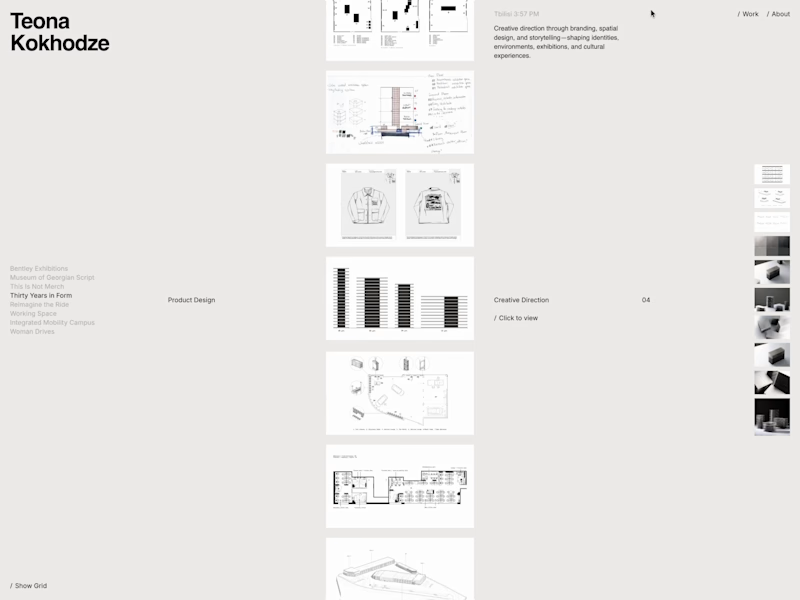
Teona Kokhodze — Framer Website Creative Director Portfolio
10
81
AI projects
AI
New projects from the best AI creators
View more
Message
13
Filip Panov
max
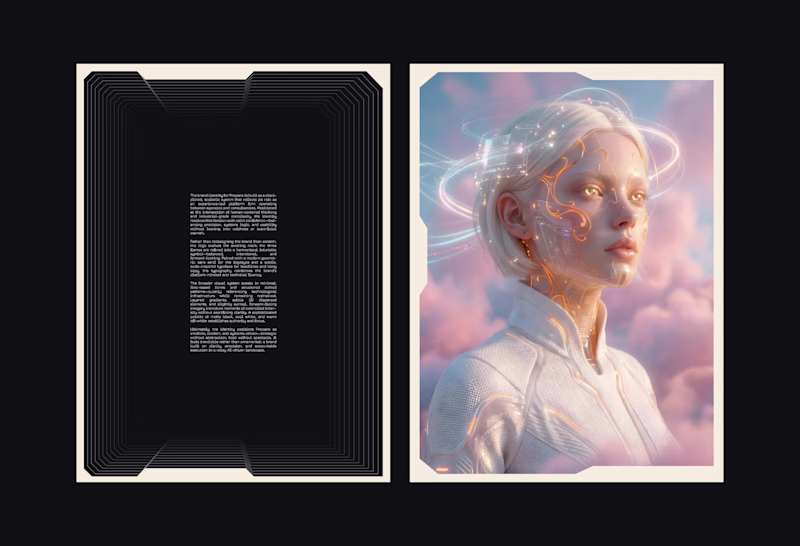
Brand Identity for Propane
13
143
Message
16
Anna asol_design
pro
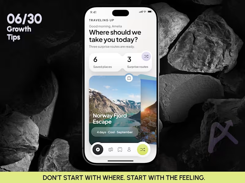
Mobile App Design | AI Trip Randomizer Planner Mobile IOS App
16
56
Message
7
Darya Batyr ✦
max
From AI-Generated to Premium: Spartan SEM Brand Identity
7
52
Message
9
Razvan Badea
pro
Alkera - Logo Design & Brand Identity
1
9
190
Brand design projects
Brand design
Bold visual identities and branding systems created by top independent designers
View more
Message
6
Virginia Roson
pro
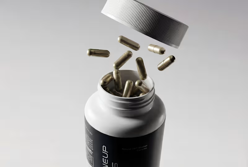
Brand Identity and Packaging Design for Maneup Labs
6
101
Message
9
Révolté
pro
Vetti Brand Identity Design
9
70
Message
8
Mateus Scopel
pro
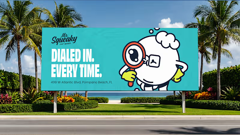
Mr. Squeaky | Brand Design
8
49
Message
5
Flávia Jackeline
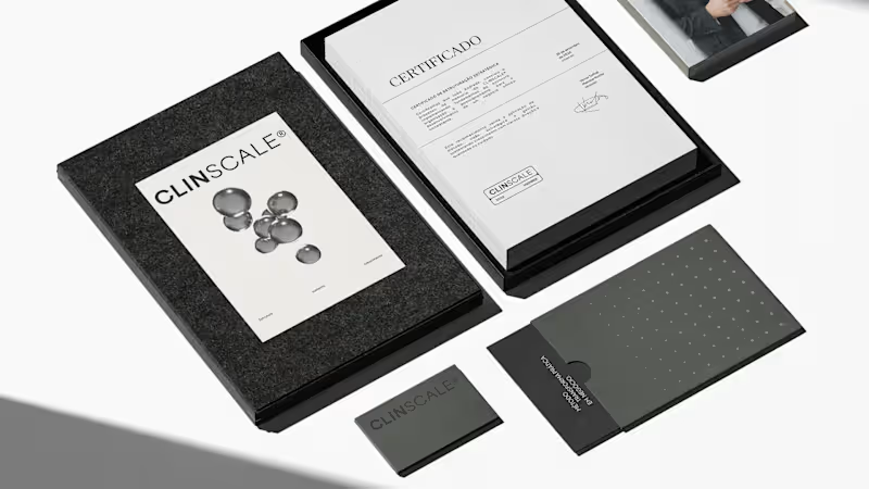
ClinScale — Brand Identity & Logo Design for Clinical Research
1
5
44
Video editor projects
Video editing
Creative video edits made using today’s best editing tools
View more
Message
3
Kayla Elorza
pro
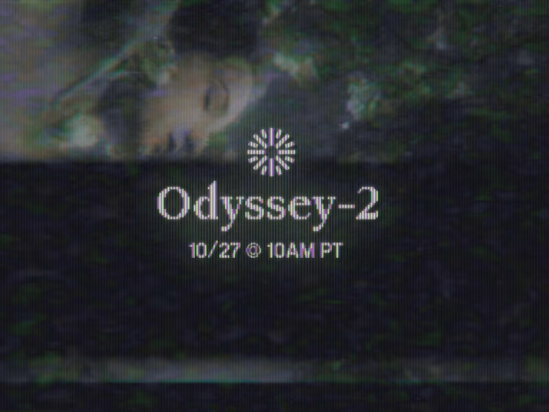
Odyssey-2 Launch Video Teasers
3
108
Message
6
Alejandra Tello
max
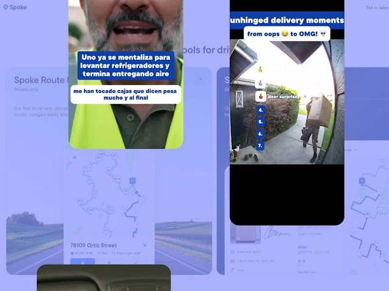
Meme-Driven Video Editing for a Delivery Driver App
1
6
139
Message
1
George Alexander-Pike
pro
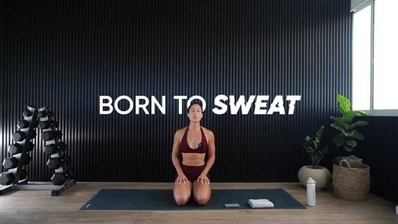
Born To Sweat Video Editing/Motion Graphics
1
1
76
Message
6
Jesse Calis
pro
Halate Showreel
1
6
67
Standout projects
Standout projects
More projects we love that are making waves across the web
Message
17
Anna Selkova
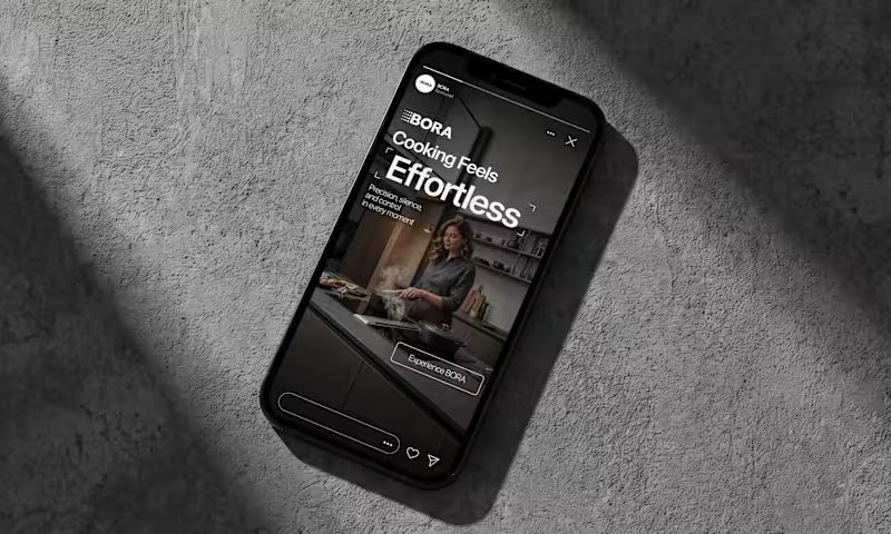
BORA – Ad Creative Concept Most kitchen appliance ads sell you the warm family dinner. I wanted to try the opposite. Built this BORA concept as a portfolio piece, treating the product like architecture instead of tech – dark marble, concrete, no hands, no food styling. Just a pot, steam, and silence. The steam does all the movement in the motion piece. Typography stays out of the way – one line, low CTA, nothing fighting the composition. Turns out when you strip out the lifestyle, the price point sells itself.
2
17
146
Message
13
Samson Akintunde
Here's a short commercial I made for Wollsey, a brand that's into making and selling of bold jewelry. I made sure to preserve every single detail of the character while showcasing all the jewelry pieces using light. And yes, I made it using AI More on this project is coming.
4
13
249
Message
7
Aleksei Maslenkin
pro
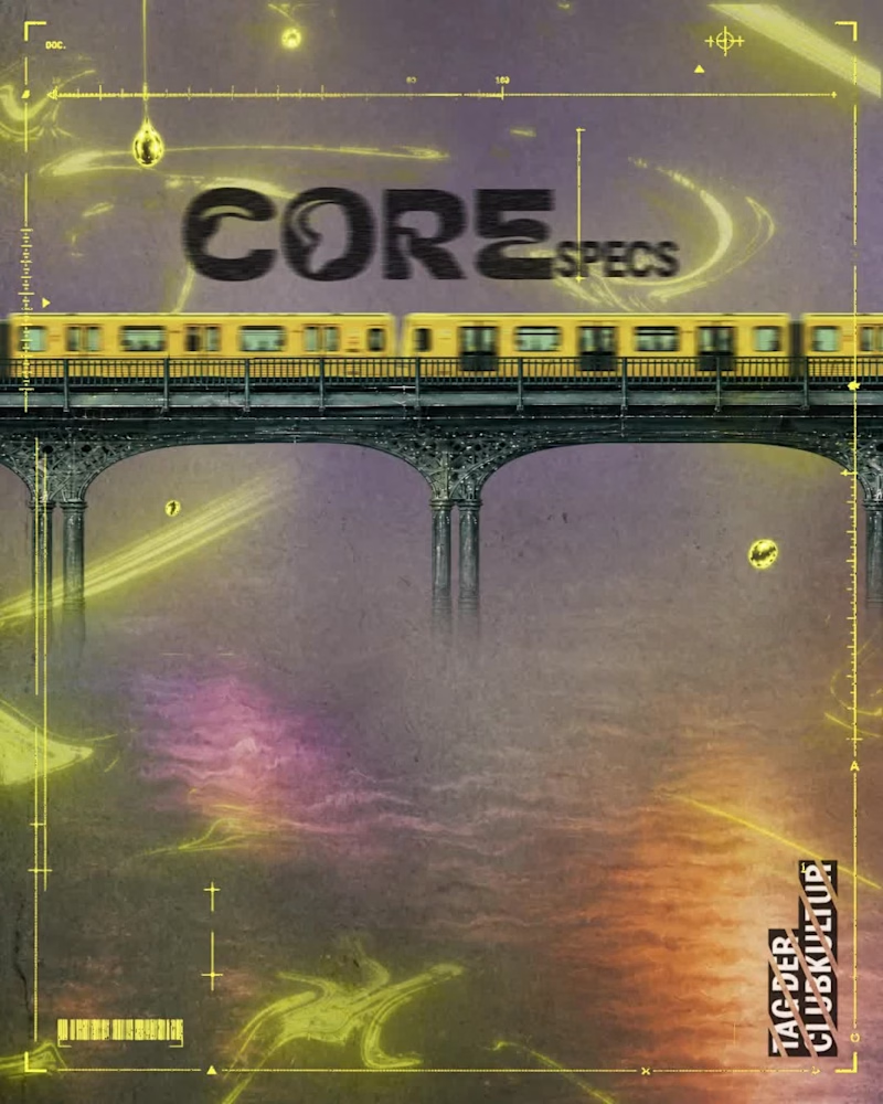
Animated Event Video Poster | Tag der Clubkultur Dynamic motion design and video poster created for the "COREspecs" event as part of Berlin's official Tag der Clubkultur festival series. The visual concept merges an authentic underground Berlin aesthetic—featuring iconic transit motifs, gritty textures, and acid neon accents—with clean, structured typographic hierarchy and a fully synchronized lineup reveal. Software & Tools: Adobe After Effects (motion design, compositing, visual effects, and expression-driven audio reactivity), Suno AI (custom industrial/EBM sound design and score). Deliverable: Vertical looping video teaser optimized for social media promotion and digital event boards. #
4
7
146
Message
26
Virginia Roson
pro
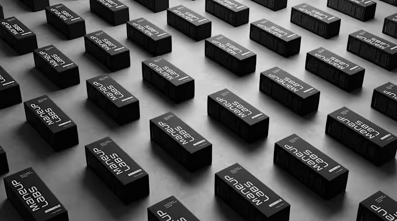
Hot take: hair growth products don't have to look like medicine to work like it. Most brands in this category go clinical white and blue, it reads safe, but it also reads like something you'd hide in a drawer, not something you'd want visible on your sink. For Maneup Labs, I went almost fully black instead. That was a real risk. In a category this saturated with sterile, pharmacy-white packaging, going dark could just as easily read cold, or get lost next to competitors leaning into "clean = trustworthy." But it did the opposite: next to every clinical-looking bottle on the shelf, black reads premium, not medicinal, closer to what you'd expect from a grooming or fragrance brand than a hair-loss aisle. That's the audience shift the whole rebrand was built around, not the guy who wants to feel like he's medicating something, but the guy who wants a product that looks like it belongs on his counter. Would a bottle like this make it out of your bathroom cabinet and onto your sink? Check it out (https://contra.com/p/oN7mPNlL-maneup-labs-brand-identity-and-packaging-design)
15
26
435
Message
18
Klym Yevtushenko
pro
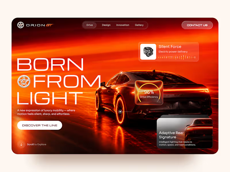
Orion GT — Luxury Automotive Landing Page 🏎️🔥 Orion GT is a landing page concept for a premium performance car brand, built around speed, innovation, and a cinematic digital experience. The goal was to make the vehicle feel like more than a product — creating an immersive introduction where lighting, motion, typography, and interface details reinforce the feeling of performance and exclusivity. Special attention was given to: • a cinematic hero composition that makes the vehicle the main visual focus; • a high-energy red and orange palette inspired by speed, heat, and light 🔥; • oversized typography that strengthens the premium, futuristic character; • floating performance UI elements that communicate features without interrupting the visual experience; • glass-style interface cards for drive efficiency, electric power delivery, and adaptive lighting; • a clear “Discover the Line” CTA integrated into the storytelling; • responsive mobile layouts that preserve the atmosphere while simplifying the composition 📱; • a minimal mobile navigation designed to keep the experience focused and immersive. The result is a bold automotive experience that combines luxury presentation with a technology-driven interface — turning the landing page into part of the product experience itself. Looking to create a premium website for your automotive, mobility, or technology brand? Let’s build something that feels as powerful as the product. ⚡
11
18
1K
Message
20
Pixel Maven
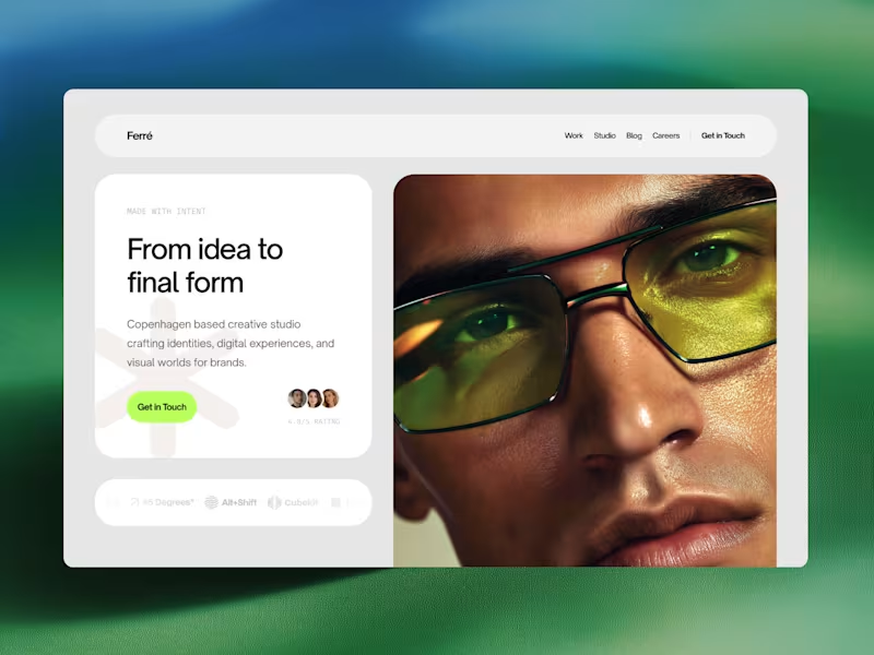
Ferré is an agency template designed for creative studios, design firms, and independent practices looking to present their work with clarity and confidence. Built around an editorial visual language, this template combines bold typography, subtle interactions, and an immersive layout to create a sophisticated digital presence. Showcase your work, introduce your studio, share ideas through a journal, and give potential clients a clear sense of what you do. View Demo → (https://www.framer.com/marketplace/templates/ferr/)
8
20
308
Message
23
Yurii Tarasov
pro
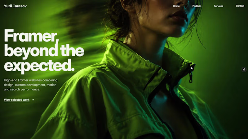
Custom liquid interaction built in Framer. Turning a static hero into a responsive visual surface through cursor-driven distortion.
32
23
2.2K
Message
12
Alex Martínez
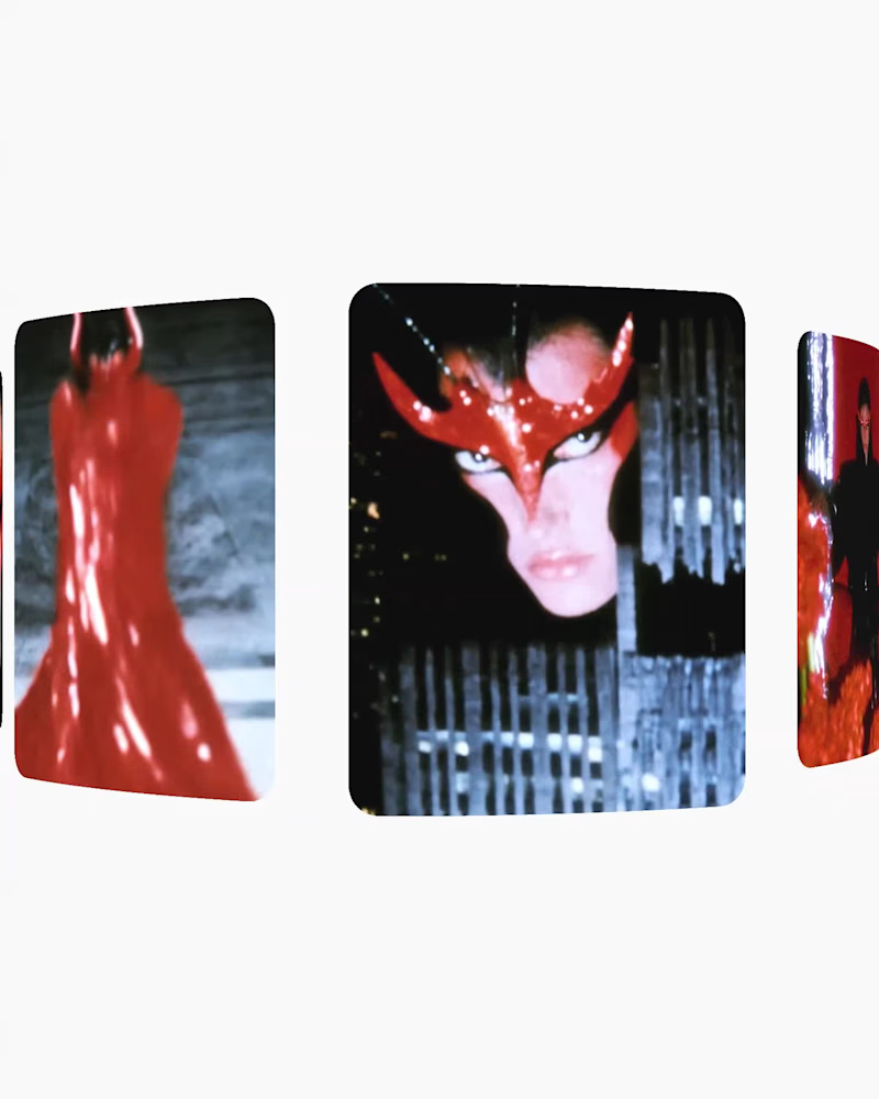
The city learned to pray to the Mantis Queen. // a.exot (https://www.instagram.com/p/DdbwAuJDe-N/?utm_source=ig_web_copy_link&stkn=MzRlODBiNWFlZA==)A short AI visual experiment exploring surreal worldbuilding, character design and cinematic motion. Created with generative AI, focusing on atmosphere, composition, movement and visual storytelling.
3
12
248
Message
16
Oseh Favour
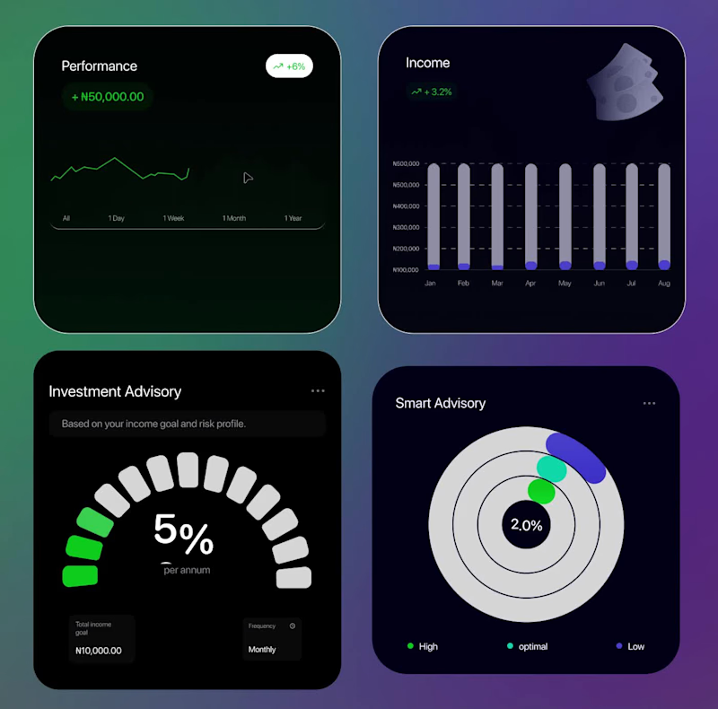
Animated Fintech UI for pie showing portfolio performance, Investment income, Investment advisory, and smart advisory features through interactive financial visualization A motion exploration for Pie, bringing key wealth-management features to life through animated UI components. The concept explores how portfolio performance, investment income, investment advisory, and smart advisory can be presented in a clear and engaging way while keeping the overall experience simple and premium. A look at how motion can make financial products feel more intuitive, modern, and easier to understand.
13
16
783
Message
9
Charles
pro
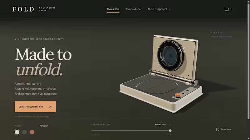
What if customers could explore your product before asking about it? FOLD is an original interactive camera concept by Launch in Seven. Turn it in 3D, try three finishes, unfold the lens, then frame a miniature sculpture garden and save your own postcard. I built the camera, the scene and the working capture flow together. The images here come from the live prototype. We can build a focused interactive launch page or product configurator around your idea. Message me with the product and the interaction you want visitors to try. Fictional product study, not a client commission or physical camera for sale.
3
9
230
Message
8
Andrés Sepúlveda Morales
max
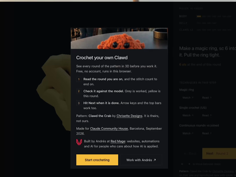
prepping for my workshop on Monday, this is a crochet visualization tool to see each and every step to turn yarn into a crab for the Claude Community House (claudebcn.com (https://claudebcn.com)). Cool, no?
2
8
257
Message
8
Charles
pro
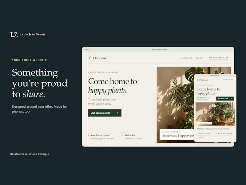
Imagine sending someone a link and saying, “This is my business.” I made this 30-second film for Launch in Seven’s new Business Idea to First Launch service. It shows an illustrative plant-care idea becoming a clear offer, a mobile-friendly page, an inquiry path and outreach drafts. The $1,500 fixed package includes one offer brief, one responsive landing page, one connected inquiry form, three outreach drafts and one consolidated revision. Domain and hosting costs are separate. Scope, inputs and delivery date are agreed before we start. Explore the package or message me with your idea and who it helps: https://contra.com/s/beq6QLOb-business-idea-to-first-launch-landing-page-and-inquiry-form Original illustrative example, not a client commission or sales result. Custom motion, generated imagery, narration and original music.
5
8
294
Message
15
Kris Anfalova
pro
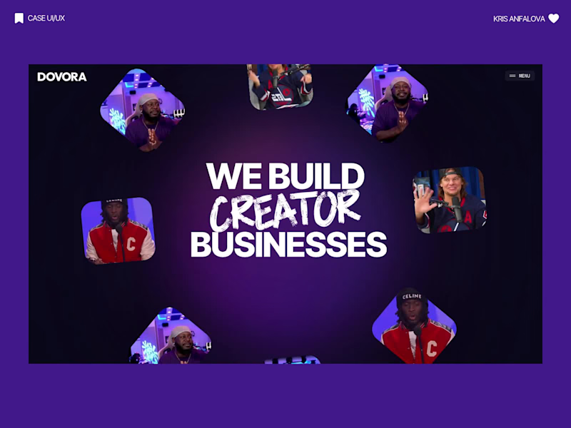
Designed the website for Dovora — an agency that builds businesses for creators, not brand deals. "We don't represent brands, we don't split focus" is basically the whole pitch, and I wanted the site to feel just as uncompromising. So no polished stock creator-economy visuals. The hero is a wall of real streamer/podcast footage arranged in overlapping diamonds and rounded frames — actual creators, mid-stream, mid-laugh — with a glowing gradient orb behind bold "WE BUILD CREATOR BUSINESSES" type. It reads more like a highlight reel than a landing page, which felt right for an audience that lives on camera. The second section flips the energy completely — dark, minimal, almost aggressive typography ("BUILT EXCLUSIVELY FOR CREATORS. FULL STOP.") paired with huge chrome-and-neon 3D letterforms spelling out CREATORS. It's loud in a completely different way than the hero, and that contrast is intentional — this isn't a buttoned-up agency deck, it's built for people who make content for a living. Genuinely fun brief to lean all the way into.
7
15
362
Message
30
Studio Meva
pro
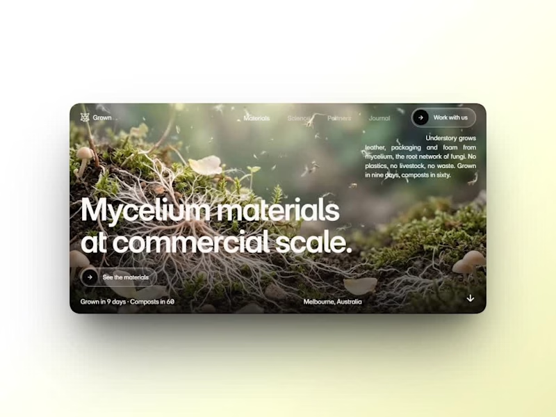
Day 12/30 of my hero section challenge. Another day of prioritising the visuals and imagining a company that doesn't exist. I promise the next one is a tech brief with barely any imagery at all, I've leaned hard on beautiful photography for twelve days straight. Concept: a mycelium materials company producing leather, packaging and foam grown from fungal networks. The design deliberately inverts the category's defaults; biotech branding tends toward dark, clinical and electric blue, so this one goes warm and botanical, with a subtle looping video of spores drifting and mushrooms emerging. The copy pulls hard the other way: plain, technical, B2B-direct, anchored by two concrete numbers instead of sustainability adjectives. Twelve briefs across travel, food retail, personal branding, events, landscape architecture, pet services, hospitality, coffee, lighting, wellness, restaurants and now biomaterials. 12 down, 18 to go. Built on the Viper template by Westhill Studio, adapted and customised by me. Imagery and video generated with AI.
11
30
336
Message
19
Mateo Lucero
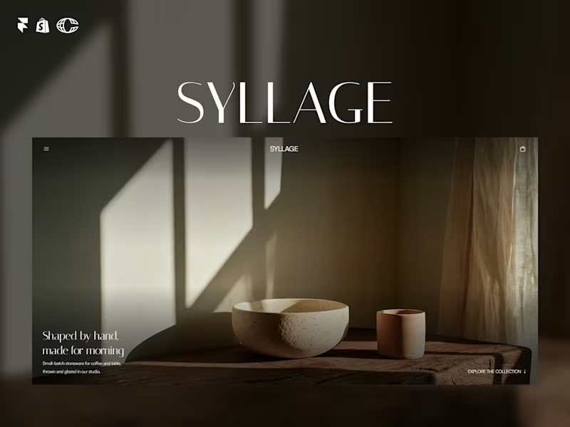
SYLLAGE is live. A complete ecommerce template for ceramic and small-batch product brands, built in Framer with full Shopify integration. 15 pages. 4 CMS collections. Journal, collections, product categories, legal pages, all done. Minimal, editorial, built to sell, not just look good. Check it out and let me know what you think ↓ https://contra.com/products/Rzd5vtXw-syllage-ceramic-ecommerce
9
19
409
Message
23
Aleksandar Coric
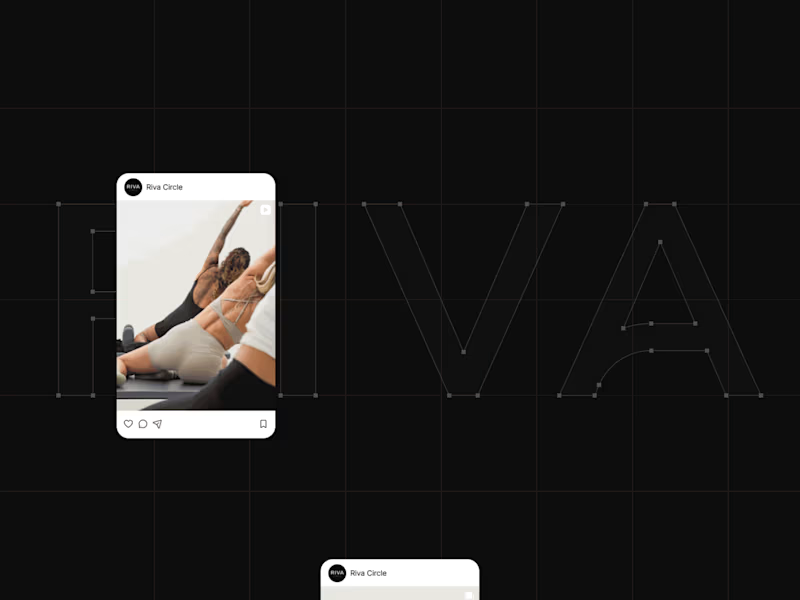
How do you turn movement into a visual identity without literally showing movement? That was one of the questions behind the branding for Riva Circle, a Pilates studio based in St. Gallen, Switzerland. Riva Circle came to us as a completely new brand. The task was to build the brand from the ground up and create a visual language that could define how Riva Circle would be perceived from the very beginning. The goal was to create something modern and dynamic, but without being loud or overly expressive. We wanted the brand to feel refined and contemporary, while still capturing something essential to Pilates: movement, control, balance, and the connection with the body. That became the starting point for the wordmark. We explored how we could translate the expression of the body and the movement of Pilates into typography. Rather than illustrating movement directly, we looked for a way to make it part of the letterforms themselves. This led us to a custom typographic treatment where a simple continuous line becomes part of the letters. Most importantly, that line appears within the letter A, creating a subtle but distinctive gesture. From that detail, we developed the visual language of the brand. The result is intentionally simple, clean typography, a restrained visual system, and a recognizable symbol built from the same idea of movement. For me, that balance was really important. The brand needed to have enough character to be recognizable, but not so much visual noise that it would compete with the experience Riva Circle is offering. And I think the brand has proven that direction quite well. Just one year after launching, Riva Circle has grown, established a recognizable presence, and, most importantly, built a strong community around the studio. So, this project was ultimately about taking something as expressive as movement and finding a very simple visual expression for it. One that can stay relevant as the brand continues to grow.
10
23
1.1K
Explore projects