Freelancers in Warsaw
Sign Up
Post a job
Sign Up
Log In
Filters
1
Projects
People
Yunis Mikayilov
pro
Warsaw, Poland
Premium Launch Videos for funded AI Startups | Motion Design
$50k+
Earned
10x
Hired
5.0
Rating
218
Followers
expert
Hired
Follow
Message
Premium Launch Videos for funded AI Startups | Motion Design
3
⭐ A shot from the launch video for Stilta. Agentic AI for patent litigation - raised $10.5M seed, a16z + YC.
3
302
27
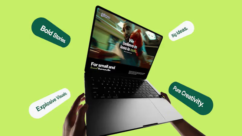
Atomic — Branding
27
299
4
Vibecoder — Branding & Launch Video | Motion Design
4
111
11
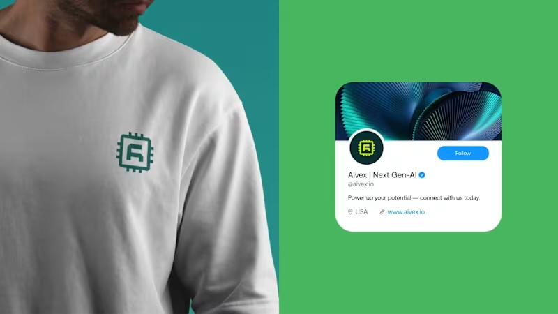
Aivex — Brand Design
11
165
Follow
Message
Matt Gemi
pro
Warsaw, Poland
Ex-growth marketer. Now I design & build in Framer & NextJs
$10k+
Earned
14x
Hired
5.0
Rating
134
Followers
Top
expert
+1
Follow
Message
Ex-growth marketer. Now I design & build in Framer & NextJs
4
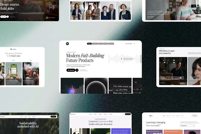
Design explorations
3
4
479
3
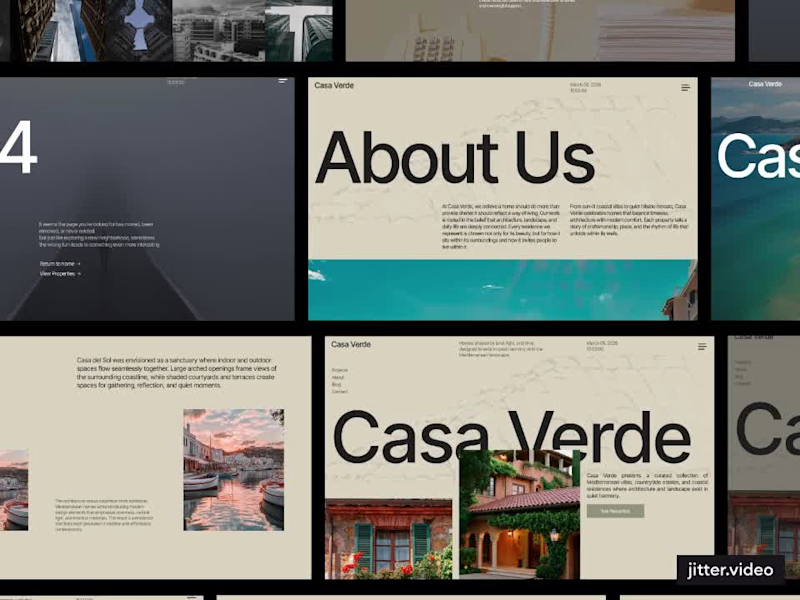
Casa Verde Luxury Real Estate Framer Template
3
47
3
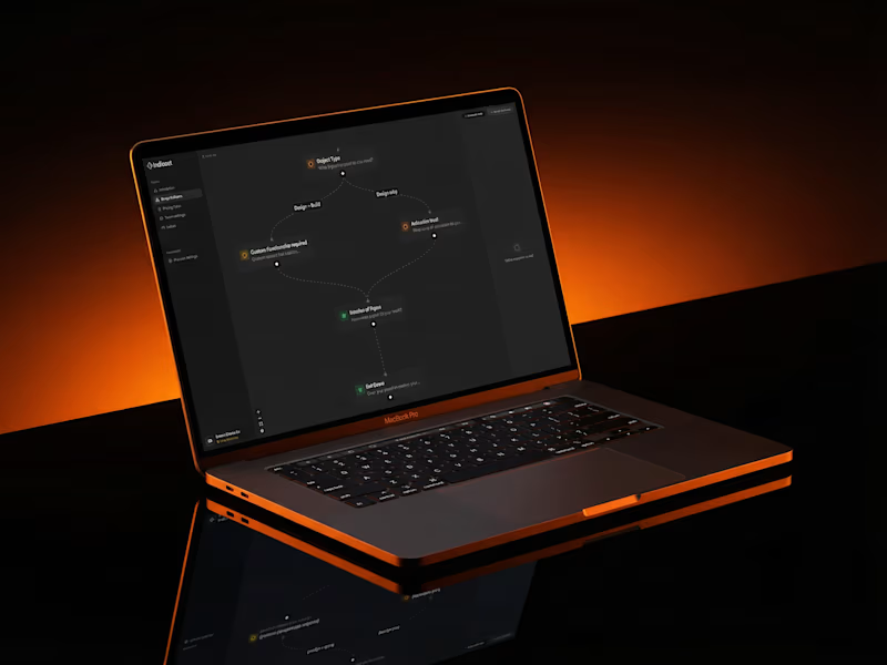
A great product for everyone on Contra. Indicost helps you skip unnecessary client calls and still deliver accurate proposals fast. It is a visual pricing logic builder that lets you map your service rules once and let clients receive instant price estimates by email. No more back and forth just to understand scope. Setup takes less than 30 minutes and can save you dozens of hours of work over time. Try it now with no credit card required. If it fits your workflow, choose a lifetime deal or a monthly plan. https://indicost.app/ http://go.indicost.app/
3
804
1
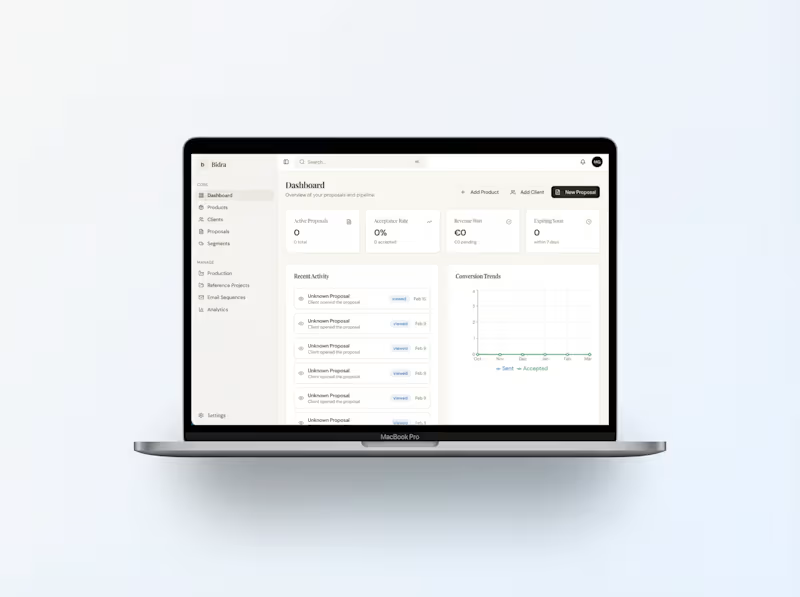
Proposal & CRM Application
1
18
Follow
Message
Klym Yevtushenko
pro
Warsaw, Poland
SaaS Product Designer | UI/UX, Webflow & B2B Websites
$1k+
Earned
3x
Hired
5.0
Rating
271
Followers
Follow
Message
SaaS Product Designer | UI/UX, Webflow & B2B Websites
13
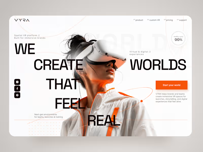
VYRA — Immersive VR Experience Landing Page 🥽✨ VYRA is a futuristic landing page concept for a spatial VR platform that helps brands and teams create immersive digital environments for launches, storytelling, training, and interactive experiences. The goal was to translate the feeling of entering another world into a clean, premium digital interface. The visual direction combines oversized typography, immersive photography, minimal UI, and vibrant orange accents to create a strong sense of technology and motion. Special attention was given to: • a cinematic hero composition that immediately introduces the VR experience; • oversized typography integrated with the main visual to create depth and movement; • a minimal black, white, and orange palette that keeps the interface futuristic without feeling overly technical 🟠; • subtle orbital graphics and supporting details that reinforce the idea of spatial environments; • a clear “Start your world” CTA that connects naturally with the brand message; • supporting metrics and micro-elements that add a sense of technology and precision; • responsive mobile layouts that preserve the visual impact while simplifying the composition 📱; • a clean mobile navigation experience that keeps product, custom VR, pricing, and support easy to access; • a flexible visual system suitable for VR products, immersive platforms, and emerging technology brands. The result is a bold digital experience that makes spatial technology feel premium, accessible, and exciting — turning the website itself into the first step toward an immersive world. Looking to create a memorable website for your VR, AR, AI, or emerging technology product? Let’s build a digital experience that feels like the future 🚀
8
13
182
9
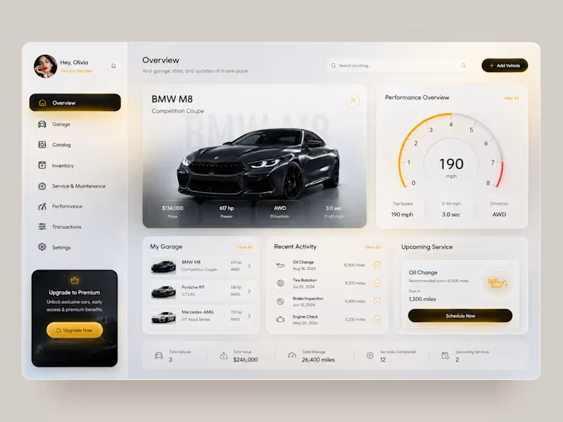
Premium Garage — Automotive Management Dashboard 🚘 A premium automotive dashboard concept designed to bring vehicle management, performance data, maintenance, and garage activity into one connected digital experience. The goal was to combine a luxury automotive aesthetic with a data-rich interface that still feels clean and easy to navigate. The concept explores both light and dark modes, using warm gold accents, spacious layouts, and strong vehicle imagery to create a premium feel. Special attention was given to: • a clear dashboard hierarchy that keeps the vehicle and its key data at the center; • performance insights including top speed, acceleration, drivetrain, and power 📊; • a structured garage experience for managing multiple vehicles; • maintenance tracking with recent activity and upcoming service information 🔧; • quick access to Garage, Catalog, Inventory, Performance, Transactions, and Settings; • premium membership and upgrade touchpoints integrated naturally into the interface; • light and dark themes that maintain the same visual hierarchy and premium character 🌗; • mobile layouts redesigned around vehicle cards rather than simply shrinking the desktop dashboard; • compact filters and bottom navigation for faster mobile interaction 📱; • a consistent gold accent system used for active states, CTAs, performance indicators, and key actions. The result is a polished automotive product experience that turns complex vehicle information into a structured, premium, and easy-to-navigate interface. Looking to create an automotive platform, management dashboard, or data-heavy digital product? Let’s turn complex functionality into an experience users actually enjoy using 🚀
6
9
227
137
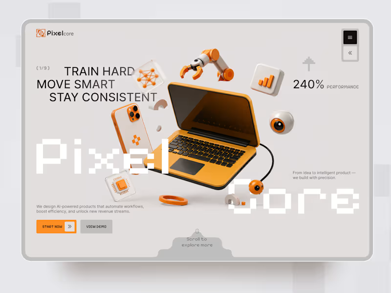
Pixelcore — AI & Technology Landing Page 🤖⚡ Pixelcore is a futuristic landing page concept for an AI-powered technology company focused on automation, data, integrations, and digital product development. The goal was to communicate innovation and technical expertise without falling into the typical dark, overly complex AI aesthetic. The visual direction combines a clean monochrome interface with bold orange accents, pixel-inspired typography, and playful 3D technology objects. Special attention was given to: • a dynamic hero composition built around 3D tech visuals and strong typography; • a distinctive orange accent system that guides attention toward key actions 🟠; • pixel-inspired typography that reinforces the digital and technological character of the brand; • 3D objects representing AI, automation, analytics, hardware, and connected technology; • clear CTAs that make the next step immediately visible; • service cards for AI Automation, Data Insights, Integrations, and Product Design; • trust elements and performance metrics that support the company’s positioning; • responsive mobile layouts that simplify the composition while keeping the same visual identity 📱; • a modular visual system that could easily scale across services, case studies, and additional landing pages. The result is a clean but expressive digital experience that makes an AI company feel innovative, approachable, and visually memorable — without sacrificing clarity or usability. Looking to create a distinctive website for your AI, SaaS, or technology product? Let’s turn complex technology into a digital experience people instantly understand ⚡
52
137
3.8K
29
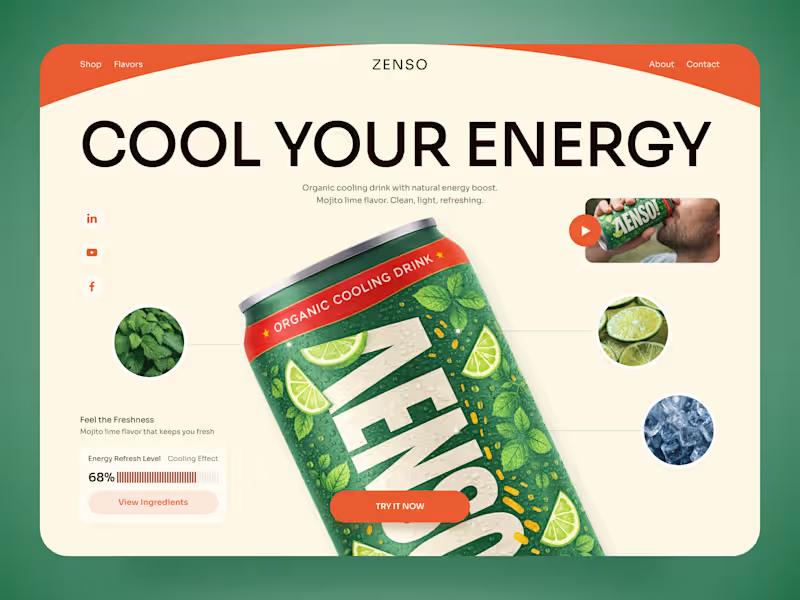
ZENSO — Organic Energy Drink Landing Page 🍋🌿 ZENSO is a bold landing page concept for an organic cooling drink that combines natural energy with a fresh, lifestyle-driven identity. The goal was to make the product feel refreshing from the very first screen while giving the can a strong visual presence. The design combines oversized typography, organic colors, ingredient imagery, and playful composition to build a distinctive beverage experience. Special attention was given to: • a product-first hero that makes the ZENSO can the main visual focus; • a fresh green, orange, and cream palette inspired by mojito lime, mint, and citrus 🍋; • oversized typography that adds energy without competing with the product; • ingredient close-ups that visually communicate flavor and freshness; • supporting product details such as the cooling effect and energy refresh level; • lifestyle imagery and video elements that make the brand feel more dynamic; • a clear “Try It Now” CTA integrated naturally into the composition; • responsive mobile layouts that preserve the oversized product presentation while keeping navigation simple 📱; • a clean visual system that can scale across different flavors and future product launches. The result is an energetic digital experience that turns a simple beverage into a memorable lifestyle product — fresh, playful, and easy to recognize. Looking to create a bold digital experience for your beverage, food, or FMCG brand? Let’s make your product impossible to scroll past ✨
13
29
1.2K
Follow
Message
Adrian Kuleszo
pro
Warsaw, Poland
Premium design to grow your business - DesignMe
$10k+
Earned
5x
Hired
5.0
Rating
242
Followers
Top
expert
+2
Follow
Message
Premium design to grow your business - DesignMe
10
TravelWith - Onboarding
10
918
10
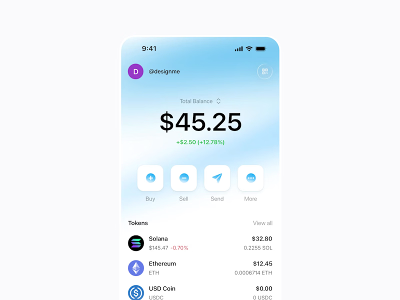
Crypto Wallet App - concept exploration
10
1.1K
6
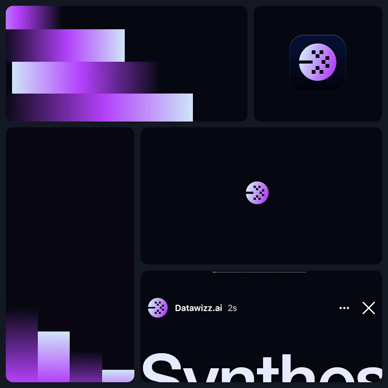
Datawizz.ai branding exploration ✨
6
1.1K
3
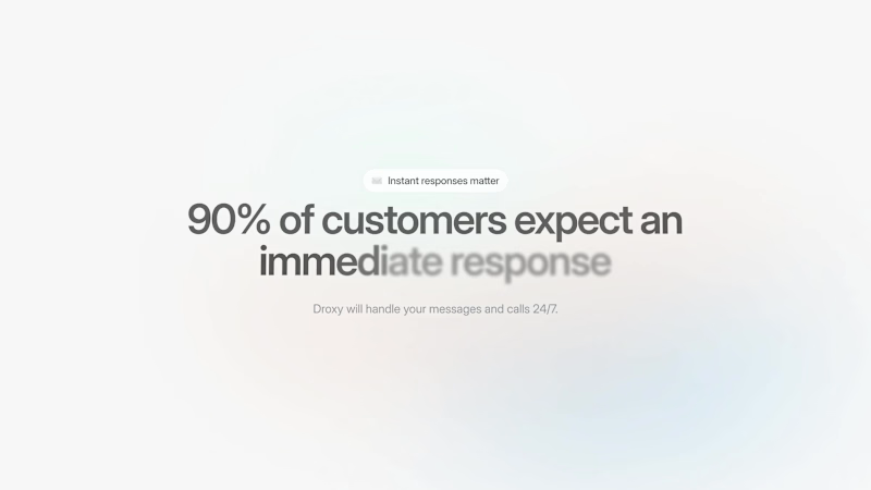
Droxy.ai: Reinvented with a bold brand and dynamic web presence
3
184
Follow
Message
Kris Anfalova
pro
Warsaw, Poland
Premium UI/UX & Web Design for Fintech, SaaS & Web3 | Framer
$10k+
Earned
1x
Hired
5.0
Rating
272
Followers
expert
expert
+1
Follow
Message
Premium UI/UX & Web Design for Fintech, SaaS & Web3 | Framer
102
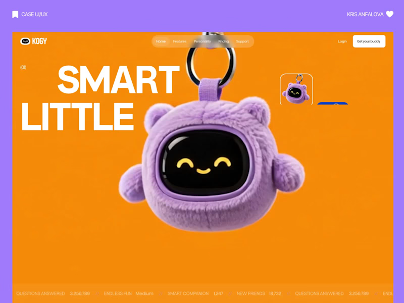
Kogy — AI Companion Toy / UI/UX Design Designed the landing page for Kogy — a plush, keychain-sized AI companion that learns, plays, and keeps you company throughout the day. The tricky part with products like this: lean too techy and you lose the cuteness, lean too cute and it stops feeling like a real smart device. So instead of the usual soft-pastel illustration route, I let real hero-scale photography of the plush character carry the whole page — its actual texture, its little smile, its scale as a keychain — wrapped in bold, high-contrast orange and oversized type. A small character-selector strip (Lumi, Mochi, Poppy) hints at collectibility, and a live scrolling stat ticker at the bottom (questions answered, active companions) keeps it grounded as a real AI device, not just a toy. Genuinely one of the more fun briefs I've worked on.
26
102
2.2K
116
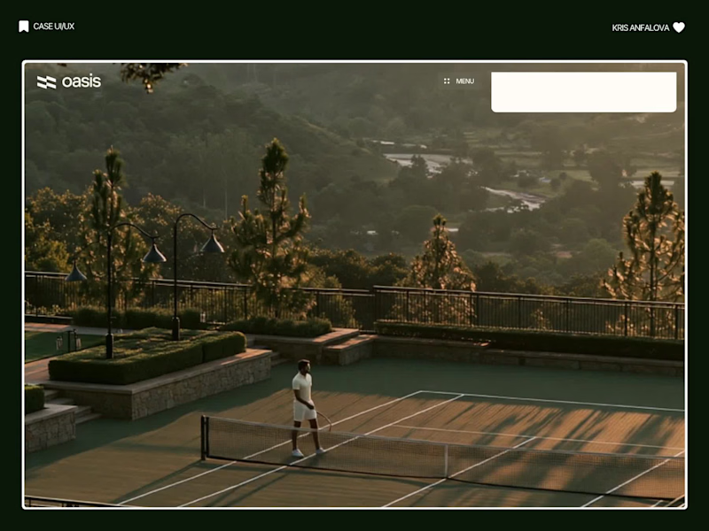
Oasis — Padel & Tennis Booking Platform Oasis is a court booking platform for padel and tennis clubs — members can select a court, check availability, and confirm payment in one streamlined flow. I designed the booking interface, built directly over real club photography. Rather than placing the booking form on a neutral background, I anchored it directly over a full-bleed, golden-hour photograph of the real court. Before a user even looks at a date picker, they’ve already felt the atmosphere — that emotional context does more for conversion than any copy could. The booking card itself stays intentionally minimal: court name, availability, surface type, date, duration, and price, in that order. No unnecessary steps between deciding and confirming. I used a distinct chartreuse accent — a departure from the green typically associated with sports apps — to carry through the primary CTA and a first-time-visitor promo card, giving the whole flow a bit of warmth and personality without slowing anything down. Creative: Midjourney Video: Flux Animation: jitter
37
116
2.7K
0
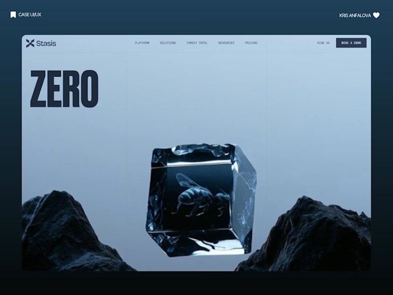
Stasis Landing Page Design
0
24
2
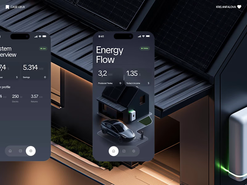
Solar Energy Monitoring App Design
2
25
Follow
Message
Anastasiia Barbashyna
pro
Warsaw, Poland
Designer for your SaaS, app, deck and brand.
$5k+
Earned
2x
Hired
5.0
Rating
56
Followers
Expert
Follow
Message
Designer for your SaaS, app, deck and brand.
3
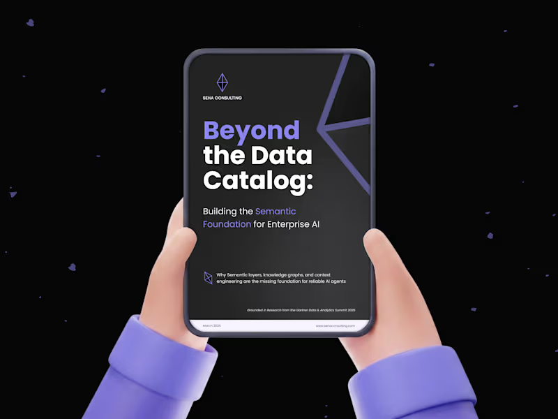
Whitepaper Design
3
10
2
Abyshcho - iOS Word Game done with Lovable
2
32
5
Scalable SaaS Management Solution from ground up
5
72
3
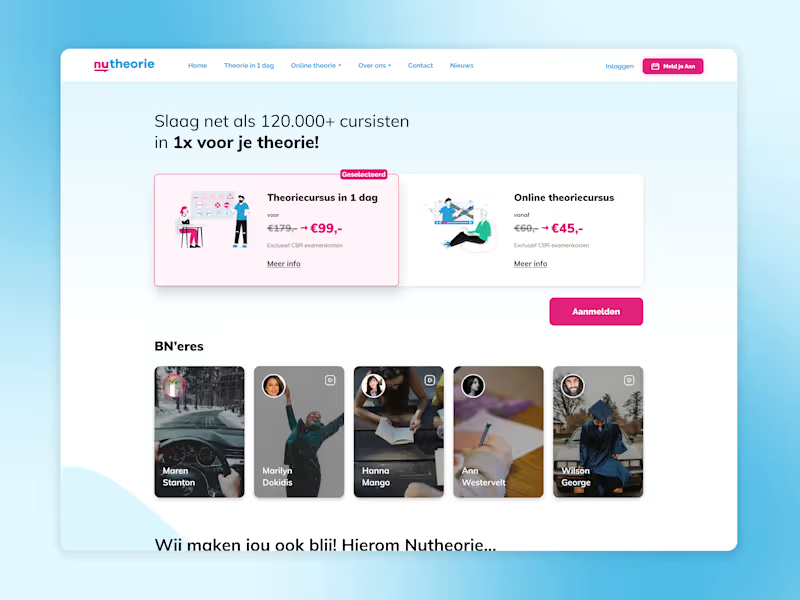
Evolving Next-Gen Drivers Experience: Nutheorie
3
54
Follow
Message
Vova Kondriianenko
pro
Warsaw, Poland
Staff Product Designer. I design, build and improve software
$25k+
Earned
4x
Hired
5.0
Rating
275
Followers
expert
Expert
Follow
Message
Staff Product Designer. I design, build and improve software
7
Hello, Contra! Check out my latest work in progress on amazing new features for a health tech mobile app 🚀
2
7
270
5
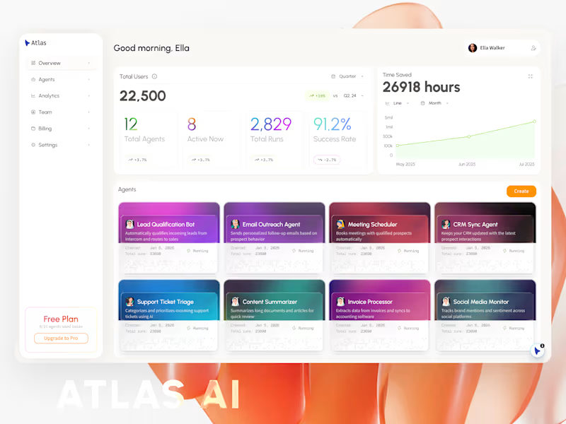
AI Agent UI Design
5
150
5
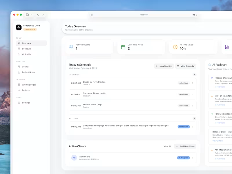
Hey, Contra! Check my first digital product: Freelance Core - your client pipeline in a box. Built this for myself, now sharing it with you! Freelance Core is a pre-built web app for managing your freelance business. Run it locally or deploy to Vercel. SQLite database included - no setup headaches. 🍱 What's inside: - Client pipeline with project tracking and a Kanban board - Weekly schedule for all your calls - AI-powered call prep (never walk into a meeting blind) - Project notes that actually stay organized - Reports dashboard to see where your time goes - Pipeline value tracking so you know your business health at a glance 🛠️ More is coming! https://contra.com/products/YWzMLUC9-freelance-core-your-clients-pipeline-in-a-box
5
1K
12
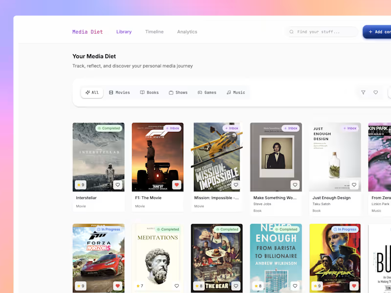
Media Diet: Your Personal Media Curator
12
177
Follow
Message
Piotr Jarkowski
pro
Warsaw, Poland
Designer & Webflow Expert
$5k+
Earned
1x
Hired
5.0
Rating
22
Followers
Follow
Message
Designer & Webflow Expert
0
Webflow Landing Page Design and Development
0
12
0
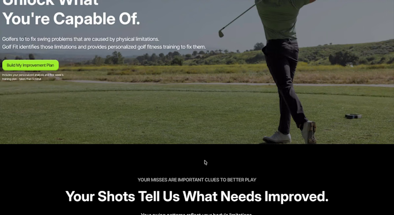
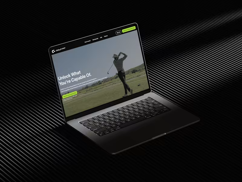
GolfFit Landing Page Design and Webflow Development
0
10
3
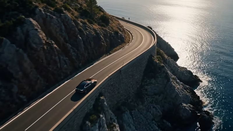
For Envato Challenge, I created a fictional launch commercial for a premium electric vehicle brand called Volta EV7. Rather than focusing only on AI-generated output, I wanted to show how creative judgment shapes the final result. Every stage of the project involved iteration, selection, and refinement. From naming the brand and designing the logo to generating visuals, creating cinematic video sequences, crafting the voiceover, generating music and sound effects, and finally editing everything into a cohesive story. Envato served as the primary creative toolkit throughout the project. I used its AI-powered tools to generate visual concepts, voiceover, music, and sound effects, while continuously refining the outputs until they matched the premium, cinematic direction I envisioned. To document that process, I also created a walkthrough showing how the project evolved from an initial idea into the finished film. https://x.com/piotr_ams/status/2081527934884405518 @Envato
1
3
213
2
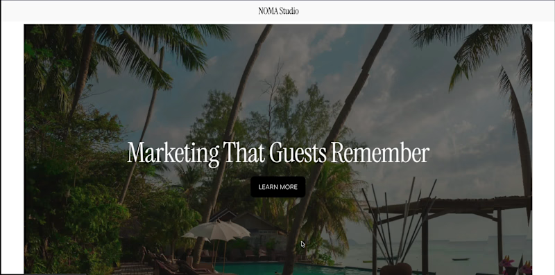
NOMA Studio is a Squarespace website created for hospitality marketing agencies, boutique hotels, luxury resorts, and destination brands. The goal was to design a website that feels editorial, cinematic, and commercially viable. Something that could realistically be used by a creative agency while showcasing what's possible with Squarespace. The design focuses on immersive imagery, refined typography, generous whitespace, and a strong visual hierarchy to create an experience that reflects the hospitality industry. To bring the design to life, I used Finish Layer throughout the site, including layered hero compositions, subtle scroll animations, hover interactions on buttons and key interface elements, and carefully positioned visual components that add depth without overwhelming the content. I also uploaded and used the Satoshi typeface for body copy to complement the high-contrast serif headings and create a modern editorial balance. The entire website has been designed with responsiveness in mind, ensuring layouts, typography, spacing, and interactions adapt smoothly across desktop, and mobile devices. This project demonstrates how Squarespace can be used not only to create visually compelling websites, but also production-ready templates suitable for real businesses. Live Website: https://maroon-lavender-74nm.squarespace.com (https://maroon-lavender-74nm.squarespace.com/) Password: 123 X Post: https://x.com/piotr_ams/status/2080404565405405196
2
256
Follow
Message
Explore people