The network for creativity
Join 1.25M professional creatives like you
Connect with clients, get discovered, and run your business 100% commission-free
Creatives on Contra have earned over $150M and we are just getting started
Back to feedPost

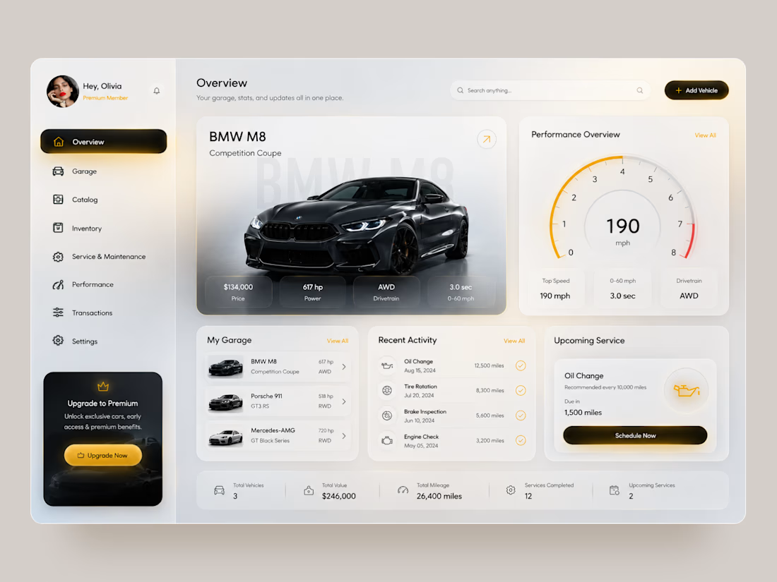
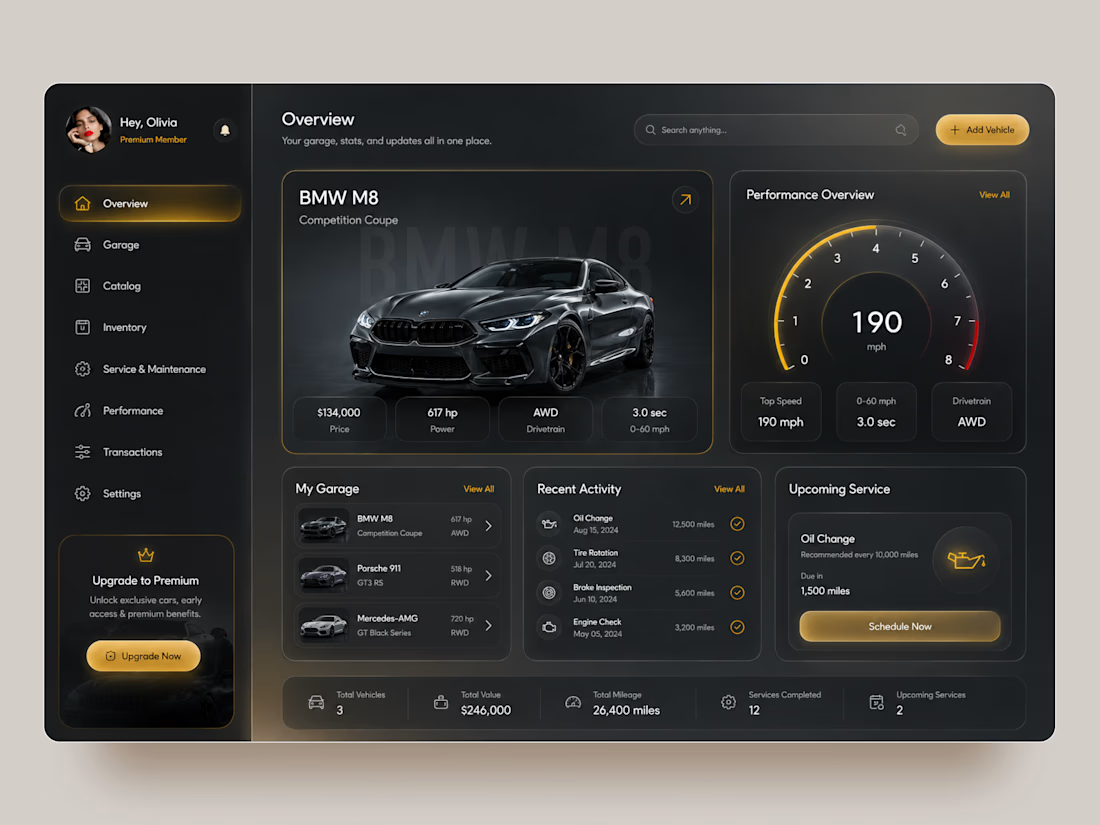
Premium Garage — Automotive Management Dashboard 🚘
A premium automotive dashboard concept designed to bring vehicle management, performance data, maintenance, and garage activity into one connected digital experience.
The goal was to combine a luxury automotive aesthetic with a data-rich interface that still feels clean and easy to navigate. The concept explores both light and dark modes, using warm gold accents, spacious layouts, and strong vehicle imagery to create a premium feel.
Special attention was given to:
• a clear dashboard hierarchy that keeps the vehicle and its key data at the center;
• performance insights including top speed, acceleration, drivetrain, and power 📊;
• a structured garage experience for managing multiple vehicles;
• maintenance tracking with recent activity and upcoming service information 🔧;
• quick access to Garage, Catalog, Inventory, Performance, Transactions, and Settings;
• premium membership and upgrade touchpoints integrated naturally into the interface;
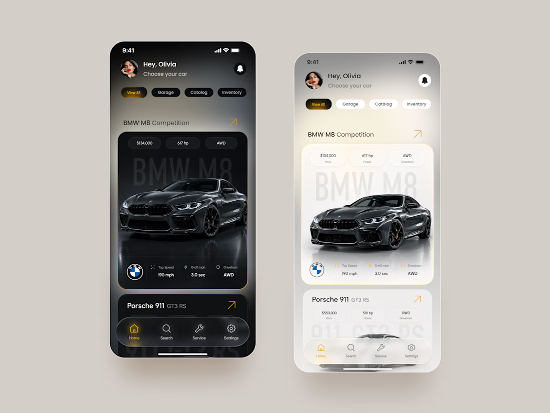
• light and dark themes that maintain the same visual hierarchy and premium character 🌗;
• mobile layouts redesigned around vehicle cards rather than simply shrinking the desktop dashboard;
• compact filters and bottom navigation for faster mobile interaction 📱;
• a consistent gold accent system used for active states, CTAs, performance indicators, and key actions.
The result is a polished automotive product experience that turns complex vehicle information into a structured, premium, and easy-to-navigate interface.
Looking to create an automotive platform, management dashboard, or data-heavy digital product?
Let’s turn complex functionality into an experience users actually enjoy using 🚀



This feels so premium 🔥

Really clean dashboard structure!

The dark version looks incredible 👏

Love the automotive aesthetic here! 🏎️

Love the gold accents against the dark UI ✨

Love seeing both light and dark versions — they each have a completely different mood 🌗

Nice work

Love this!

The car definitely feels like the hero without overpowering the data.
The network for creativity
Join 1.25M professional creatives like you
Connect with clients, get discovered, and run your business 100% commission-free
Creatives on Contra have earned over $150M and we are just getting started











Related posts

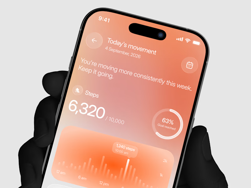
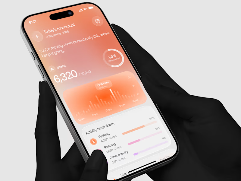
Designed a step tracking screen where you can see your daily progress and weekly trend in one glance.
Same screen, two shots. Which one would stop your scroll? 👀

11 voted
73%
4 voted
27%
15 votes
Closed


Exploring a clean, modern SaaS dashboard UI. Focused on simple layouts, smooth interactions, and a better user experience 🚀


i had to like this, it got my attention, very nice build mate.




Clean and confident work! The green gradient with the mark feels very modern for fintech - trustworthy but not boring. The app screens look really polished. Curious how you landed on this mark, does it represent growth / movement?