The network for creativity
Join 1.25M professional creatives like you
Connect with clients, get discovered, and run your business 100% commission-free
Creatives on Contra have earned over $150M and we are just getting started
Back to feedPost
Exploring a clean, modern SaaS dashboard UI. Focused on simple layouts, smooth interactions, and a better user experience 🚀


This Nova dashboard exploration is super clean, Naim! Really like how you kept the layout simple but still data-rich. The smooth interactions you mentioned really show in the video, and the project cards hierarchy is easy to scan. Great work on the overall UX.

Thanks Ashik! Yeah for Nova I really wanted to keep it data-rich but still simple to scan — especially the project cards. Glad the smooth interactions came through in the video!

Thank you Naim vai! The Projects section with progress bars was the main focus. Tried to make it feel modern SaaS with Jitter for that extra smoothness!

Very polished SaaS dashboard concept. Clean, modern, and the attention to layout simplicity is excellent. The Figma to Framer + Jitter workflow is showing great results.
Thanks a lot Anisur! Appreciate it — trying to perfect that Figma to Framer + Jitter flow for dashboards. Happy you liked the simplicity!
The network for creativity
Join 1.25M professional creatives like you
Connect with clients, get discovered, and run your business 100% commission-free
Creatives on Contra have earned over $150M and we are just getting started






Related posts

What if your watch collection had a dashboard this luxurious?
Meet Chronova. Built for collectors who care about every detail.
Would you use this?


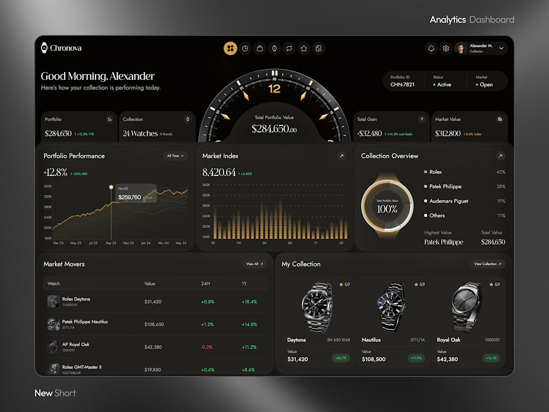
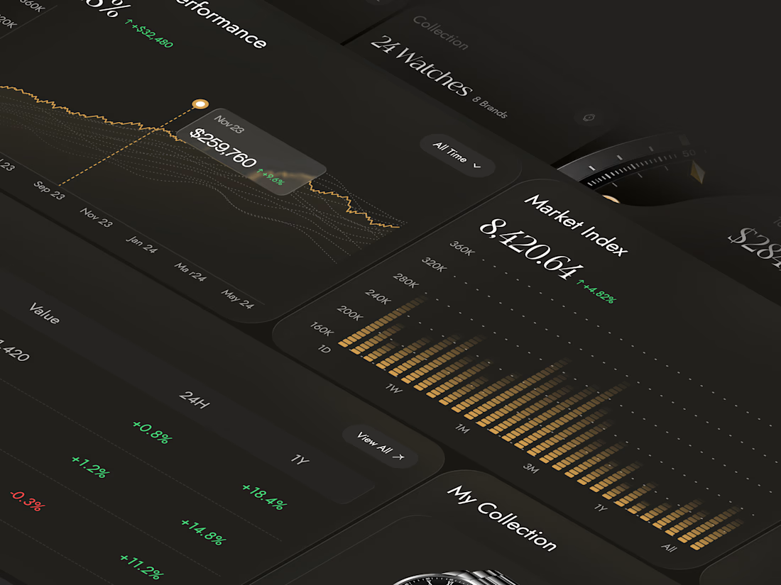
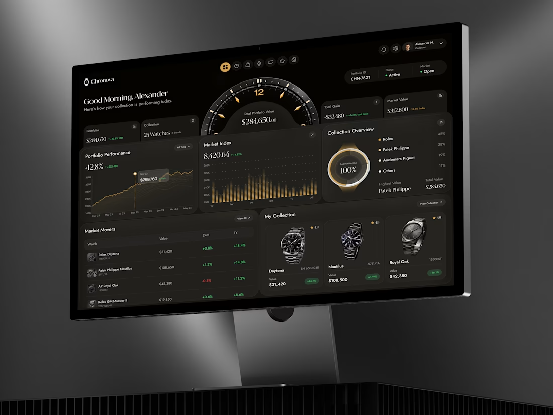

Premium dashboard😍

Recent work on MAE - Visual identity

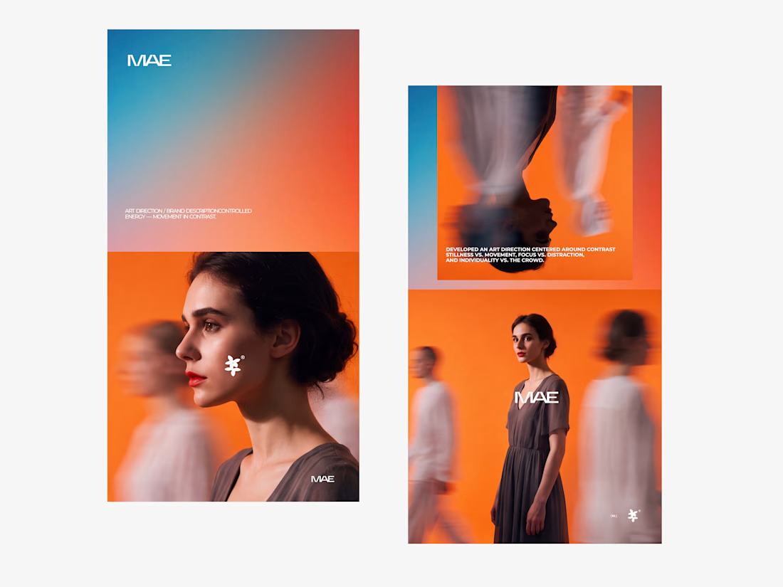

The motion blur on the figures gives the orange-to-blue gradient a reason to be there, and the small star mark stays readable on both the cheek and the shirt. Did the star come first as a standalone mark, or did it grow out of the photography direction?

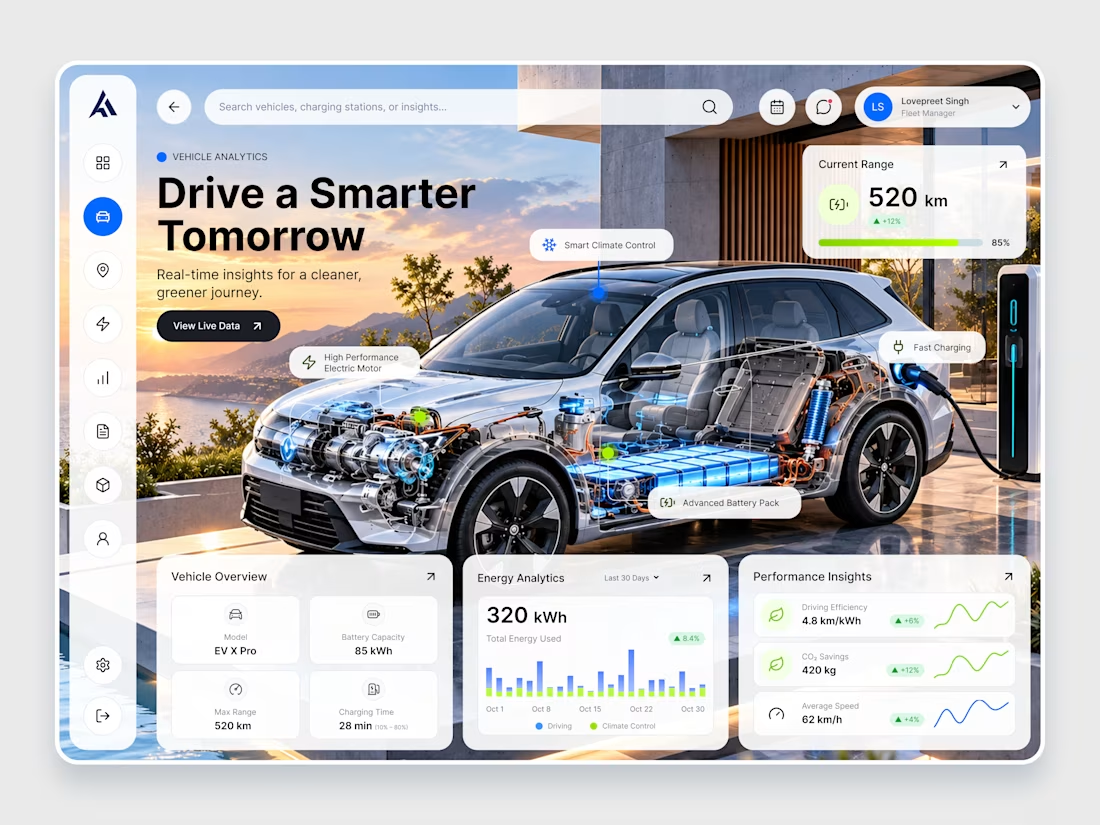
EV X Pro — Futuristic EV Analytics & Dashboard Design
Introducing EV X Pro, a futuristic electric vehicle analytics dashboard designed to make every journey smarter, cleaner, and more efficient. ⚡
Featuring a premium automotive visual, real-time battery insights, energy consumption analytics, charging performance, driving efficiency metrics, and an intuitive dashboard interface, this concept combines modern UI/UX design with next-generation electric mobility.
Designed with a clean glassmorphism aesthetic, vibrant blue accents, and minimal data visualizations, EV X Pro delivers a seamless experience for monitoring vehicle performance and sustainable driving.


That's really unique & futuristic dashboard 🔥🔥🔥🔥🔥