The network for creativity
Join 1.25M professional creatives like you
Connect with clients, get discovered, and run your business 100% commission-free
Creatives on Contra have earned over $150M and we are just getting started
Back to feedPost
Pixelcore — AI & Technology Landing Page 🤖⚡
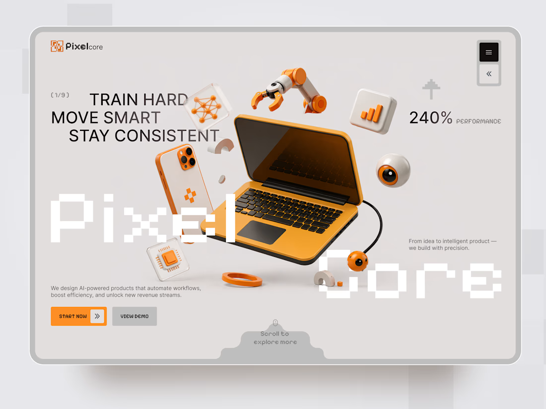
Pixelcore is a futuristic landing page concept for an AI-powered technology company focused on automation, data, integrations, and digital product development.
The goal was to communicate innovation and technical expertise without falling into the typical dark, overly complex AI aesthetic. The visual direction combines a clean monochrome interface with bold orange accents, pixel-inspired typography, and playful 3D technology objects.
Special attention was given to:
• a dynamic hero composition built around 3D tech visuals and strong typography;
• a distinctive orange accent system that guides attention toward key actions 🟠;
• pixel-inspired typography that reinforces the digital and technological character of the brand;
• 3D objects representing AI, automation, analytics, hardware, and connected technology;
• clear CTAs that make the next step immediately visible;
• service cards for AI Automation, Data Insights, Integrations, and Product Design;
• trust elements and performance metrics that support the company’s positioning;
• responsive mobile layouts that simplify the composition while keeping the same visual identity 📱;
• a modular visual system that could easily scale across services, case studies, and additional landing pages.
The result is a clean but expressive digital experience that makes an AI company feel innovative, approachable, and visually memorable — without sacrificing clarity or usability.
Looking to create a distinctive website for your AI, SaaS, or technology product?
Let’s turn complex technology into a digital experience people instantly understand ⚡



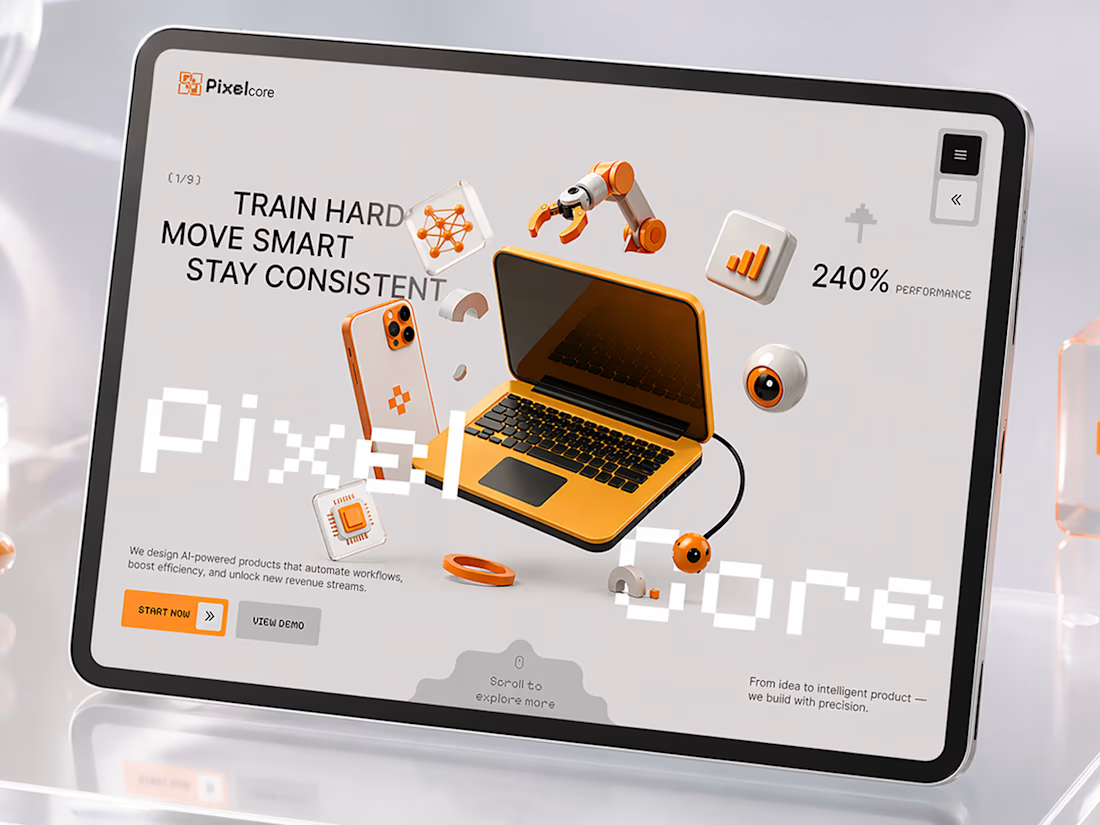

Love the orange accents 🧡

The orange and neutral palette works so well for this concept.

Creative work

Really nice tech aesthetic here ⚡️

Great work!

Wow! How did you approach balancing all the 3D elements without making the hero feel too busy?

Thank you! 🙌 I kept one main 3D element as the focal point and used the smaller elements to support the composition without competing for attention

The 3D visuals look amazing


I like this

Love this one! 🔥

Great Work. Love it!

Really like how the design feels futuristic without becoming too complicated.

Really like the layout and colors, looks cool.


pixelcore is a great name ngl

The orange accent system is doing a lot of work here, it keeps the whole thing from tipping into generic AI-startup dark mode. Did you land on that palette early or was it a reaction to seeing too many all-black landing pages in this space?
A bit of both 😄 We wanted to avoid the typical all-black AI aesthetic from the start, and orange gave us the energy and contrast we needed while keeping the interface clean and tech-focused 🟠⚡

This is Nice

like the tech vibe

Futuristic without relying on the usual AI aesthetic!

Great concept

Really nice work.

The PixelCore wordmark cutting across the laptop mockup is a strong hook, most AI landing pages play it way too safe with typography. My take: the pixel-inspired type is what makes the orange accents feel intentional instead of decorative. What almost didn't make the final cut here?
The oversized PixelCore wordmark almost didn’t make it 😄 It felt risky at first, but once we saw how it interacted with the 3D composition, it became one of the elements that gave the whole concept its character ⚡
The PixelCore wordmark cutting across the laptop mockup is a strong hook, most AI landing pages play it way too safe with typography. My take: the pixel-inspired type is what makes the orange accents feel intentional instead of decorative. What almost didn't make the final cut here?

Awesome

Really like the balance between futuristic visuals and usability. How did you decide where to use the orange accents without letting them overpower the AI-focused content?
I used orange mainly to guide attention — CTAs, key details, and selected 3D elements 🟠⚡ Keeping the rest neutral helped the AI-focused content stay clear while still giving the brand a distinctive energy.


Good work🔥👏👏

The modular system is the smart part here. Building the hero and service cards to scale into case studies means the client gets a design system, not just one page. The pixel type on the CTAs is what keeps the orange feeling purposeful rather than decorative.

Amazing Work 🙌


3D hero composition is really striking


Nice Work!
The network for creativity
Join 1.25M professional creatives like you
Connect with clients, get discovered, and run your business 100% commission-free
Creatives on Contra have earned over $150M and we are just getting started

Challenges
View all


Related posts

I design some of the cleanest landing pages.
This is for an healthtech company.
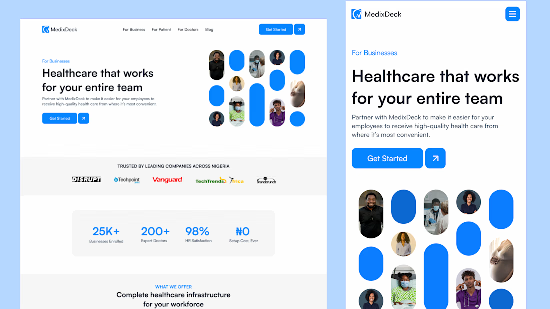

Great Job, Daniel

AI based memory rewinder app. Which design is better as Homescreen?
7 voted
88%
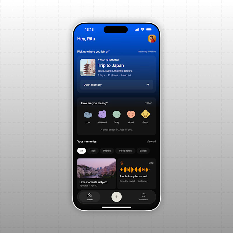
1 voted
12%
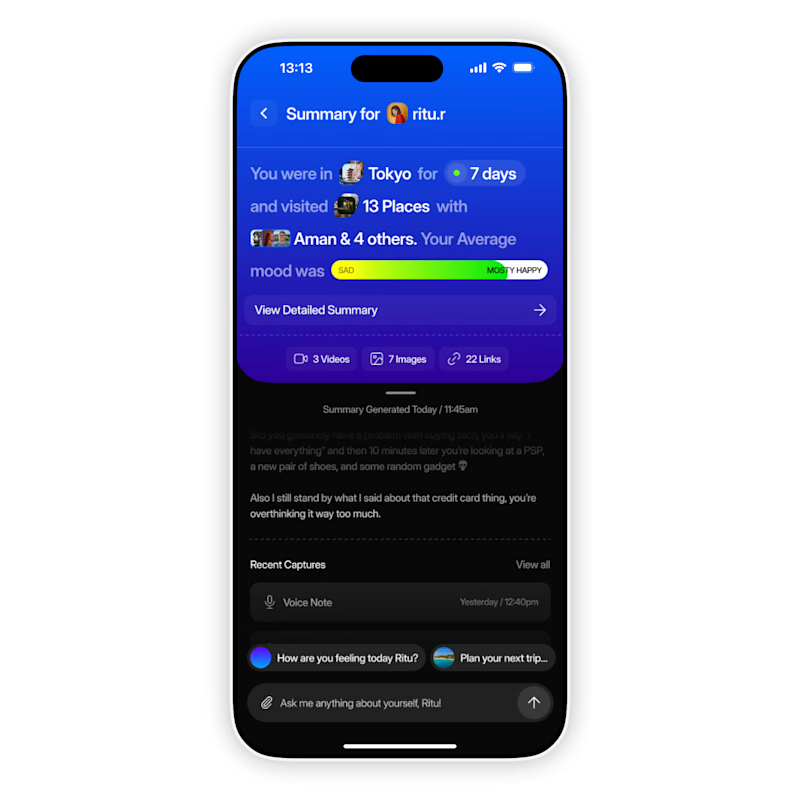
8 votes
Closed

The mood-capture direction feels more distinctive to me—the layered cards give the memory context real personality. I’d keep the summary drawer as a quick-glance fallback for returning users.

Cocoa Bliss - Chocolate packaging