Built with Jitter
Stasis Landing Page Design

Kris Anfalova


Stasis is an AI-driven sandbox platform that isolates and neutralizes zero-day threats before they impact enterprise environments. I designed the landing page — hero through data-proof sections — built around a cold, calculated visual identity.
My role: UI/UX Design
Scope: Landing page — hero, metrics, data card sections
The Problem
Security buyers are professionally skeptical. They've seen every "next-gen," "AI-powered," "military-grade" claim in the book, and marketing adjectives don't move them — proof does. Most competitors also default to the same generic dark-mode security aesthetic, which makes differentiation genuinely hard.
The challenge was building a page that felt technically serious enough to earn trust from security engineers, while still being visually distinct enough to actually stand out.
The Approach
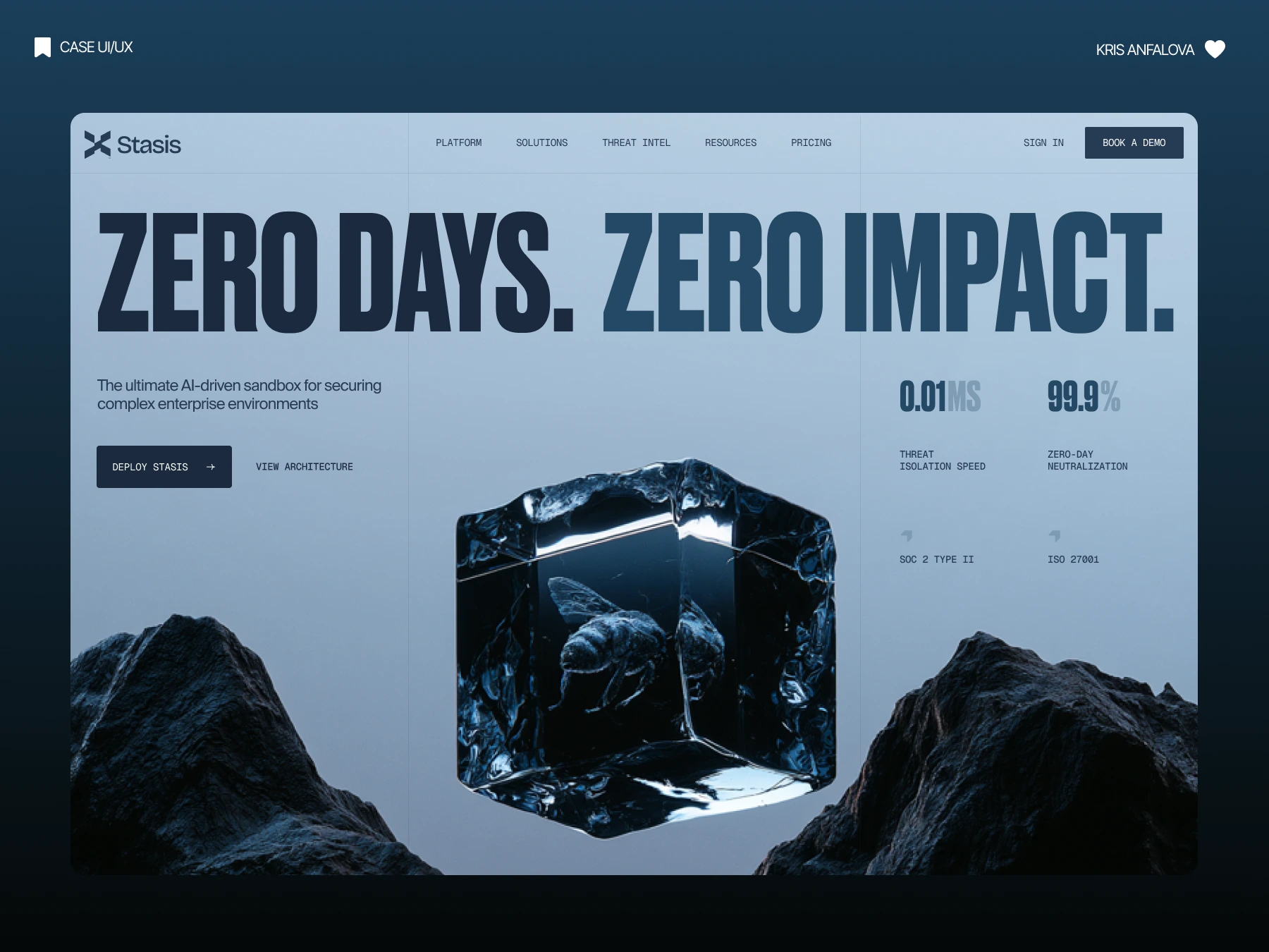
I built the entire visual identity around one literal metaphor: a bee frozen mid-flight inside a block of ice. It's an unusual, almost unsettling image for a cybersecurity site — and that's exactly why it works. It visualizes the product's core function (catching a threat and freezing it instantly) more effectively than any icon or diagram could.
Oversized, condensed typography — "ZERO DAYS. ZERO IMPACT." — delivers the value prop with the same industrial confidence as the visual. Rather than burying performance data on a separate features page, I put the hard numbers (0.01ms threat isolation, 99.9% neutralization) directly in the hero, next to SOC 2 and ISO 27001 badges. A skeptical security buyer sees the proof before they've finished reading the headline.
Extending the concept
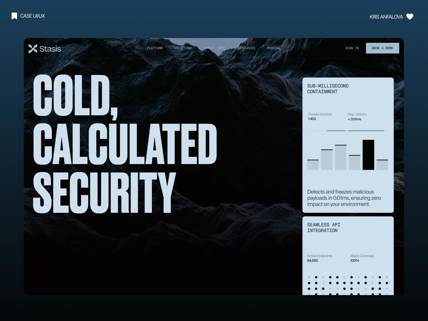
The second scroll section moves into near-black mountain terrain — reinforcing "stasis" as cold, geological, permanent — paired with live-feeling data cards: threats isolated, average latency, active endpoints, stack coverage. These aren't decorative stats; they're structured to look like something pulled straight from a real dashboard, keeping the tone technical rather than promotional.
Key design decisions
Frozen-insect hero visual as a literal product metaphor
Oversized condensed typography for industrial confidence
Hard performance metrics placed directly in the hero
Compliance badges (SOC 2, ISO 27001) for enterprise trust
Cold, geological visual system (ice, mountains, dark blue)
Dashboard-style data cards instead of decorative stat blocks
Dark-to-darker scroll narrative building technical depth
Outcome
A cybersecurity landing page that earns credibility through specificity, not adjectives — and a visual identity distinct enough to be remembered in a category where almost everything looks the same.
Like this project
Posted Aug 27, 2026
Designed a landing page for Stasis with a unique visual identity to instill trust and differentiate from competitors.
Likes
0
Views
36
Timeline
Aug 27, 2026 - Aug 27, 2026
Clients
Stasis