The network for creativity
Join 1.25M professional creatives like you
Connect with clients, get discovered, and run your business 100% commission-free
Creatives on Contra have earned over $150M and we are just getting started
Back to feedPost
ZENSO — Organic Energy Drink Landing Page 🍋🌿
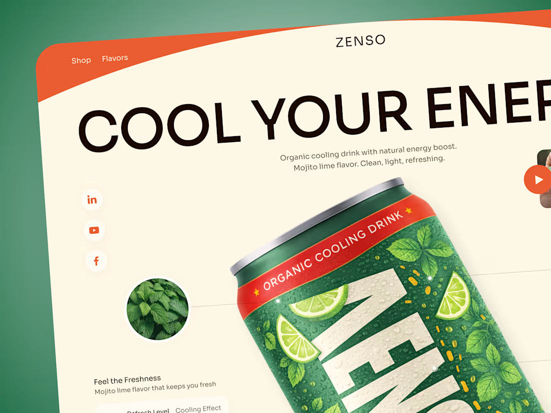
ZENSO is a bold landing page concept for an organic cooling drink that combines natural energy with a fresh, lifestyle-driven identity.
The goal was to make the product feel refreshing from the very first screen while giving the can a strong visual presence. The design combines oversized typography, organic colors, ingredient imagery, and playful composition to build a distinctive beverage experience.
Special attention was given to:
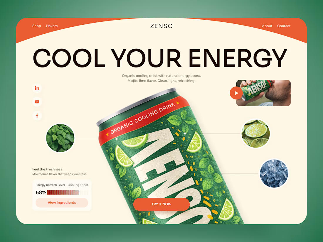
• a product-first hero that makes the ZENSO can the main visual focus;
• a fresh green, orange, and cream palette inspired by mojito lime, mint, and citrus 🍋;
• oversized typography that adds energy without competing with the product;
• ingredient close-ups that visually communicate flavor and freshness;
• supporting product details such as the cooling effect and energy refresh level;
• lifestyle imagery and video elements that make the brand feel more dynamic;
• a clear “Try It Now” CTA integrated naturally into the composition;
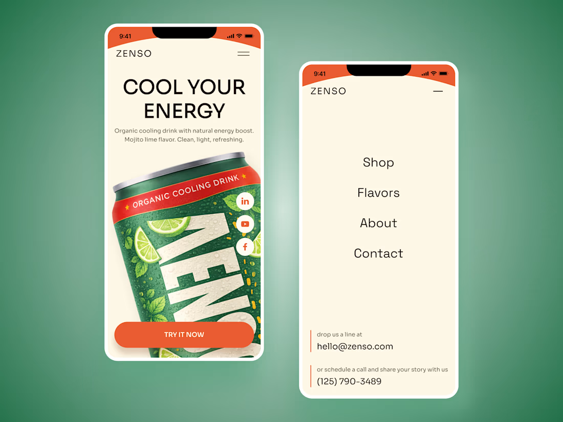
• responsive mobile layouts that preserve the oversized product presentation while keeping navigation simple 📱;
• a clean visual system that can scale across different flavors and future product launches.
The result is an energetic digital experience that turns a simple beverage into a memorable lifestyle product — fresh, playful, and easy to recognize.
Looking to create a bold digital experience for your beverage, food, or FMCG brand?
Let’s make your product impossible to scroll past ✨



Love how the mint and lime details reinforce the feeling of freshness 🍋

Such a fun concept 👏

How did you approach adapting such a large product visual for mobile?

I kept the product as the main focal point, but simplified the surrounding elements and adjusted the scale to keep the mobile layout clean and balanced 📱🌿

Looks so fresh 🌿

The typography and product composition work really well together.

Really nice color combination here😍


Really nice color combination here.

The product visual looks amazing.


Love the style

Was the color palette inspired directly by the mojito lime flavor?
The network for creativity
Join 1.25M professional creatives like you
Connect with clients, get discovered, and run your business 100% commission-free
Creatives on Contra have earned over $150M and we are just getting started











Related posts

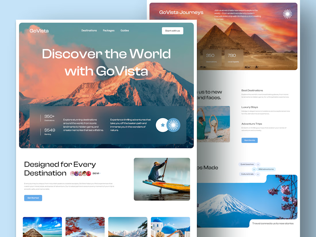
GoVista Journeys - A travel landing page designed to make people dream of their next destination.
A travel company based in Leicester, UK, needed a visually engaging landing page to showcase its destinations and travel experiences while its larger website was being prepared.
The goal was simple: make a strong first impression through beautiful travel imagery, a clean layout, and a design that makes people want to explore more.
Because in travel, the journey can begin long before the booking. ✈️
What catches your attention first on a travel website: the images, the destinations, or the overall design? 👇

I like this very much, very good concept


EarthHub – A Platform for Nature Expeditions ⛰️
Stumbled upon this project in my hard drive, had to publish!


Top to bottom nice work

A hungry customer decides in about 3 seconds.
Is your website making them hungrier, or sending them to the competitor down the street?
Marco's restaurant had great food, and empty tables every Friday night.
Not because the pasta was bad. Because the website was.
Last month, a couple searched "Italian restaurant near me" and found Marco's page. Blurry photos. A menu as a PDF that never loaded on the phone. No way to book a table. They closed the tab in 5 seconds and walked into the place next door.
Marco never knew. That's the dangerous part. You don't see the customers your website loses.
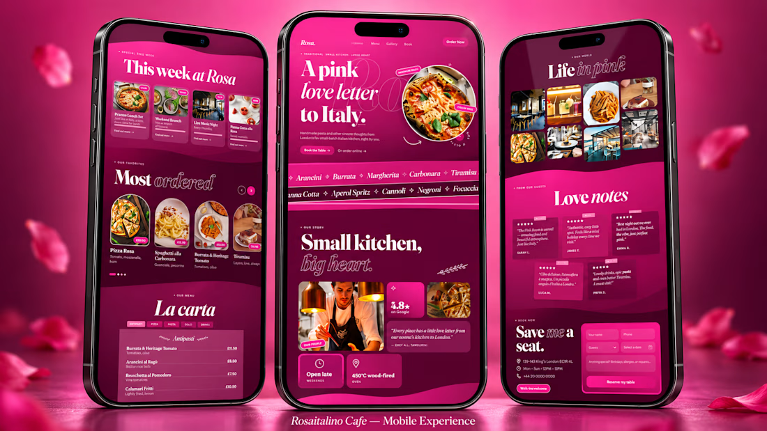
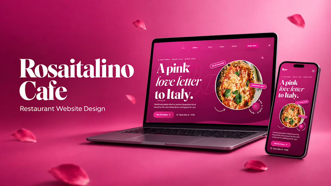
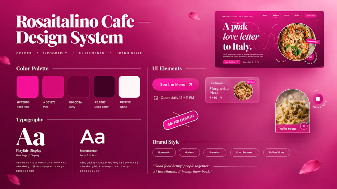
So I built a concept to show what that same restaurant could look like: Rosa italino Cafe, a rose-pink Italian restaurant website for London.
Here's what a website like this gives the owner:
🌹 A first impression that sells
People judge a restaurant in 3 seconds. A bold, beautiful design makes them hungry before they read a single word.
🍝 A menu that works like your best waiter
Dishes with photos, descriptions and prices, easy to scroll on a phone. Your signature dishes get the spotlight, so people order more of what you want to sell.
📱 Bookings from thumbs
Most people find a restaurant on their phone. A simple booking section means they reserve a table in a few taps instead of giving up.
⭐ Trust at a glance
Reviews, photos and your story in one place, so a stranger feels safe choosing you over the place next door.
📣 A place for your offers
Lunch sets, weekend specials, live music nights: update them and your regulars see them first.
🕛 A sales person that never sleeps
Your website is open at 2 AM, on Sundays and on holidays, showing your food to everyone who searches.
None of this needs a bigger budget. It needs a website designed like it cares about your food as much as you do.
That's what I do. I'm Swayam. I design and build websites for restaurants and small businesses, made to look stunning and turn visitors into customers.
Run a restaurant, cafe, salon or any small business?
Message me your business name and I'll send you a quick concept idea for your brand. No pressure, no boring sales pitch.
(Rosa italino Cafe is a concept project. Marco is a fictional character, but the problem is very real.)


Thats real intuitive post!