
✨ GIF Animation


Web experiences for founders. Felt, not just seen.

Web experiences for founders. Felt, not just seen.
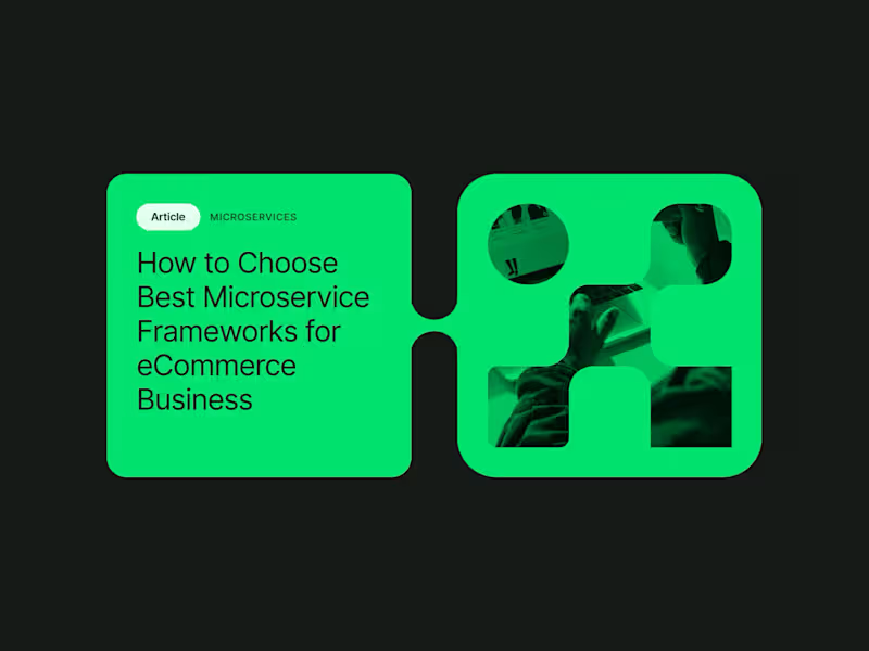
I had the privilege of collaborating with the team at northstar.cx (http://northstar.cx), who crafted the beautiful brand identity for Alokai (formerly Vue Storefront). Based on their exceptional work, I was invited to create this brand showreel introduction that brings visual identity to life.
35
2.1K


Webflow/Framer Expert & UXUI Designer for growing businesses
- $1k+
- Earned
- 2x
- Hired
- 4.6
- Rating
- 60
- Followers
Webflow/Framer Expert & UXUI Designer for growing businesses


Hey Contra community! 👋
Just wanted to pop in and introduce myself.
I’m a web designer and developer, and my main rule is simple: design must be buildable. We’ve all seen beautiful layouts that completely fall apart the moment a developer touches them. I hate that. Because I understand code, I build Figma files and design systems that are clean, organized, and actually ready for production.
Right now, I’m wrapping up a smart home interface and putting together a tight design system for it.
My question for the founders and product managers: What drives you crazy the most when handing design over to your developers? Where does it usually go wrong?
2
616
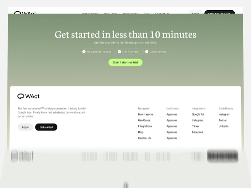
A quick look through the landing page layout for WAct 👀
🔗 Explore the full case study on Behance: WAct on Behance
(https://www.behance.net/gallery/253815513/WACT)I believe most founders know the frustration of running paid ads that bring plenty of clicks, but zero qualified leads. The WAct team needed more than just a visually appealing layout, they needed a site that immediately explains how their platform connects ad spend to actual WhatsApp conversations.
What I focused on here:
Clear hero section: Addresses the pain point right away by showing how ad budget converts directly into real customer chats.
Logical flow: Guides the reader step-by-step from the main problem to key analytics, integrations, and the contact form without any fluff.
Approachable visual style: Combines warm editorial tones and sharp typography so complex B2B data feels straightforward and easy to digest.
For me, combining UI architecture with clean technical implementation is what transforms a site from a static showcase into a high-converting product tool.
I'm currently open to new project opportunities and collaborations. DM me if you have a project in mind!
3
298
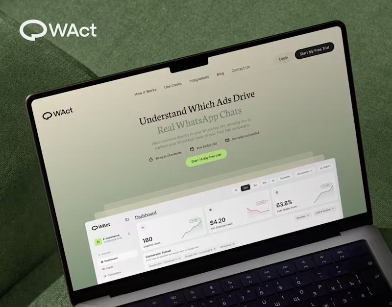
When designing WAct, the main challenge was to make complex analytics feel calm, approachable, and actionable.
Marketing tech platforms often suffer from visual noise: endless charts, aggressive contrast, and buried data.
For WAct, I took an editorial SaaS approach:
Visual Hierarchy: Kept the primary metric cards (CPL, Lead Quality Score) instantly readable at a glance.
Warm Aesthetic: Used a soft, olive-green gradient backdrop paired with editorial typography to make the brand stand out from generic blue dashboard templates.
Dashboard Logic: Structured the flow so users can track multi-channel ad conversions straight into WhatsApp chats without getting overwhelmed.
Building a complex B2B platform or analytics tool? Let’s connect and create a seamless UI/UX for your product.
🔗 Explore the full case study on Behance:
Check out WAct on Behance (https://www.behance.net/gallery/253815513/WACT)
7
22
707


FONCk/ Illustrator/ Motion Design/ frame by frame.


Hardworking UI/UX Designer & Motion Pro
Hardworking UI/UX Designer & Motion Pro


AI Video Content Creator
AI Video Content Creator


Kling AI 3.0 is not just about generating videos — it’s about building a complete cinematic production pipeline with AI.
For this fantasy project about a young sorceress and a king, the entire process started long before animation.
First, I developed the cinematic structure using ChatGPT & Claude:
• Story foundation
• Scene-by-scene screenplay direction
• Dialogue flow
• Camera concepts
• World-building and atmosphere planning
After the creative skeleton was complete, I moved into visual pre-production:
• Creating concept frames to establish the cinematic mood
• Designing scene previews and shot composition
• Developing character sheets for consistency across all sequences
Then came the main AI production stage:
• High-detail image generation in Nano Banana 2
• Cinematic animation and motion workflows in Kling AI 3.0
• Advanced consistency techniques to maintain characters, lighting, and environments between scenes
• Refining realism, textures, depth, and cinematic movement
The audio pipeline was built separately:
• Voice acting and dubbing with ElevenLabs
• Cinematic background music generated with Suno
• Additional sound effects from ElevenLabs and my personal SFX library
Finally, everything went through post-production:
• Visual corrections and compositing in Adobe Photoshop
• Full cinematic editing, pacing, transitions, sound synchronization, and final mastering in Adobe Premiere Pro
Kling AI 3.0 is accelerating the evolution of AI filmmaking — where a single creator can now build cinematic worlds with a complete AI-driven production workflow.
Currently working with Higgsfield AI & Kling AI.
1
77

Kling AI 3.0 is now here — and it’s already delivering in 4K.
The latest update marks a significant leap in AI video generation, pushing the boundaries of cinematic storytelling, realism, and visual fidelity.
Key improvements in Kling AI 3.0:
-Advanced AI video generation in 4K resolution
-More detail and high-definition textures
-Enhanced cinematic realism and lighting quality
-Improved motion consistency and lifelike animation
-Stronger text-to-video accuracy and scene coherence
-Optimized output for short-form content (TikTok, Reels, ads)
Kling AI 3.0 sets a new standard for AI-generated video content, enabling creators to produce high-end cinematic visuals without traditional production limitations.
The evolution of generative AI video is accelerating, moving toward fully hyper-realistic content creation.
Currently working with Higgsfield AI & Kling AI.
1
150

Seedance 2.0 just hit 1080p — sharper, cleaner, and finally production-ready.
I ran a quick experiment — and the jump in quality over the past year is honestly insane.
This time: a Viking chase sequence inspired by Assassin’s Creed Valhalla by Ubisoft (https://www.linkedin.com/company/ubisoft/) — built to feel like a real cinematic trailer, not “AI content.”
Method: image-to-video workflow — all scenes generated in Nano Banana 2.
Here’s what actually makes it work:
• structured storytelling (not random prompts)
• precise action sequences
• strong visual direction
• controlled atmosphere
That’s the difference between generic AI output and content that feels directed.
For brands, this means:
• faster concept validation
• high-end visuals without full production
• content that actually stops the scroll
Add ElevenLabs sound design — and it starts competing with real video pipelines.
We’re not replacing production — we’re compressing it.
If you’re a brand, agency, or creator looking to produce cinematic AI video that doesn’t look like AI — let’s talk.
Open for collaborations & custom projects.
Currently working with Higgsfield AI (https://www.linkedin.com/company/higgsfield/) & ElevenLabs (https://www.linkedin.com/company/elevenlabsio/).
0
168

Premium UI/UX & Web Design for Fintech, SaaS & Web3 | Framer

Premium UI/UX & Web Design for Fintech, SaaS & Web3 | Framer
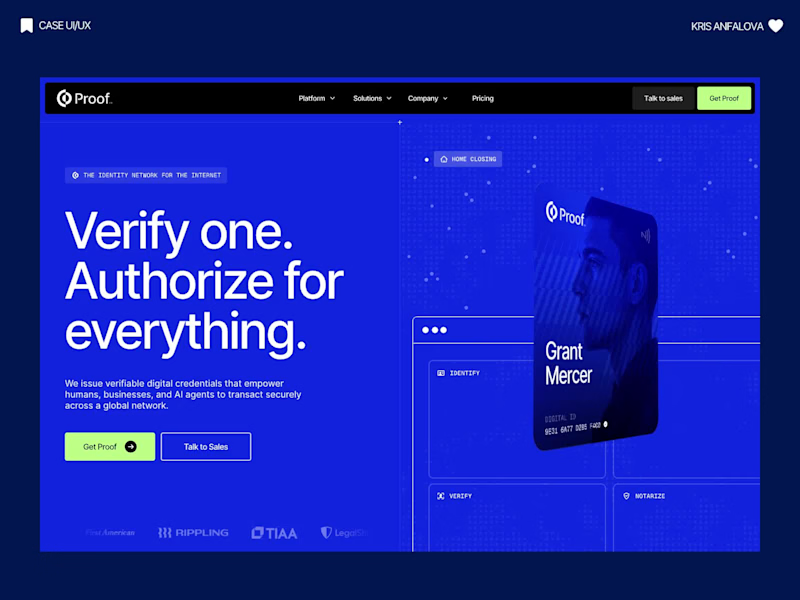
B2B SaaS website design for Proof — an identity platform that lets AI agents act on behalf of real people, built to convert enterprise security buyers.
Proof issues cryptographically verified credentials: a human verifies once, and their AI agent is then authorized to sign, notarize or transact for them. The site had to sell a category most buyers had never heard of — agent authorization — to security, compliance and engineering leads at banks, law firms and hospitals, and move them into a sales conversation instead of a bounce.
The hero says it in five words — "Verify one. Authorize for everything." — next to a live credential card, so an abstract protocol becomes something you can see in two seconds. The page alternates near-black, white and electric blue, and every switch marks a new argument: the risk, the mechanism, the network, the platform, the API. That rhythm keeps a 14-section B2B SaaS website scannable in a single scroll.
I built 20+ Lottie animations for the parts copy can't carry — credential signing, the authorization handshake, the global network map — kept light enough not to cost load time. For imagery I wrote a style recipe for AI generation (one lens, one lighting setup, one grade) so the finance, legal and healthcare scenes read as one commissioned shoot rather than stock AI. Technical buyers get a real code block with real API calls, because that section is what they scroll to find.
14+ sections, desktop and mobile designed separately, a component library, Lottie files ready for the dev team, and a written art-direction guide for generating new imagery in-brand.
6
9
1.1K
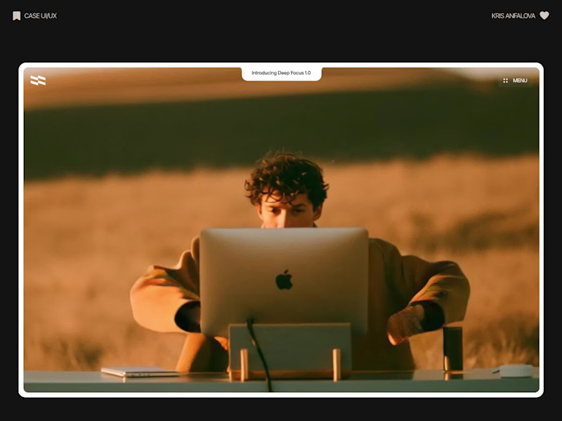
Deep Focus is a fictional macOS app that silences notifications so people can do deep work. The catch is the audience: people who need a productivity app are already tired of apps. Every competitor promises more features, so this page had to promise relief and turn it into a download within seconds.
What I did
I started from the pain, not the product. The second screen lists what a normal day looks like: push notifications, endless pings, 142 unread emails, context switching. I styled those chips like the four benefit chips in the hero, only white instead of frosted, so the visitor reads before and after without a line of explanation.
The hero section design shows no interface on purpose. This product is about absence, and a screenshot would add noise, so a person alone in a field does the proving. The headline “Deep focus. Anywhere.” is a high-contrast serif because every tool in this category speaks in a grotesque, and a serif sounds calm and human.
I kept one action, Download for macOS, with no pricing and no form. The first job of this landing page design is a download, and everything else can wait until after it.
Would you keep the serif for the headline, or switch to a grotesque so it feels more like software?
28
79
2.3K
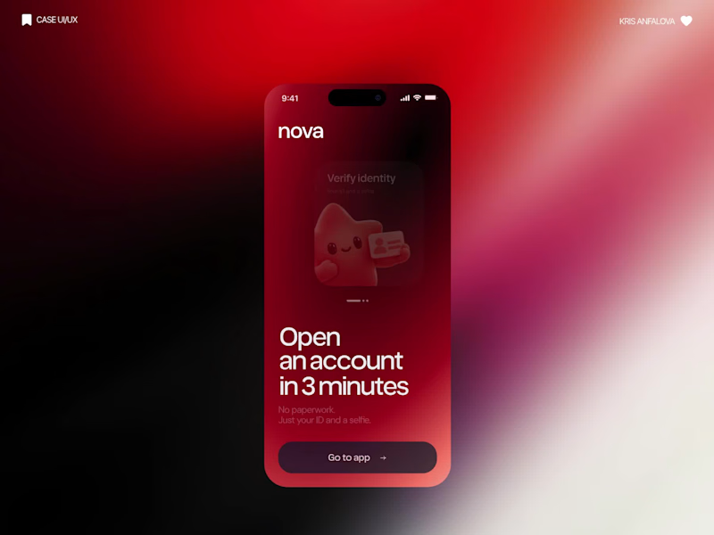
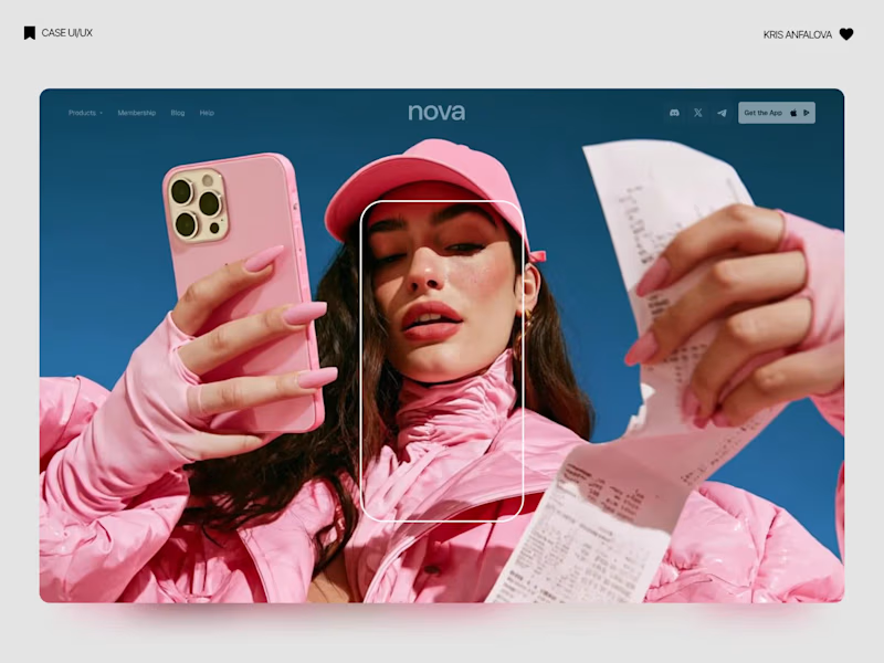
What if sending money felt a little more like giving a gift?
For Nova, I explored a banking app that brings payments, cards, and a bit of personality together. You can check your balance, browse recent transactions, send or request money, top up, and pay bills.
My favorite part is the digital postcard feature. Before sending a transfer, you can add a little illustrated card—a heart, a birthday greeting, or a playful character. A simple way to make birthday money or a thank-you feel more personal.
I carried that same 3D character into onboarding, pairing it with bold red gradients and large, clear payment details. There’s room for play, while the recipient and amount stay easy to check.
Would you add a postcard to a transfer? I’d love to know what occasion you’d use it for.
35
92
5.9K

2D & 3D Animator - Rive, AE, C4d 🎨
2D & 3D Animator - Rive, AE, C4d 🎨

This is the full production process behind Luvu 👋 sketches, color concepts, final look, 100+ unique animations, start to finish.
And this is Luvu himself: companion and unofficial gym buddy to over 1 million people who probably didn't expect to bond with a cartoon character while doing lunges 😂
He doesn't do the "wave once and disappear" mascot thing, he sticks around. No transitions, no cutting away between tabs, he's just there the whole workout, judging your form (and he can really dish it out when it's off). Live voice with lip sync, every animation blending smoothly into the next through a full Rive (https://contra.com/matt_jedrzejewski_f7ljy1gy) state machine.
He talks. He reacts. He has moods. Built with an ex-Duolingo team who basically dared me to make people addicted to opening a fitness app, which, fair warning, is a strange thing to be proud of 🙌
Shipped v1 in 6 weeks. Somehow ended up past 1M users. Still not over it.
Product: https://apps.apple.com/us/app/luvu-home-fitness-workouts/id6747844405
Live Luvu Preview: https://rive.app/s/Z9lVdZjLk0qKPXkIJR2BaQ/?runtime=rive-renderer (use startLuvu trigger and pick 1-2 idle states)
17
45
1.9K


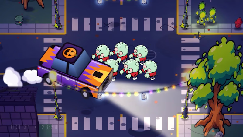
Pick a car. Hit the handbrake. Turn the horde into combo points. 🚗💨
Play free: www.animattor.co/zombie-drift (http://www.animattor.co/zombie-drift) (live leaderboard, beat me!)
Desktop (keyboard or gamepad), mobile (gyroscope).
🏆 Top 3 on October 18 get 1 year of Rive Cadet from me. Post a screenshot in comment of your score on X, LinkedIn or here and tag me and Rive.
🚙 Real drift physics. Every car handles differently and is fun in its own way
🔓 Monster truck unlocks once you pass 500,000 points
💨 Drifting to stack combos
🛞 Ramps with slowmo its something, fix your car in repair garage
I started building it right before the weekend. By Sunday I was already beating my own high scores.
Built in Rive with the Rive CLI and Claude. Zombies are animated vectors, the cars are custom vector designs, and the HUD runs on data binding [+ GPU Canvas / Luau]. The whole game is just 2.37 MB.
Drop your score below 👇
Got feedback or something's not working? Let me know.
13
32
1.8K