A quick look through the

Dima Strizhak


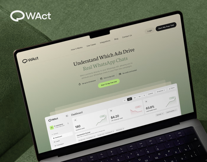
A quick look through the landing page layout for WAct 👀
🔗 Explore the full case study on Behance: WAct on Behance
I believe most founders know the frustration of running paid ads that bring plenty of clicks, but zero qualified leads. The WAct team needed more than just a visually appealing layout, they needed a site that immediately explains how their platform connects ad spend to actual WhatsApp conversations.
What I focused on here:
Clear hero section: Addresses the pain point right away by showing how ad budget converts directly into real customer chats.
Logical flow: Guides the reader step-by-step from the main problem to key analytics, integrations, and the contact form without any fluff.
Approachable visual style: Combines warm editorial tones and sharp typography so complex B2B data feels straightforward and easy to digest.
For me, combining UI architecture with clean technical implementation is what transforms a site from a static showcase into a high-converting product tool.
I'm currently open to new project opportunities and collaborations. DM me if you have a project in mind!
Like this project
Posted Sep 1, 2026
A quick look through the landing page layout for WAct 👀 🔗 Explore the full case study on Behance: WAct on Behance (https://www.behance.net/gallery/25381...