
pro
Dima Strizhak
Webflow/Framer Expert & UXUI Designer for growing businesses


A quick look through the landing page layout for WAct 👀
🔗 Explore the full case study on Behance: WAct on Behance
(https://www.behance.net/gallery/253815513/WACT)I believe most founders know the frustration of running paid ads that bring plenty of clicks, but zero qualified leads. The WAct team needed more than just a visually appealing layout, they needed a site that immediately explains how their platform connects ad spend to actual WhatsApp conversations.
What I focused on here:
Clear hero section: Addresses the pain point right away by showing how ad budget converts directly into real customer chats.
Logical flow: Guides the reader step-by-step from the main problem to key analytics, integrations, and the contact form without any fluff.
Approachable visual style: Combines warm editorial tones and sharp typography so complex B2B data feels straightforward and easy to digest.
For me, combining UI architecture with clean technical implementation is what transforms a site from a static showcase into a high-converting product tool.
I'm currently open to new project opportunities and collaborations. DM me if you have a project in mind!
3
258
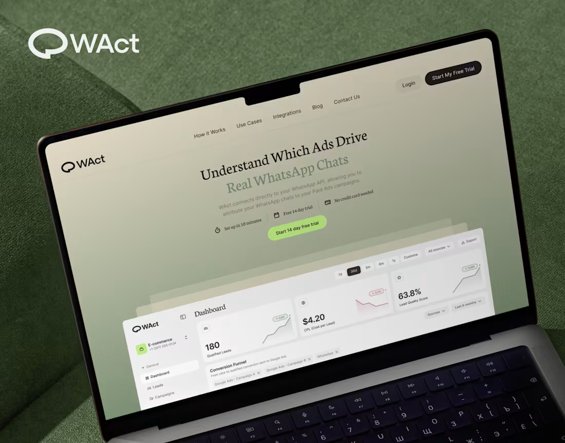
When designing WAct, the main challenge was to make complex analytics feel calm, approachable, and actionable.
Marketing tech platforms often suffer from visual noise: endless charts, aggressive contrast, and buried data.
For WAct, I took an editorial SaaS approach:
Visual Hierarchy: Kept the primary metric cards (CPL, Lead Quality Score) instantly readable at a glance.
Warm Aesthetic: Used a soft, olive-green gradient backdrop paired with editorial typography to make the brand stand out from generic blue dashboard templates.
Dashboard Logic: Structured the flow so users can track multi-channel ad conversions straight into WhatsApp chats without getting overwhelmed.
Building a complex B2B platform or analytics tool? Let’s connect and create a seamless UI/UX for your product.
🔗 Explore the full case study on Behance:
Check out WAct on Behance (https://www.behance.net/gallery/253815513/WACT)
7
22
661
When selling a premium service, mentorship, or high-value framework, a generic template fails to convey the true depth of your offer. The challenge I solved here was translating a multi-stage methodology into an intuitive, high-converting digital experience, built natively on Webflow.
By combining an editorial landscape aesthetic with modern, scroll-triggered interactions, I turned an abstract concept into a seamless visual journey.
Methodology Visualized: I designed custom interactive nodes (Relaxation → Attention → Motivation) that walk users step-by-step through the core process.
Webflow Build: I developed the full site on Webflow with clean HTML/CSS architecture, fluid animations, and fast load speeds.
Editorial Identity: I paired a warm color palette and subtle grid architecture with vintage illustration elements to build immediate authority.
Flexibility: I set up a clean Webflow CMS structure so you can easily update content without touching code.
Need a custom site that clearly communicates the value of your framework and converts visitors into clients? Send me a message and let’s discuss your project!
23
53
2.6K
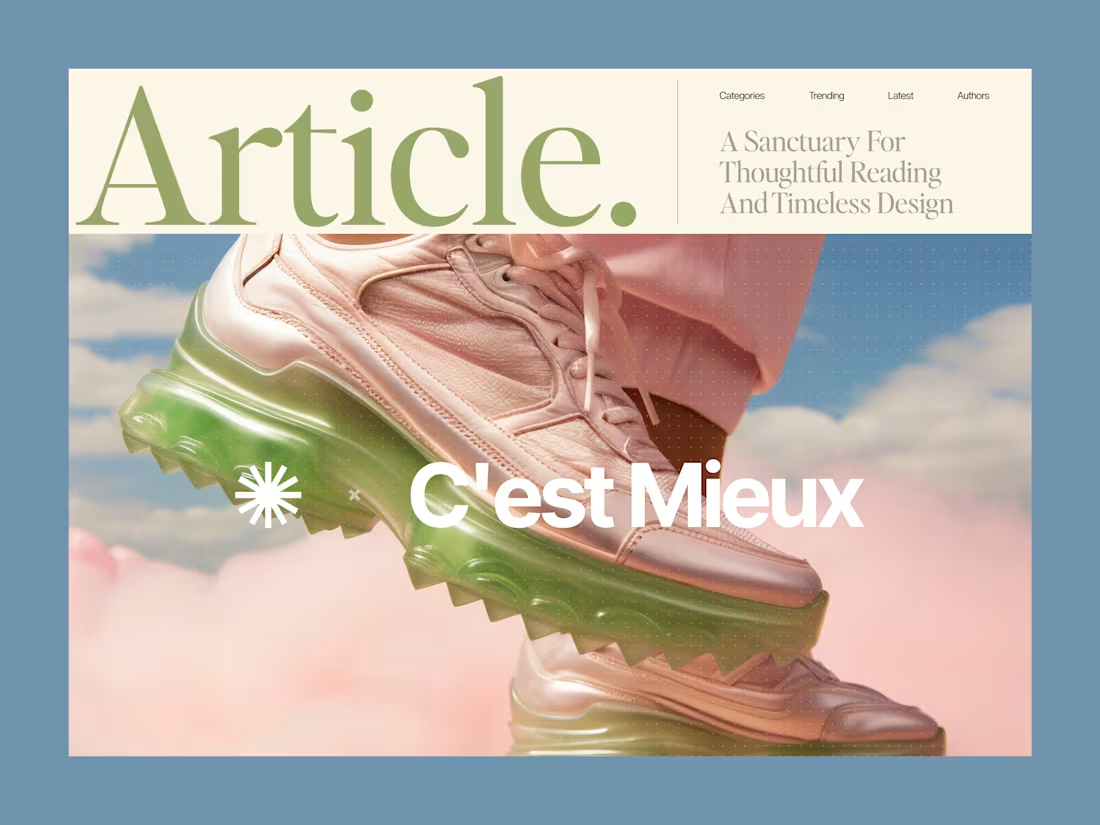
Why overcomplicating your layout kills readability.
Most content-heavy sites fail because they try to show everything at once. Sidebars, badges, related articles, and tiny fonts create cognitive overload. The user gets tired after two paragraphs and leaves.
Good design is about aggressive editing. You need to manage where the eye goes first.
In this layout, the hierarchy does all the work:
• A massive headline sets the mood and context instantly
• Generous white space prevents visual fatigue
• The clean grid ensures the reader actually focuses on the text
We don't need complex decorations to make a web page look expensive. We just need perfect typography and discipline.
Are you building a product or content platform that feels too cluttered? Drop a link below, and I’ll tell you where your users are getting stuck.
13
55
1.9K