
pro
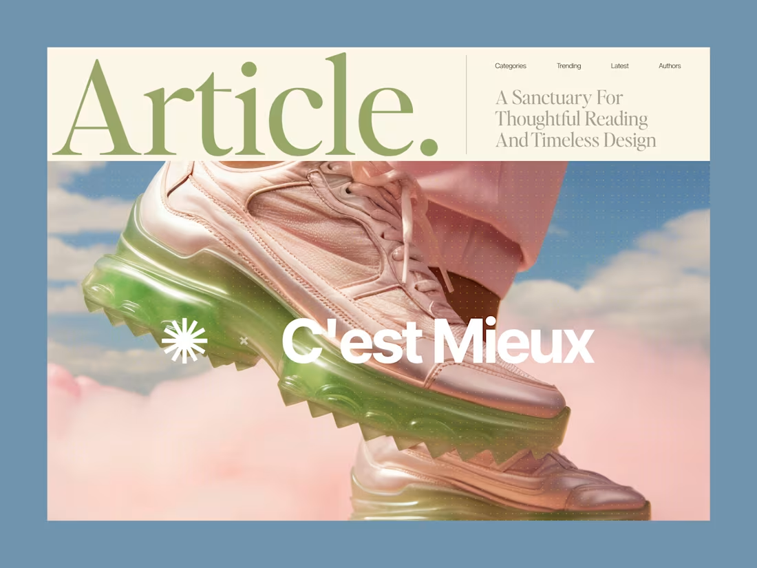
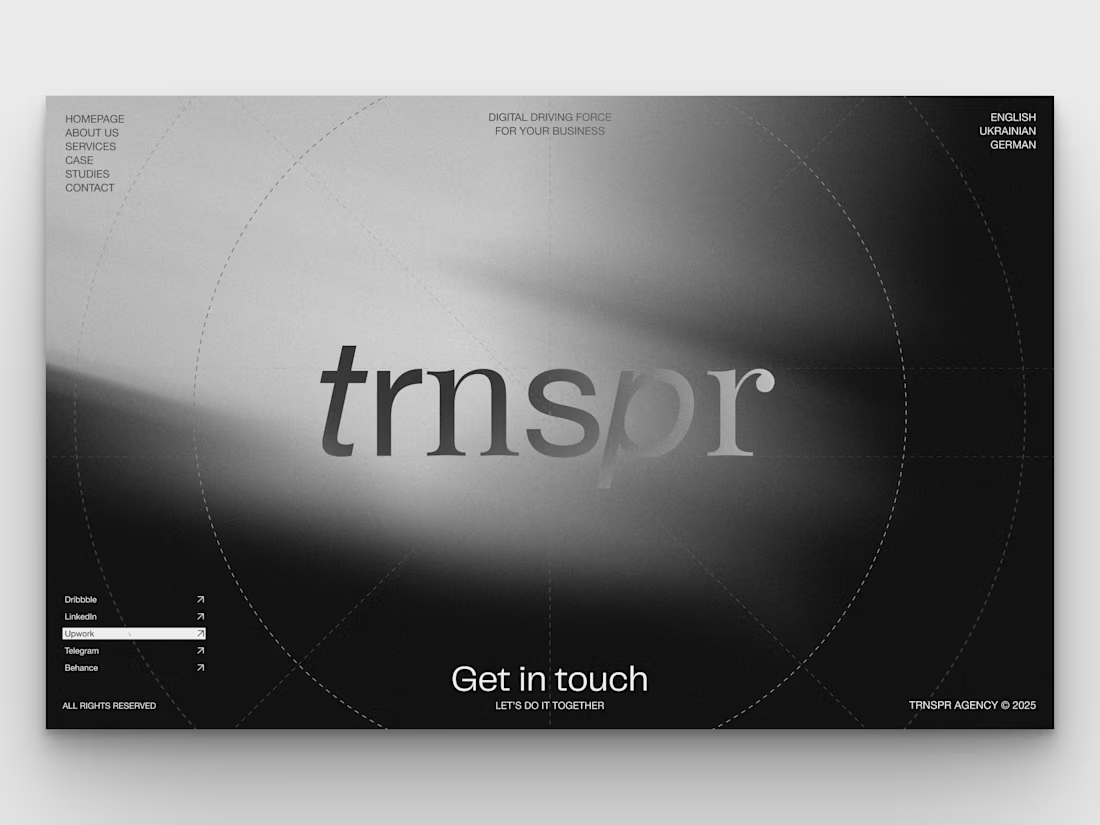
Why overcomplicating your layout kills readability.
Most content-heavy sites fail because they try to show everything at once. Sidebars, badges, related articles, and tiny fonts create cognitive overload. The user gets tired after two paragraphs and leaves.
Good design is about aggressive editing. You need to manage where the eye goes first.
In this layout, the hierarchy does all the work:
• A massive headline sets the mood and context instantly
• Generous white space prevents visual fatigue
• The clean grid ensures the reader actually focuses on the text
We don't need complex decorations to make a web page look expensive. We just need perfect typography and discipline.
Are you building a product or content platform that feels too cluttered? Drop a link below, and I’ll tell you where your users are getting stuck.
13
55
2.1K
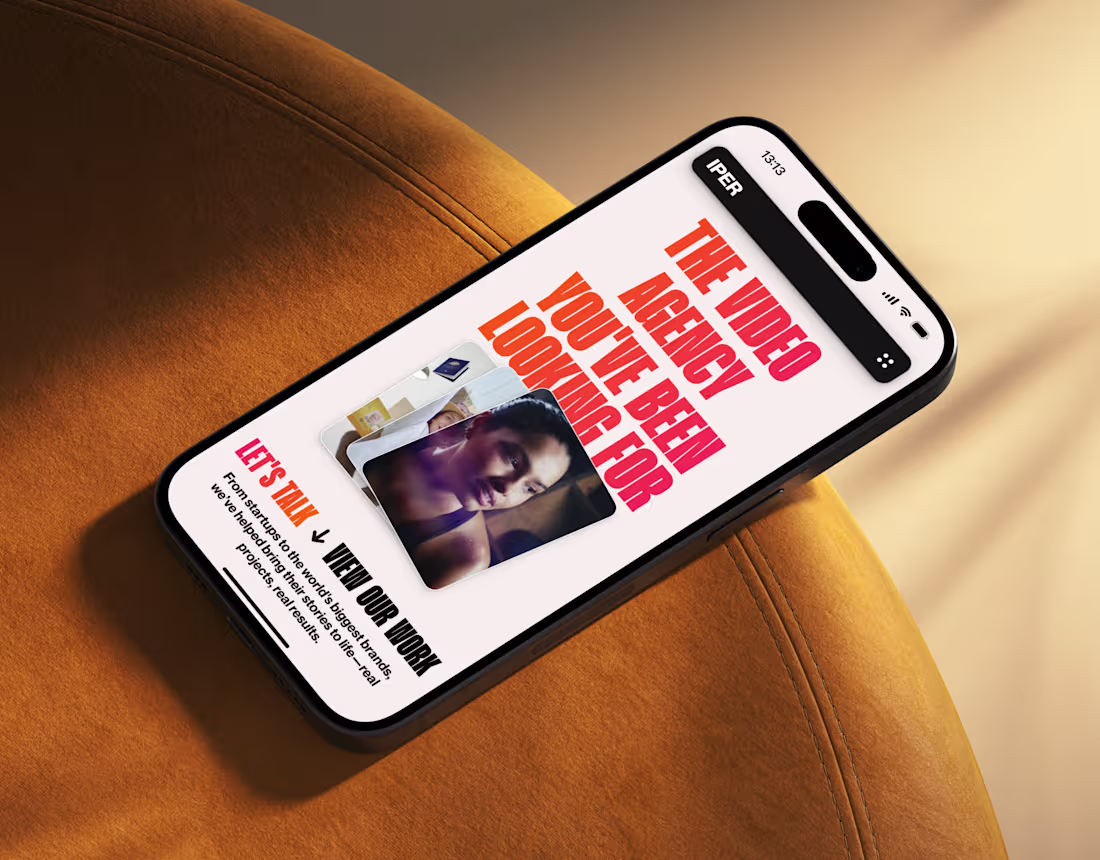
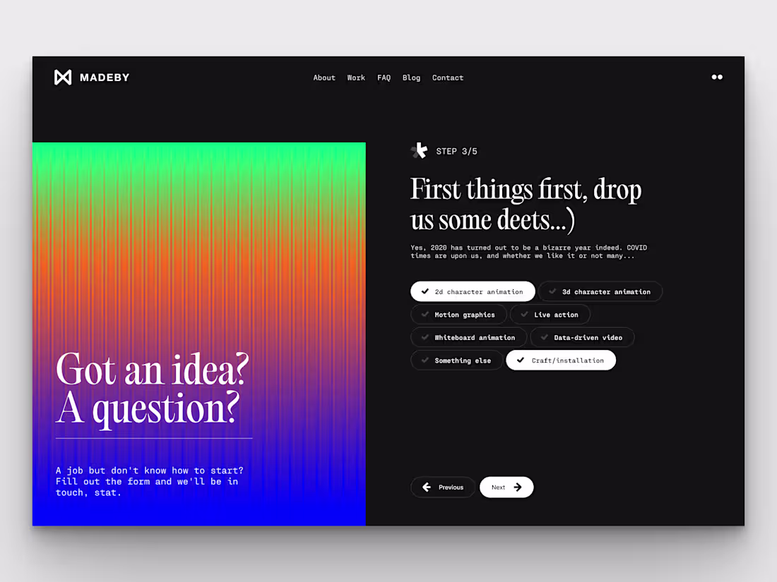
IPER - Website Design
2
12
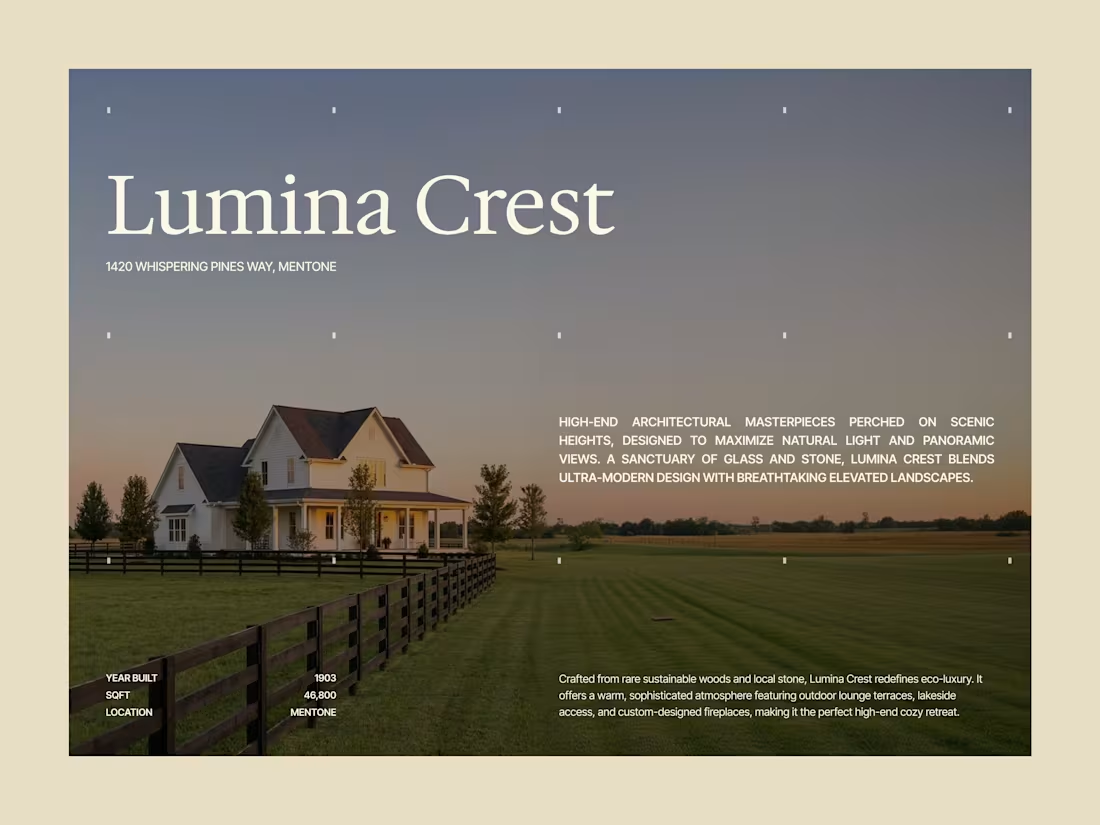
Designing for the audience who never buys "features."
High-net-worth clients don't buy houses based on a list of amenities. They purchase exclusivity, privacy, and an unmatched sense of place. If your digital presentation focuses on listing details rather than crafting an immediate, palpable atmosphere, your message is being ignored.
Design must speak directly to their desires. That means using expansive typography, a restricted color palette, and prioritizing silence in the layout. This execution immediately transforms a property into a destination.
I build refined digital environments that reflect the true scale and value of your business.
1
2
334
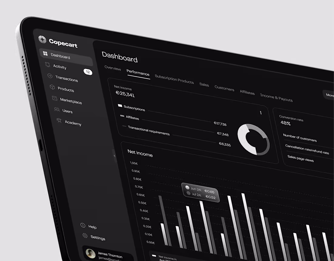
Copecart Dashboard, Website, Mobile App
1
12
When it comes to premium e-commerce, less is always more. Clean layout discipline and sharp typography hierarchy are what make a brand look effortlessly expensive.
I’m currently opening a few spots for Branding, Digital Design and Development. If you want your product to do the talking without corporate fluff, send over a DM.
1
2
336
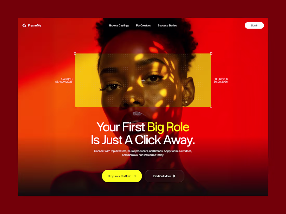
The results are in! 🔴
First of all, thank you all for voting on my previous post! The engagement was wild! The red version took a decisive lead, and it’s easy to see why.
While the blue direction felt the high-contrast and mysterious, red represents a perfect balance between expressive, confidence-inducing visuals and a strict, professional layout. My goal here was to command immediate attention and give the product a strong, premium visual authority right from the first second.
I focused on strict vertical grid discipline and a tight typography layout to keep the interface structured, while the yellow framing acts as a strategic focal point that instantly captures the eye. By balancing the intense, hot gradients at the top with a grounded, rich black base for the metrics, the hero section feels incredibly impactful without sacrificing readability.
For those who voted: what specific element made the red version stand out the most for you?
2
6
473
Hey Contra community! 👋
Just wanted to pop in and introduce myself.
I’m a web designer and developer, and my main rule is simple: design must be buildable. We’ve all seen beautiful layouts that completely fall apart the moment a developer touches them. I hate that. Because I understand code, I build Figma files and design systems that are clean, organized, and actually ready for production.
Right now, I’m wrapping up a smart home interface and putting together a tight design system for it.
My question for the founders and product managers: What drives you crazy the most when handing design over to your developers? Where does it usually go wrong?
2
435

Brown's International Yachts: Branding & Website
1
5
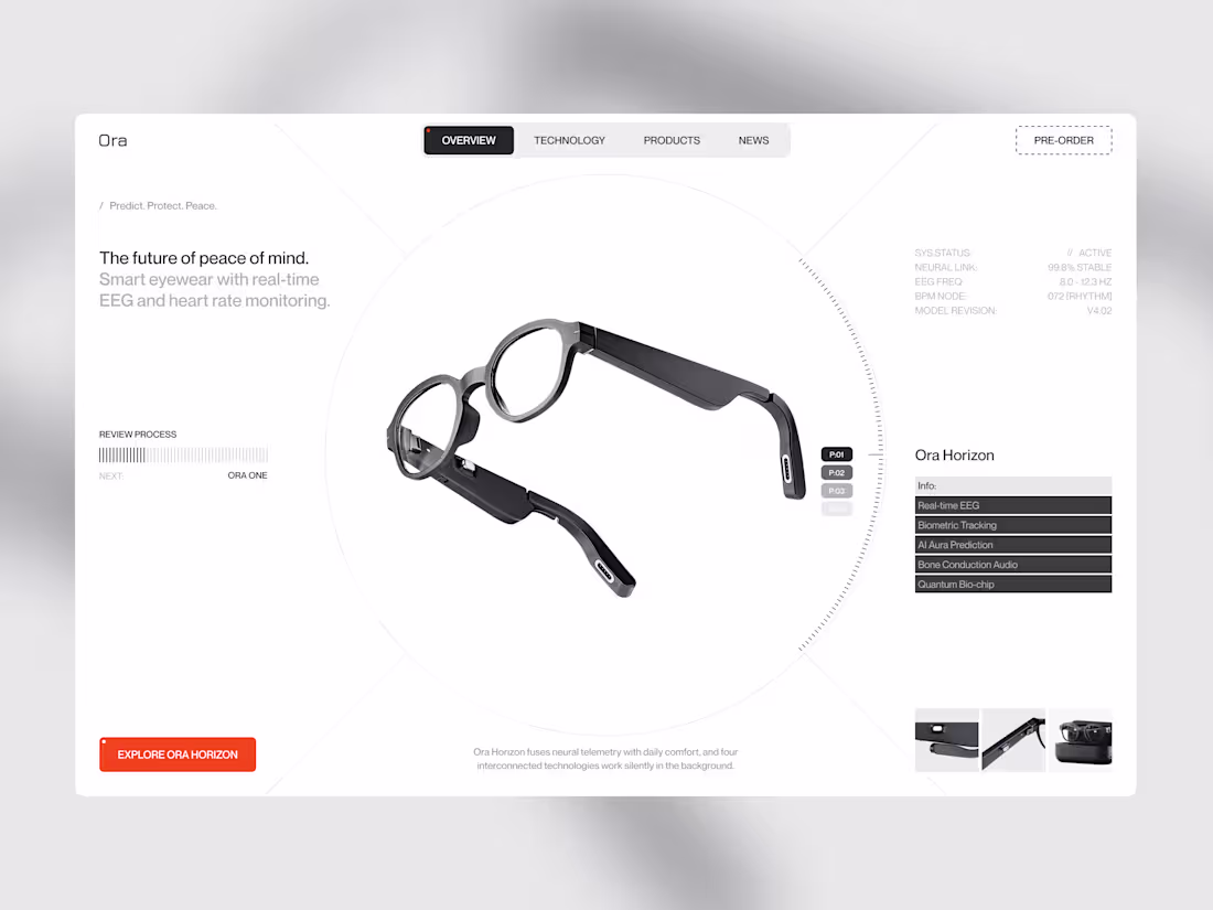
Where smart interfaces lose their users
When I designed this layout for Ora Horizon, the biggest challenge was handling a massive amount of complex bio-data without creating cognitive overload. Most deep-tech startups think that dumping raw data onto the screen proves their technology works. It doesn't.
Good product design means displaying only what matters. It requires absolute discipline.
Here is exactly how I structured their interface to keep it clean:
• I placed the hardware and the core value on the left so the physical product dominates the screen to establish immediate focus.
• I pushed the technical data to the right: Metrics like EEG frequencies and model revisions are grouped quietly using a subtle font weight so they don't distract.
• I tightly contained the micro-navigation: Interactive features like the preview carousel and categories are strictly isolated to keep the main flow entirely uncluttered.
When you cut the visual noise, you immediately change how expensive the product feels. My goal was to move this from a messy lab screen to a clean, premium experience.
If you are building a data-heavy application or hardware platform, stop making your users think so hard.
Drop a link to your product below or send a DM, and let’s clean up your interface.
2
237
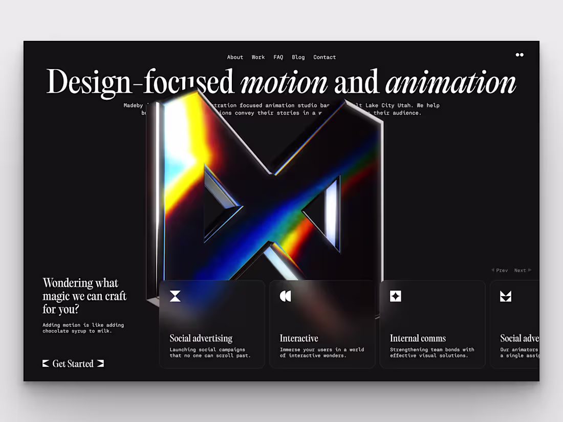
Website UX/UI Design for Animation Studio
0
4
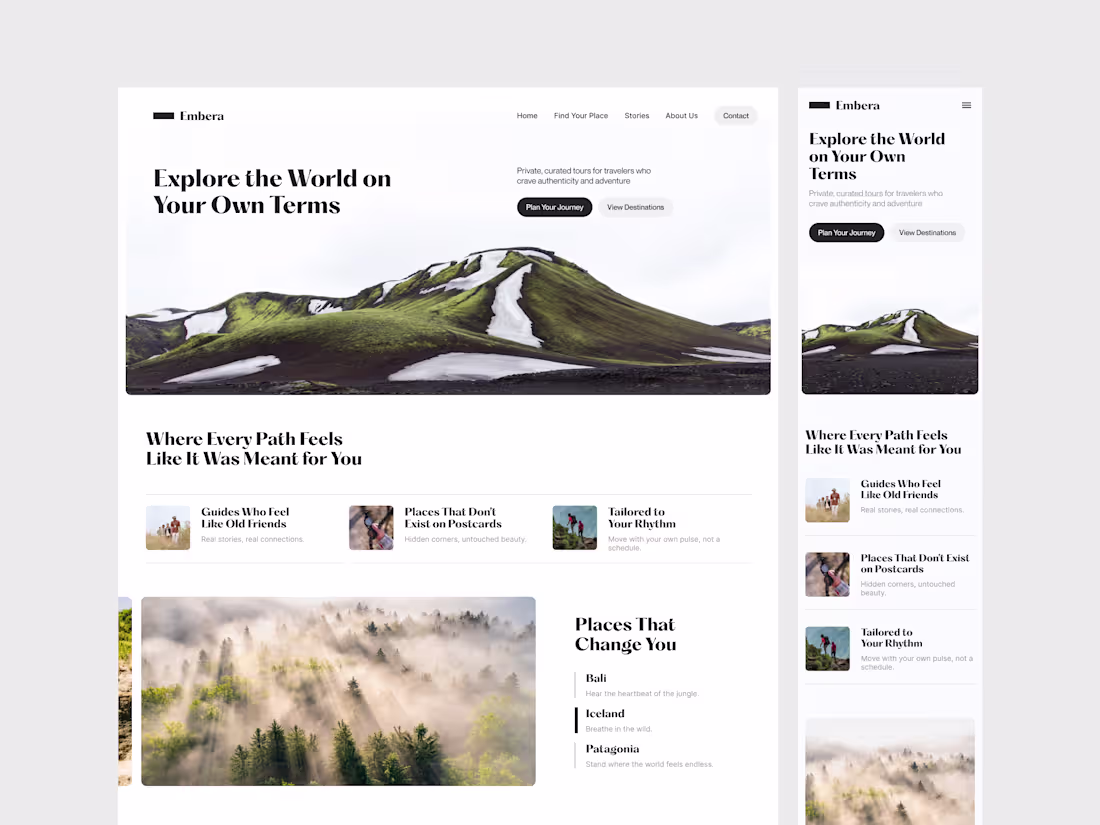
Conversion-Ready Web Design for Travel Platform
0
5
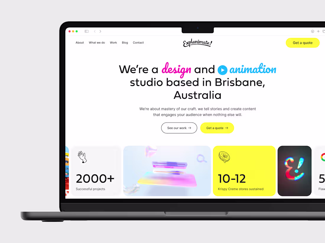
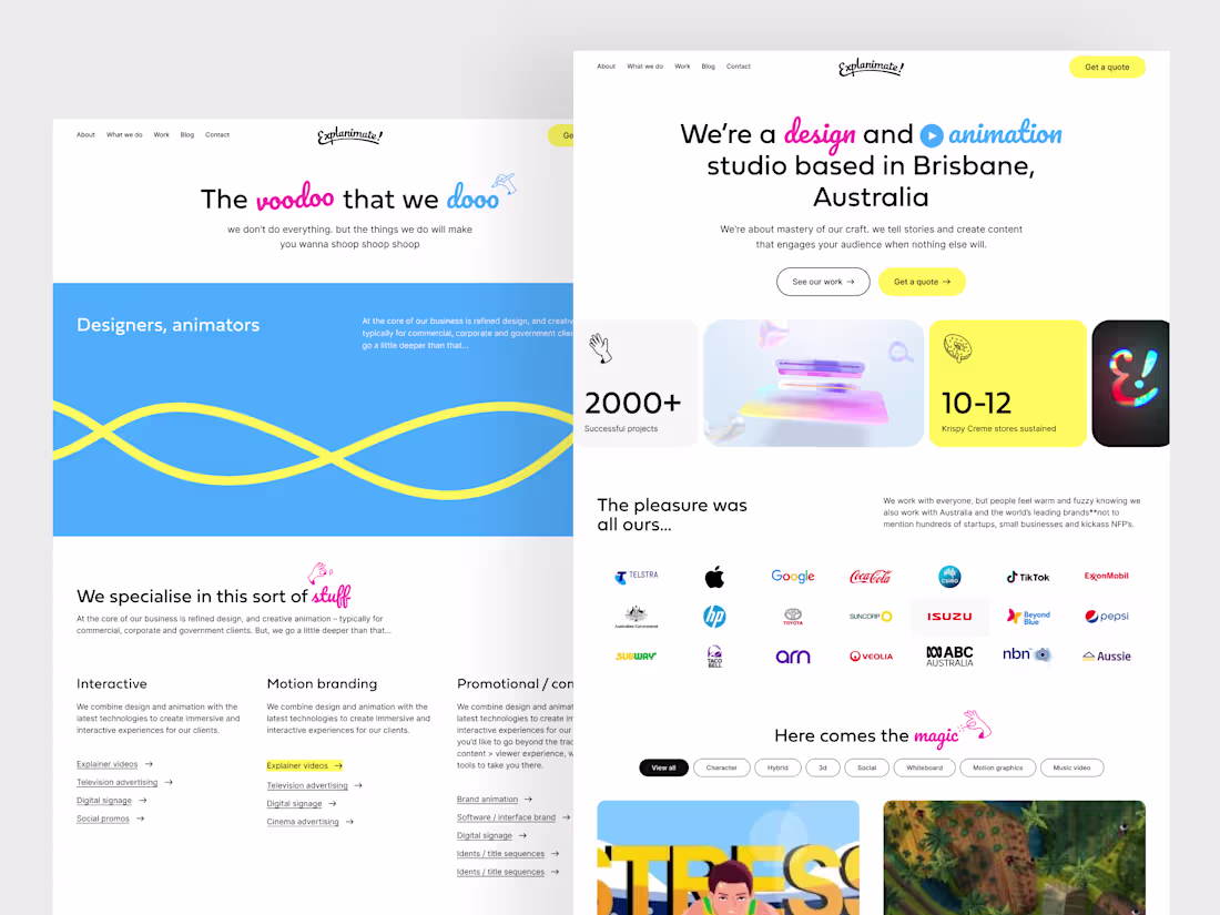
Home page design for Animation Studio from Brisbane, Australia
1
3
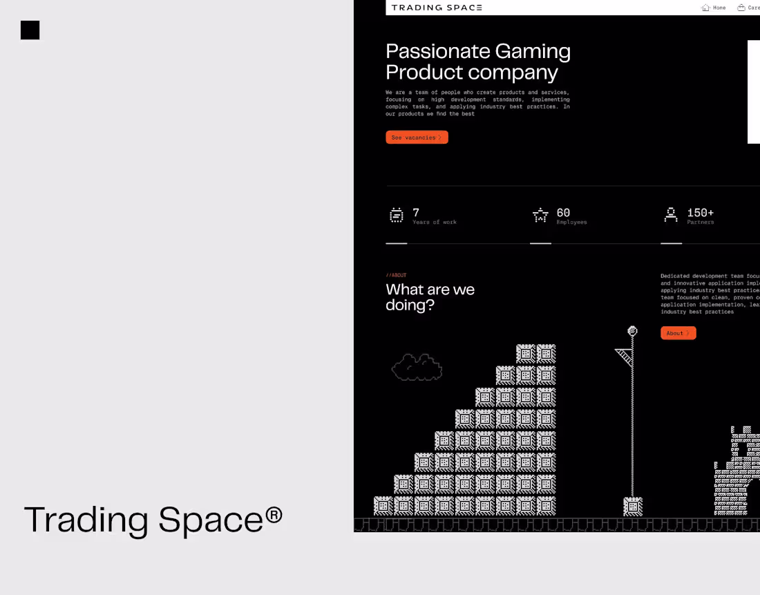
Trading Space - Web Design
0
9
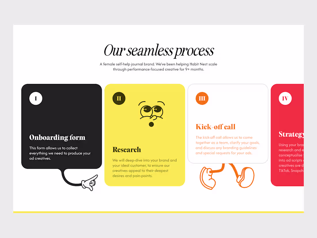
Clean process workflow for Leading UGC Agency
0
4
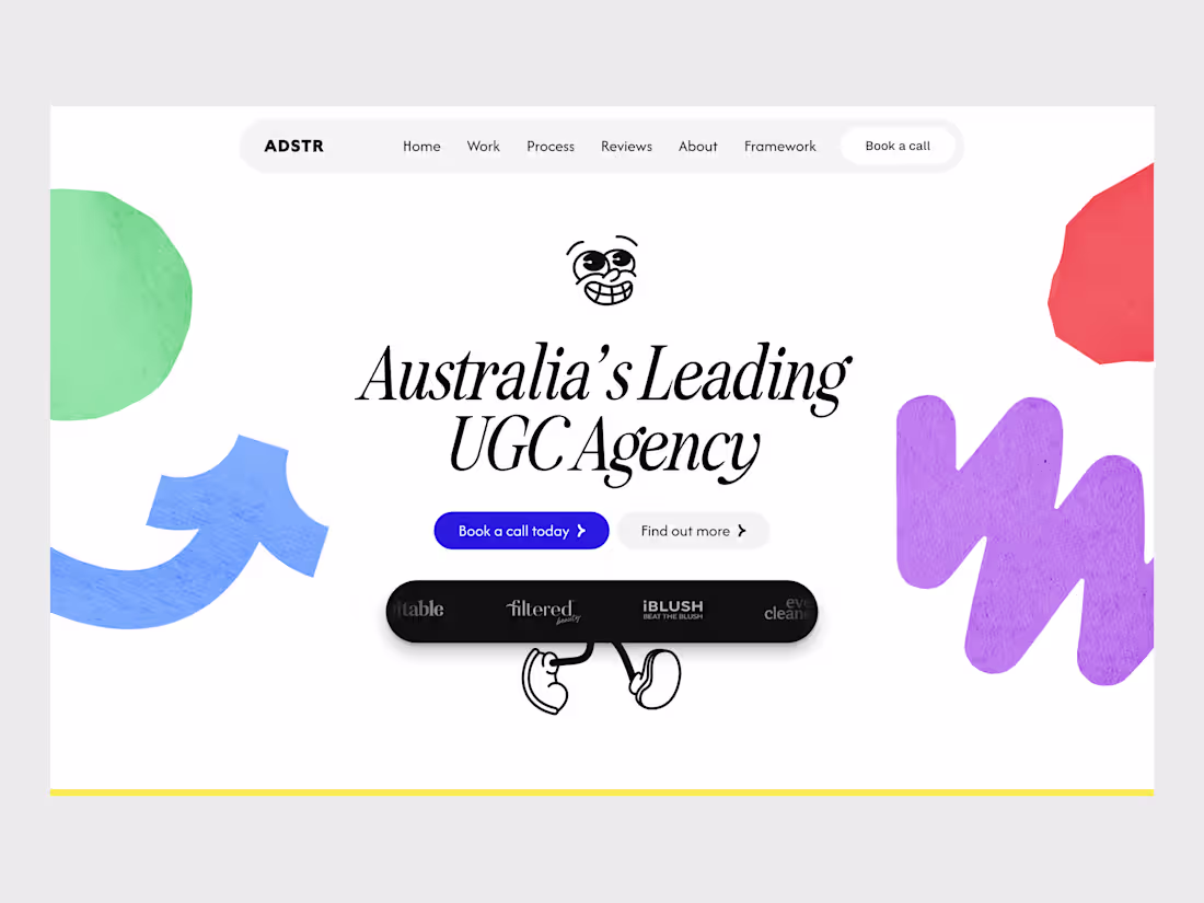
Creative Hero Landing Page for Australia's UGC Agency
0
5
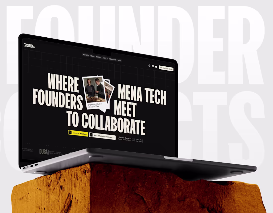
Founder Connects
0
8
Modern Mobile UI for Personal Development App
0
1
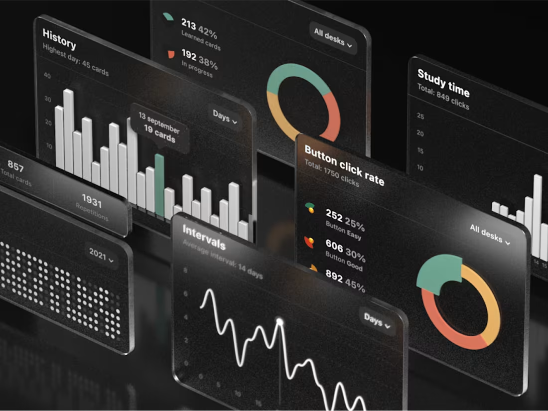
Anki App Statistics
0
2
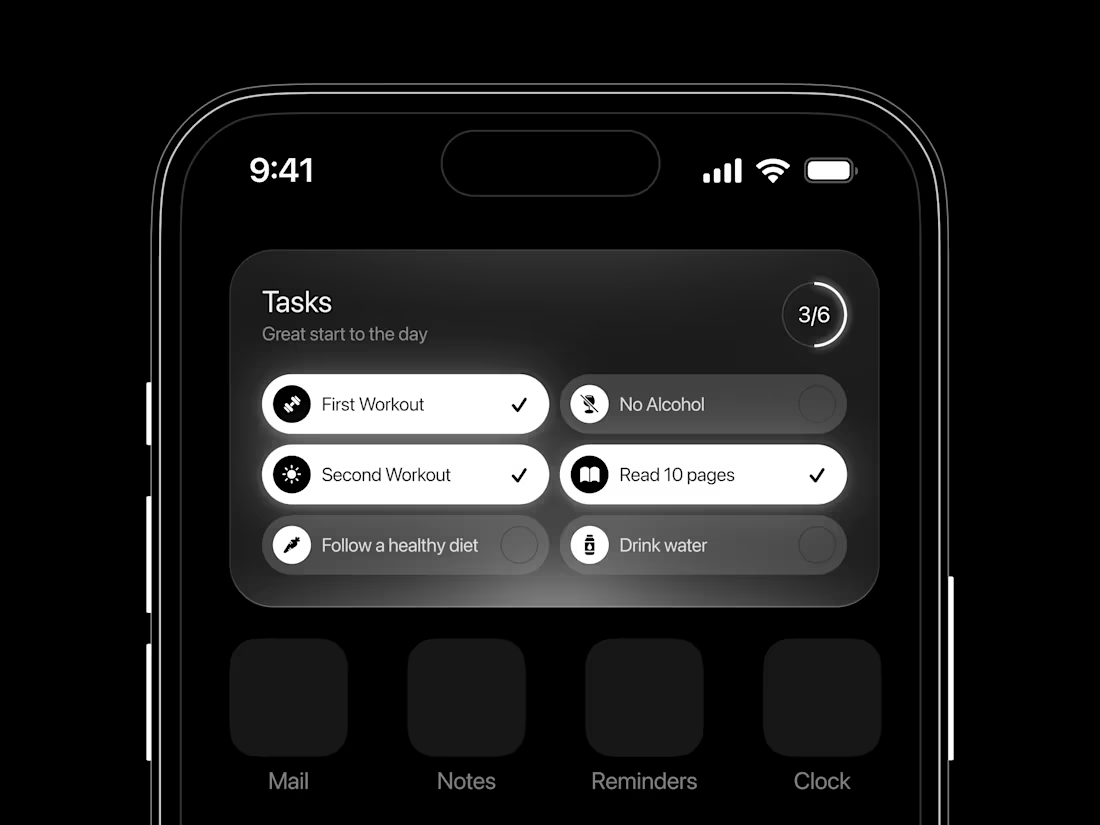
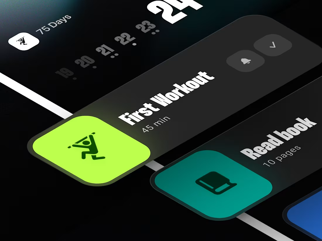
Minimalist Habit Tracker UI Dark Mode App Design
1
9
Interactive Contact Form & Lead Generation UI
0
6
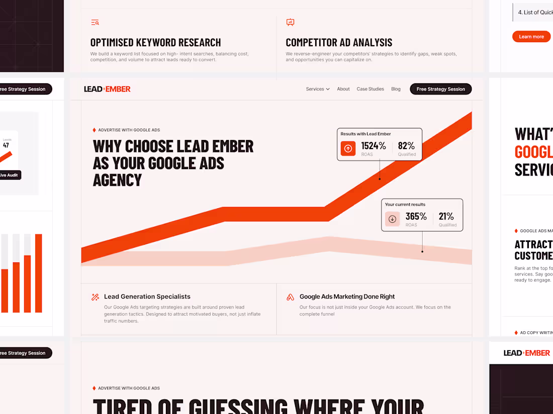
If your website is loud, it looks desperate.
Look at most digital marketing or Google Ads agencies today, their sites are usually packed with generic stock photos, flashy badges, and visual noise that you completely lose track of their expertise. It’s a common mistake to think that to look successful, a B2B website needs to be chaotic, when in reality, serious corporate clients care much more about clarity than visual glitter.
This layout on the screen is a quick look at how I design for high-ticket service businesses, using a different approach:
More focus on your results: I clean up the layout and remove useless decorations so your actual track record, numbers, and case studies stand out instantly.
Easy to scan for busy clients: I use clean typography and sharp contrast so future corporate partners can understand your core expertise and positioning in less than five seconds.
Built properly for Webflow & Framer: A premium design is useless if it lags or breaks on phones. I build clean, structured layouts that look flawless on mobile and transfer perfectly to code.
Your website is the mirror of your operations, and if it looks like a cheap template, you are simply turning away clients who are ready to pay for a premium service.
2
456
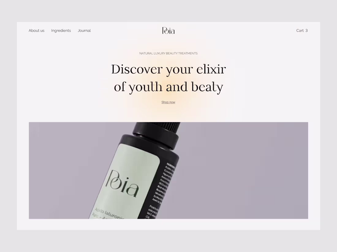
Poia Landing Page Design
0
1
Landing Page Concept for Motion & Animation Studio
0
2
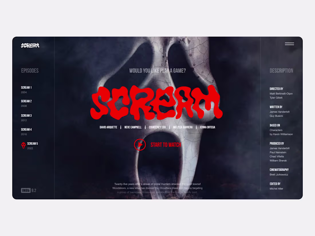
Scream Homepage Concept
0
4
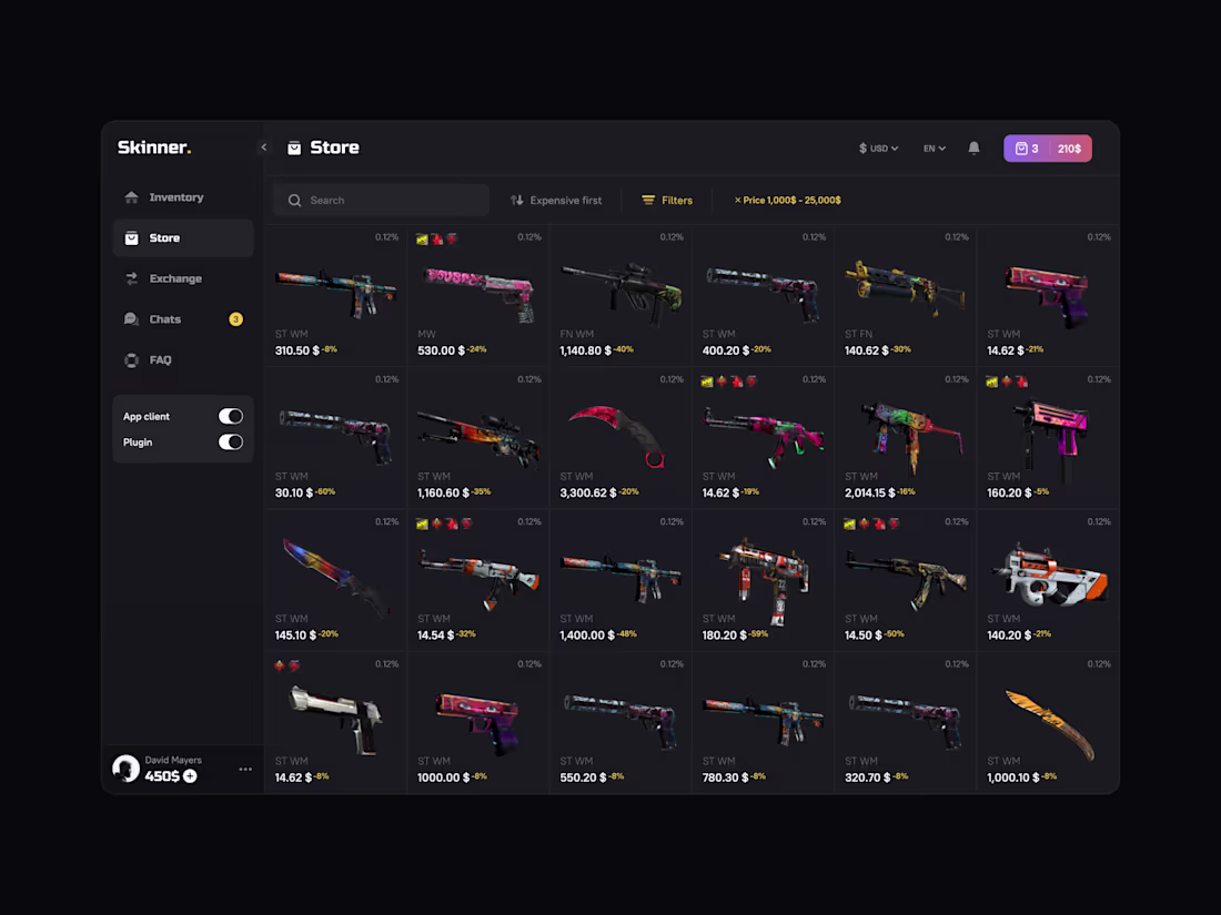
CS:GO Market UI Design
0
2
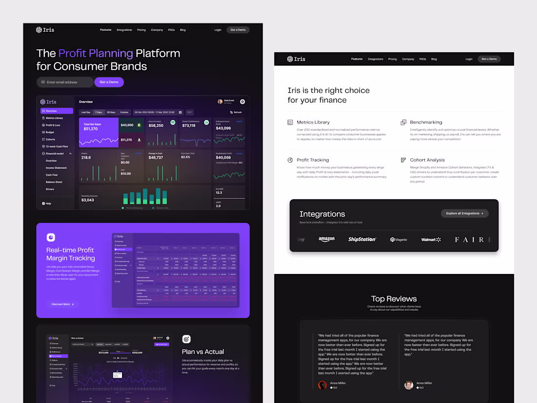
SaaS Dashboard Design for Finance Analytics
0
1
Footer Section UI Design for Design Agency
0
3
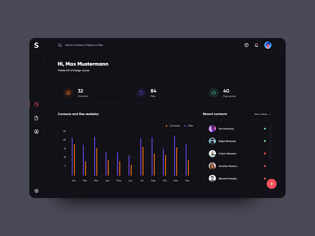
Dashboard UI Design
0
3
Anki App Mobile Flashcard Interface
0
5
Anki App Mobile Redesign
0
3
Dashboard App Mobile Design
0
3
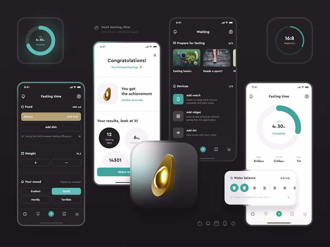
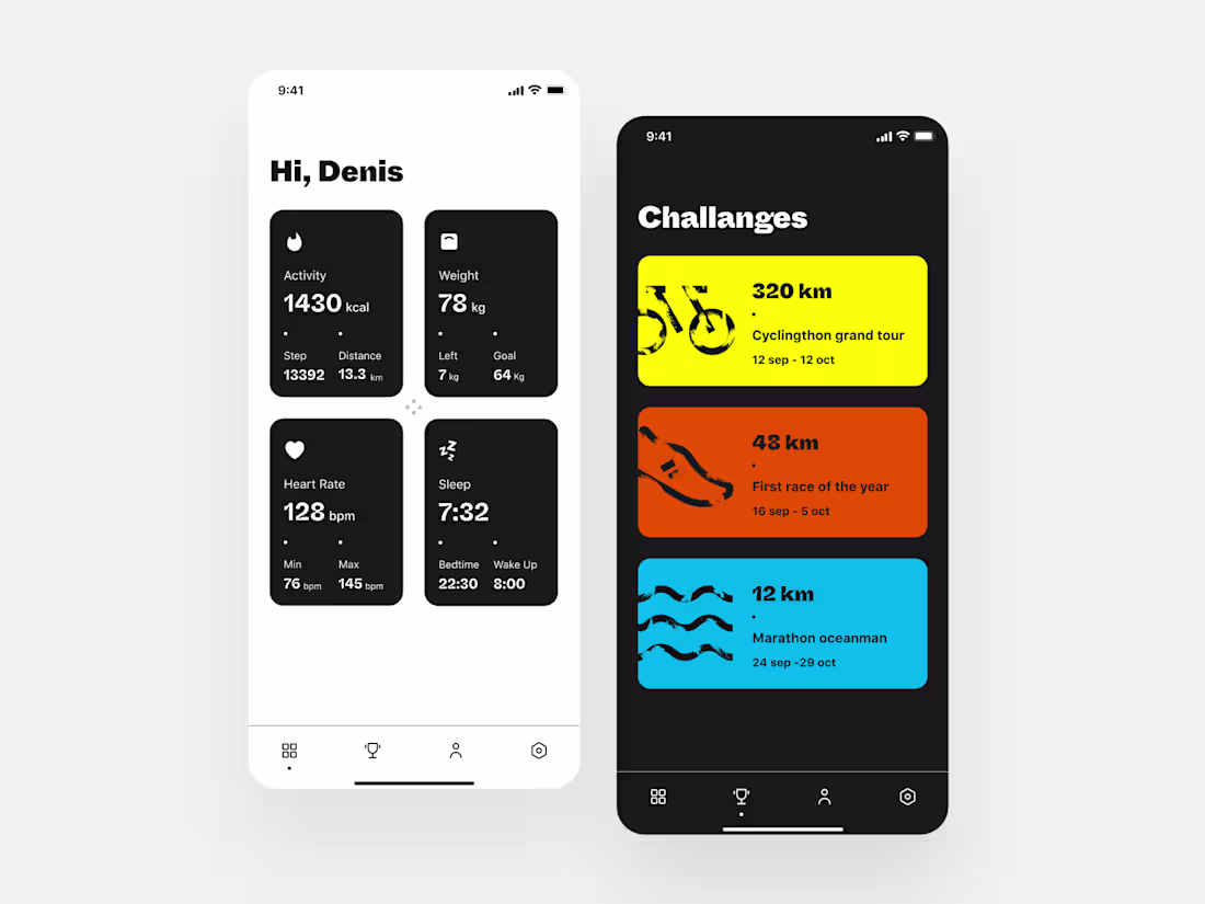
Fasting App Design
0
3
Taplink Mobile App Design
0
5
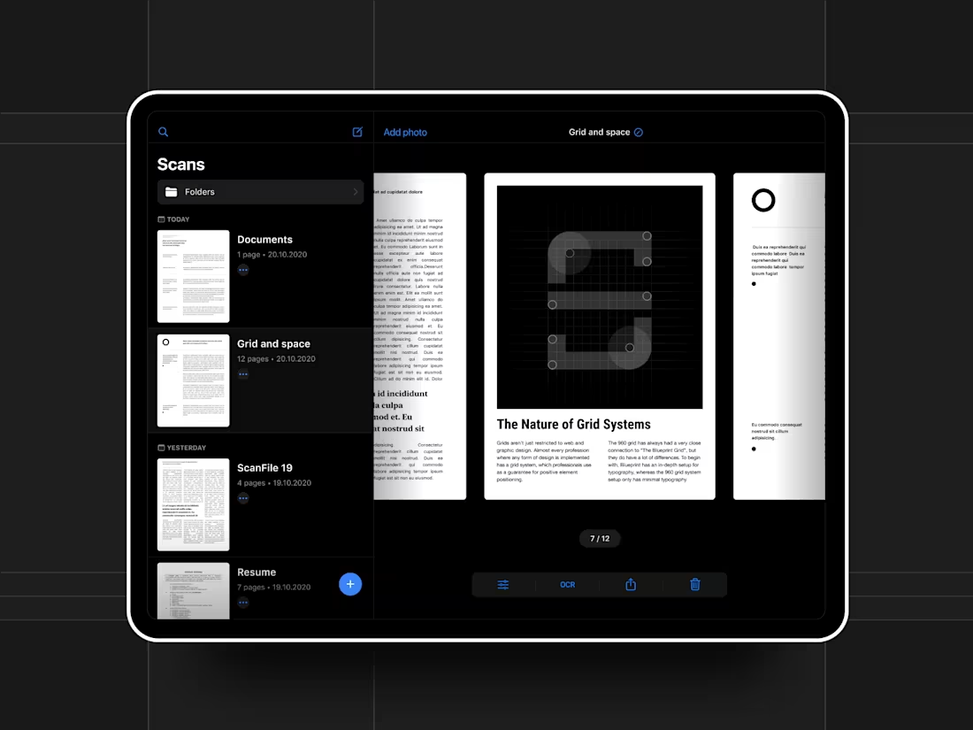
Scanner Ipad Design
0
2
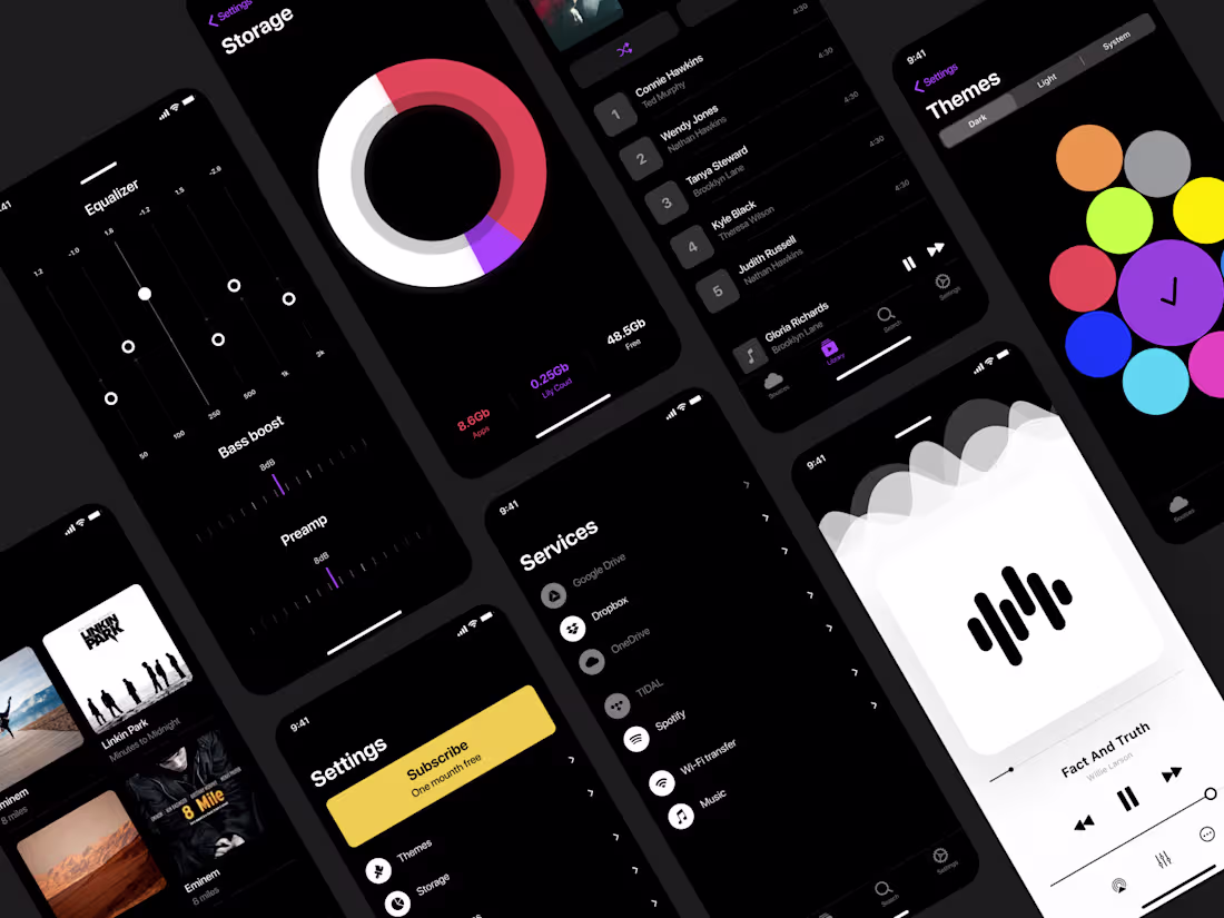
Dashboard Storage Design
0
1
Premium Music App Mobile Design
0
2
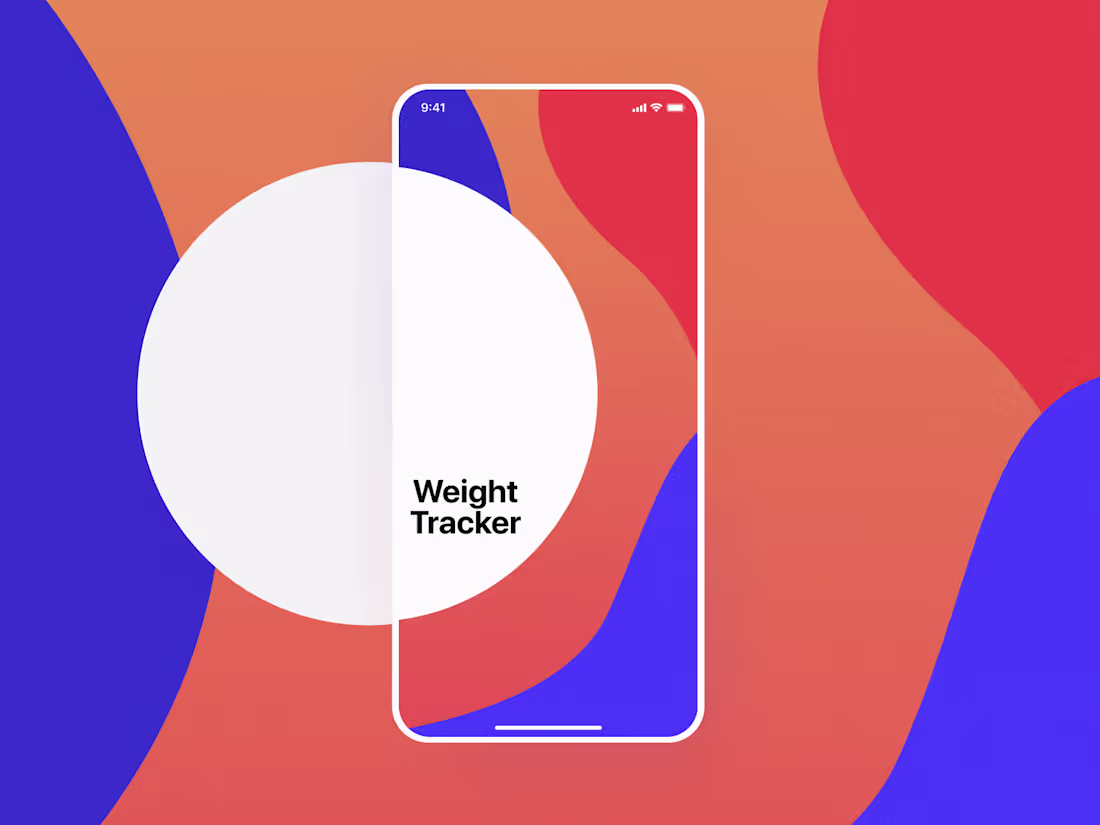
Weight Tracker Mobile Design
0
3
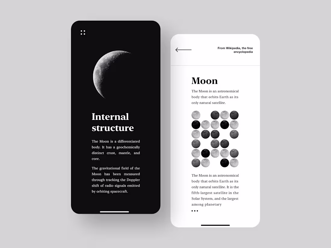
Minimalist Encyclopedia App Concept
0
3
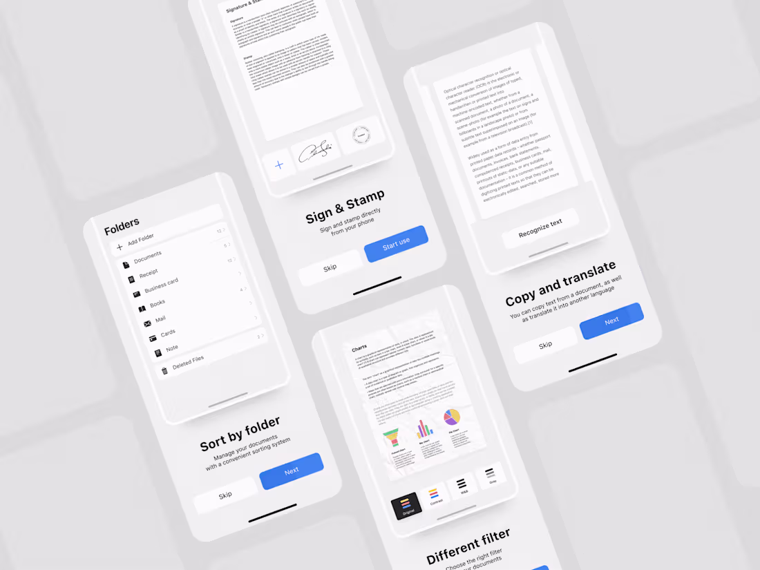
Onboarding Scanner Mobile App Design
0
4
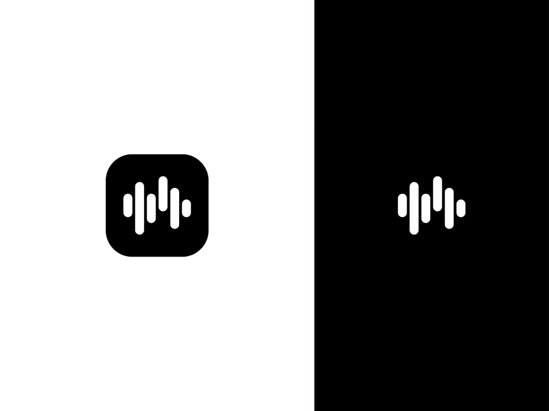
Icon Equalizer UI Design
0
2
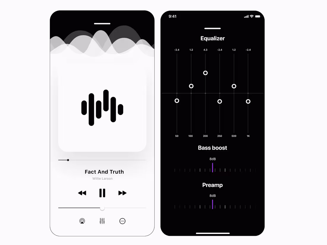
Audio Player UI | High-Contrast Equalizer Concept
0
6
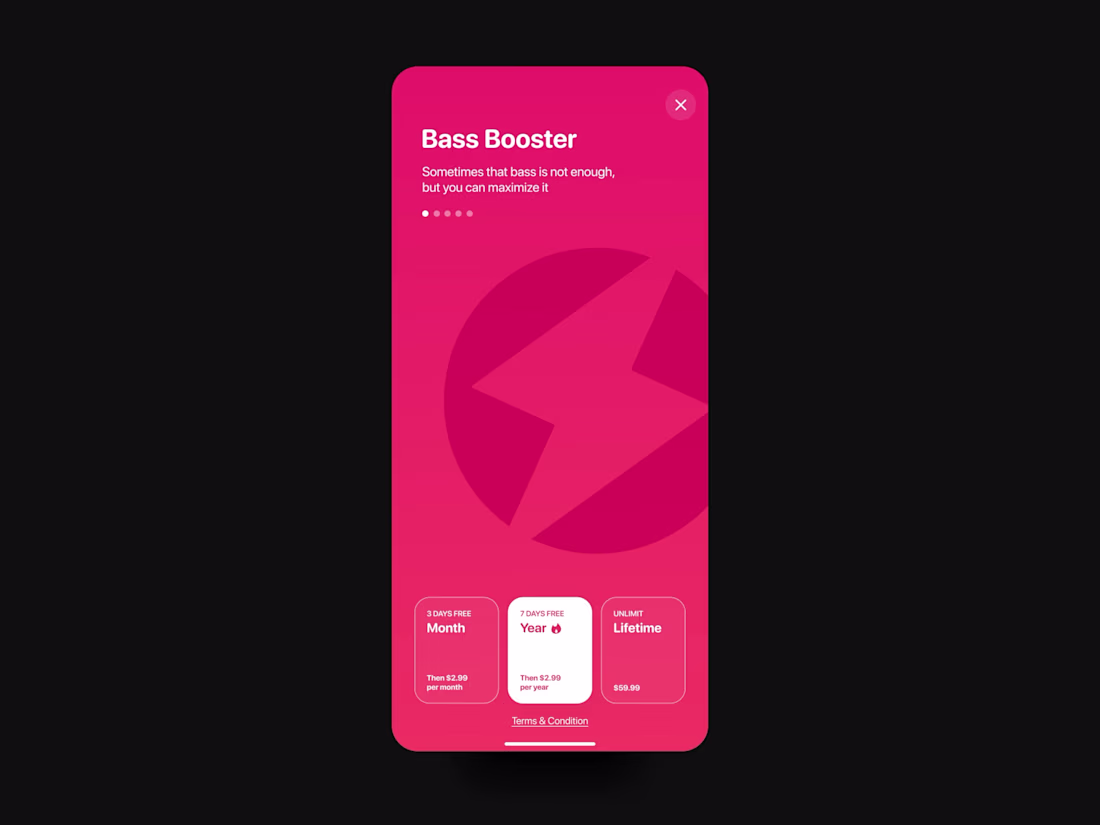
Bass Booster App | Premium Paywall & Subscription UI
0
1