The network for creativity
Join 1.25M professional creatives like you
Connect with clients, get discovered, and run your business 100% commission-free
Creatives on Contra have earned over $150M and we are just getting started
Back to feedPost
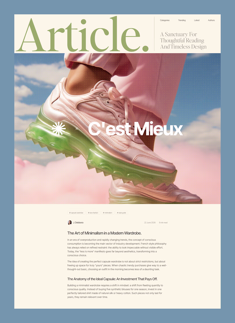
Why overcomplicating your layout kills readability.
Most content-heavy sites fail because they try to show everything at once. Sidebars, badges, related articles, and tiny fonts create cognitive overload. The user gets tired after two paragraphs and leaves.
Good design is about aggressive editing. You need to manage where the eye goes first.
In this layout, the hierarchy does all the work:
• A massive headline sets the mood and context instantly
• Generous white space prevents visual fatigue
• The clean grid ensures the reader actually focuses on the text
We don't need complex decorations to make a web page look expensive. We just need perfect typography and discipline.
Are you building a product or content platform that feels too cluttered? Drop a link below, and I’ll tell you where your users are getting stuck.
Love this!
Simplicity!
Outstanding
One of the best designs I’ve seen today. Really solid work 👏 keep pushing.
This turned out great 🔥 How long did it take to complete?
Love this design! ❤️
Impressive design !
Nice
Love the visual balance here
really nice visual direction
Love the color theme!
The network for creativity
Join 1.25M professional creatives like you
Connect with clients, get discovered, and run your business 100% commission-free
Creatives on Contra have earned over $150M and we are just getting started
Related posts
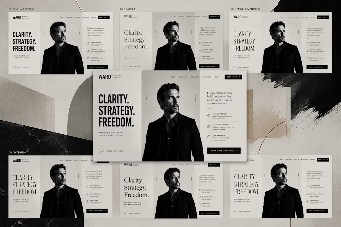
Can a font change the way people perceive a website?
Absolutely.
Every concept in this carousel uses the same:
• layout
• content
• images
• colors
The only thing that changes is the typography.
Each font gives the same website a different personality. It can feel bold and confident, elegant and premium, or modern and approachable.
Typography isn't just about readability.
It sets the tone, shapes emotion, and influences how people perceive a brand before they read a single word.
excellent presentation
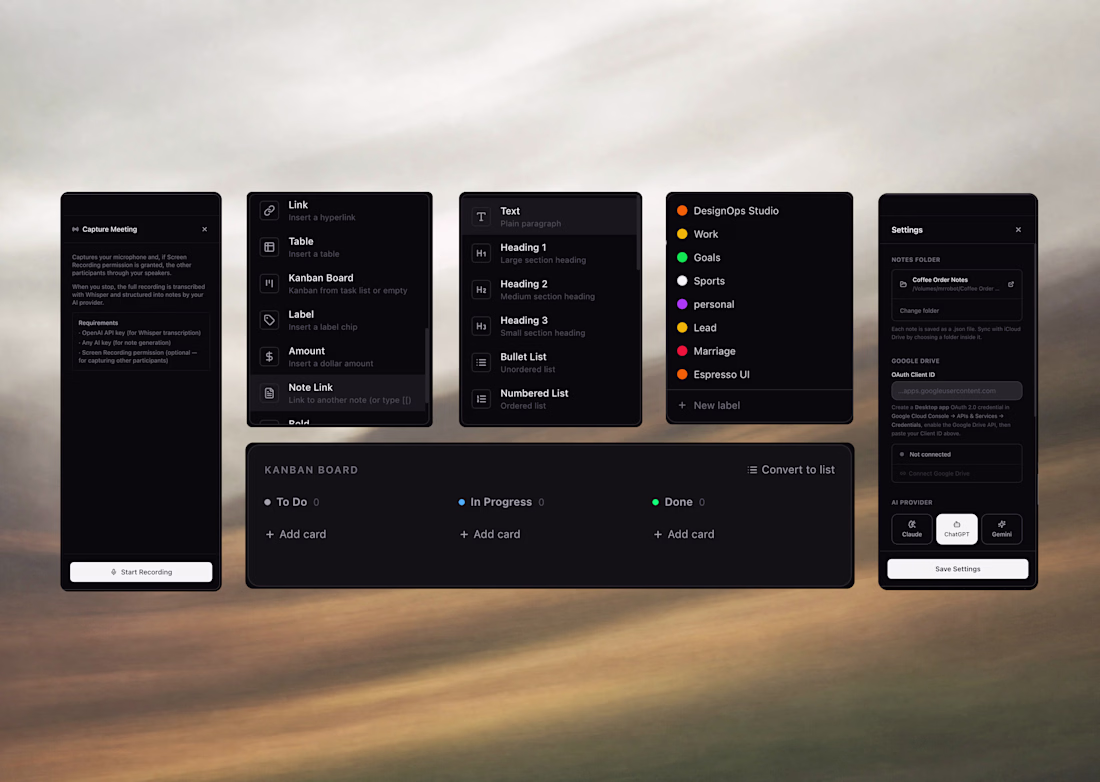
The kanban and note components blending into that warm blurred background instead of a flat panel is a nice touch, feels more native to macOS than most Figma-to-app kits. Is Coffee Order shipping as an actual Mac app, or is this staying a design system exploration for now?

My first read was a "2," but staring longer it splits into two separate quotation-mark-like shapes stacked on each other. Was the ambiguity intentional from the brief, or did it emerge while you were exploring and you decided to keep it?
Trending
Claude
Claude has entered the design space. How are you using Claude Design?
Contra University
Learn from expert creatives how to earn more using next-gen AI tools.
fifaworldcup2026
The World Cup is here and the whole world's watching. How are you designing for the world stage?
creativeaiflow
Creative AI workflows are evolving. What tools do you use, and what are their strengths and weaknesses?
freelancerlife
Freelancer life is wins, pivots, and everything in between. What’s yours right now?