The network for creativity
Join 1.25M professional creatives like you
Connect with clients, get discovered, and run your business 100% commission-free
Creatives on Contra have earned over $150M and we are just getting started
Back to feedPost
Taste Test
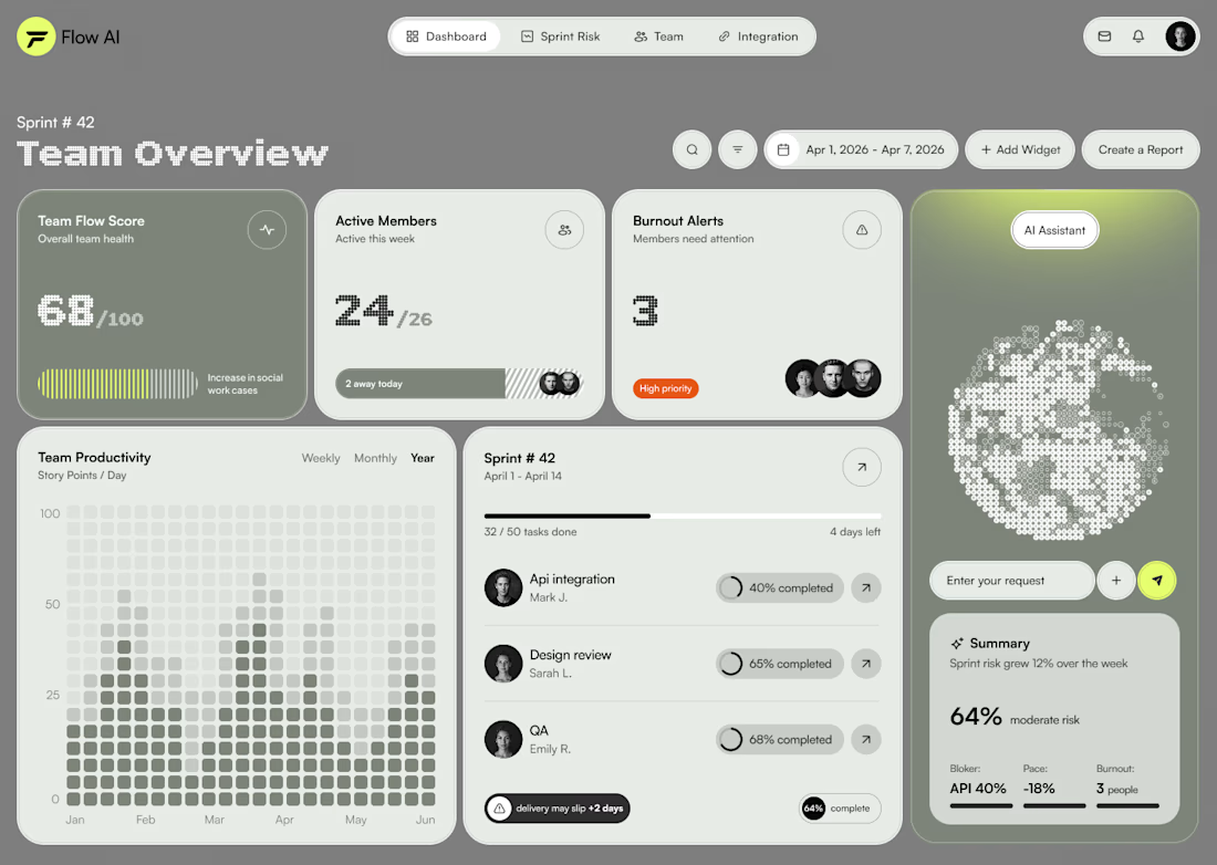
Testing two color directions for an AI sprint dashboard — which reads better at a glance?

21 voted
40%
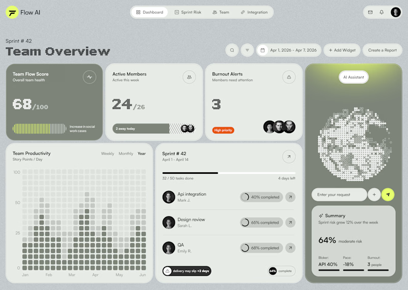
31 voted
60%
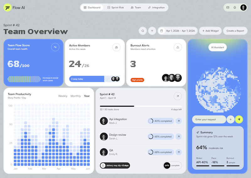
52 votes
Closed

Matcha for me. Also, the overall design looks really polished

Hi Murad,
Thanks a lot!❤️


Both looks good but I think you can do something better than those hehe

Both options are great but the Matcha option attract me more
I appreciate your opinion. Thanks!
It's my pleasure

huge fan of the matcha! far less expected & also carries a nice calm feel with it.

I would choose Blueberry because of its stronger contrast, clearer hierarchy, and more recognizable visual cues.

Blueberry looks better here, why dont you try the matcha version with a nice light shade of black with that green. I think it would look amazing here and see that green really pop how it should.
Thanks for the suggestion! I'll definitely try it
Update me, I want to check it out.
Something like this?

Blueberry


Decent design!

Well planned


Blueberry is better

I will pick Matcha 🙌

This feels modern, fresh, and polished!
Thanks!☺️

Went with Blueberry, the blue accent creates more contrast against the grey cards so the eye lands on the actual numbers faster. Matcha is nice but the green blends a bit too close to the neutral grey background for a glance test.
Totally agree with you!

I think BlueBerry

Blueberry ( Blueish Platte ) appears to be over used these days. Definitely Matcha.

Blueberry looks better, matcha color feels outdated

Probably I'm biased, not really a matcha fan, so I'd definitely go with blueberry :D

Blue definitely stands out more. The contrast draws your eyes straight to the main data cards. Have you tested how both look in dark mode yet?
No, thanks for the recommendation. I'll try

blue

Matcha🔥

The noise texture feels more cohesive with the Matcha to me


Fantastic work! Wishing you continued success.
Thanks a lot!🫶

Matcha is better

Blueberry reads faster for me: the blue separates cleanly from the neutral greys so the numbers and charts pop, while the matcha olive sits too close to the background and muddies the productivity heatmap. Blue also keeps green free to mean status, which matters on a dashboard where green usually reads as on track.
Thanks for your opinion!


i prefer the blueberry
The network for creativity
Join 1.25M professional creatives like you
Connect with clients, get discovered, and run your business 100% commission-free
Creatives on Contra have earned over $150M and we are just getting started

Challenges
View all


Related posts


Which 404 page design for a world-class film production studio would you choose - Pink or Black? ✨👠
404pagecreativedesignfashionwebsiteCreative Design Frontend DevelopmentWeb DesignFigmaJavaScriptWebflow


31 voted
40%
46 voted
60%
77 votes
Closed

Black version looks more editorial, tho the pink one is rly eye-catching

A quick taste test.
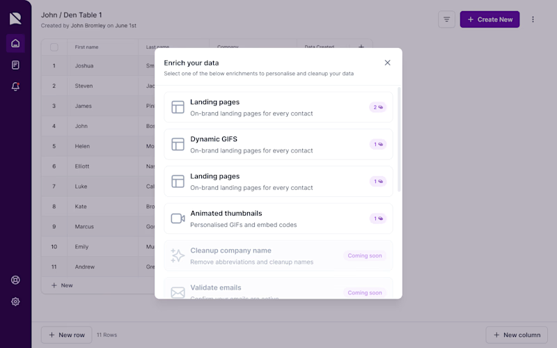
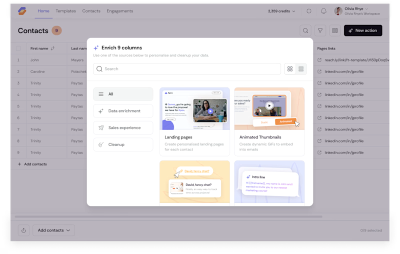
I rebuilt this enrichment picker to scale from 6 flat rows to 40+ options without slowing anyone down spot what changed beyond the coat of paint. Icons replace credit counters so people scan by type, not by a number that means nothing until you click in. A search bar shows up because a list that works at nine choices breaks at forty. Tabs split by intent (Data enrichment, Sales experience, Cleanup) instead of dumping everything into one scroll, and the cards carry a visual preview instead of a text label, so you know what you're picking before you commit credits to it.
Nothing here is decoration. Every pixel is doing a job.
What's the first difference you caught?
3 voted
16%
16 voted
84%
19 votes
Closed

after..


Marigold is a one day concept for envato's human by design challenge. i set the direction in real photography first then generated against that standard.