The network for creativity
Join 1.25M professional creatives like you
Connect with clients, get discovered, and run your business 100% commission-free
Creatives on Contra have earned over $150M and we are just getting started
Back to feedPost
Taste Test
A quick taste test.
I rebuilt this enrichment picker to scale from 6 flat rows to 40+ options without slowing anyone down spot what changed beyond the coat of paint. Icons replace credit counters so people scan by type, not by a number that means nothing until you click in. A search bar shows up because a list that works at nine choices breaks at forty. Tabs split by intent (Data enrichment, Sales experience, Cleanup) instead of dumping everything into one scroll, and the cards carry a visual preview instead of a text label, so you know what you're picking before you commit credits to it.
Nothing here is decoration. Every pixel is doing a job.
What's the first difference you caught?
3 voted
16%
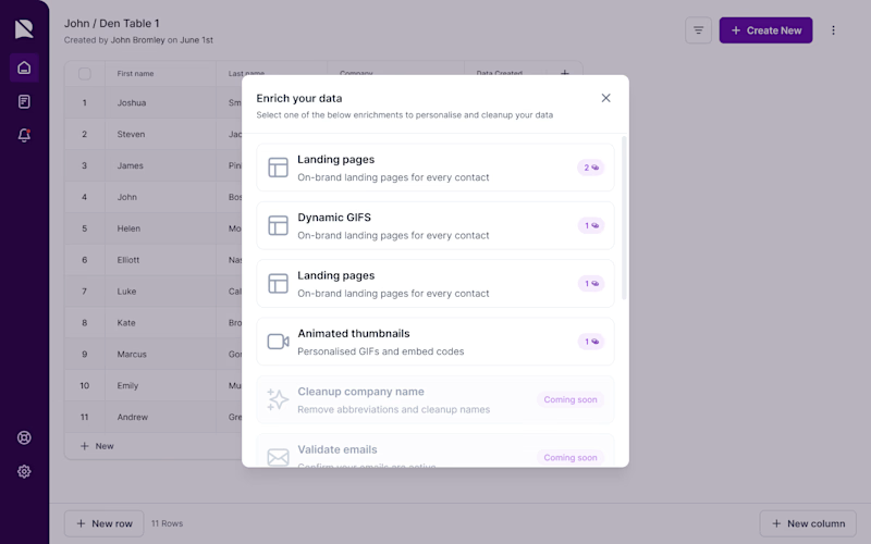
16 voted
84%
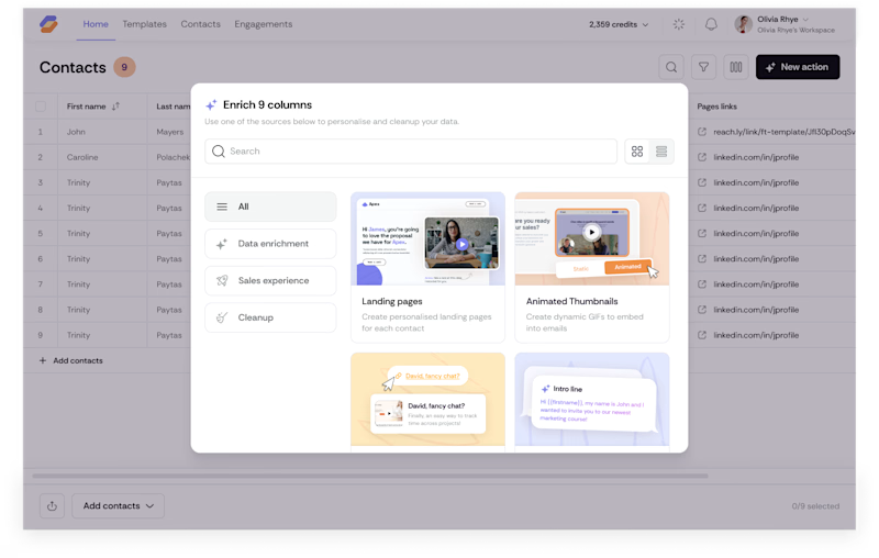
19 votes
Closed

after! that pop of color, even if shades are light, makes it feel so much less stale.

Thank you, Nicolette, that's exactly the point of a small color pop: it doesn't need to be bold to shift the whole feel from static to alive.

The intent-based grouping is doing a lot of work hereespecially the visual preview before committing credits. That’s a thoughtful way to make a dense enrichment flow feel scannable.
Thank you, Rohan, glad the design read that way.
It was exactly my aim.


After is way better! 🐐✨
Thank you!

after..
thank you...

Could you, please, share which pros led you to vote for this option?

no doubts, "After" 🔥
🙌

Swapping the credit counters for icons is the part that actually solves the scaling problem, a number only means something once you've memorized it, an icon doesn't ask you to. Did the 40+ option version need grouping or search to stay usable, or does scanning by type handle it on its own?
Icons handle recognition, but recall still needs a shortcut at 40+ options, someone who already knows what they want shouldn't have to scan visually for it. That's what the search bar is for: browsing by type covers discovery, search covers direct retrieval. The tabs then narrow...

Voted After. The tabs by intent make the biggest difference for scale.
Thank you, nice to see support of my vision

The search + intent-based tabs were the first things I noticed. Love how every change here seems to reduce decision fatigue rather than just make the UI look cleaner.
Thanks that's exactly the intent behind it. Search and tabs both exist to cut the search space before someone even starts scanning, so the decision fatigue drops before they see a single card. The icons and previews then do the same job at the individual-item level, telling you...

Previews! Those look cool!
🙌 thank you
The network for creativity
Join 1.25M professional creatives like you
Connect with clients, get discovered, and run your business 100% commission-free
Creatives on Contra have earned over $150M and we are just getting started





Related posts

Two color directions for an AI governance explainer. A draft AI use policy becoming the questions nobody can answer yet.
20 voted
77%
6 voted
23%
26 votes
Closed

blue for sure 💯


Which one would you brand the bakery on?
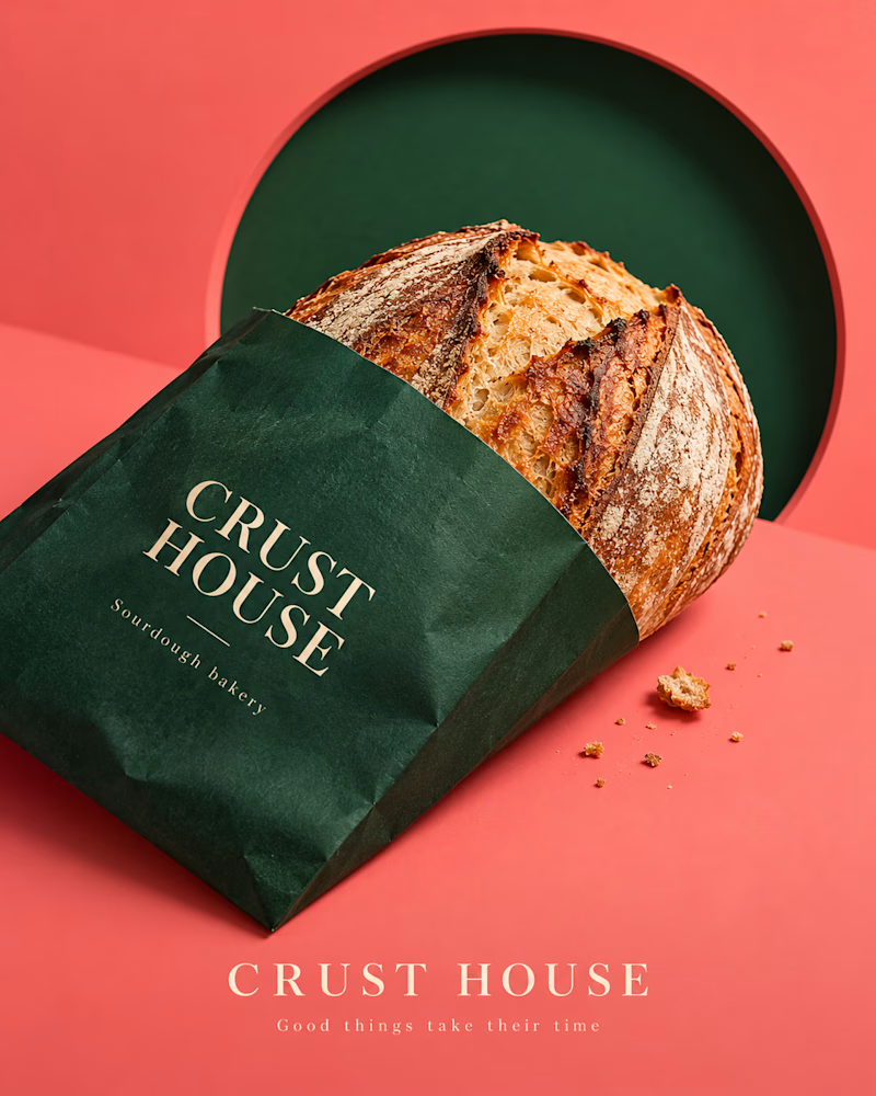
The first is a forest green bag on coral, the loaf tipped out of it, a dark green disc behind, crumbs scattered on the surface, fine serif in cream.
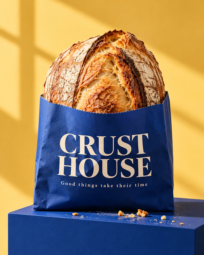
The second stands upright, a cobalt bag on a cobalt block against yellow, the loaf rising out of the top, window light across the wall, crumbs at the base.
One sells the loaf. The other sells the shop.
👇 #packagingdesign #brandconcept #foodphotography
3 voted
33%
6 voted
67%
9 votes
Closed
window


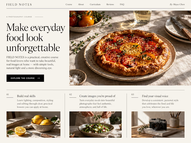
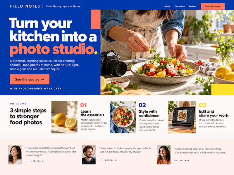
Which Kajabi sales page design would you choose for this course? Vote for A or B and tell me what made the difference.

23 voted
50%
23 voted
50%
46 votes
Closed

B still could be polished though...maybe try giving the text section little bit more real estate..I don't know