The network for creativity
Join 1.25M professional creatives like you
Connect with clients, get discovered, and run your business 100% commission-free
Creatives on Contra have earned over $150M and we are just getting started
Back to feedPost
Taste Test
Which 404 page design for a world-class film production studio would you choose - Pink or Black? ✨👠
404pagecreativedesignfashionwebsiteCreative Design Frontend DevelopmentWeb DesignFigmaJavaScriptWebflow


31 voted
40%
46 voted
60%
77 votes
Closed

I love the boldness of the pink version, it really catches attention 🔥🔥🐐


Tysm, Antonio! It's really bold and unapologetic 👠🔥

Black version looks more editorial, tho the pink one is rly eye-catching
Thanks for your vote ✨

The black version reads more editorial to me too—the restrained palette gives the type and image treatment a sharper, more cinematic hierarchy.
That's interesting, thanks for your vote 🔥🚀

The pink version..Straightforward please
We appreciate your vote, Damilola 🔥🐐
The black version has such a confident editorial tension—those oversized type fragments make the 404 feel like part of the film world, not an afterthought. I love how clearly the two moods separate.

Black anytime anyway

Pink version , I don't really know what's going on in the black frame ,clarity first always

Your opinion means a lot to us ✨

I think the black 3D cylindrical perspective text effect will work best for the film production studio. what do you think?

Both looks great

I don't know but this pink one would have been better, just the color I think

Honestly, both are top-tier. If the studio leans towards thrillers or sci-fi, the black version is flawless. But if they produce fashion-forward or high-energy films, that pink is undeniably eye-catching. Great work on both directions.


Black

Pink isn't cutting corners, it's just straight to understand.


black is good from ux perspective

Black Version. "Wrong script right studio" and the clapperboard framing feel authentic to film production. The pink version looks good but reads more like high fashion editorial than film production.
Makes sense, thanks for your vote 🔥🚀

Pink version for me 😍

The pink version is bold but the black version is kinda too much

the black wins

The pink one. An error page should look like one at first glance. The bold color, distortion, and interaction is already making it feel much more relevant to a film production brand 🙌
Sounds interesting 🙌🚀


black. wrong script right studio is a proper film joke for a 404

Easily the black. I like the playfulness of the design.

Pink one
🚀🔥


Black Version for me. It feels more premium and fits the film production vibe better. The contrast makes the design stand out more.
Tysm, Kabir 🐐🔥

Black Version

It looks luxurious🔥

Black one to me, but not because of color, but distortion effect - it's so eye-catching!
Thanks, Kate!

The network for creativity
Join 1.25M professional creatives like you
Connect with clients, get discovered, and run your business 100% commission-free
Creatives on Contra have earned over $150M and we are just getting started





Related posts


Sharing a few recent projects 👋
It has been an exciting few months! A good mix of industries in this one, from an arcade and a mini golf hire company to car inspections and hospitality.
Excited to see what the rest of the year brings!


I should try adding blur also when slide goes back or a 0.1 delay in upcoming one,
the mid transition phase is bothering me


Bringing 200+ integrations, workflows and AI agents together in one clean, animated experience. We'd love to hear your thoughts!


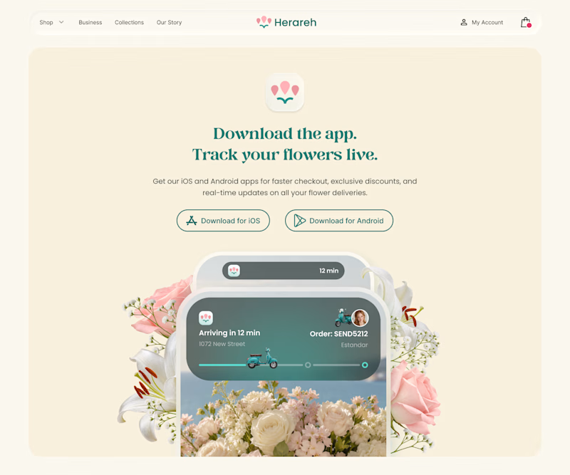
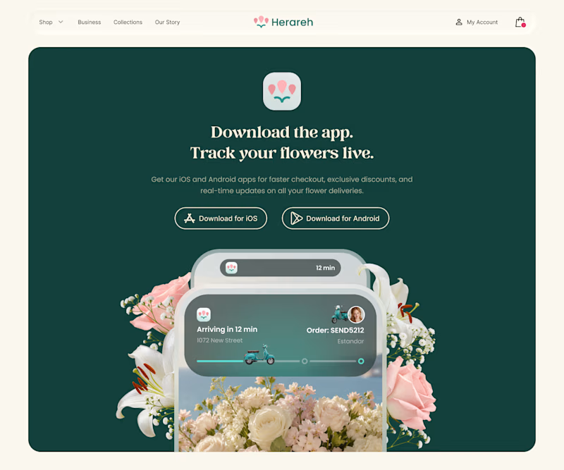
Which version makes you want to download the app? 🌸
I’m exploring two color directions for Herareh’s app download section. Vote A or B and tell me why—I’d love your perspective!
4 voted
24%
13 voted
76%
17 votes
Closed

deep green feels so lovely, good work


