The network for creativity
Join 1.25M professional creatives like you
Connect with clients, get discovered, and run your business 100% commission-free
Creatives on Contra have earned over $150M and we are just getting started
Back to feedPost
Taste Test

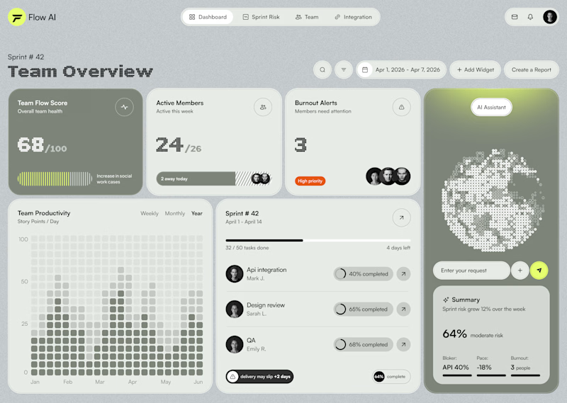
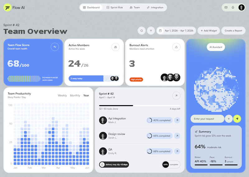
Testing two color directions for an AI sprint dashboard — which reads better at a glance?

16 votes
Ends in 1d

I would choose Blueberry because of its stronger contrast, clearer hierarchy, and more recognizable visual cues.

Matcha for me. Also, the overall design looks really polished
Hi Murad,
Thanks a lot!❤️

Super work
Thanks!


Both looks good but I think you can do something better than those hehe

Both options are great but the Matcha option attract me more
I appreciate your opinion. Thanks!
It's my pleasure

huge fan of the matcha! far less expected & also carries a nice calm feel with it.

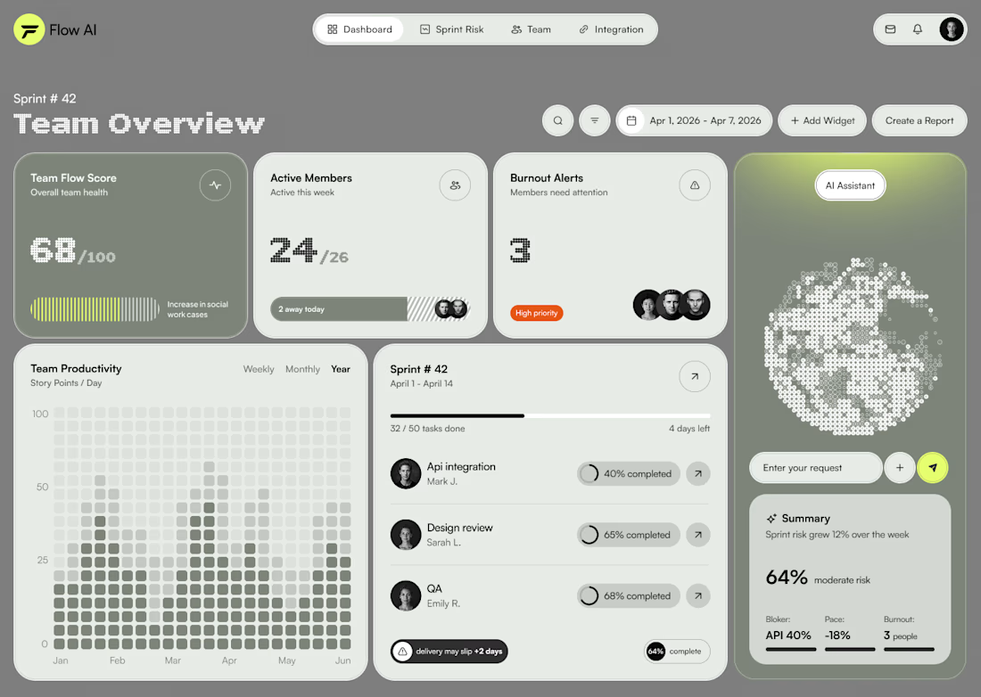
Blueberry looks better here, why dont you try the matcha version with a nice light shade of black with that green. I think it would look amazing here and see that green really pop how it should.
Thanks for the suggestion! I'll definitely try it
Update me, I want to check it out.
Something like this?

Blueberry

The network for creativity
Join 1.25M professional creatives like you
Connect with clients, get discovered, and run your business 100% commission-free
Creatives on Contra have earned over $150M and we are just getting started
Trending

Claude
Claude has entered the design space. How are you using it?

Contra University
Learn from expert creatives how to earn more using next-gen AI tools.
Brand Design
The best brand designers are on Contra. Scroll to see what's trending in brand design. What are you building?
creativeaiflow
Creative AI workflows are evolving. What tools do you use, and what are their strengths and weaknesses?
freelancerlife
Freelancer life is wins, pivots, and everything in between. What’s yours right now?



Related posts

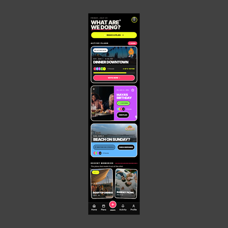
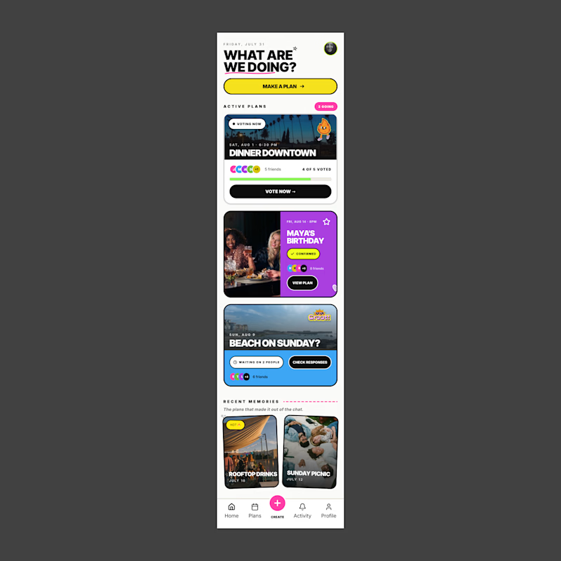
I’m exploring two visual directions for Together, an app concept for the Flowstep challenge focused on helping friends make plans, vote, and keep track of what’s coming up.
For this comparison, I wanted to test how much the overall visual theme changes the feel of the product.
The dark version feels bolder, more energetic, and more nightlife-driven.
The light version feels cleaner, more approachable, and easier to scan.
Dark mode: bold, social, energetic
Light mode: clean, friendly, approachable
Since this app is all about making plans with friends, the visual direction needs to feel fun without becoming overwhelming.
Which version feels stronger for a social planning app?
6 voted
55%
5 voted
45%
11 votes
Closed

Cause of my habits… dark mood for me always

If you had to choose one option to present your brand without actually talking to the users, what would you choose?
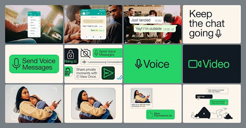
Lately, I've been pushing myself to explore what's possible with Figma Motion and see just how far I can take animations without leaving Figma.
I recently came across a really smooth WhatsApp animation and thought, why not recreate it? So I challenged myself to build it from scratch, paying close attention to the timing, easing, and micro-interactions.
It's been a fun way to learn, experiment, and sharpen my motion design skills.
How do you think it turned out? 👀
I'd love to hear your feedback!
23 voted
79%
6 voted
21%
29 votes
Closed

Animated visuals makes the user stay, while static will not attract much

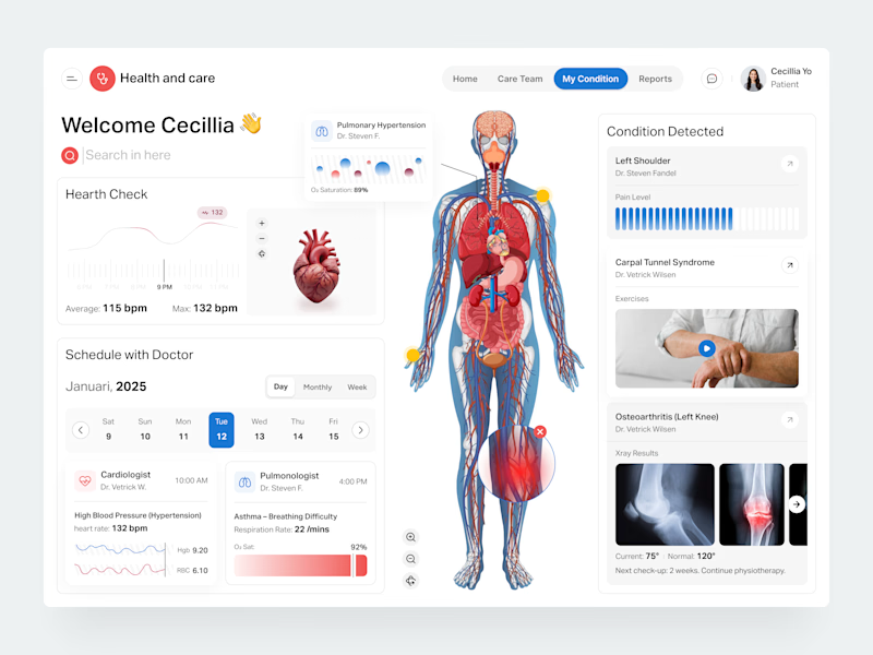
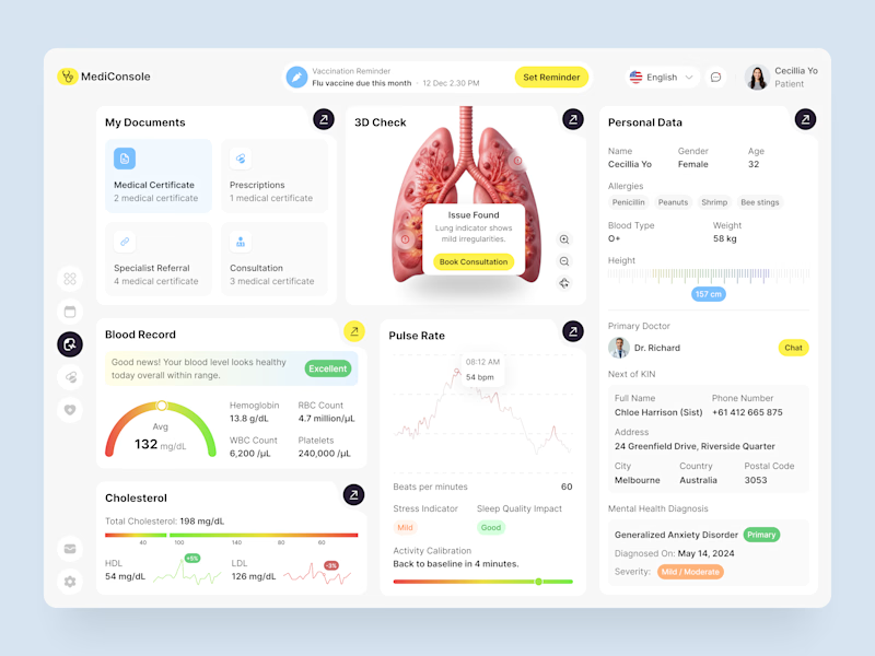
I've been exploring healthcare product design recently, and these are my top 2 healthcare dashboard concepts.
Which dashboard is your favorite: Option A or Option B? Why?
2 voted
33%
4 voted
67%
6 votes
Closed

Incredible work!