The network for creativity
Join 1.25M professional creatives like you
Connect with clients, get discovered, and run your business 100% commission-free
Creatives on Contra have earned over $150M and we are just getting started
Back to feedPost
Taste Test

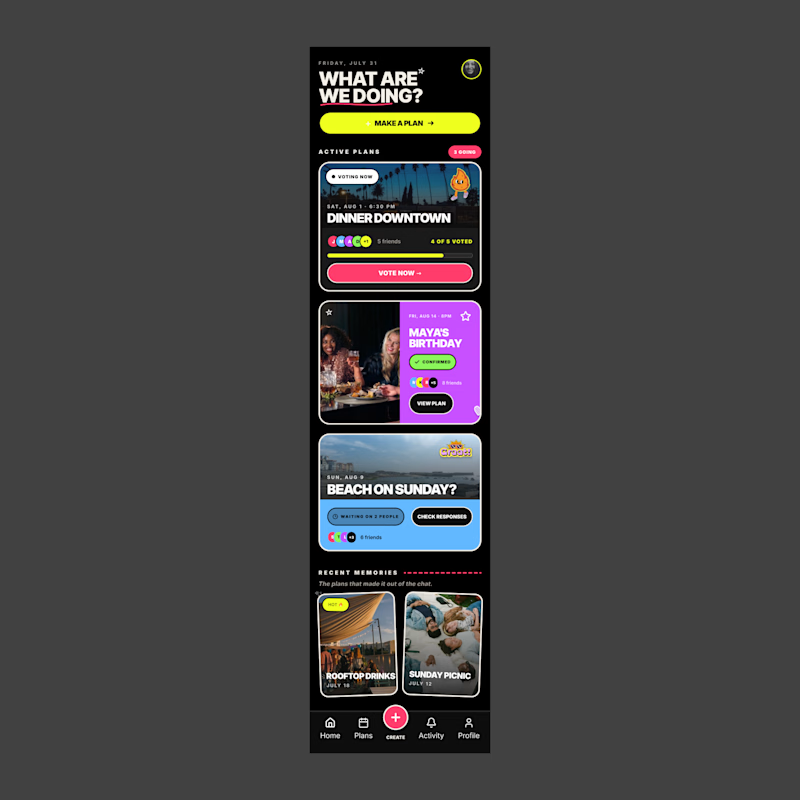
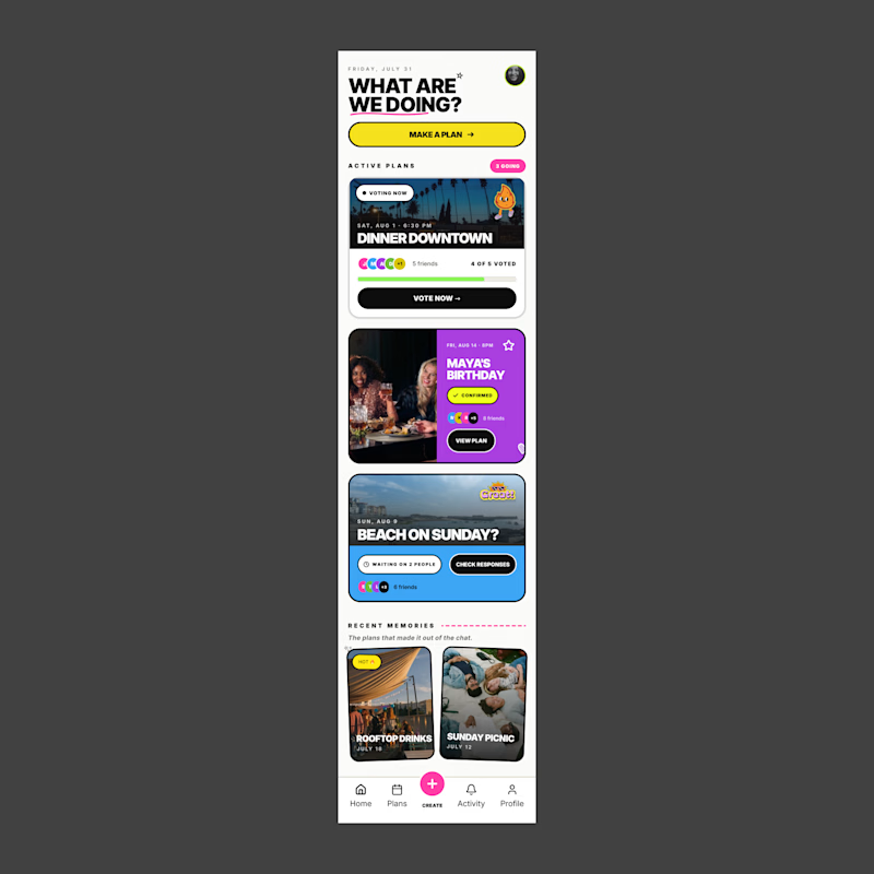
I’m exploring two visual directions for Together, an app concept for the Flowstep challenge focused on helping friends make plans, vote, and keep track of what’s coming up.
For this comparison, I wanted to test how much the overall visual theme changes the feel of the product.
The dark version feels bolder, more energetic, and more nightlife-driven.
The light version feels cleaner, more approachable, and easier to scan.
Dark mode: bold, social, energetic
Light mode: clean, friendly, approachable
Since this app is all about making plans with friends, the visual direction needs to feel fun without becoming overwhelming.
Which version feels stronger for a social planning app?

6 voted
55%
5 voted
45%
11 votes
Closed


Nice design !
Thank you, I appreciate that!

I prefer dark theme
I do too

Cause of my habits… dark mood for me always
really what are your habits 😅
The network for creativity
Join 1.25M professional creatives like you
Connect with clients, get discovered, and run your business 100% commission-free
Creatives on Contra have earned over $150M and we are just getting started

Challenges
View all


Related posts

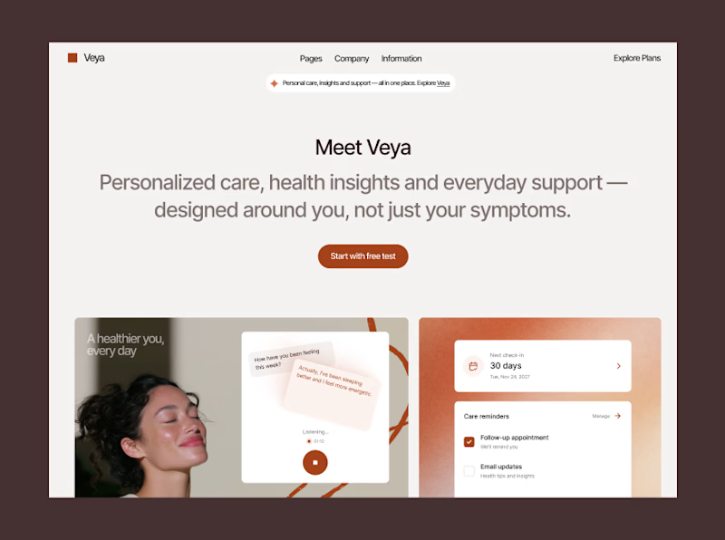
Two different audiences, two different directions,
which one are you into?
58 voted
48%
64 voted
52%
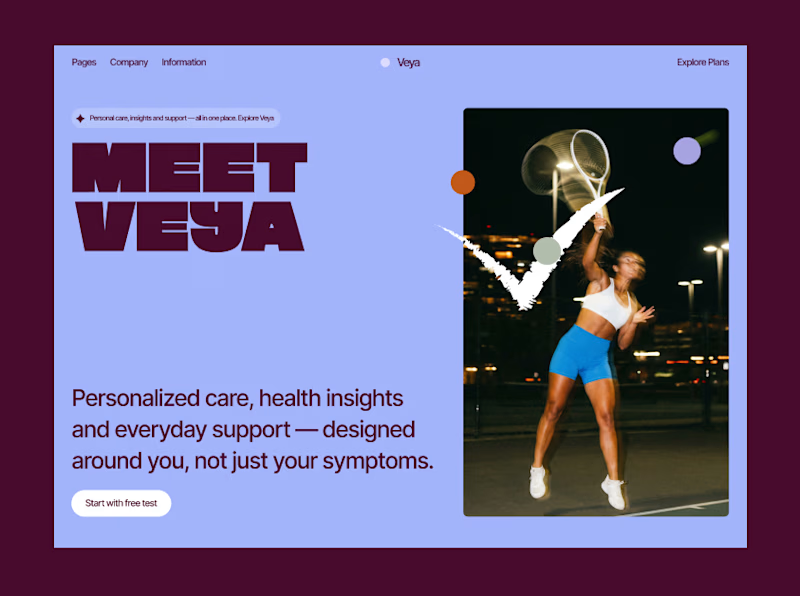
122 votes
Closed

Amazing designs 😊

Fintech app home dashboard design
A mobile wallet app concept focused on everyday money management: checking your balance, sending money to people you pay often, and keeping an eye on recent transactions all from one home screen.
The layout keeps the essentials up top (balance, quick actions like Top Up, Send, Request) and moves frequent contacts and transaction history below, so the most-used actions stay within reach without extra taps.
This version tests a gradient treatment on the balance card to see if it helps the total stand out against the rest of the screen, versus a flatter, neutral card.
Would love to hear which balance card style feels more natural to use day to day.
3 voted
33%
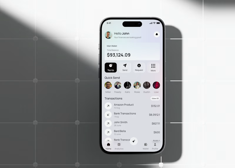
6 voted
67%
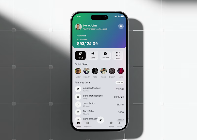
9 votes
Closed

the gradient is cool


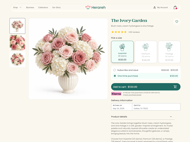
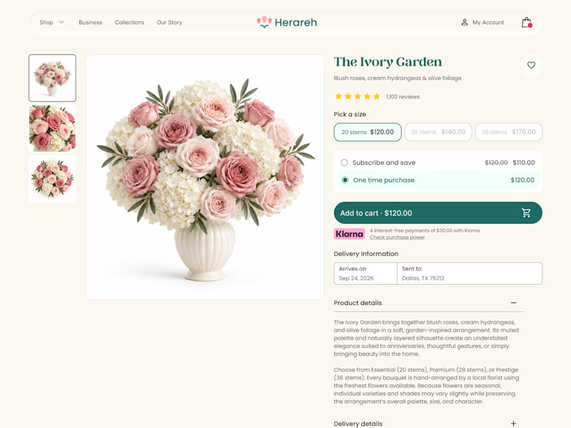

Icon cards for me, bouquets are such a visual purchase that a scannable icon beats reading "small/medium/large" every time. Did the compact chips version convert worse in testing, or are you still gathering data on that?