The network for creativity
Join 1.25M professional creatives like you
Connect with clients, get discovered, and run your business 100% commission-free
Creatives on Contra have earned over $150M and we are just getting started
Back to feedPost
Taste Test


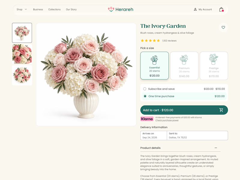
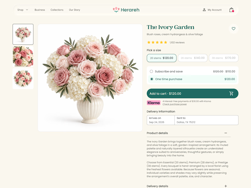

Icon cards for me. The little bouquet illustrations make the size choice easier to scan than the chips.
Thanks! I’m glad the bouquet illustrations made the size options easier to scan. That was the main goal behind this version.

Icon cards read faster at a glance, but chips scale better once you go past 4-5 sizes - card grids get cramped on mobile fast. If bouquet sizes stay in the S/M/L/XL range, icon cards win. If you'll likely add more (single-stem, seasonal, XXL), chips keep the layout stable and are easier to tap accurately on a phone.
Great point. For now, the experience will only have three size options, so the icon cards should remain manageable, even on mobile. But if the range grows, compact chips would definitely scale better. Thanks for the thoughtful feedback!

i think i con cards are easy to handle.
Thank you! I’m glad the icon cards felt easy to understand and interact with


the flower cards make picking easy. nice test
Thanks! That’s exactly what I was aiming for making the size selection feel quicker and easier

the icon cards are so cute, i've never seen anything really like it! those have my vote, hands down.
Thank you! I wanted the size selector to feel distinctive and add a little personality without making the choice harder. I’m glad it worked for you

Thanks for your vote! The compact chips definitely keep the interface cleaner and save more space, especially on smaller screens

Icon cards for me, bouquets are such a visual purchase that a scannable icon beats reading "small/medium/large" every time. Did the compact chips version convert worse in testing, or are you still gathering data on that?
Still gathering feedback for now, I haven’t tested conversion yet. This was more of a quick preference test, but I agree: since bouquets are so visual, the icons may make the choice feel more intuitive


compact chips for me
Thanks, @Nazar Koliano I can see the appeal the chips keep everything simple and compact

Icon card better clarity and easier to choose
Thanks, @Seemak Iqbal Agreed, clarity makes all the difference. Please follow me for more UX tests!

Icons always help the users imagine what they will get. It will help the business to convert more users to customers
Spot on, @Mohamed SF Visuals definitely boost conversion. Please follow my profile so you don't miss the next test!

Icon cards give user a pictorial illustration of the difference between the options provided for purchase

Icon cards won 79% here, and the real reason is probably that they double as a size preview — the shopper compares stem count visually before reading a label, which a text chip can't do.
Great breakdown, @Mark Barliet! Spotting the stem count visually before reading is a huge win. Please follow along for more UX breakdowns!

Honestly, the design looks a bit busy, and about the bouquet cards, I can say that although the first one is easy to scan and choose for the user, it takes too much space. The second one is more clear and saves more space, especially when the user opens this interface through the phone.
The network for creativity
Join 1.25M professional creatives like you
Connect with clients, get discovered, and run your business 100% commission-free
Creatives on Contra have earned over $150M and we are just getting started





Related posts


Twenty-five years of credits, finally on a website that looks the part.
Just take a look at what kind of web we create ✨👇
Reflection of the brand history with taste, precision, and premium branding.
Scroll responsibly: https://productionportugal.com 😉🔥


Wow! Nice setup 🎥

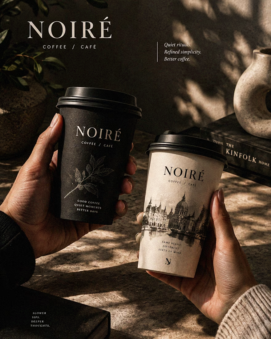
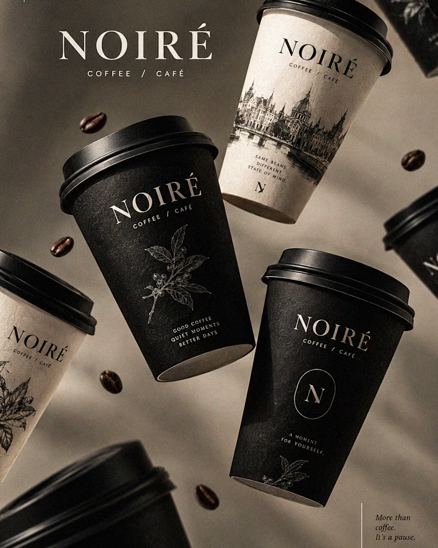
I Just Created NOIRÉ 🔥
A Coffee Brand Built Around the Pause.
NOIRÉ is a premium café brand built around a simple idea:
Great coffee should feel like a moment of pause, not another part of the
routine.
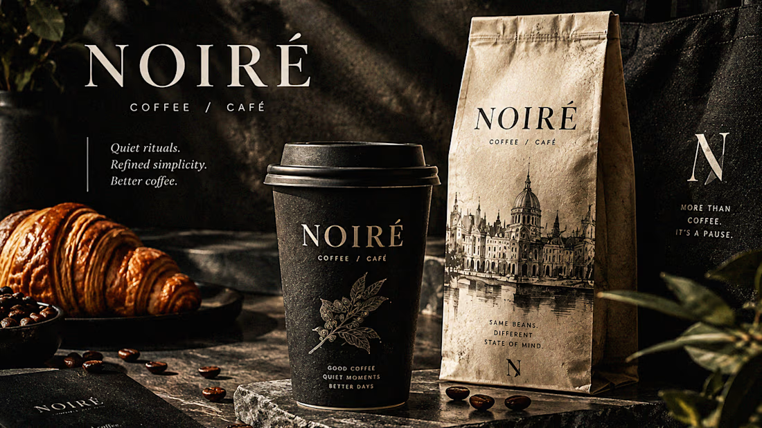
The project explores a complete visual identity, packaging
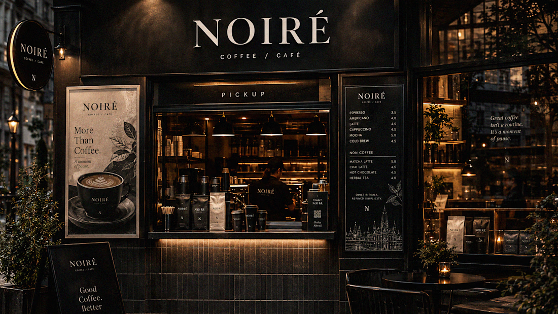
system, takeaway cups, coffee bags, tote bags, menu design, café applications and lifestyle campaign direction.
Instead of relying on the usual loud coffee aesthetics, I
built NOIRÉ around deep charcoal, warm ivory, soft graphite, refined
typography, subtle botanical illustrations and quiet editorial compositions.
The visual language is intentionally dark, tactile, and understated - giving every touchpoint the feeling of a slow morning, a quiet table, and coffee worth taking your time with.
From the cup in your hand to the café around you, every detail was designed to make the brand feel like a ritual.
Waiting for your thoughts in the comments 🙌🔥
branddesignertastetestBrand DesignGraphic DesignPackaging DesignAdobe IllustratorAdobe InDesignAdobe Photoshop




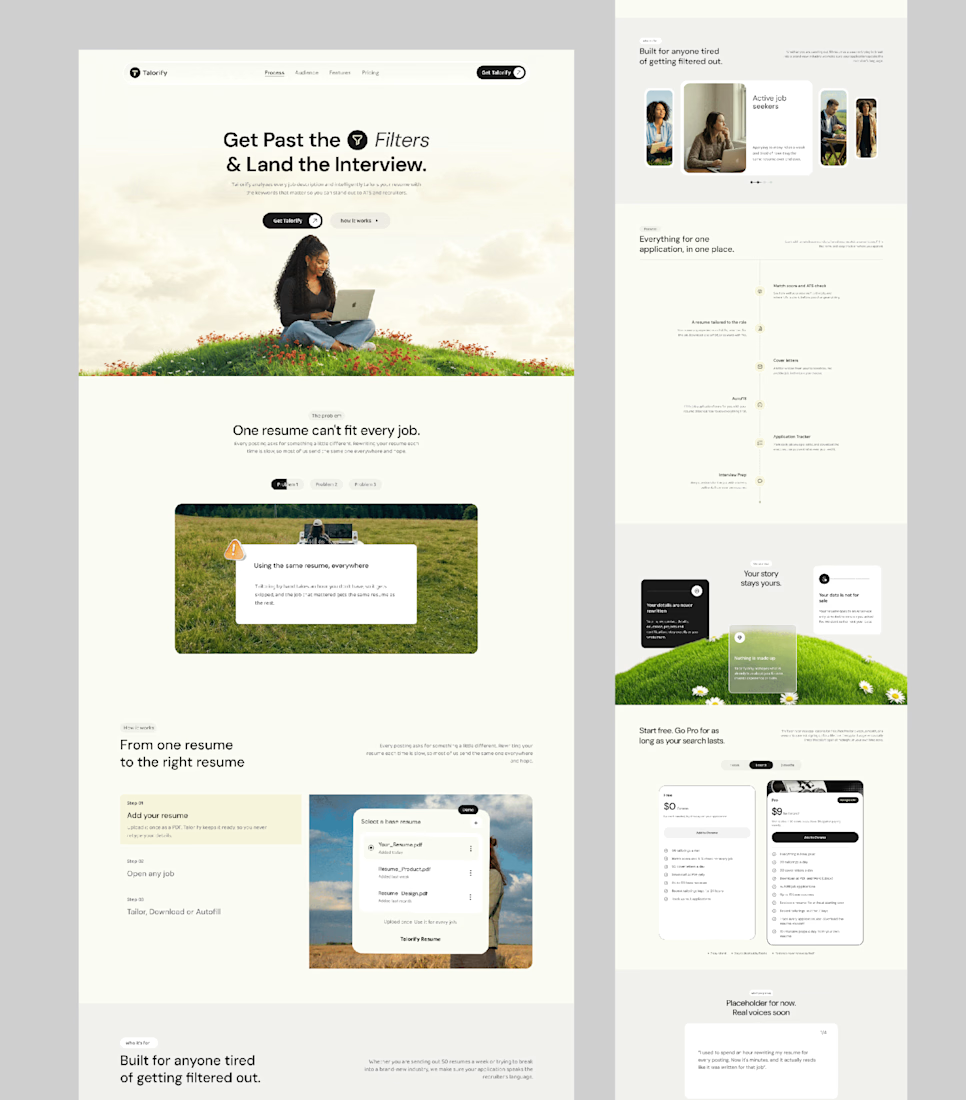
Talorify requested a high-converting landing page. Guess what?
Delivered the full design and development.
A high-converting landing page has one primary job, And this one is basically saying:
“Please get me from the store.” 🔥
Don’t overload your landing page with buttons that confuse your users. Give them one clear direction and make it easy to take action.
Check it out and tell me:
Would you call this design premium?
Hi, I’m Emmanuel Bliss, Product Designer (UI/UX).I bring clarity to what already exists and what is yet to exist.
Checkout the Live HERE


Definitely premium. Did they measure if this new design actually brought in more sign-ups and conversions compared to before?