The network for creativity
Join 1.25M professional creatives like you
Connect with clients, get discovered, and run your business 100% commission-free
Creatives on Contra have earned over $150M and we are just getting started
Back to feedPost
Taste Test
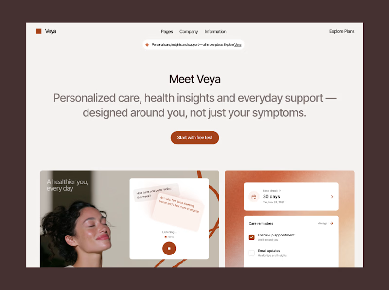
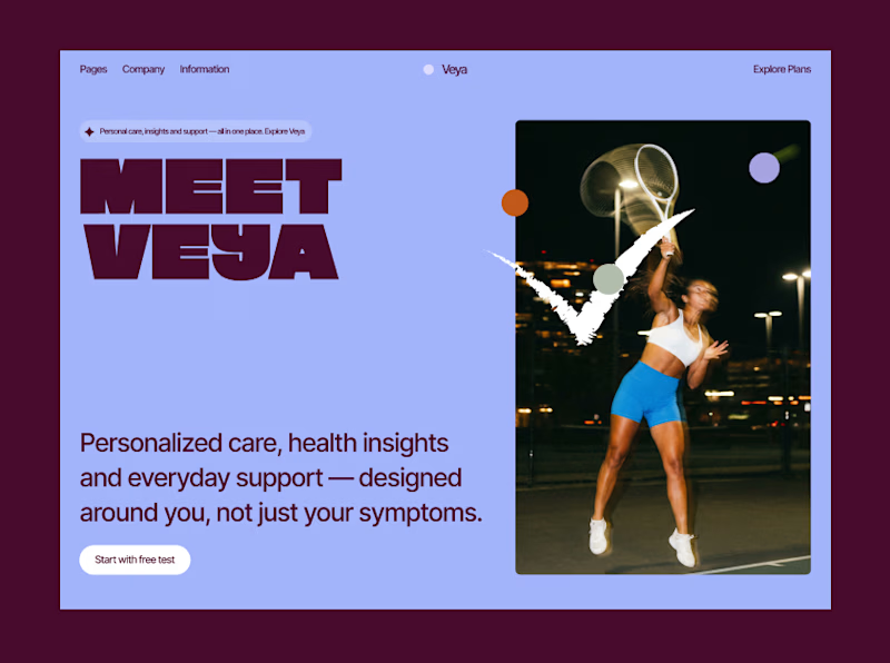
Two different audiences, two different directions,
which one are you into?
58 voted
48%
64 voted
52%
122 votes
Closed

both are great..

Thank you so much! 🔥

Version 2 immediately grabs me, that purple is so much more alive. Was the health/wellness angle in version 1 tested with real users, or is this purely a gut call before you commit?
The difference in target audience, second is younger, active sport life

The split between the two directions makes the design decision tangible—both routes feel intentional, and the visual contrast makes the choice easy to compare.
Yep, agree, changing composition for design direction isn`t enough!

Amazing designs 😊
Thank you so much! 😊

They’re both amazing!
Thank you! 🔥

i'm a huge fan of 2!
Thank you so much! 😊

yay! totally agree!🙌

Both are great, but I’d choose Version 1 is clean and more engaging. 😊
Interesting, thank you so much for voting 🔥

2 - Bold and Strong
Yep, totally different vibe!

Option 1 is minimalist, while Option 2 relies on massive typography. UI is somewhat subjective, but from a UX perspective, readability and direct access to case studies matter most.
yep, Option 1 is using standard Landing page flow. Opt 2 is more about storytelling and reveling the product gradually.


2 is awesome
Thank you so much 😊


I’d go with 2. It feels more focused and intentional, with a stronger visual hierarchy for the audience.
yep, agree! 🙌


I agree with the second direction. It breaks away from traditional health tech branding and speaks directly to a more active, modern demographic.

Lovely designs. I believe it depends on the direction intended. 💚

both are amazing, love for 1 more

Option 1 is better in this case IMO, healthy is a bit too important to be as playful as opt 2. Great job Helen!! 😍

Both look good!

Looks great!

Tbf the first one is probably the better decision, but goddamn I loove the second one.

I vote for 2 because it's so bold and beautiful. and 1 is clean and professional.

1st one got my vote

Going with 1. For a health product the warmth in the photography and the softer palette do more to earn trust than the bold sport energy of 2, even though 2 is the more striking layout on its own.

Both are strong but direction 2 hits differently. That bold typography with the dark background just pulls you in right away.

The minimal direction on the left hits different! Both concepts are executed so well Helen.

Love your design

Definitely leaning towards design that is more expressive nowadays.

Version 1 sells the outcome (you, mid-motion, winning) while version 2 sells the relationship (someone listening to you). For a health brand, that second promise is probably the harder sell to make credible, and the calmer layout is doing real work toward it.


Outstanding work !
The network for creativity
Join 1.25M professional creatives like you
Connect with clients, get discovered, and run your business 100% commission-free
Creatives on Contra have earned over $150M and we are just getting started





Related posts

Which hero visual feels right for this brand?
While working on the homepage for Halfspace, a website design and SEO agency, I explored two different hero visuals for the same headline and layout. Same message, same structure, just a different visual metaphor and mood.
Option 1 - Rocket Launch. Bold, literal, and energetic, visually reinforcing the "launch your business" message with motion and fire.
Option 2 - Glass Cube. Abstract, sleek, and premium, giving a more refined, tech-forward feel without relying on a literal metaphor.
Would love your honest UX/UI take, which direction feels more impactful, memorable, and aligned with a web design/SEO brand, and why?
11 voted
41%
16 voted
59%
27 votes
Closed

Both design are great; it's hard to choose one





Option B feels nothing but premium

Two cuts of the same Outlier promo. 24 seconds each, one framed wide, one framed for the phone. 1 or 2. Why?🤔
8 voted
50%
8 voted
50%
16 votes
Closed
Going with 2. Most people will watch it on their phone anyway and the tighter framing feels punchier. 1 looks more cinematic though.