The network for creativity
Join 1.25M professional creatives like you
Connect with clients, get discovered, and run your business 100% commission-free
Creatives on Contra have earned over $150M and we are just getting started
Back to feedPost
Taste Test
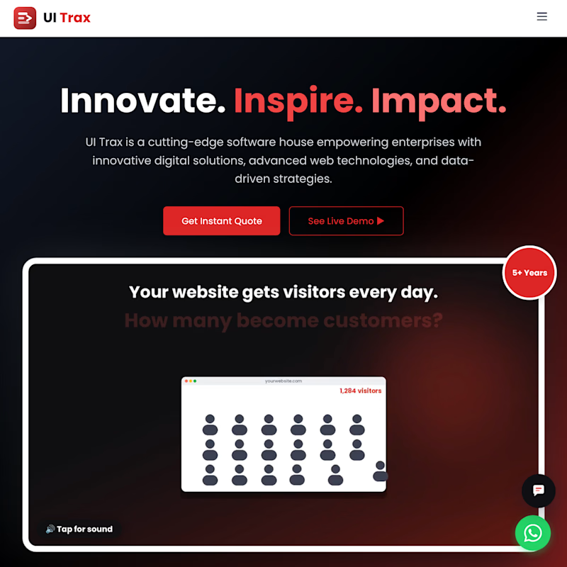
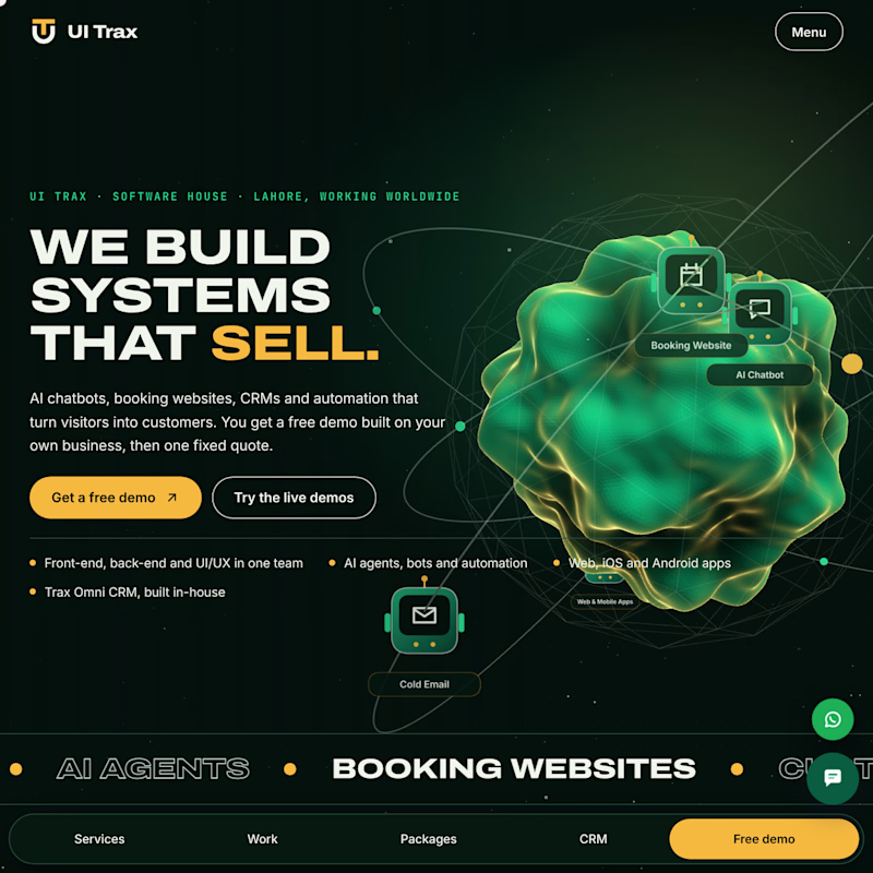
We rebuilt uitrax.com from scratch. Same company, same services. Which homepage would you trust with your project, and why? Your vote decides which style we use for our next client build.
7 votes
Ends in 1d


Thanks Amna. Clarity is what I’d bet on too: the first screen now says what we build, and the votes so far seem to agree.

After for me, the 3D blob grabs you right away 🟢 And the headline says what you do fast.
Thanks Moussa, really appreciate the vote. That was the goal with the first screen: the 3D core pulls the eye in and the headline says what we do before anyone has to scroll.

After — the 3D blob earns trust instantly.
Thanks. It's a real-time three.js mesh, and I kept the headline right next to it so the visual gets attention and the message lands in the same glance.

The "AFTER" Looks much better, much modern and much more interactive and actively passes the information about what you do at a glance
Thanks Anyadi, that's exactly what we were aiming for. The goal was for a visitor to understand what we do within the first screen, and for the page to feel alive while they do.
You did a great job on that
Thanks Anyadi, I appreciate it. It would help a lot if you shared this so more people can vote and tell us what they think.
The network for creativity
Join 1.25M professional creatives like you
Connect with clients, get discovered, and run your business 100% commission-free
Creatives on Contra have earned over $150M and we are just getting started



Related posts


So interactive

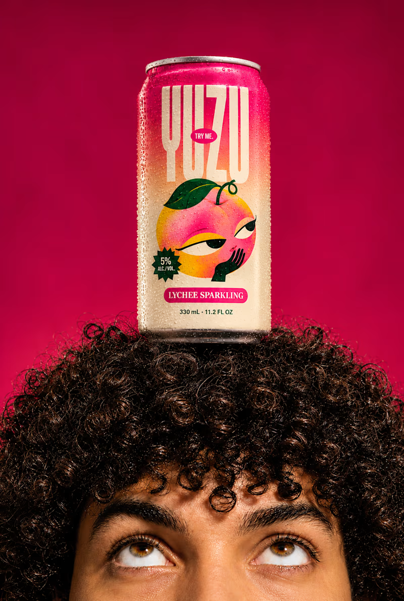
YUZU Flavor Face-Off — Which One Wins?
39 voted
48%

43 voted
52%
82 votes
Closed

Fresh & Bold gets my vote. That deep red makes the can impossible to miss, and the design lets the product do the talking instead of the lifestyle shot around it. Sweet & Playful is lovely photography, but on a shelf I think the red one is the one you'd actually pick up first.

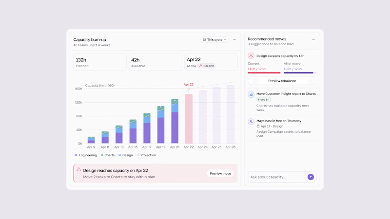
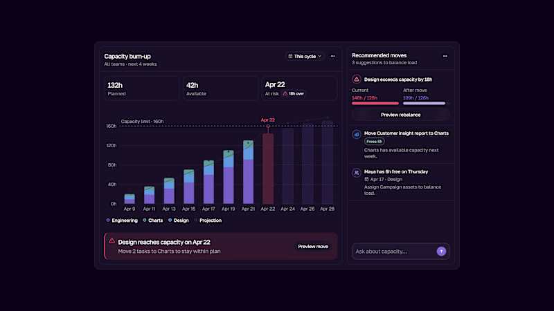
Capacity burn-up UI.
Track team workload, spot capacity risks early, and rebalance work before teams get overloaded.
Light & Dark modes.

2 voted
33%
4 voted
67%
6 votes
Closed
This is the kind of dashboard that actually gets used — the burn-up chart makes overload visible at a glance instead of hiding it in a table somewhere. I like that the point is spotting the risk early, not just reporting it after the fact. Both modes read well, though the dark one makes the chart pop a bit more for me.