The network for creativity
Join 1.25M professional creatives like you
Connect with clients, get discovered, and run your business 100% commission-free
Creatives on Contra have earned over $150M and we are just getting started
Back to feedPost
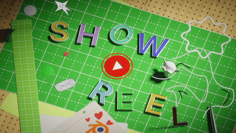
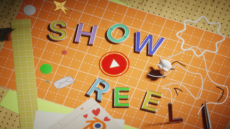
Taste Test

Same frame
Same scene,
Two different takes on color.
Which one looks better? Your call.
No AI used.
3 votes
Ends in 1d

Green for me. The red play button is the hero of the frame, and on green it's sitting on its complement so it pops. On the orange board it starts blending into the warm tones. The orange does make the pastel letters feel softer though, so maybe it suits a calmer ending shot?

Green — it feels calmer and more cinematic.
The network for creativity
Join 1.25M professional creatives like you
Connect with clients, get discovered, and run your business 100% commission-free
Creatives on Contra have earned over $150M and we are just getting started



Related posts

working on a case study for my latest project - brand identity for Coral Pay.
need your help choosing the best cover video for it:
35 voted
23%
118 voted
77%
153 votes
Closed

Lilac looks amazing with the 3D shining.

From the StarlightIQ promo. Hundreds of dots, one shape, no hard cuts anywhere. Can you see the difference?
12 voted
57%
9 voted
43%
21 votes
Closed

So smooth, I really can't spot a single cut. Going with 2 on this one.

Boyi (猼訑) · SHC-18/36 🐑 👁️✨
Which do you prefer — Foil Card 🃏 or 3D Render?


25 voted
54%
21 voted
46%
46 votes
Closed

Nice!