The network for creativity
Join 1.25M professional creatives like you
Connect with clients, get discovered, and run your business 100% commission-free
Creatives on Contra have earned over $150M and we are just getting started
Back to feedPost

A quick look through the landing page layout for WAct 👀
🔗 Explore the full case study on Behance: WAct on Behance
I believe most founders know the frustration of running paid ads that bring plenty of clicks, but zero qualified leads. The WAct team needed more than just a visually appealing layout, they needed a site that immediately explains how their platform connects ad spend to actual WhatsApp conversations.
What I focused on here:
Clear hero section: Addresses the pain point right away by showing how ad budget converts directly into real customer chats.
Logical flow: Guides the reader step-by-step from the main problem to key analytics, integrations, and the contact form without any fluff.
Approachable visual style: Combines warm editorial tones and sharp typography so complex B2B data feels straightforward and easy to digest.
For me, combining UI architecture with clean technical implementation is what transforms a site from a static showcase into a high-converting product tool.
I'm currently open to new project opportunities and collaborations. DM me if you have a project in mind!
UI DesignUX DesignWebflow DevelopmentAdobe PhotoshopFigmaWebflowwebsiterevampwebdeveloperwebdesigner


The network for creativity
Join 1.25M professional creatives like you
Connect with clients, get discovered, and run your business 100% commission-free
Creatives on Contra have earned over $150M and we are just getting started





Related posts


Twenty-five years of credits, finally on a website that looks the part.
Just take a look at what kind of web we create ✨👇
Reflection of the brand history with taste, precision, and premium branding.
Scroll responsibly: https://productionportugal.com 😉🔥


Wow! Nice setup 🎥

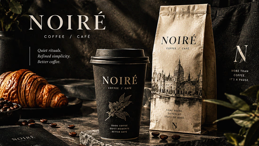
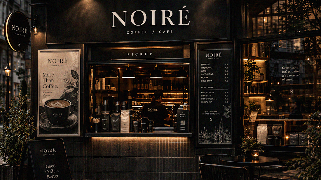
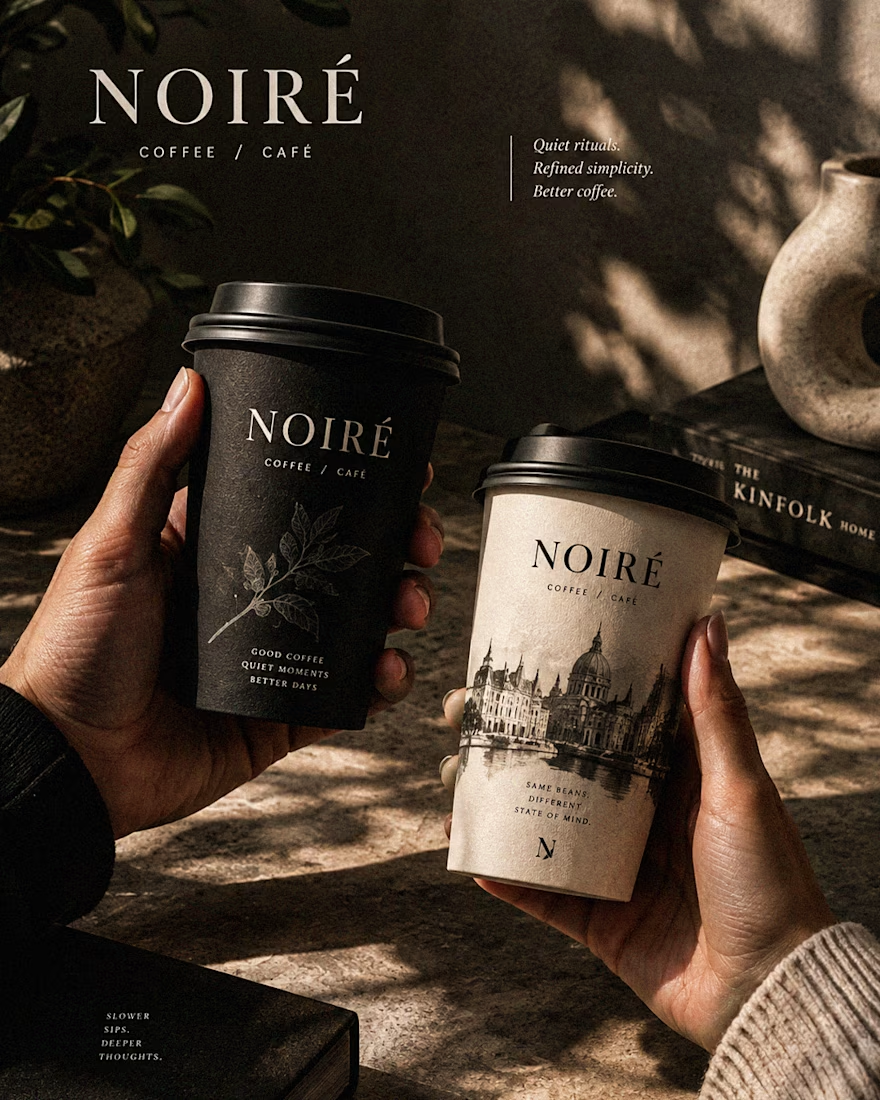
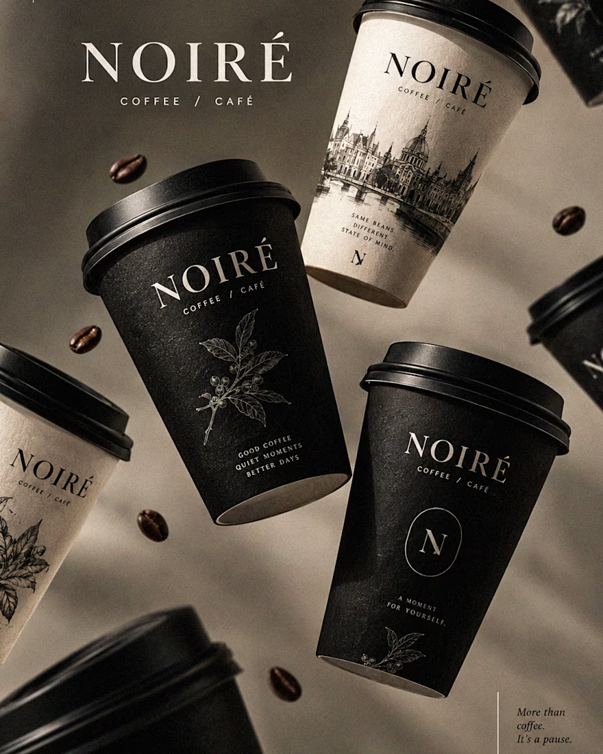
I Just Created NOIRÉ 🔥
A Coffee Brand Built Around the Pause.
NOIRÉ is a premium café brand built around a simple idea:
Great coffee should feel like a moment of pause, not another part of the
routine.
The project explores a complete visual identity, packaging
system, takeaway cups, coffee bags, tote bags, menu design, café applications and lifestyle campaign direction.
Instead of relying on the usual loud coffee aesthetics, I
built NOIRÉ around deep charcoal, warm ivory, soft graphite, refined
typography, subtle botanical illustrations and quiet editorial compositions.
The visual language is intentionally dark, tactile, and understated - giving every touchpoint the feeling of a slow morning, a quiet table, and coffee worth taking your time with.
From the cup in your hand to the café around you, every detail was designed to make the brand feel like a ritual.
Waiting for your thoughts in the comments 🙌🔥
branddesignertastetestBrand DesignGraphic DesignPackaging DesignAdobe IllustratorAdobe InDesignAdobe Photoshop