The network for creativity
Join 1.25M professional creatives like you
Connect with clients, get discovered, and run your business 100% commission-free
Creatives on Contra have earned over $150M and we are just getting started
Back to feedPost

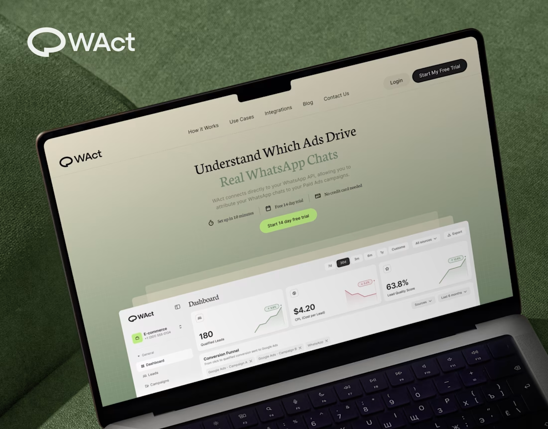
When designing WAct, the main challenge was to make complex analytics feel calm, approachable, and actionable.
Marketing tech platforms often suffer from visual noise: endless charts, aggressive contrast, and buried data.
For WAct, I took an editorial SaaS approach:
Visual Hierarchy: Kept the primary metric cards (CPL, Lead Quality Score) instantly readable at a glance.
Warm Aesthetic: Used a soft, olive-green gradient backdrop paired with editorial typography to make the brand stand out from generic blue dashboard templates.
Dashboard Logic: Structured the flow so users can track multi-channel ad conversions straight into WhatsApp chats without getting overwhelmed.
Building a complex B2B platform or analytics tool? Let’s connect and create a seamless UI/UX for your product.
🔗 Explore the full case study on Behance:
Check out WAct on Behance




Really nice composition.


Clean design !

Super cool color palette man, great job! 😊

this is nice


the green screen looks nice. the numbers pop

The network for creativity
Join 1.25M professional creatives like you
Connect with clients, get discovered, and run your business 100% commission-free
Creatives on Contra have earned over $150M and we are just getting started





Related posts

Post
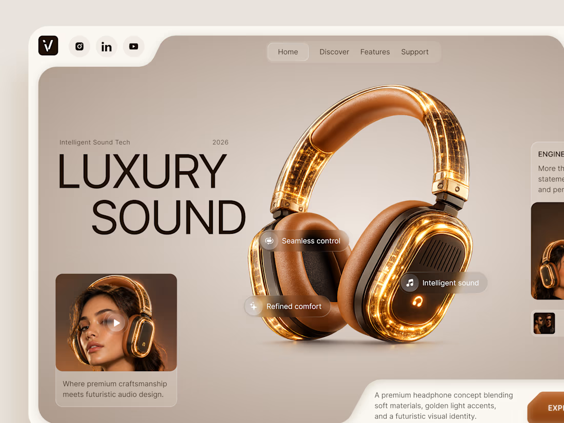
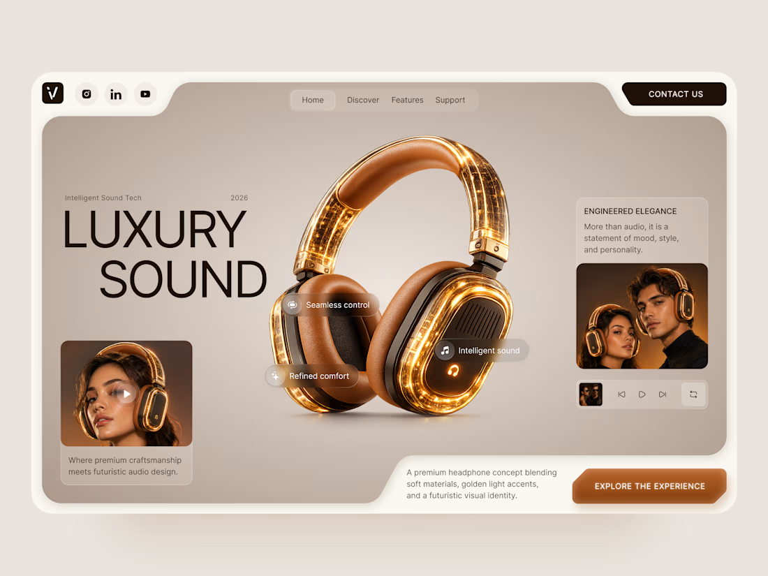
Luxury Sound — Premium Headphones Landing Page 🎧✨
A premium landing page concept for a luxury audio brand, built around a bold headphone design and a refined visual experience
The design combines warm neutral tones, glowing details, oversized product visuals, and minimal typography to create a futuristic yet elegant feel
Special attention was given to:
• Product-first composition
• Premium visual direction
• Feature highlights
• Lifestyle imagery
• Clear CTA placement
• Responsive mobile experience
The result is a clean, immersive product experience that makes the headphones feel like more than tech — they become part of the lifestyle 🔥

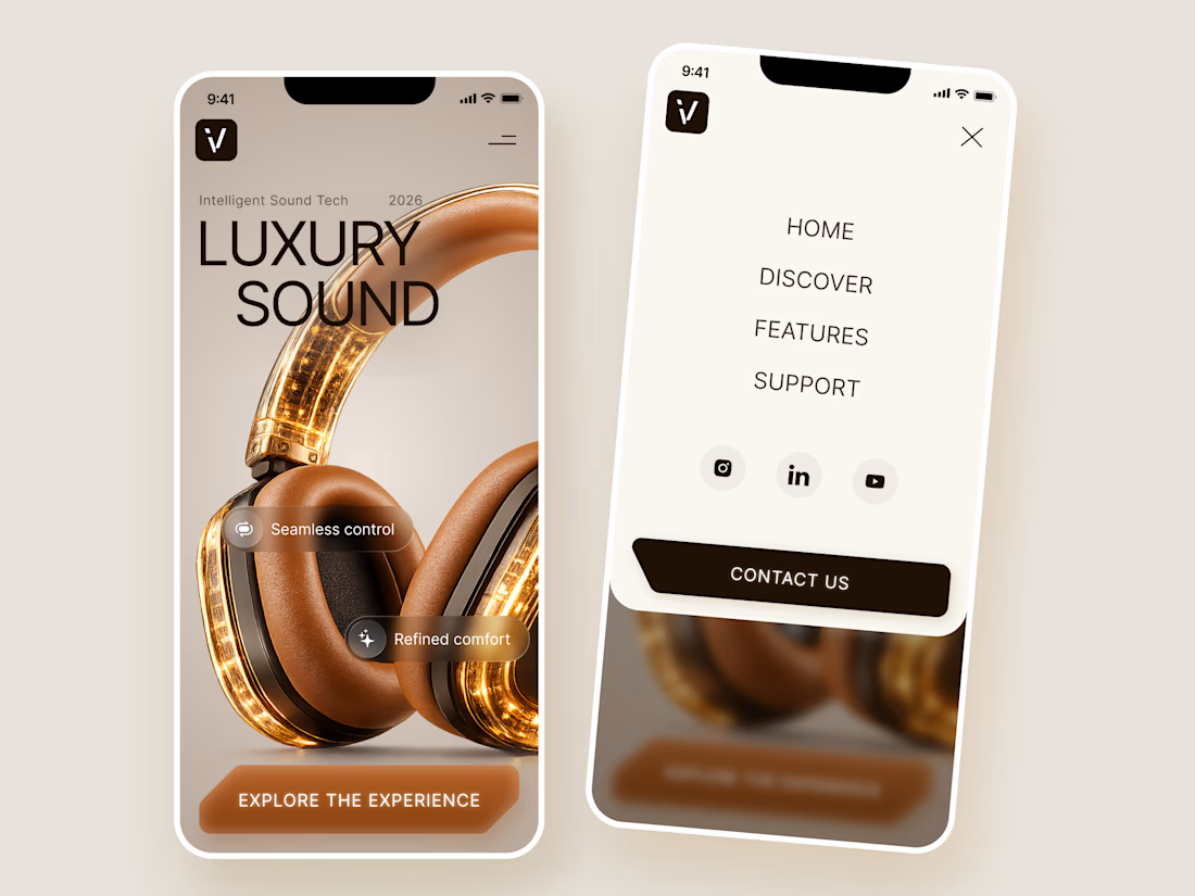

The amber glow on the headphones against that warm beige is lovely. How does the mobile menu handle the product image?

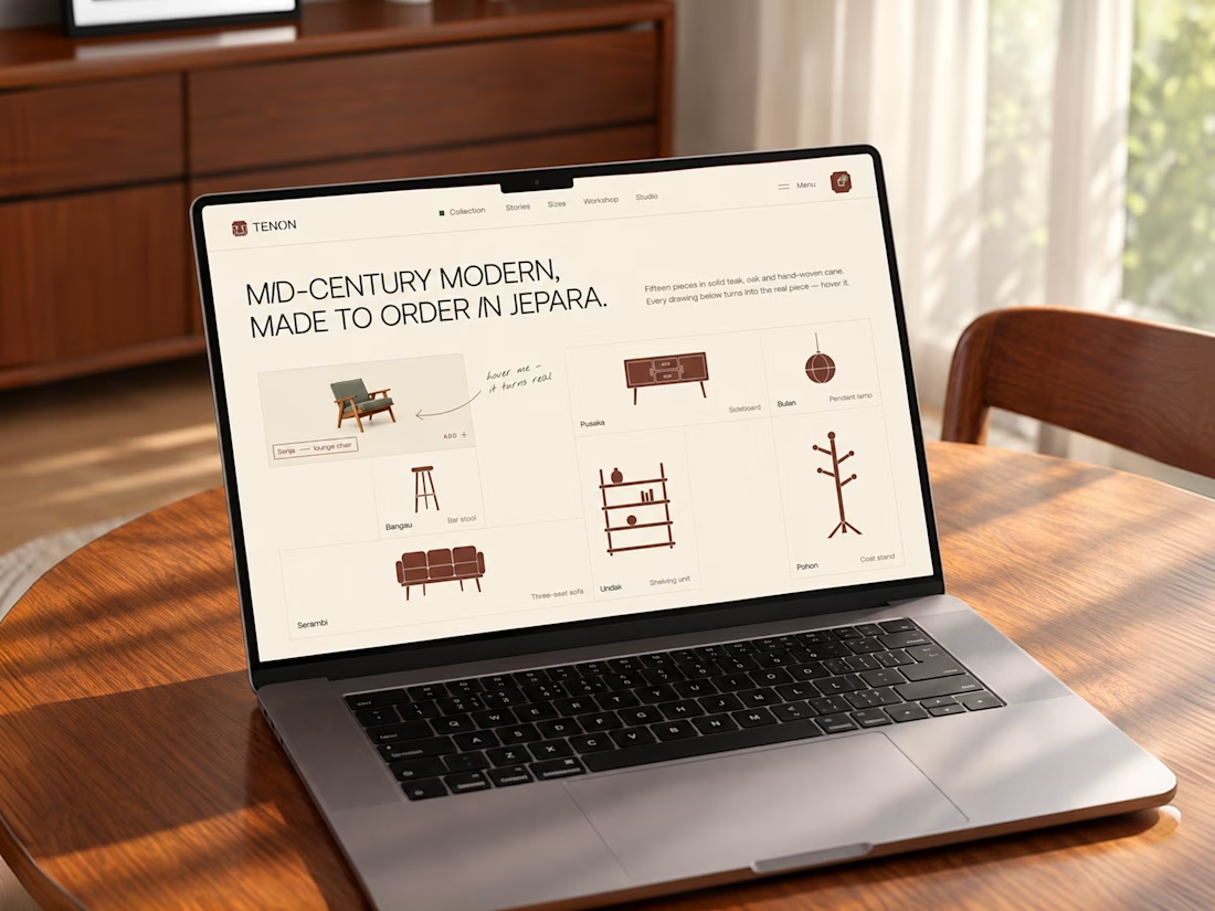
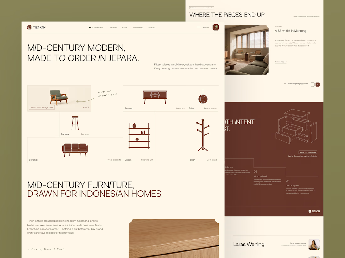
Tenon is Furniture Website Design
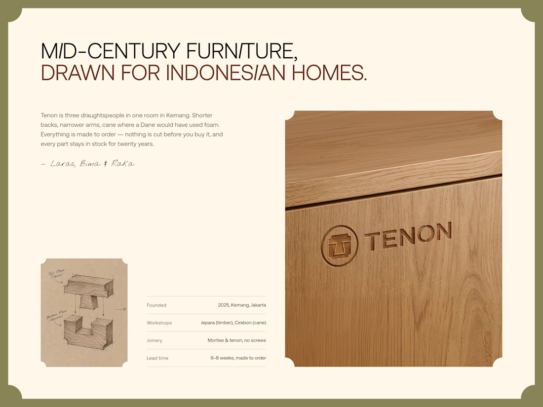
Exploring a digital experience for an Indonesian furniture brand inspired by mid-century modern design.
The website brings together product discovery, storytelling, and visual direction to make the digital experience feel as considered as the furniture itself.
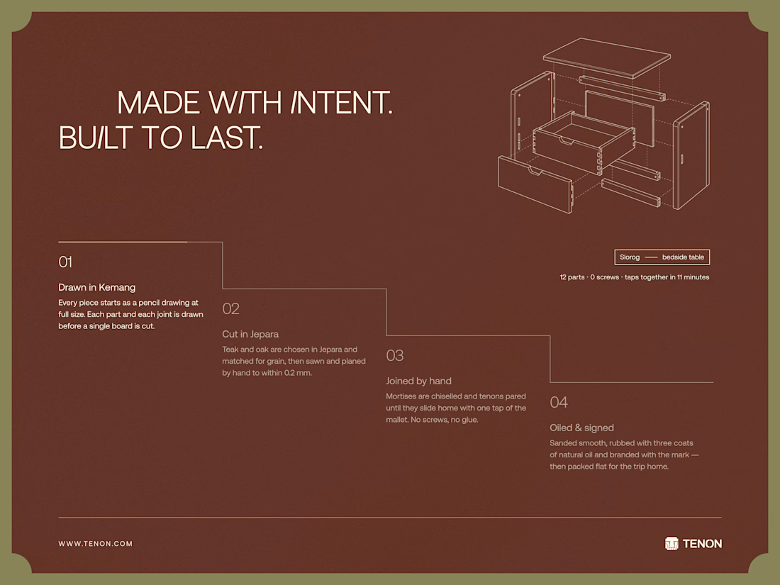
Made to order. Made to last.

Love the color choice used


Collage