The network for creativity
Join 1.25M professional creatives like you
Connect with clients, get discovered, and run your business 100% commission-free
Creatives on Contra have earned over $150M and we are just getting started
Back to feedPost


Keeping the Halloween-inspired concepts coming! 🕯️✨
This time, we're sharing Ovelle — a luxury candle e-commerce website with warm tones, elegant typography, and a moody editorial aesthetic. Would love to hear your thoughts! 🎃


Incredible Halloween concept 😍🤘✨

Wonderful work and perfect interaction

Beautiful work! 🕯️✨

The candles look so real.🙌


stunning hero, i love the small licks of flame & the wax dripping–– it gives an immersive feel for your viewer without ever getting visibly busy enough to turn anyone off.

The warm tones and editorial type really suit candles. Feels cozy and premium at the same time.

Nice work Oleksandra 🎉🎉

Wow

Love the moody aesthetic and elegant typography! The warm tones feel perfect for a luxury candle brand. How did you approach balancing the Halloween vibe with the premium feel?


peak elegant design, love it

This is really nice 👌

This is really amazing! I think I need to jump on this Halloween trend too.

That big script logo over the candle photo works so well.


the script O with the candles behind it is a lovely hero. only thing i'd look at is the nav, it gets pretty tiny and faint over the dark photo, a touch more size or weight would help

Amazing
I love it

Really nice warm tones and elegant typography. Fits the luxury candle theme so well. 👏

Feels like chocolate candle so yummy 😊

Really sick, love it!

Nice

Looks great!!!

Great designs..

Love this!

The hero section is so beautiful got me hooked

Moody and elegant, perfect for the season 🕯️

The mood on this is unreal. Such a stunning aesthetic!


Exquisite!!!!!!
The network for creativity
Join 1.25M professional creatives like you
Connect with clients, get discovered, and run your business 100% commission-free
Creatives on Contra have earned over $150M and we are just getting started





Related posts

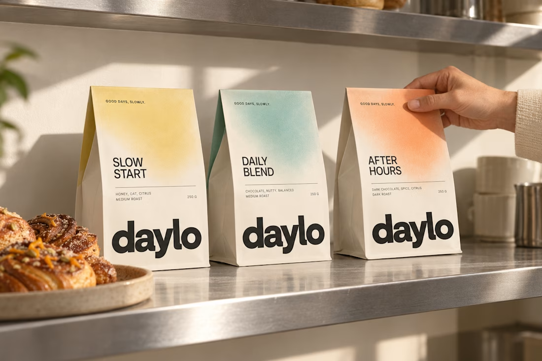
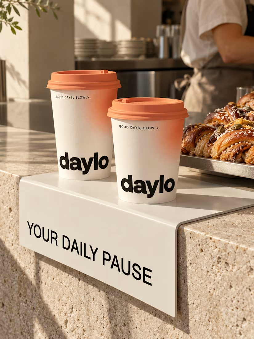
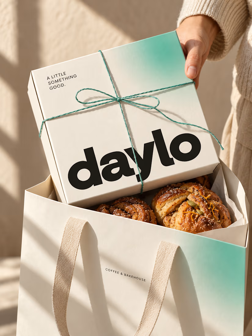
☕ Meet DAYLO - A minimalist coffee branding concept featuring bold typography, warm neutrals, and soft colors designed to make every cup feel a little more special. 🤎
Explore the full project on my Contra profile and let me know your thoughts!




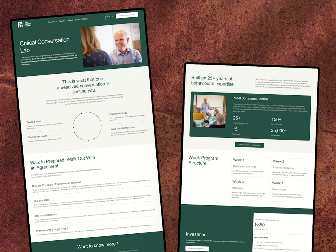
I’ve just wrapped up a new project with The Hidden Transit! 😊
I designed and developed a conversion-focused landing page for their Critical Conversation Lab programme, along with a few improvements to their existing website.
I’m happy to share the case study and give you a look at the work behind it!


Nice work on the Critical Conversation Lab landing page, Julia. Pairing a focused programme page with fixes to the existing site is often where the real conversion gains come from.


A softer side of Eroglu Studios.
A new portfolio for Alper Mlope, a freelance writer who brings philosophy and human emotion into social media storytelling.
Warm cream, orange and turquoise. Oversized type. Shapes and letters that respond to your cursor. A playful introduction to the person behind the words.
Designed and developed in HTML, CSS and vanilla JavaScript.
Case Study: https://contra.com/p/OE6BFAkP-personal-website-for-alper-mlope?r=eroglustudios
Explore live: https://infomlope.com/

Love the warm colours and playful typography! ✨ Such a creative way to reflect a writer’s personality through web design. 👏