Launch Videos for funded AI Startups | Creative Director


Launch Videos for funded AI Startups | Creative Director




Design, development and growth marketing in one place.

Design, development and growth marketing in one place.
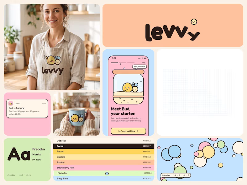


Full-stack design & dev studio for AI and tech startups
Full-stack design & dev studio for AI and tech startups
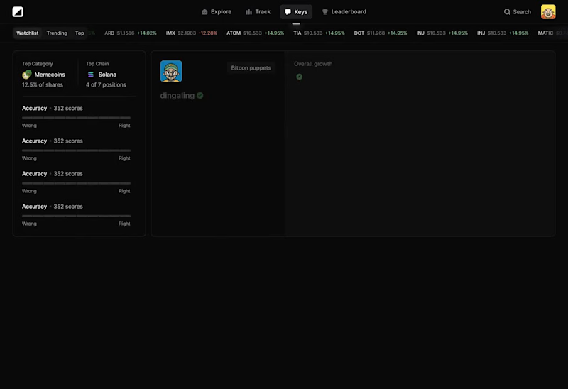
End of an era.
After 3 good years on Framer, we moved
@designme (https://x.com/designme) to our own stack.
Framer got us far, and I'd still recommend it for a lot of teams.
But the more we grew, the more we needed control: over the code, structure and speed of testing and shipping new things.
So, we rebuilt everything from scratch in Astro.
It's the same setup we now build for our clients (which is exactly why we had to run our own site on it first).
Really proud of the team and how fast we're moving now.
DesignMe 2.0 is live ↓
19
66
6K

Premium UI/UX & Web Design for Fintech, SaaS & Web3 | Framer

Premium UI/UX & Web Design for Fintech, SaaS & Web3 | Framer
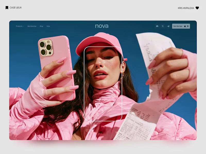
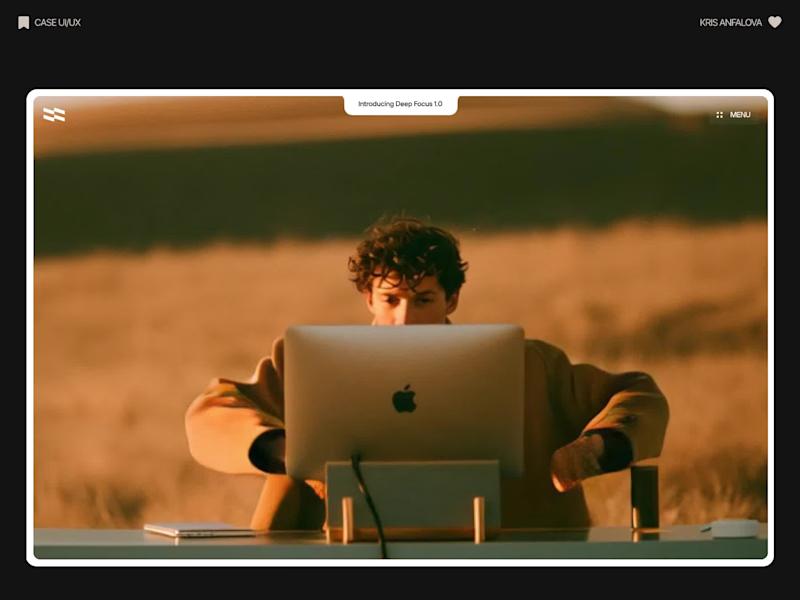
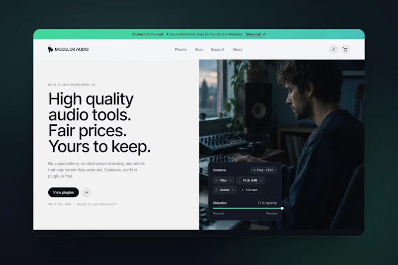
Deep Focus is a fictional macOS app that silences notifications so people can do deep work. The catch is the audience: people who need a productivity app are already tired of apps. Every competitor promises more features, so this page had to promise relief and turn it into a download within seconds.
What I did
I started from the pain, not the product. The second screen lists what a normal day looks like: push notifications, endless pings, 142 unread emails, context switching. I styled those chips like the four benefit chips in the hero, only white instead of frosted, so the visitor reads before and after without a line of explanation.
The hero section design shows no interface on purpose. This product is about absence, and a screenshot would add noise, so a person alone in a field does the proving. The headline “Deep focus. Anywhere.” is a high-contrast serif because every tool in this category speaks in a grotesque, and a serif sounds calm and human.
I kept one action, Download for macOS, with no pricing and no form. The first job of this landing page design is a download, and everything else can wait until after it.
Would you keep the serif for the headline, or switch to a grotesque so it feels more like software?
38
125
5.5K

Designer for your SaaS, app, deck and brand.

Designer for your SaaS, app, deck and brand.

SaaS Product Designer | UI/UX, Webflow & B2B Websites
- $1k+
- Earned
- 4x
- Hired
- 5.0
- Rating
- 464
- Followers
SaaS Product Designer | UI/UX, Webflow & B2B Websites

Staff Product Designer. I design, build and improve software

Staff Product Designer. I design, build and improve software
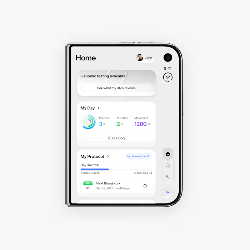
First drafts for iPhone Duo. It's too early, but I already can say that there are so many weird UX things going on with this device. Nevertheless, this is a great design challenge!
1
6
485
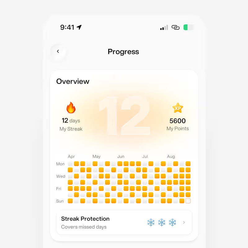
Hello, Contra! Check out my latest work in progress on amazing new features for a health tech mobile app 🚀
2
9
586
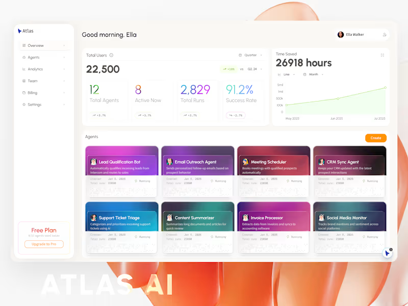
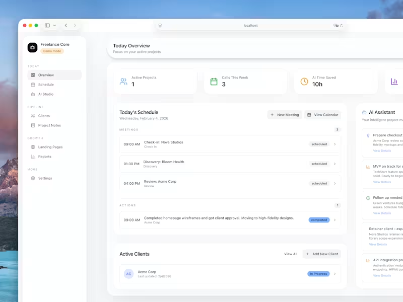
Hey, Contra! Check my first digital product: Freelance Core - your client pipeline in a box.
Built this for myself, now sharing it with you!
Freelance Core is a pre-built web app for managing your freelance business. Run it locally or deploy to Vercel. SQLite database included - no setup headaches.
🍱 What's inside:
- Client pipeline with project tracking and a Kanban board
- Weekly schedule for all your calls
- AI-powered call prep (never walk into a meeting blind)
- Project notes that actually stay organized
- Reports dashboard to see where your time goes
- Pipeline value tracking so you know your business health at a glance
🛠️ More is coming!
https://contra.com/products/YWzMLUC9-freelance-core-your-clients-pipeline-in-a-box
6
1.3K

Crafting effective product design for web and mobile apps.
- $•••••
- Earned
- 1x
- Hired
- 5.0
- Rating
- 78
- Followers
Crafting effective product design for web and mobile apps.