
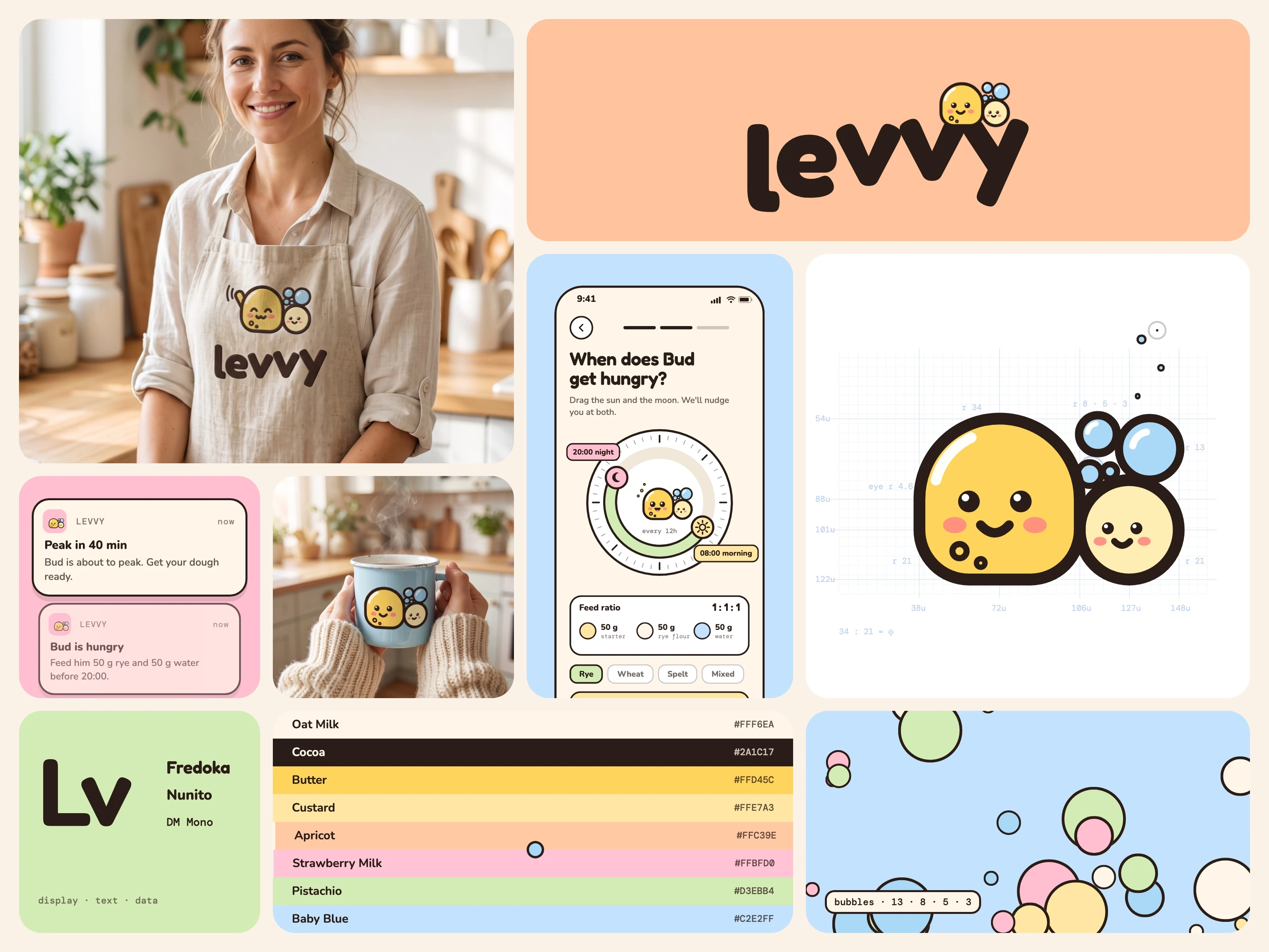
Self-initiated concept, not a client project.
The brief
A self-initiated brief: invent a brand from nothing for a small app that keeps sourdough starters alive, and take it all the way from the first word to motion. We handled every part of it:
Naming: finding and testing the name levvy, from levain to levity.
Copywriting: the brand story, the one-line idea "Your starter, kept alive.", the app copy and Bud's voice.
Branding: the mascot-led idea, the logo system, the palette and the type system.
Mascot design: Bud the yeast cell, his Fibonacci construction and eight expressions.
Product design: three app onboarding screens built around real sourdough habits.
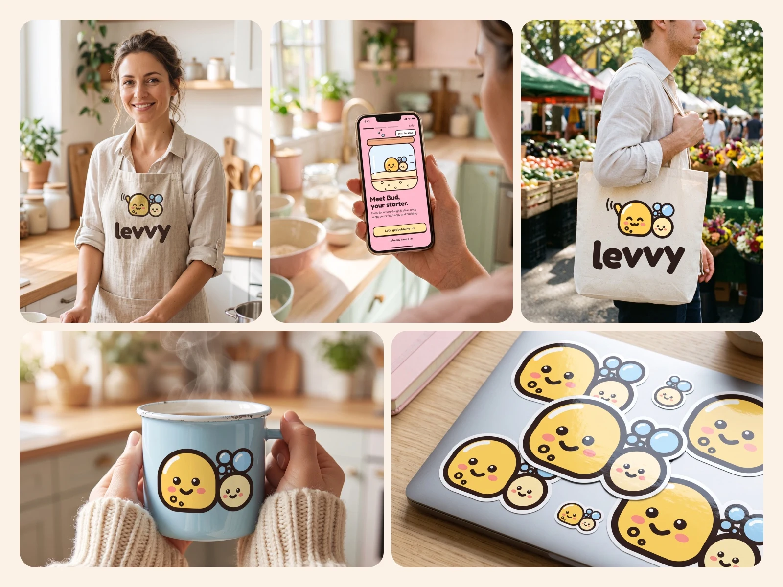
Mockups: five lifestyle merch scenes.
Motion and sound: four seamless 16-second loops with their own motion language and sound design.
Summary
levvy is a brand we invented for a small app that keeps sourdough starters alive. The identity is led by Bud, a yeast cell drawn entirely from circles, who lives in the user's jar and tells them when he is hungry. We built the full system: name, mascot and its construction, logo lockups, colour and type, three app screens, lifestyle merch, and a set of looping motion boards with their own motion language.
What is levvy?
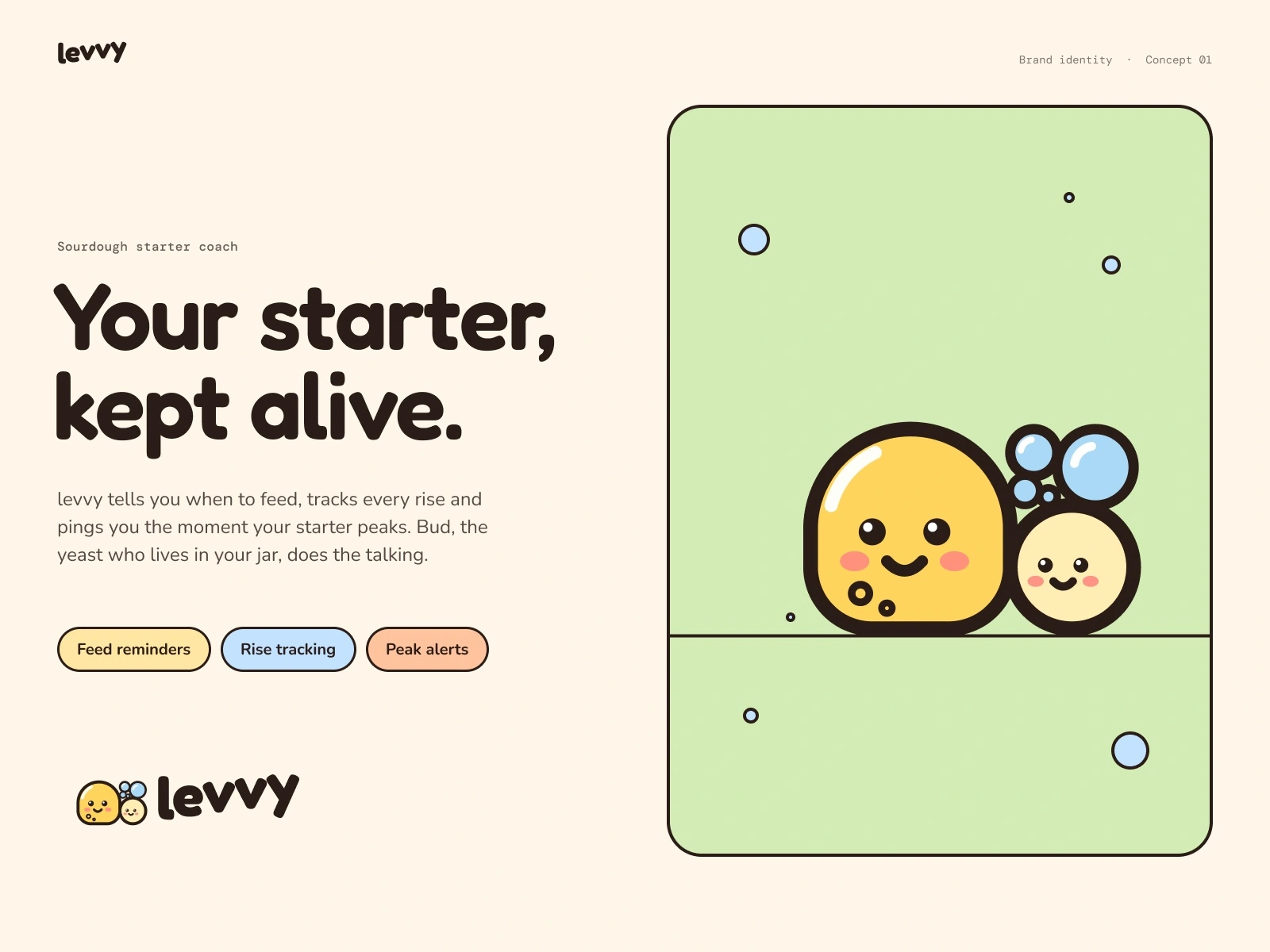
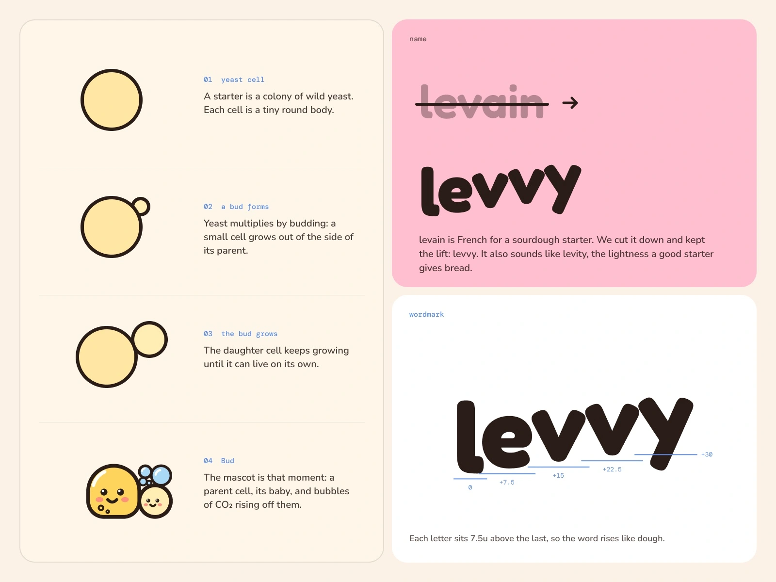
levvy is a concept for a sourdough starter coach. It reminds you when to feed your starter, tracks how much it rises after each feed, and tells you when it is about to peak, which is the best moment to bake. The name comes from levain, the French word for a sourdough starter, and it sounds like levity, the lightness a good starter gives bread.
The one-line idea: Your starter, kept alive.
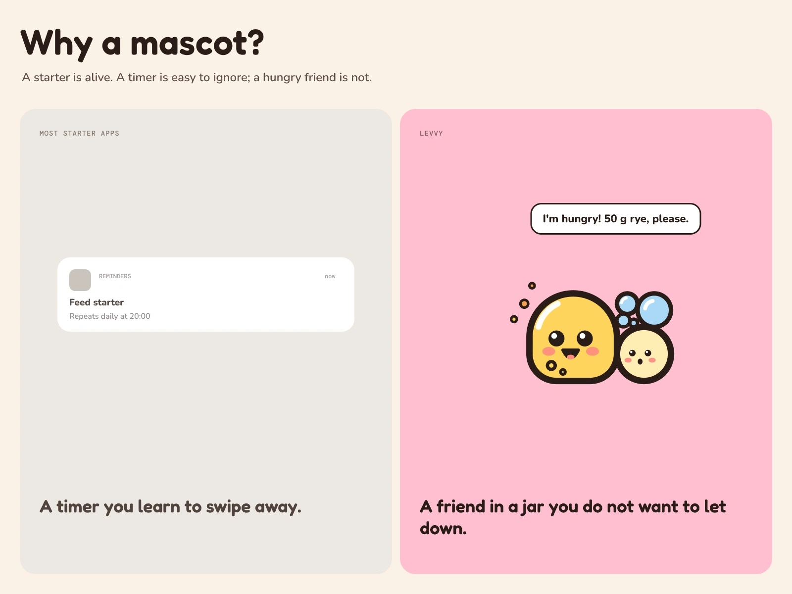
Why build a brand around a mascot?
A starter is not an ingredient, it is a living culture of wild yeast and bacteria. Bakers name their starters, carry them between homes and feel guilty when they forget to feed them. Most apps in this space treat the starter as data: a timer, a log, a chart. We wanted the opposite. If the starter has a face, a missed feed stops being a missed notification and becomes a hungry friend in a jar. That is a reason to open the app.
So the brand question became: what does the culture inside the jar look like?
Who is Bud?
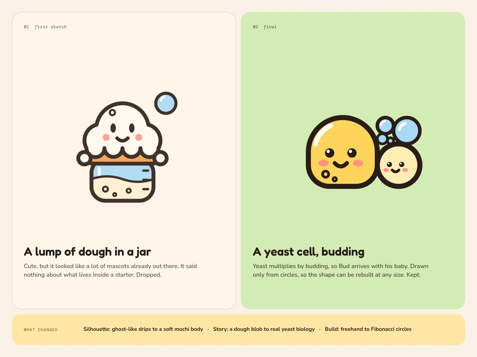
Bud is a yeast cell. Yeast reproduces by budding: a small daughter cell grows out of the side of the parent until it separates. That biology gave us the character. Bud always comes with his baby bud beside him, and a trail of bubbles rising off them, the carbon dioxide that makes dough rise.
His body is soft and squat, closer to a piece of mochi or a ball of dough than to a ghost or a blob. He sits flat on the ground line, because a starter sits at the bottom of a jar.
Our first sketch was a lump of dough with drips and little round hands. It looked like half the cute mascots already online, so we dropped it and went back to the biology. The budding cell is the version that could only belong to this brand.
How was Bud constructed?
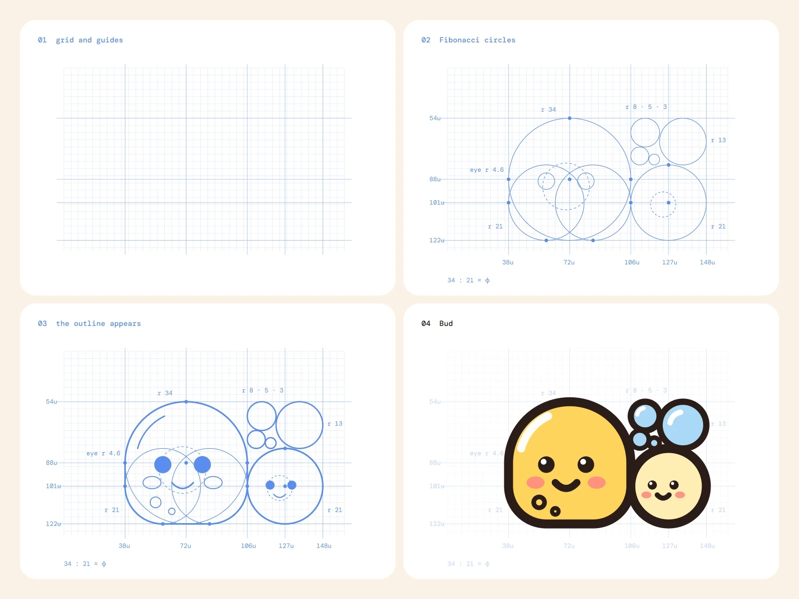
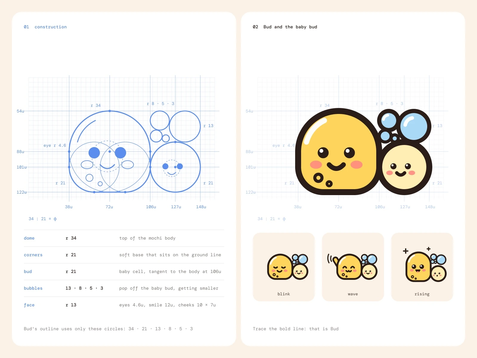
Bud is drawn only from circles, and the circles follow the Fibonacci sequence:
Body: a dome of radius 34 with two corner arcs of radius 21, sitting on a flat base.
Baby bud: a circle of radius 21, touching the body.
Bubbles: radii 13, 8, 5 and 3, getting smaller as they rise.
Face: eyes of radius 4.6 inside a face circle of radius 13.
34 to 21 is close to the golden ratio, so the parent and the baby feel balanced without being equal. The construction tile shows the working: the grid, the guides, every circle and tangent point, and then Bud's outline drawn over them in a bold line. If you only see the circles, you can still read the character.
We drew him in four steps:
Grid and guides. A 4-unit grid with guides at the top of the dome, its centre, the base of the corners and the ground line.
Fibonacci circles. The dome, the two corners, the baby bud, the four bubbles and the face circle, with every tangent point marked.
The outline appears. One bold line traces the parts of the circles that belong to Bud. Nothing else is drawn by hand.
Bud. Fill, face, shine and the two small bud scars on his body.
What does the logo system include?
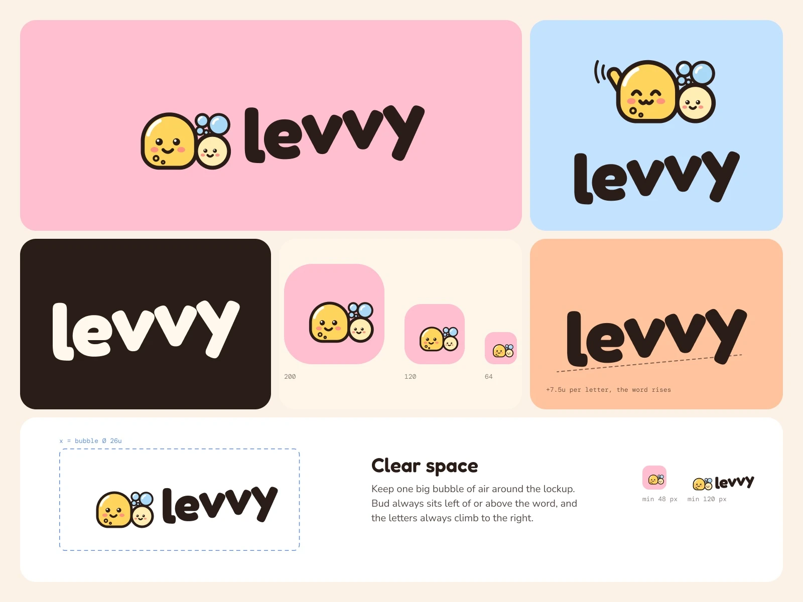
Wordmark: "levvy" set in a rounded bold face, with each letter sitting 7.5 units higher than the one before it. The word rises, the way dough does.
Lockups: a horizontal lockup (Bud beside the word) and a stacked one (Bud above the word).
Icon mark: Bud and his baby inside a strawberry-milk pink square, readable down to 48 px.
Lockup variants: Bud perched on top of the two highest letters, a round club badge, the app icon on a home screen, and a repeat pattern that alternates the word with Bud's expressions.
Rules: keep one large bubble of clear space around the lockup, keep Bud left of or above the word, and keep the letters climbing to the right. Minimum sizes are 48 px for the icon and 120 px for the horizontal lockup.
What colours and type does the brand use?
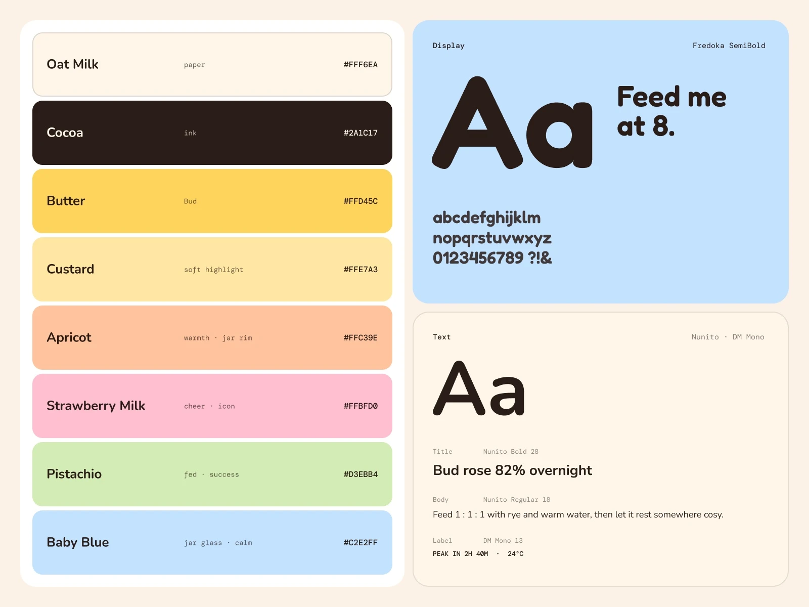
Eight soft, sweet colours, named after what goes into a morning kitchen. Bud keeps his own butter yellow; the rest of the palette stays light so he always stands out.
Oat Milk #FFF6EA, paper
Cocoa #2A1C17, ink
Butter #FFD45C, Bud
Custard #FFE7A3, soft highlight and buttons
Apricot #FFC39E, warmth and the jar rim
Strawberry Milk #FFBFD0, cheer and the app icon
Pistachio #D3EBB4, fed and success
Baby Blue #C2E2FF, jar glass and calm
Type is a three-part system: Fredoka for display and the wordmark, Nunito for interface text, and DM Mono for labels, units and data such as feed times and rise percentages.
How does Bud show what the starter is doing?
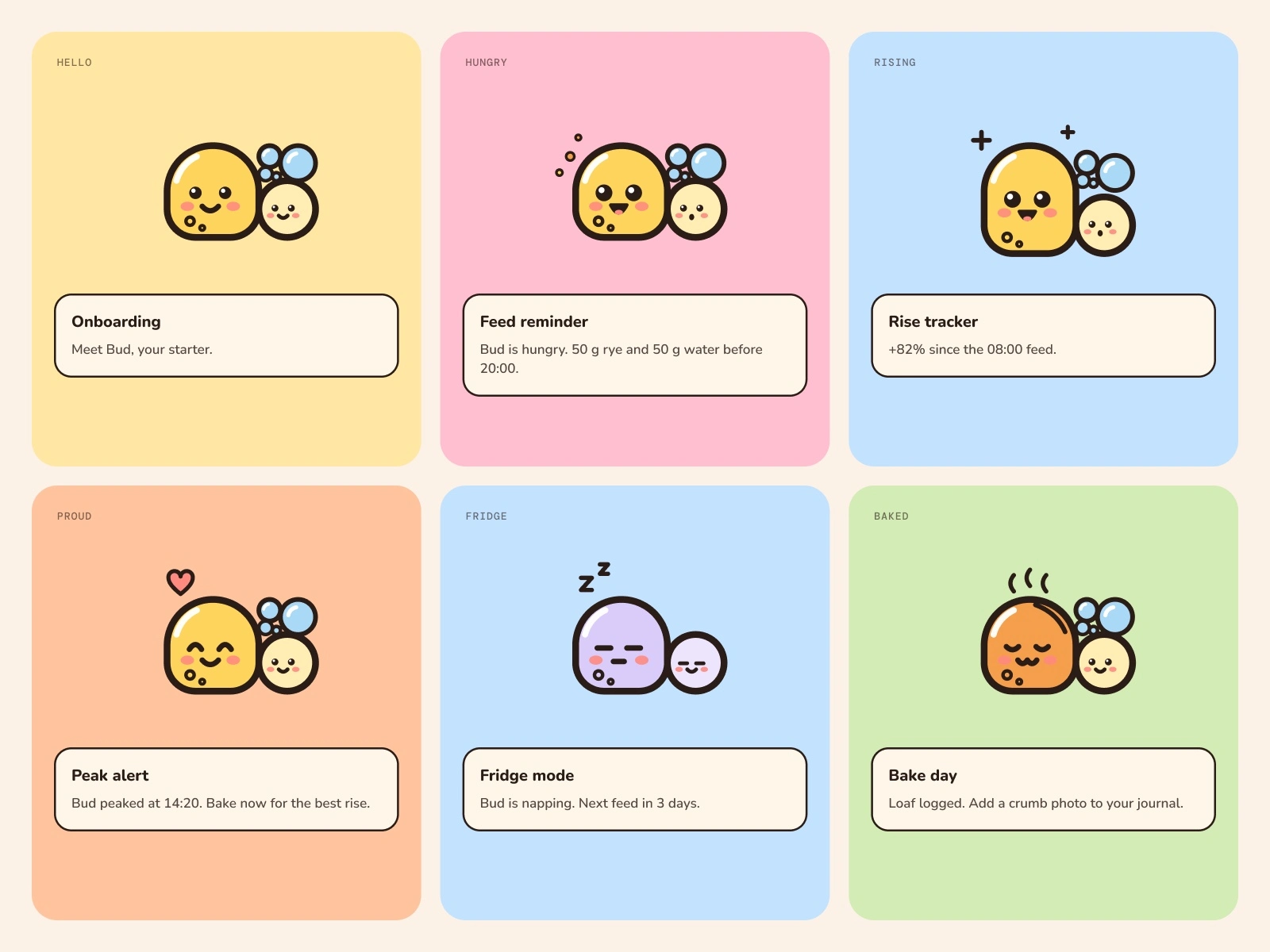
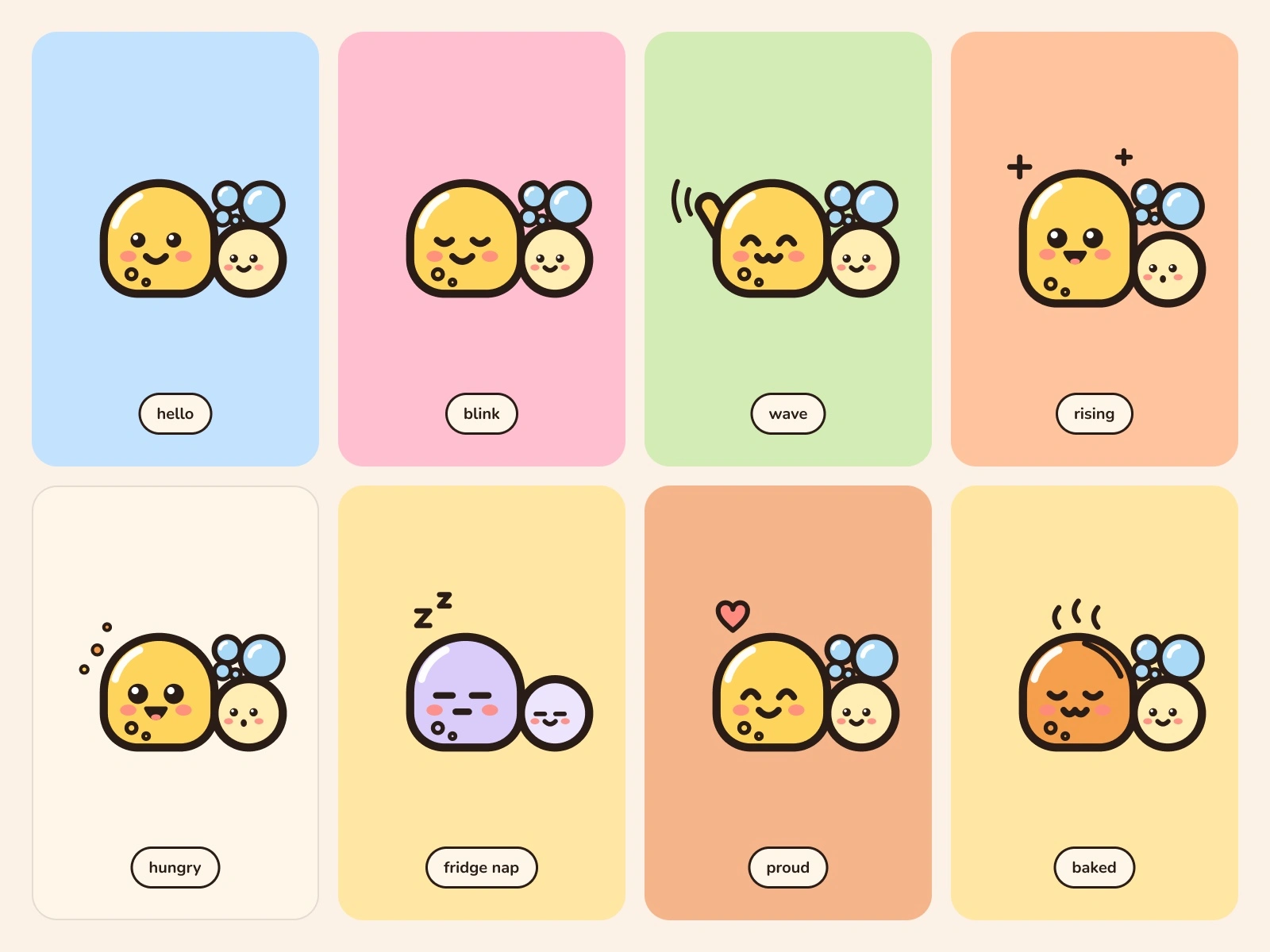
Bud has eight expressions, and each one maps to a real state of a starter:
Hello and blink: the default, a healthy starter.
Wave: onboarding and greetings.
Rising: the starter is growing after a feed.
Hungry: it is time to feed.
Fridge nap: the starter is resting in the fridge, a common way to slow it down between bakes.
Proud: it peaked on schedule.
Baked: the bread is out of the oven.
Because the states come from baking, the stickers work both as product UI and as social content.
What do the app screens do?
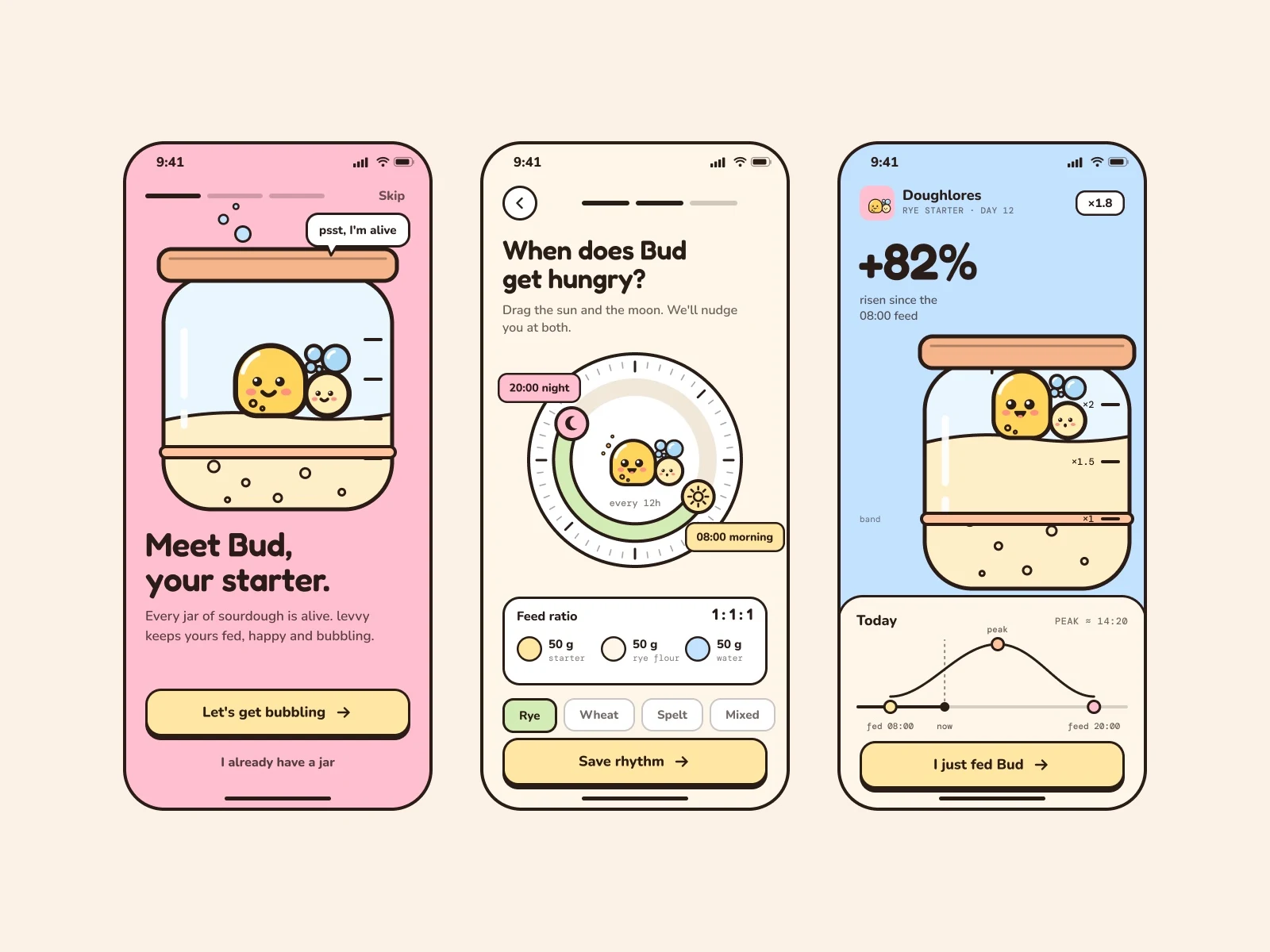
We designed three onboarding screens around things only a sourdough app would need:
Meet Bud. Bud sits inside a glass jar with a rubber band around it. Bakers really do this: the band marks where the starter started, so you can see how far it has risen.
Feeding rhythm. A 24-hour dial with a sun handle for the morning feed and a moon handle for the evening feed, a 1 : 1 : 1 feed ratio (50 g starter, 50 g rye flour, 50 g water) and a choice of flour.
Rise tracker. The starter has risen 82% since the 08:00 feed. The jar shows the level against the band, and a day timeline marks the last feed, now, the expected peak and the next feed.
Buttons are thick-outlined with a hard offset shadow, so they feel like pressable stickers rather than flat rectangles.
What does the brand look like off-screen?
We put levvy where its users actually live: a linen apron on a home baker in her kitchen, the app open on a phone in her hand, a baby blue enamel mug held with both hands, die-cut Bud stickers on a laptop, and a canvas tote at a weekend farmers market.
How does the brand move?
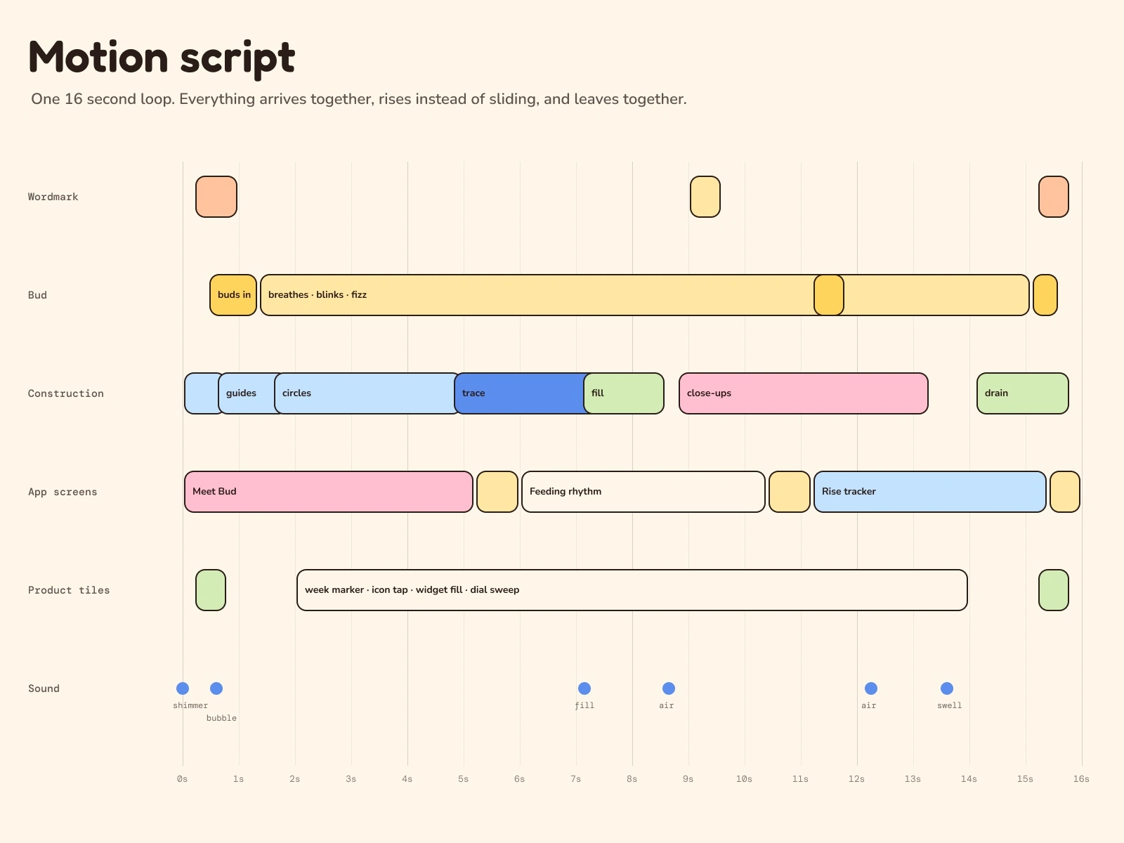
Motion is part of the identity, not something added at the end, and it follows how a starter behaves. Nothing slides or fades in. Things rise.
Rising, not sliding. The letters of the wordmark grow up out of the baseline one by one, the way dough comes up in a jar, and settle back down at the end of the loop.
Budding. Bud never just appears. His baby bud swells first, then the parent cell inflates from the ground line with a small squash as he lands.
Breathing. At rest Bud slowly inflates and deflates like proofing dough, and now and then a bubble leaves his head, rises and pops.
The construction fills like a jar. The grid rises from the ground line, every circle draws from its lowest point, the outline traces Bud, and then the colour fills him from the bottom with a soft wavy surface, like a starter climbing the glass. At the end it drains back down.
Screens change by rising. In the app tile each new screen comes up from the bottom of the phone with the same wavy surface instead of a sideways push.
Product moments. A "today" marker walks along the feeding week and each day's Bud acts out its state: hungry shakes, rising stretches, fridge nap shivers. The app icon gets pressed and Bud springs up. A yeast cell buds, grows and turns into Bud.
Close-ups. Once Bud is filled, the camera moves in on his face, then on the baby bud, and pulls back out before the drain.
One entrance. Every tile on a board arrives at the same moment and leaves at the same moment, so the loop reads as one piece.
We built four 1600 × 1200 boards, each a seamless 16-second loop: Daylight, Kitchen, Candy and Lockups. Every movement repeats on the same 8-second clock, so the loops close without a jump. The sound is a soft music bed with a few quiet accents: a shimmer as the drawing starts, a round bubble as the starter fills Bud, and a soft swell as it drains.
How did the project come together?
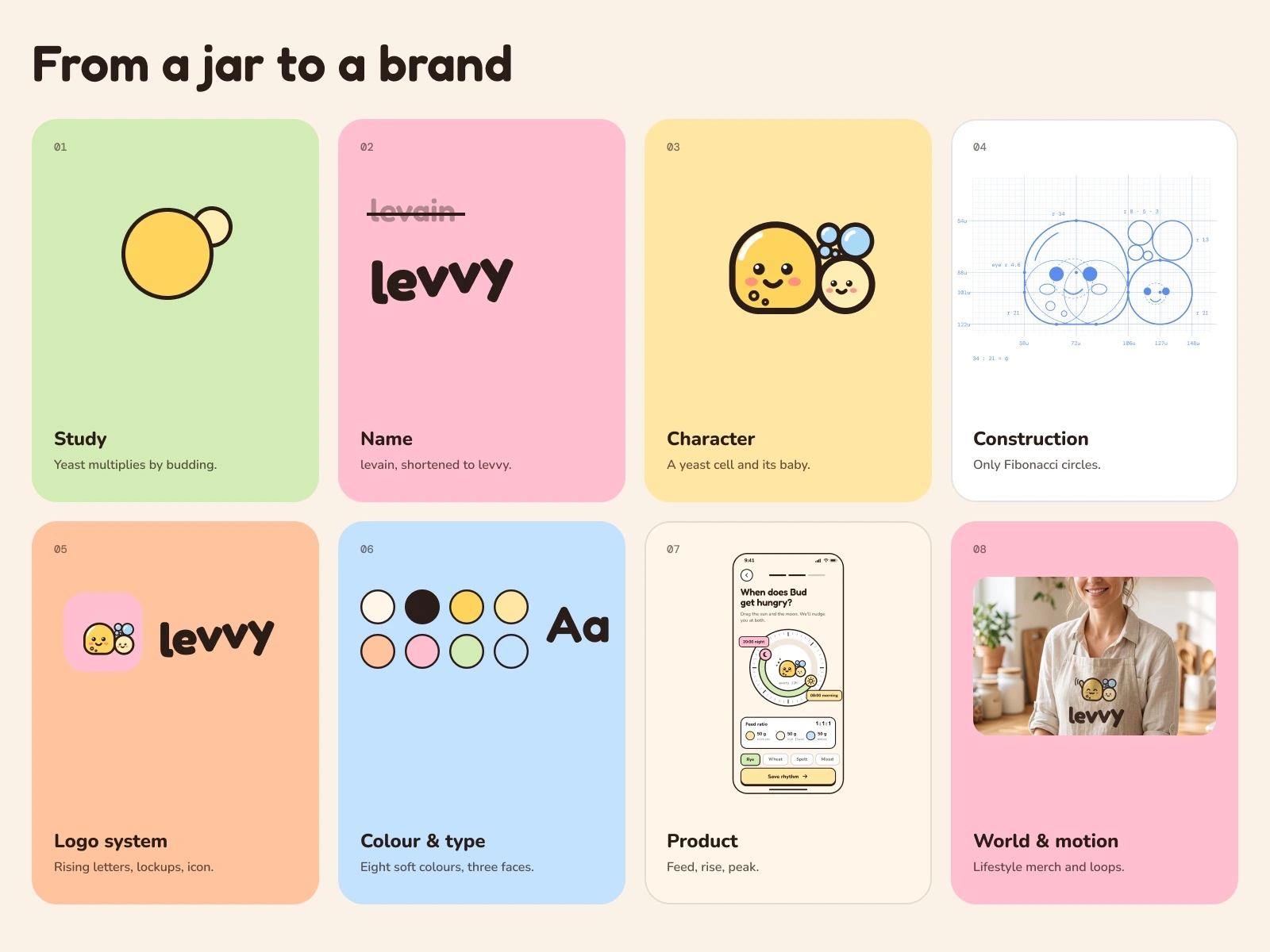
Eight steps, in order: study the biology, name it, find the character, construct it from circles, build the logo system, set colour and type, design the product, then put it into the world and into motion.
What we delivered
Name, idea and brand story
Mascot design and construction drawing
Wordmark, lockups, icon mark and four pose variants
Colour palette and type system
Eight mascot expressions
Three app onboarding screens
Five lifestyle merch mockups
Three bento brand boards and a lockup board
Four 16-second motion loops, silent and with sound
0 likes · 3 views · Nov 11, 2026
Self-initiated brand concept for a sourdough app: naming, copy, a yeast mascot, logo, app screens, merch and motion.
