Freelance Logo Designers in Verona
Sign Up
Post a job
Sign Up
Log In
Filters
2
Projects
People
Caleb Holt
pro
Pittsburgh, USA
Founder | Studio C - Custom Framer websites and branding
11x
Hired
5.0
Rating
50
Followers
expert
expert
+1
Follow
Message
Founder | Studio C - Custom Framer websites and branding
1
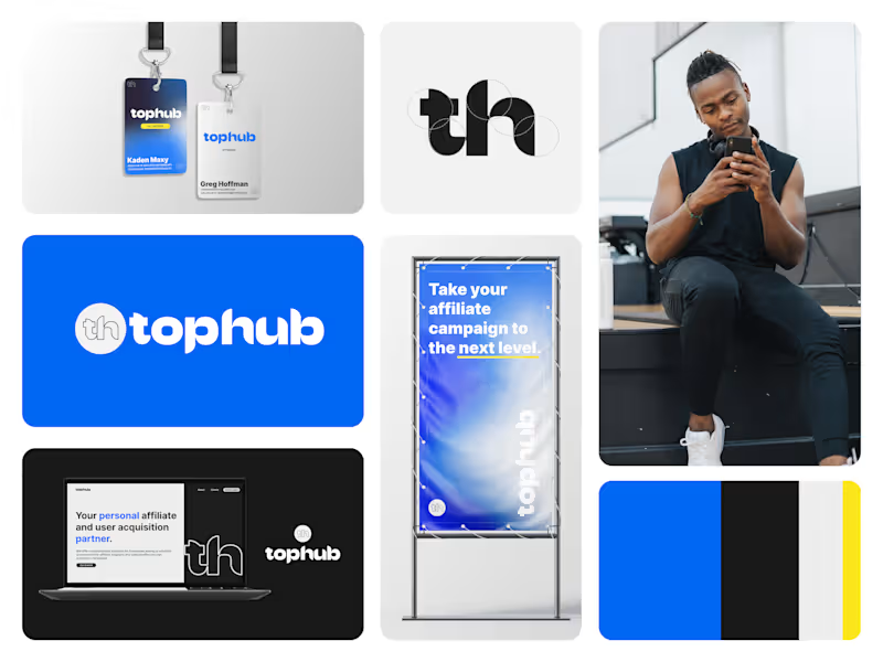
Branding work for TopHub Co. Drop 🔵 in the comments if you love working with blue on branding projects like I do.
1
1
454
5
Petalux - Branding & Website
5
20
2
TopHub - Brand Identity
2
22
5
Branding Collection '24
5
51
Logo Designer
(4)
Follow
Message
Joseph Gardonis
pro
Verona, United States
16 years of experience in graphic/web design & social media

New to Contra
Follow
Message
16 years of experience in graphic/web design & social media
1
UNIFIED STAFFING & RECRUTING REBRANDING Worked with leadership, marketing and tech departments to create updated branding identity for multi-branched staffing & placement company, Unified Staffing & Recruiting. Navigating the merging of multiple brands under one while keeping the same essence and quality of their services conveyed through their logo design was the key that helped this project get to the finish line. The website is unifiedstaffing-recruiting.com (http://unifiedstaffing-recruiting.com) with its respective screenshots of the selected pages to be viewed here. Beside the tangible visuals of the finished product, the rebranding and website redesign accomplished the following: Refresh the branding and messaging with a different look. Create a more fluid experience for users in terms of functionality and visual design. A more cost-effective and interactive hosting platform contributed to high optimization of the website and saved the client money. Helped propel their services, prompts, and highlighted what helped them stand out from other comparable staffing companies.
1
20
1
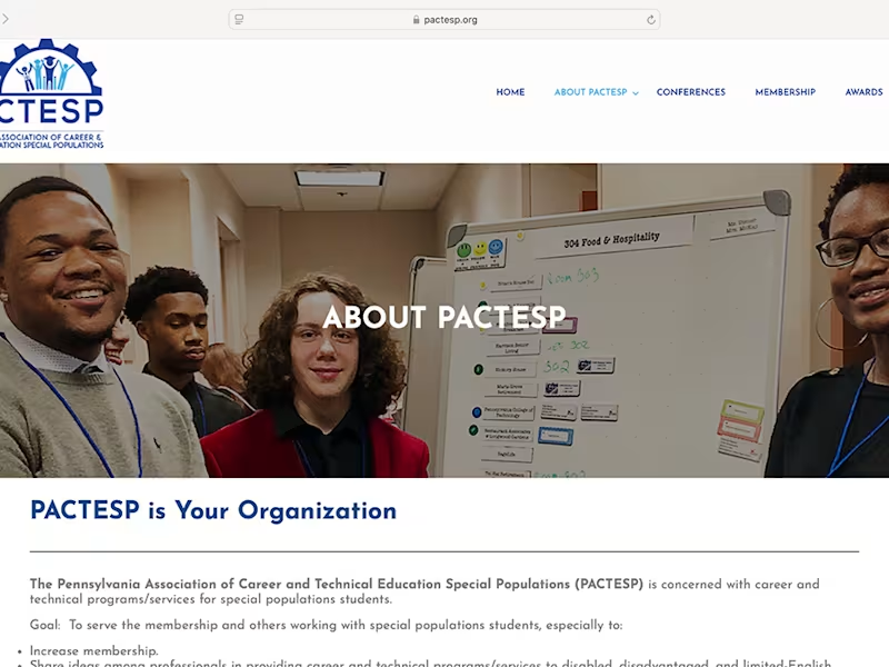
PACETESP WEBSITE BRANDING & REDESIGN Worked with new leadership at the Pennsylvania Association of Career and Technical Education Special Populations, which is in association with the Penn State Greater Allegheny Campus, to redesign their logo/branding and website. The website is pactesp.org (http://pactesp.org) with its respective screenshots of the selected pages to be viewed here. Beside the tangible visuals of the finished product, the rebranding and website redesign accomplished the following: 1. Refresh the branding and messaging with a different look. 2. Create a more fluid experience for users in terms of functionality. 3. A more cost-effective and interactive hosting platform contributed to fast page speed loading and saved the client money. 4. Helped propel their services, educational courses and membership features into the spotlight.
1
77
1
CITY HEMP RX LABEL DESIGNS Worked with the owner of City Hemp RX to create and design product labels and additional graphics for Hemp CBD oil products in their respective applications.
1
45
1
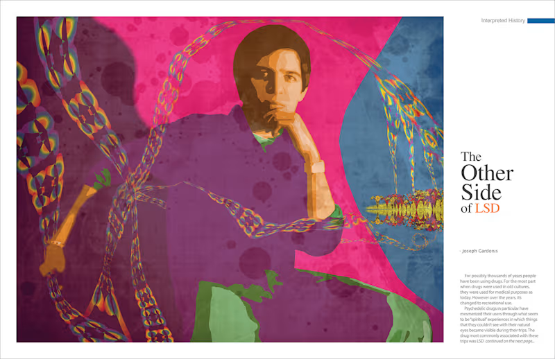
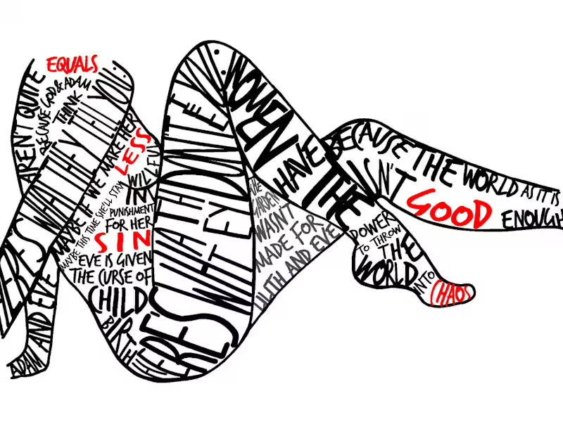
PSYCHEDELIC ART MAGAZINE SPREAD Created and designed illustration using live model, photoshop, illustrator and outlandish fantasy.
1
75
Logo Designer
(2)
Follow
Message
Illia Iarmatsevych
Pittsburgh, USA
Clean designs with a hint of perfection
Follow
Message
Clean designs with a hint of perfection
0
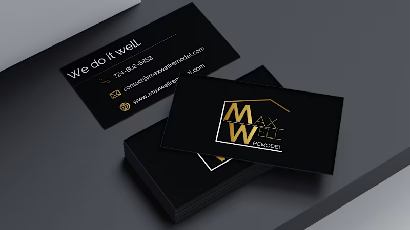
MaxWell Remodel - Brand Identity
0
11
0
FreshFace Skincare Boutique - Brand Identity
0
9
0
MaxWell Remodel - Website Design & Development
0
8
View more →
Logo Designer
(2)
Follow
Message
Janelle Carlson
Pittsburgh, USA
Putting Passion Into Your Brand
Follow
Message
Putting Passion Into Your Brand
0
Logo for Local Business
0
3
0
Branding Kit
0
3
0
Brand Overhaul for Local Pizza Shop
0
2
0
Typography
0
5
Logo Designer
(3)
Follow
Message
Chris Hornak
pro
Pittsburgh, USA
I craft custom websites and SEO strategies that scale.
1x
Hired
10
Followers
Follow
Message
I craft custom websites and SEO strategies that scale.
1
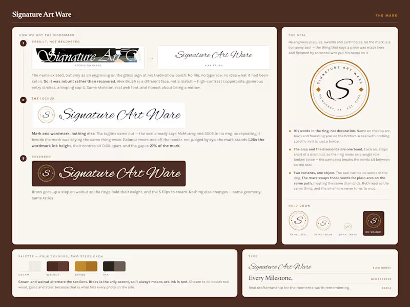
His logo existed in exactly one place. Etched into the glass sign at his trade-show booth. No file. No typeface. So I rebuilt it, and drew him a seal to go with it. His name on the top arc, his town and his year on the bottom. John has engraved keepsakes in McMurray since 2002. On paper that is a trophy shop. It isn't. Look at the portrait he etched into glass. So the work leads and the service list waits. Every photo on the site is something he made. What does your business have that nobody ever sees?
1
41
1
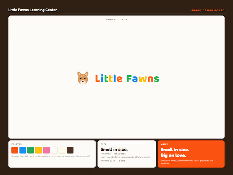
🎉 What do you build when a business has one logo and nothing else? Little Fawns is a licensed home daycare in Canonsburg, PA. Twelve spots, ages six weeks to six years, run by the owner on her own floor. What they had was a clip-art fawn, five rainbow letters, and a phone number baked into the artwork. No palette, no typefaces, no rules for any of it. The hard part wasn't the design though. It was the brief. Big centers feel safe because they're big. Small reads as risky. So "small" had to stop being the apology and start being the argument. That's the whole brand. Twelve spots is the pitch, not the limitation. After that the system was straightforward. I drew a new vector mark and kept the five colors out of their old logo, because families already recognize them. Orange is the only color that ever means "do something." The other four decorate and never ask for anything. Fredoka for headings, Baloo 2 for the wordmark, Nunito Sans for body. Rounded and warm, but properly drawn. Friendly without reading childish. The headline came from them. "Small in size. Big on love." was already sitting on one of their own social graphics. It just needed to be the first thing you read instead of the last. Then it goes to work across thirteen sections. Color banding paces the scroll, one accent carries every action, and each block answers a question a parent actually asks before they call. Every factual claim is logged against a source before it ships. The state license, the 5.0 rating from four reviews, the twenty years of experience. Nothing invented and nothing rounded up. This one's a concept build, so it isn't their live site. Swipe for the design board, the brief, and the build. What's the last brand you saw that turned its smallest feature into its main argument?
1
1
100
1
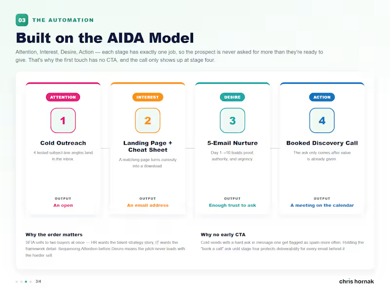
SkillsTX was launching a talent platform in North America with no demand-gen engine behind it. I built the whole thing. Cold email, a branded landing page, a gated cheat sheet, and a five-touch nurture sequence. One template carries every send. Same header, same CTA, same footer, so five emails read as one system instead of five one-offs. The sequence runs on AIDA, and each stage has exactly one job. That's why the first touch has no "book a call" ask. A cold send with a hard ask in message one gets flagged as spam more often, and that hurts every email behind it. Stage two hands the click to a page that repeats the email's exact promise. Behind the opt-in sits a real six-page SFIA cheat sheet. The SFIA 8 summary chart, the seven levels of responsibility, and where to go next. The ask only shows up at stage four, once the reader has already taken something. Swipe for the emails, the sequence, and the offer.
1
130
4
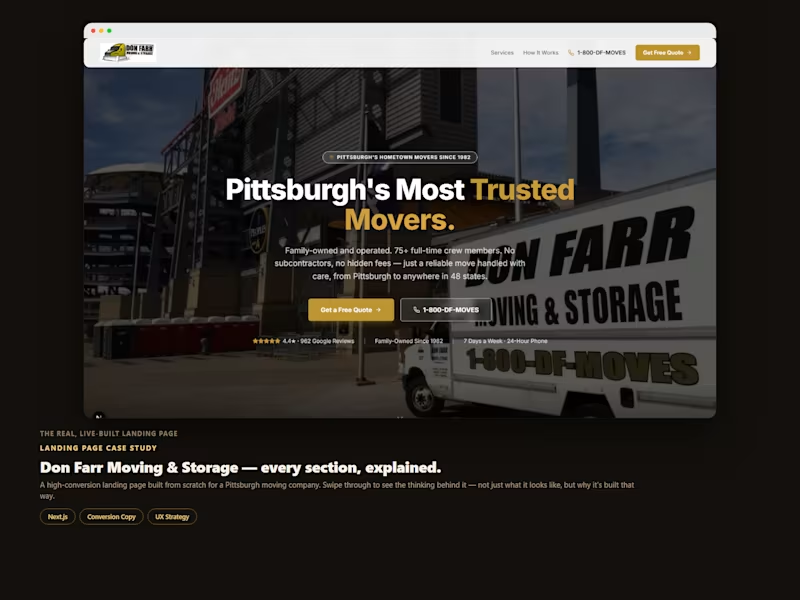
Here's a landing page I built for a Pittsburgh moving company — broken down section by section, so you can see the thinking behind it, not just the finished screenshot. The hero isn't just a headline. The form isn't just a form. Every block on this page is answering a specific objection or moving someone one step closer to booking — in order, on purpose. Swipe through to see it. Good landing pages aren't really a design problem. They're a sequencing problem — and that's the part I spend the most time on.
2
4
235
Logo Designer
(1)
Follow
Message
Richard Taylor
Pittsburgh, USA
I build brand identities that help businesses sell
Follow
Message
I build brand identities that help businesses sell
1
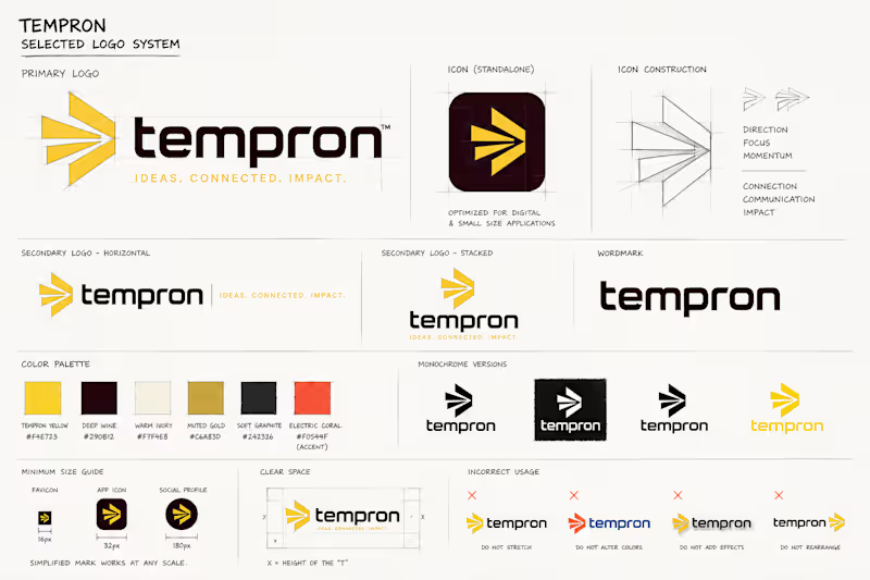
Tempron is a mid-sized advertising company looking to modernize its brand identity with a stronger, more consistent digital presence. The goal was to refresh the logo while keeping the existing yellow and deep burgundy color foundation, then expand the system with complementary colors that improve contrast and flexibility. The final direction focuses on a bold, recognizable symbol that can work independently across social media profiles, app icons, digital advertising, and other small-format applications. I also developed multiple logo configurations and brand applications to show how the identity can stay consistent across both digital and physical touchpoints. The overall approach is clean, modern, and strategic, taking inspiration from the simplicity and confidence seen in leading advertising brands while giving Tempron a distinct identity of its own.
1
62
0
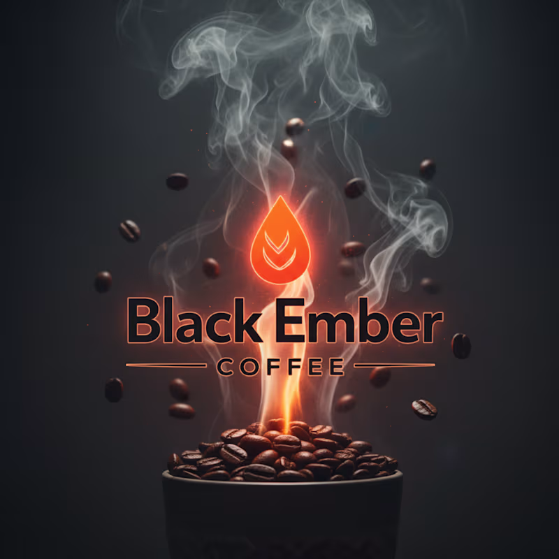
Black Ember Coffee captures the intensity of premium coffee through a bold ember flame logo, rising smoke, and roasted beans suspended in motion. The design blends luxury café branding with cinematic energy, creating a powerful visual identity that feels warm, modern, and unforgettable.
0
47
0
logo design
0
40
0
Logo for Forge District (Fake Client work)
0
63
Logo Designer
(4)
Follow
Message
Katie Clark
Pittsburgh, USA
Hi, I'm Katie. Let's collaborate!
Follow
Message
Hi, I'm Katie. Let's collaborate!
0
Paw Printz (Logo Design)
0
6
0
KURE (Logo + Brand Guidelines)
0
28
0
Motion Cache (Logo + Branded Assets)
0
27
0
Hopscotch Primary Care
0
17
Logo Designer
(2)
Follow
Message
Jordan Sigmund
Pittsburgh, USA
Design, motion, and branding for future-oriented businesses
Follow
Message
Design, motion, and branding for future-oriented businesses
0
Crafting a Country Artist's Chart-Worthy Brand
0
7
0
Branding surgical independence
0
10
0
Helping a fintech startup develop their accessible mission
0
8
0
Helping a ridesharing challenger drive sustainable change
0
12
Logo Designer
(1)
Follow
Message
Explore people