The network for creativity
Join 1.25M professional creatives like you
Connect with clients, get discovered, and run your business 100% commission-free
Creatives on Contra have earned over $150M and we are just getting started
Back to feedPost

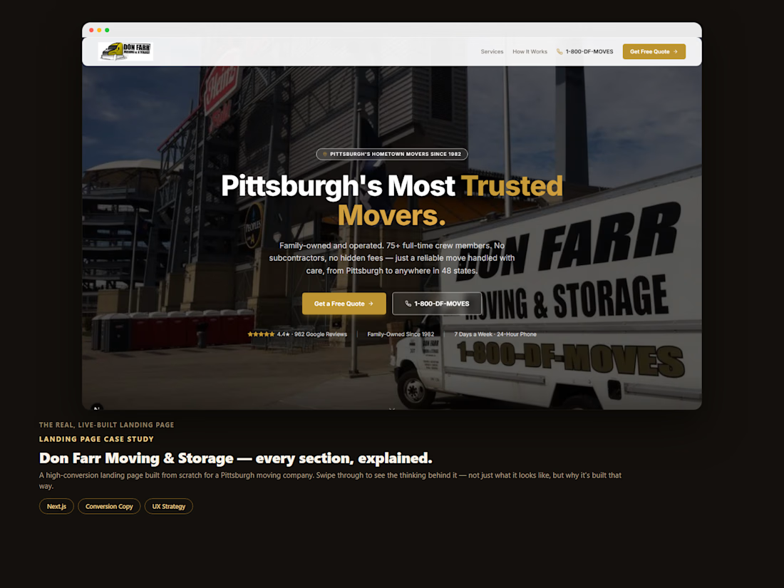
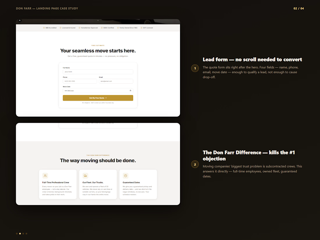
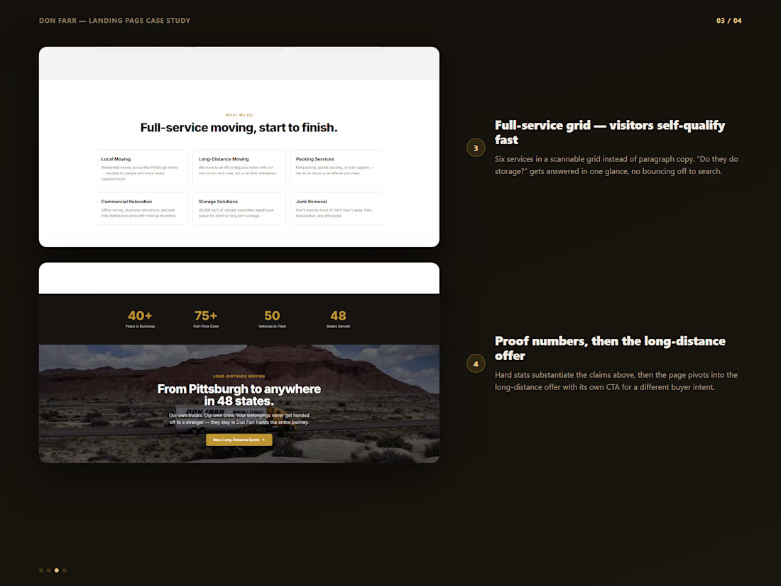
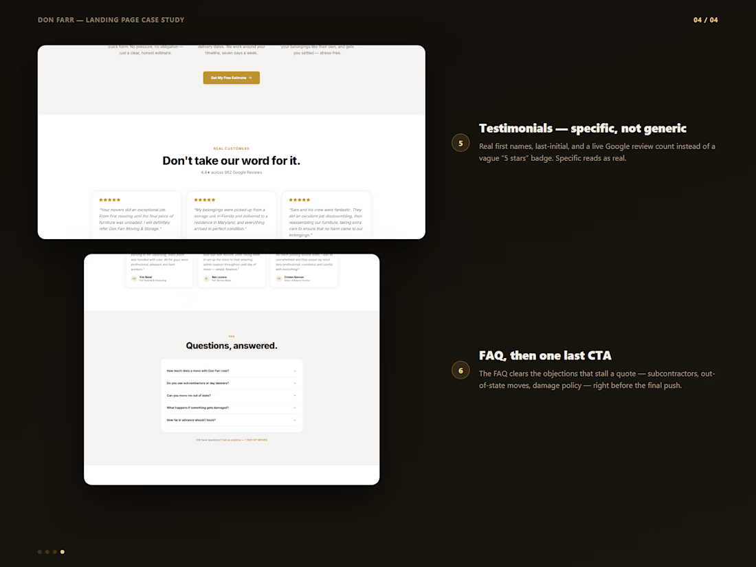
Here's a landing page I built for a Pittsburgh moving company — broken down section by section, so you can see the thinking behind it, not just the finished screenshot.
The hero isn't just a headline. The form isn't just a form. Every block on this page is answering a specific objection or moving someone one step closer to booking — in order, on purpose.
Swipe through to see it.
Good landing pages aren't really a design problem. They're a sequencing problem — and that's the part I spend the most time on.
landingpageautomationconversionstrategyPaid MarketingWeb DesignWeb DevelopmentClaudeNext.jsVisual Studio Code



"Sequencing problem, not a design problem" is a good way to frame it. I'd push back a little though, for a moving company doesn't trust signaling (reviews, insurance, local proof) carry as much weight as the order of the blocks? Where does that fit into your sequencing?

Looks great!
The network for creativity
Join 1.25M professional creatives like you
Connect with clients, get discovered, and run your business 100% commission-free
Creatives on Contra have earned over $150M and we are just getting started





Related posts


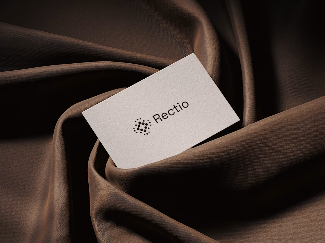
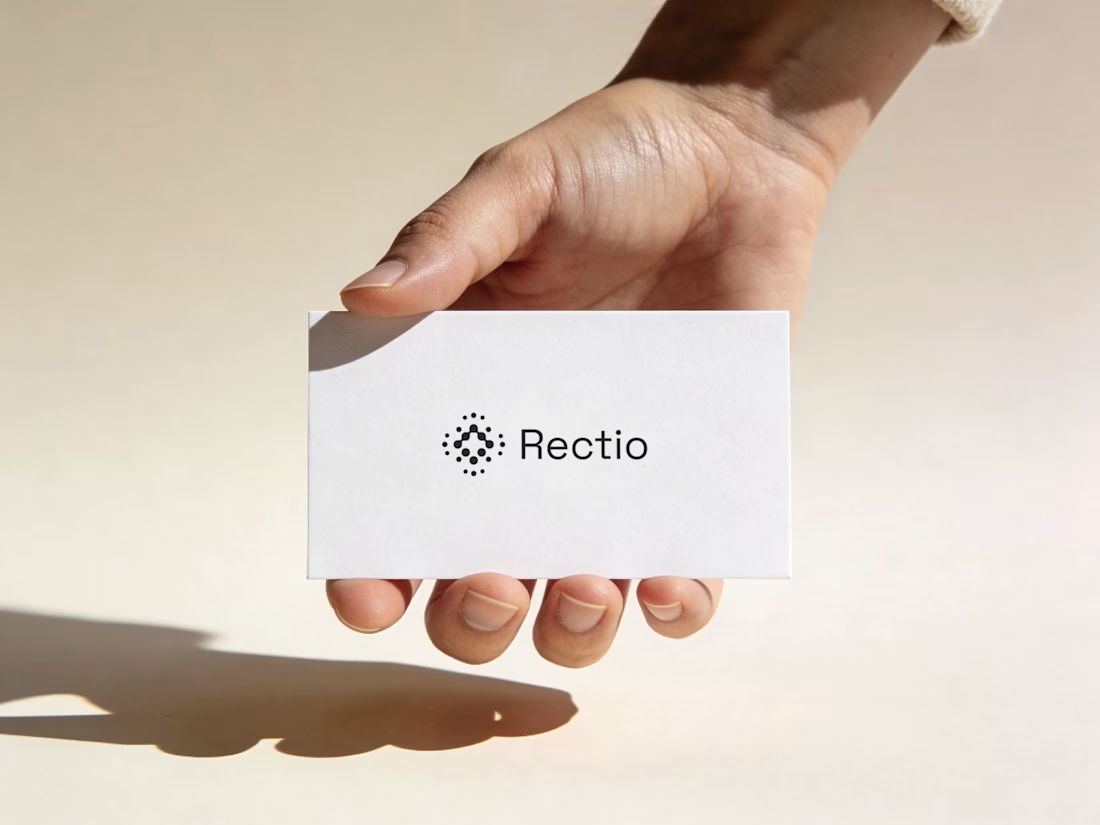
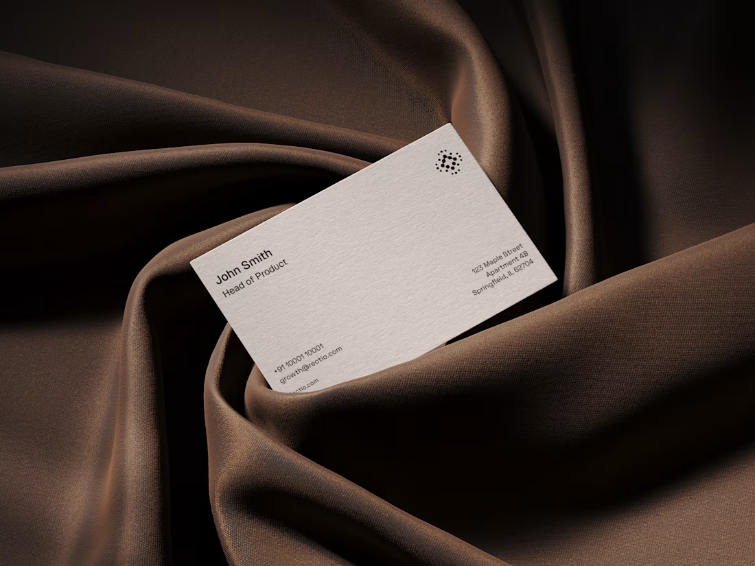
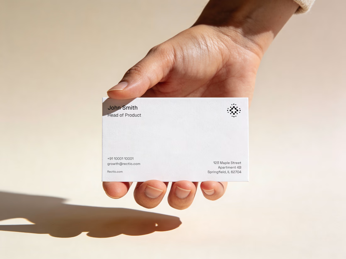
Rectio — Brand Identity
Brand Identity • Visual Direction • Business Cards • Mockups
A modern and minimal branding direction for Rectio, from visual identity to business card applications.
Created by Artonest Design Studio — artonest.design




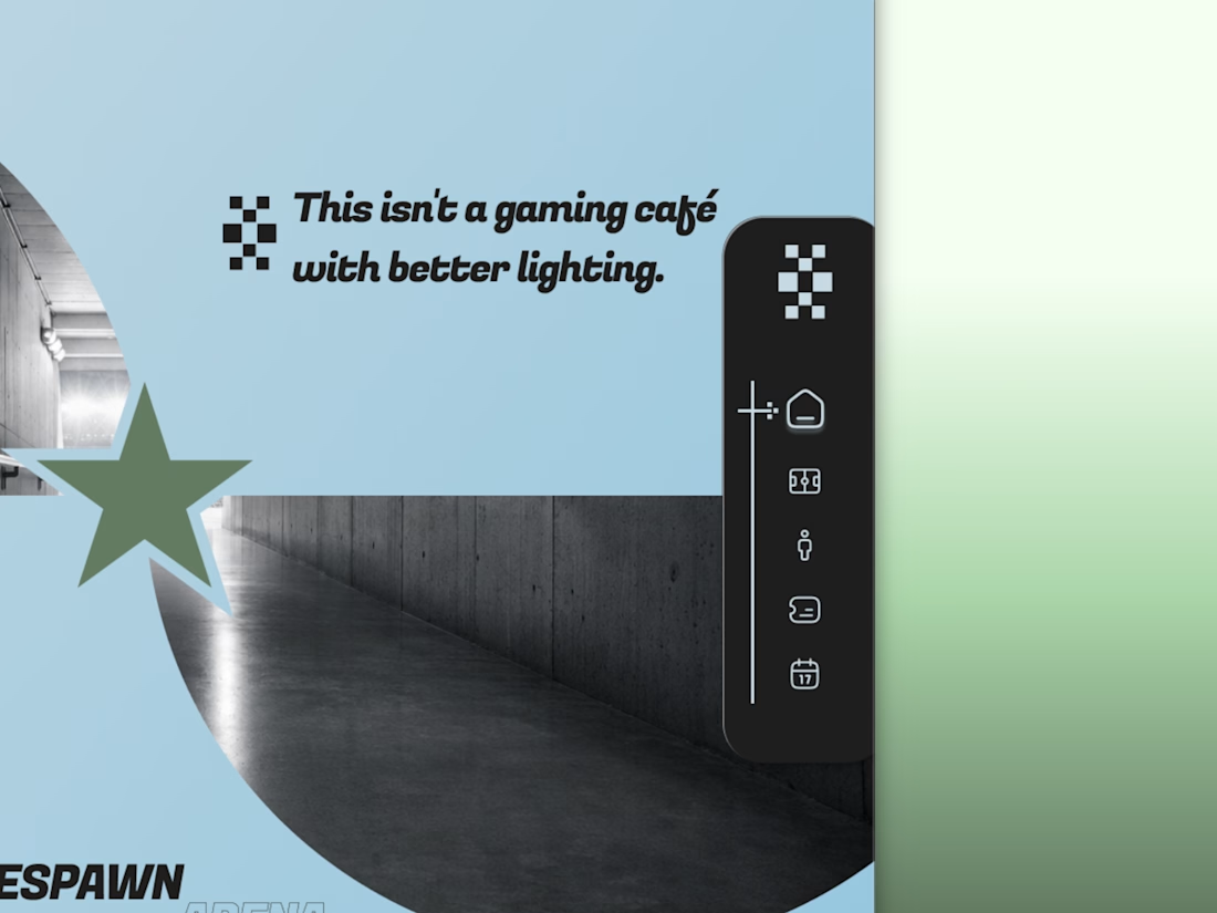
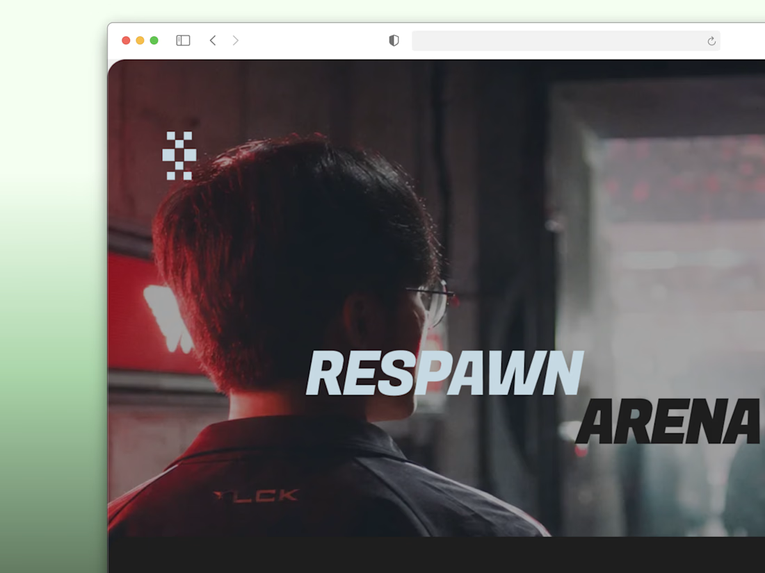
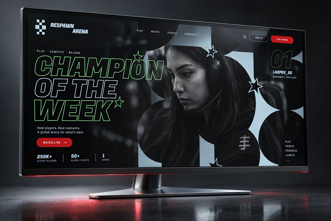
A stadium doesn't need a hype video. It needs a scoreboard.
RESPAWN ARENA, full case study drops soon.
Broadcast identity, arena wayfinding, and a brand that treats esports like the sport it is.

One of the best designs I’ve seen today. Really solid work

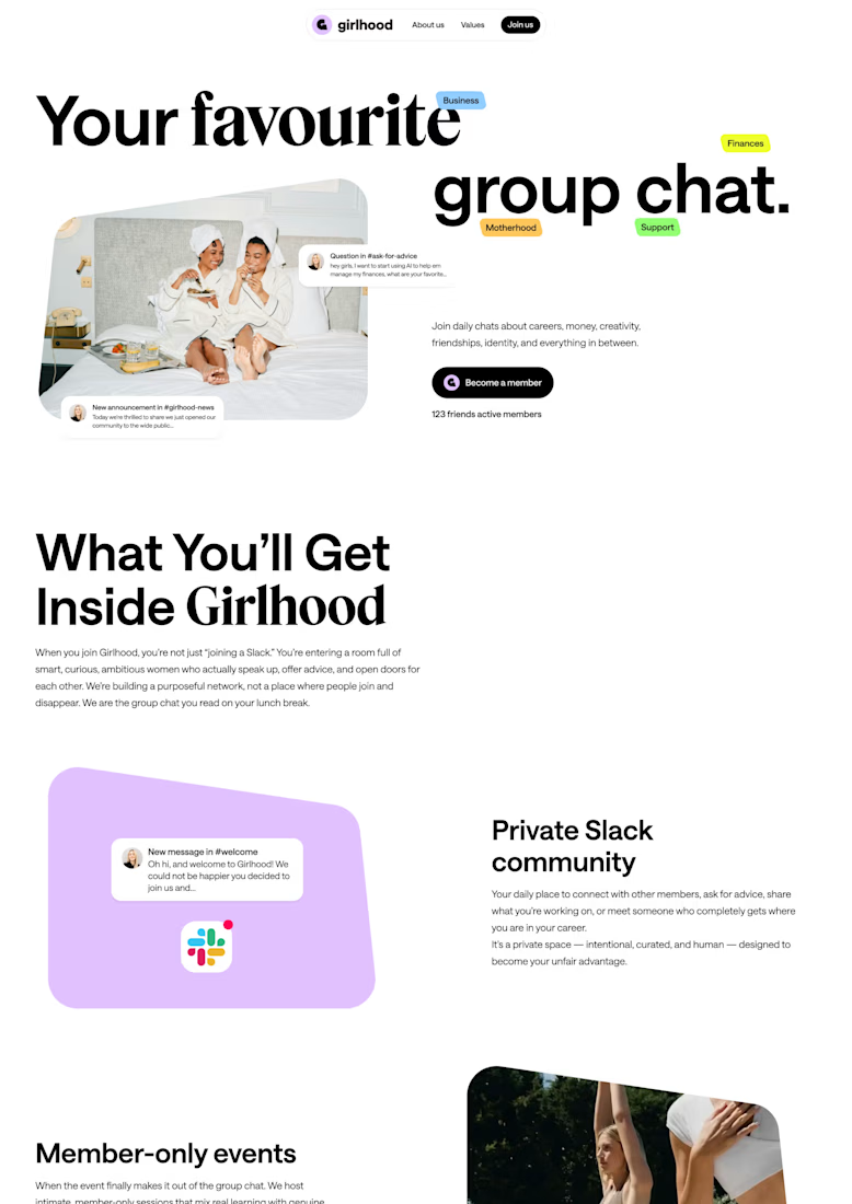

Its feel like your archive is full of honey. wonderful