Crafting a Country Artist's Chart-Worthy Brand
City Kid, Country Star
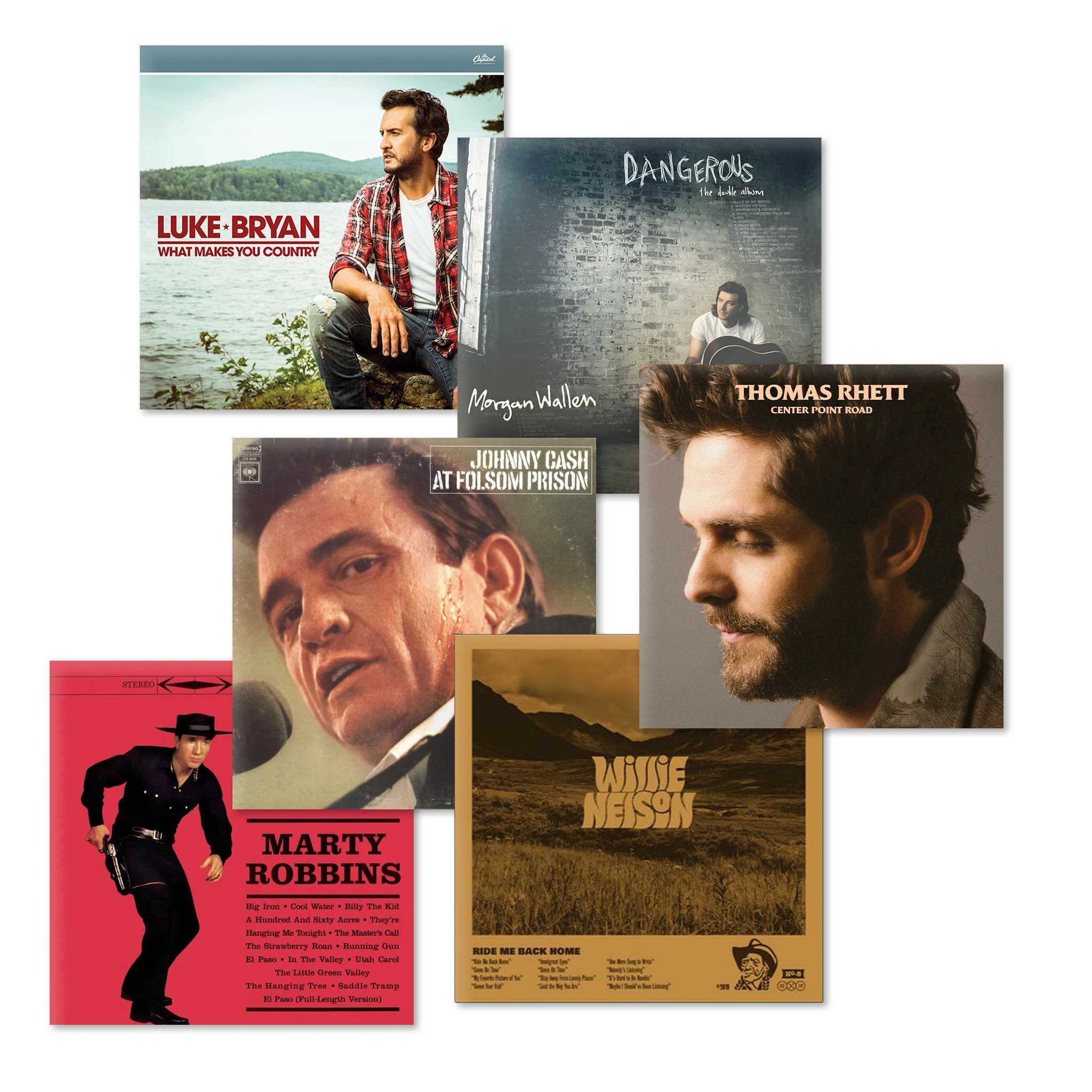
Willie Lock, a rising country star from a small town now making his mark in NYC, embodies classic hard work and determination with a modern twang. Inspired by artists like Morgan Wallen and Thomas Rhett, Willie's music reflects his own unique journey — and he needed his grassroots origins to shine through and add color to his new urban persona.
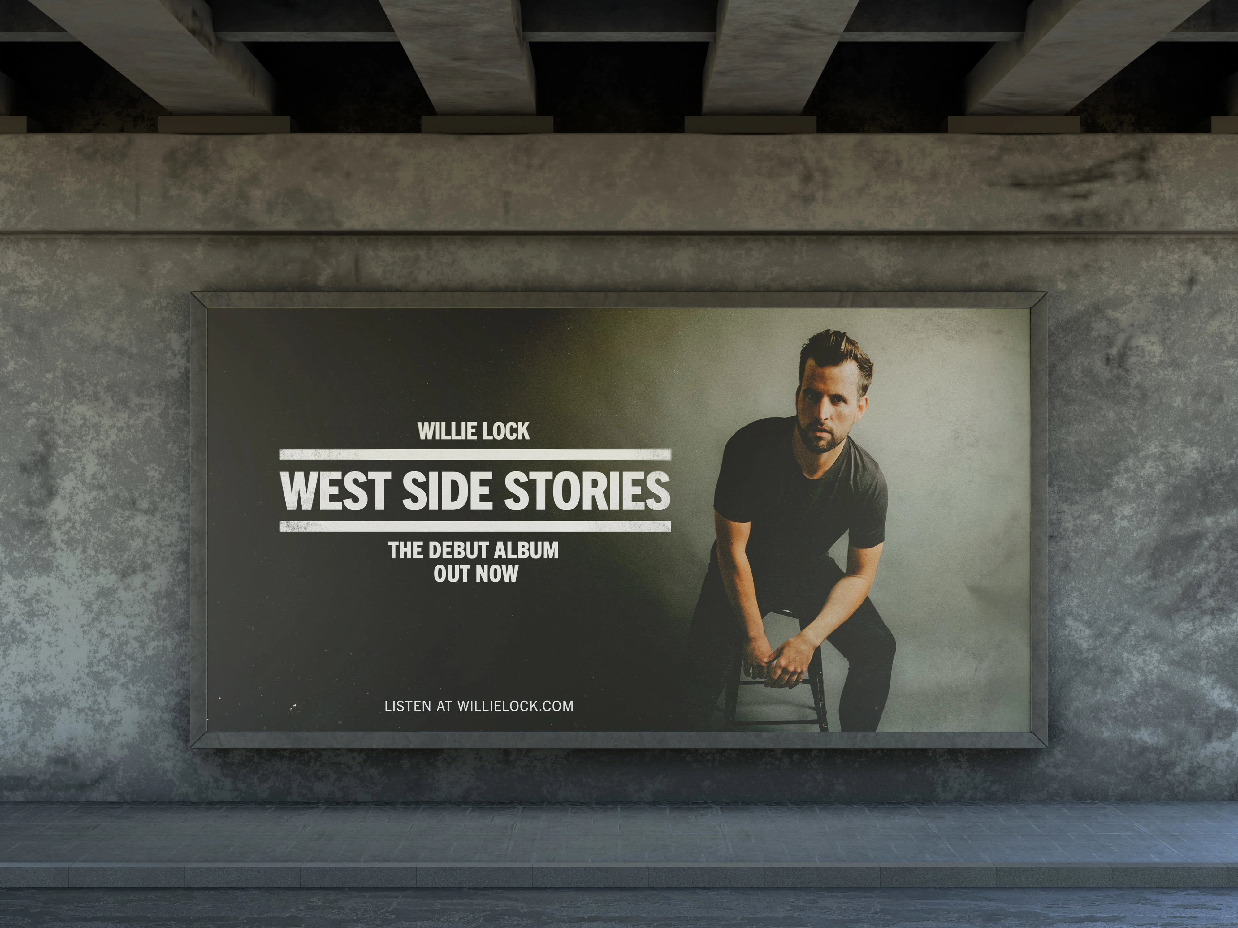
The Brand Challenge: Bridging the Gap
As an emerging artist in a competitive industry, Willie faced the challenge of creating a brand that would resonate with his unique audience. He needed a relatable yet stylish identity that could bridge the gap between his urban lifestyle and country roots, appealing to both modern tastes and traditional sensibilities while remaining professional enough to compete with big names.
Our Solution: A Fresh Take on Country Heritage
We focused on crafting a visual identity that embodied Willie’s distinct personality and musical style, using his urban lifestyle to appeal to country music fans with metropolitan musings. By blending modern design trends with subtle nods to traditional country aesthetics, we aimed to create a brand that felt both fresh and familiar, appealing to a wider audience without compromising authenticity.
Getting up to speed: Understanding the Audience
To shape a strategy that resonated deeply with Willie's audience, we had to learn more about them. We discovered that his audience was a mix of suburban and urban country music fans aged 24-35. By understanding their preferences, we were able to identify key visual elements from modern and vintage country artists that appealed to them. It was here that we recognized Willie's urban lifestyle as a unique differentiator — positioning him as an artist who longs for the good old days from his small town past.
Creating the Visual Identity: Modern Twang
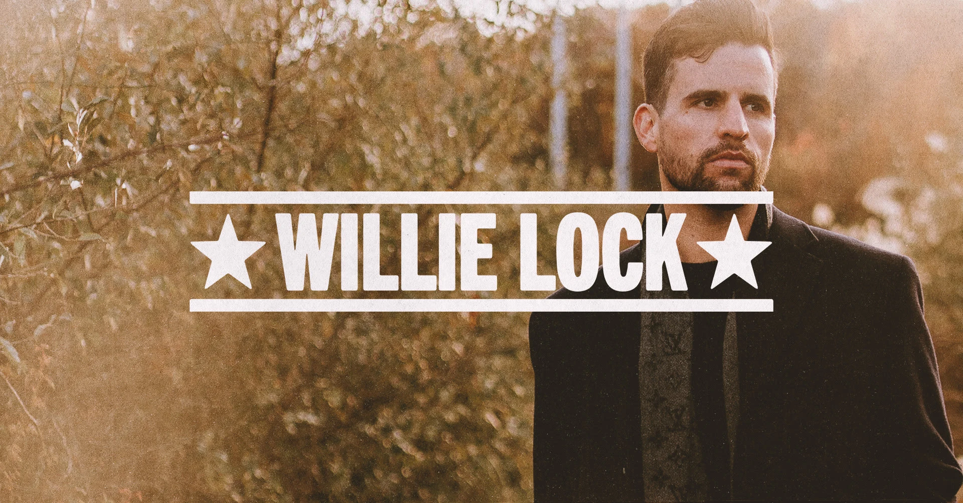
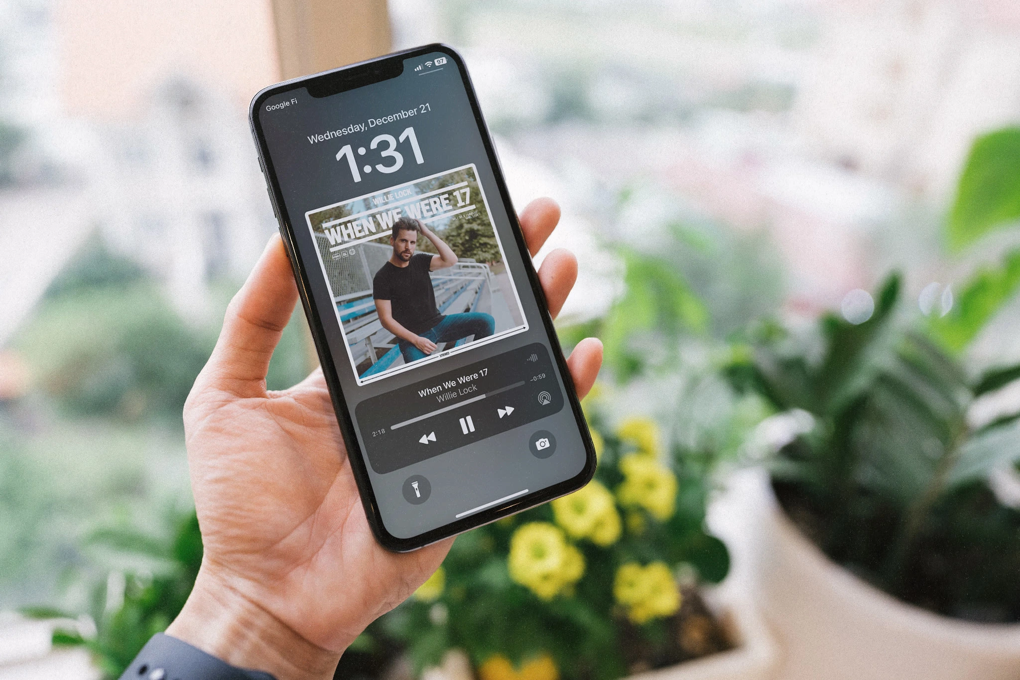
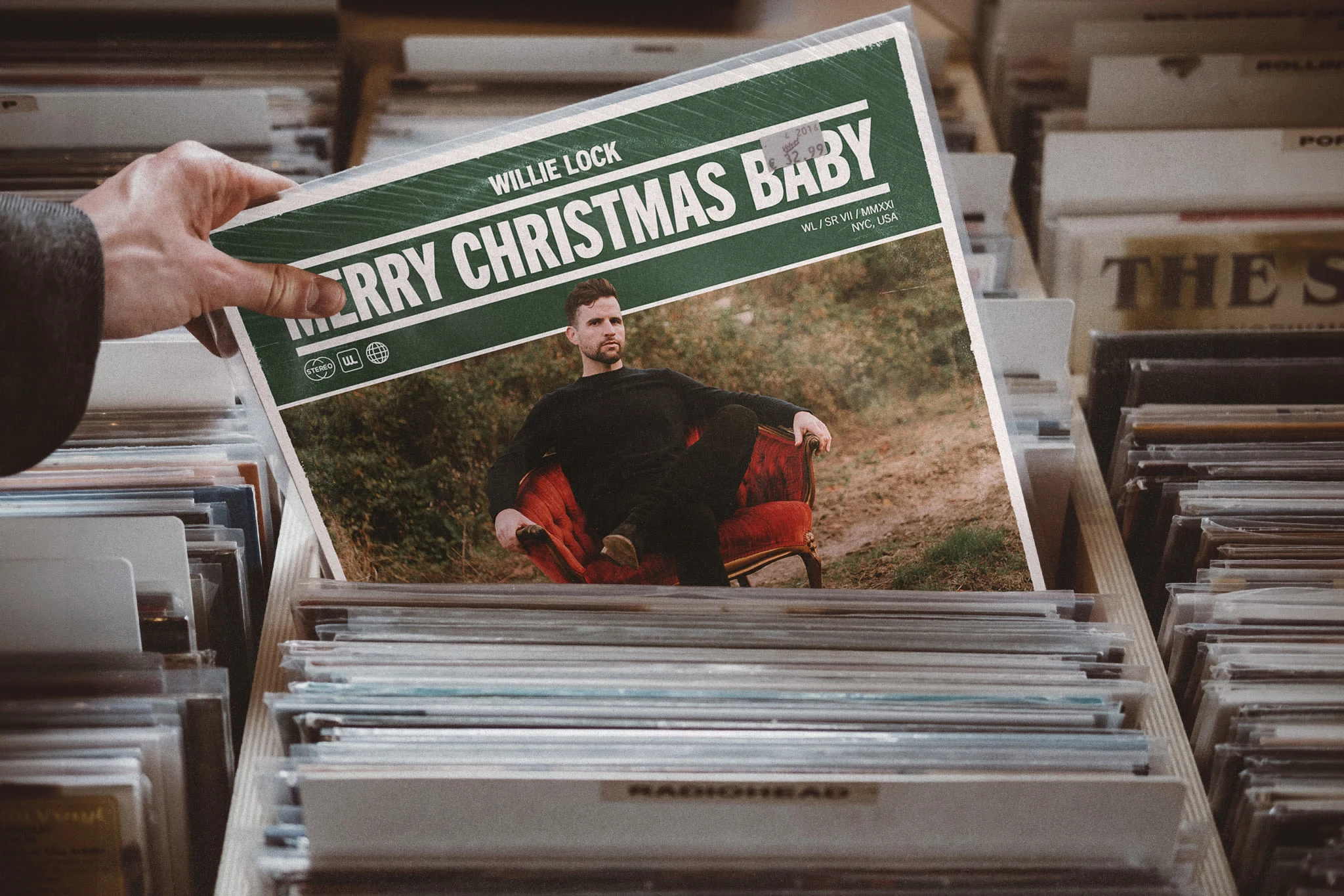
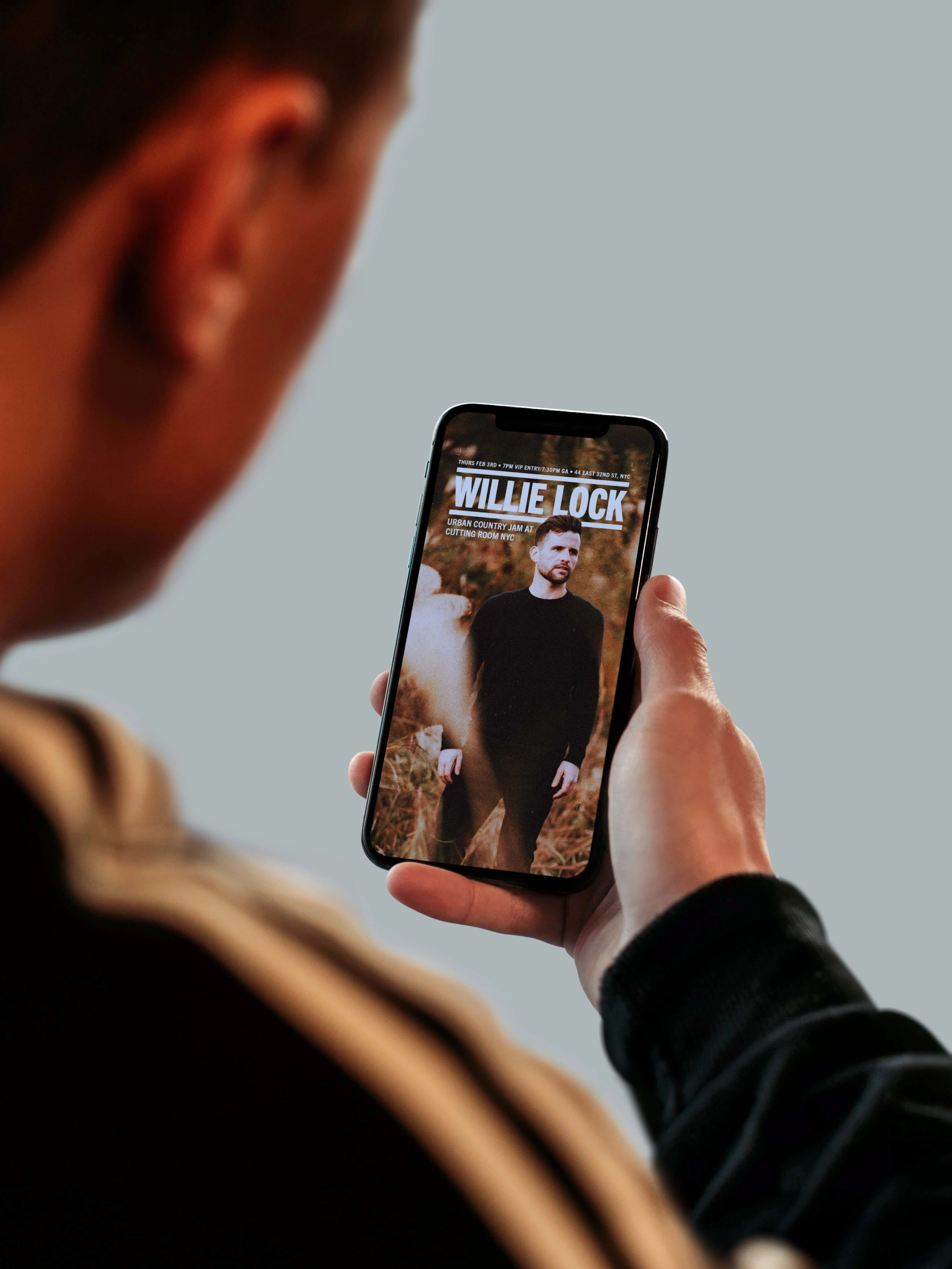
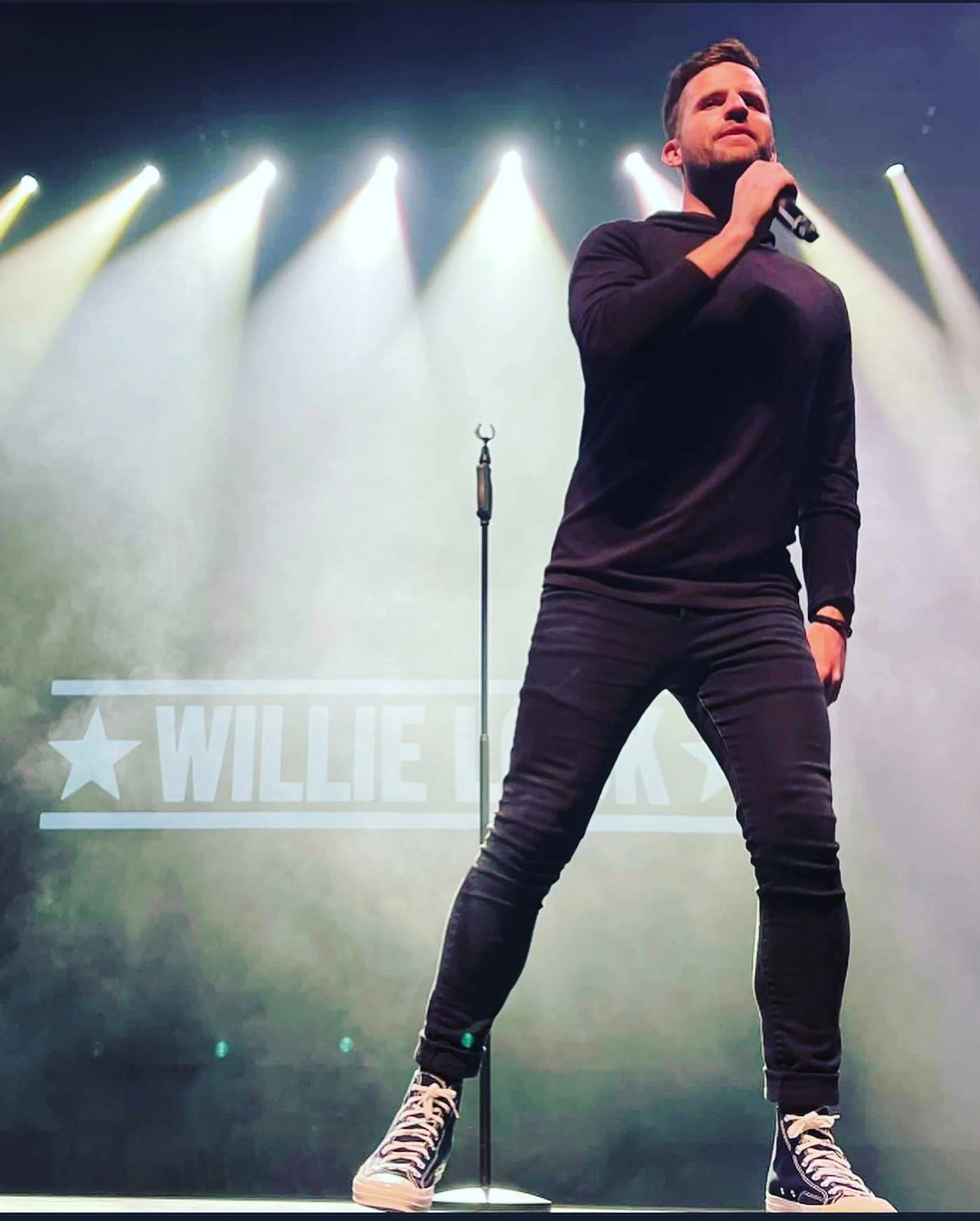
Channelling our discoveries about Willie's audience and their interests, we were able to jump into Willie's visual identity with photography at the forefront — deepening his story with diverse settings that positioned him as a passionate urbanite and longing country kid. To support the photography, we selected typefaces that bridged a slightly retro, utilitarian aesthetic with a more elevated, curated look. The bold typography helped communicate Willie's rustic roots, even in more urban photography. When channeled into wordmarks, we worked in minimal geometric elements reminiscent of popular trends from the 2010's, stylized with subtle distressing to bring it back down to earth.
The Impact: A Resonant Identity and Engagement Driver
The new visual identity helped Willie connect with his audience in a more tailored way, driving significant growth in his fanbase and engagement. His latest single "When We Were 17" debuted in the top 50 on the iTunes Country Music charts, and his Spotify statistics showed huge increases:
Over 900% growth in monthly listeners, reaching 100K
Over 900% growth in streams, surpassing 200K
Track saves increased by 500%
Playlist adds increased by over 600%
Like this project
Posted Jun 3, 2024
Helping Willie Lock, a rising country star living in NYC, strategically build a visual identity that taps into a diverse audience to drive incredible results.
