The network for creativity
Join 1.25M professional creatives like you
Connect with clients, get discovered, and run your business 100% commission-free
Creatives on Contra have earned over $150M and we are just getting started
Back to feedPost

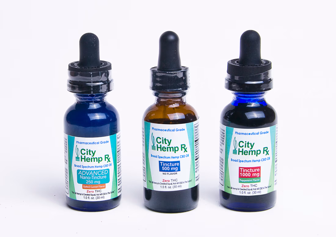
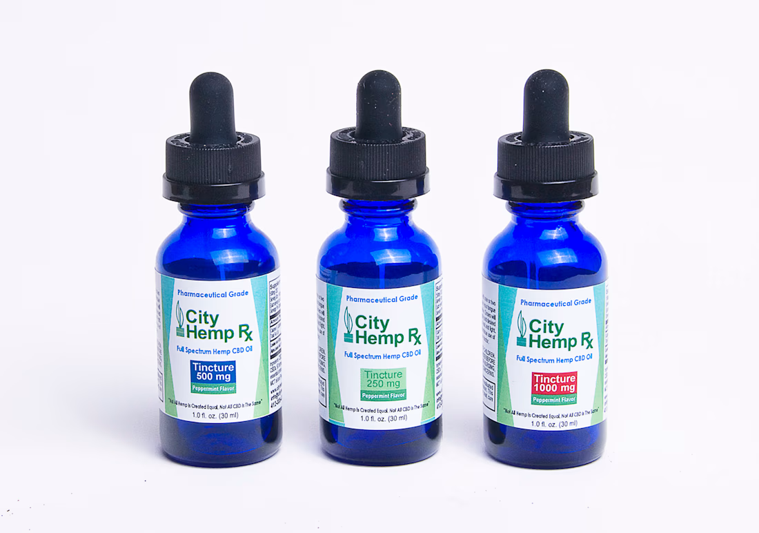
CITY HEMP RX LABEL DESIGNS
Worked with the owner of City Hemp RX to create and design product labels and additional graphics for Hemp CBD oil products in their respective applications.


The network for creativity
Join 1.25M professional creatives like you
Connect with clients, get discovered, and run your business 100% commission-free
Creatives on Contra have earned over $150M and we are just getting started

Challenges
View all


Related posts


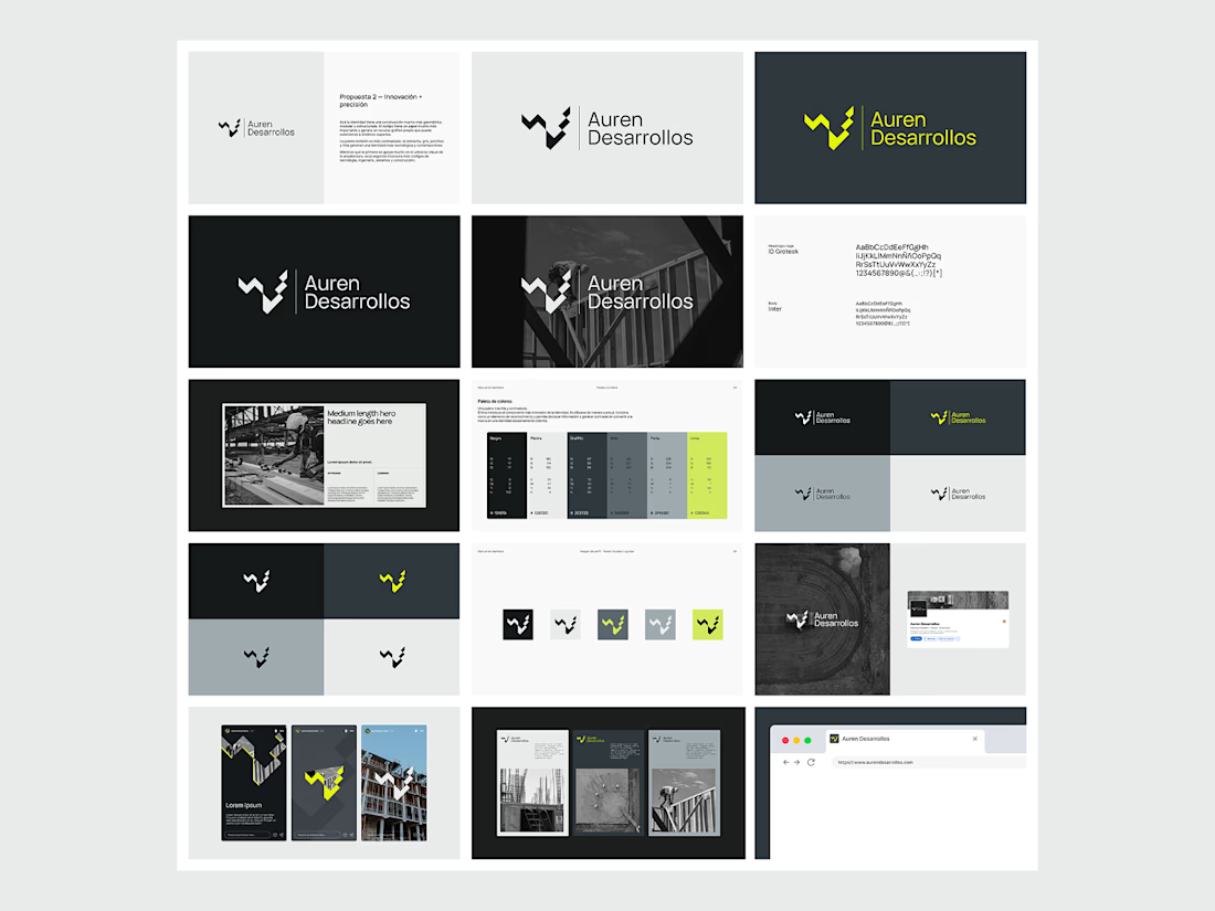
Not every direction makes it to the final brand.. this was one of the directions we explored for Auren Desarrollos, a new construction and development company we’re currently working with on its branding and website.
I’ll be sharing the final result soon, and I think the difference will be interesting to see.
What do you think?


Great!

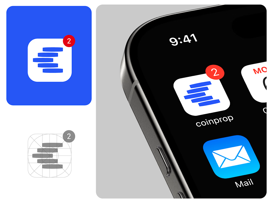
@coinprop.io Sometimes, the idea that comes to mind turns out to be so perfect that you can't believe it. This one popped up early in the project and stayed until the end as the best one. A stack of coins forming the letter C for a coin prop firm. Simple and timeless.
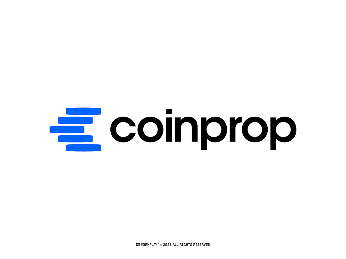

this is smart! coins as C - didn't think of that before. really clean work man

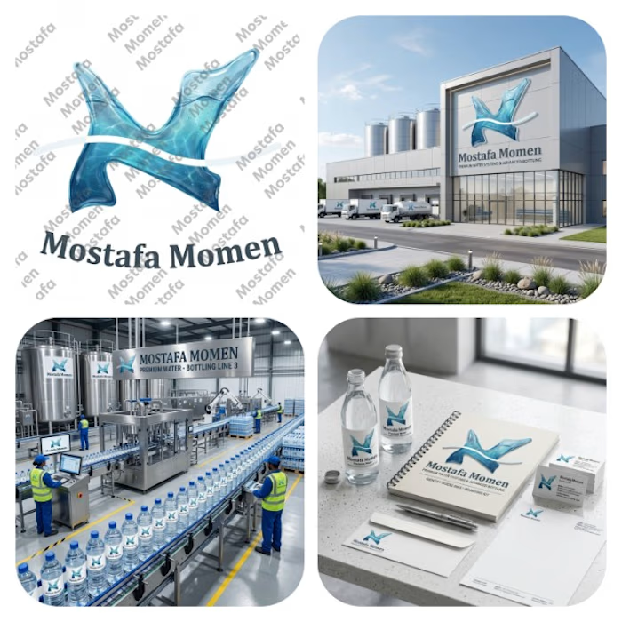
That's my case study to water bottle factory branding logo this logo is modern minimalist 3D realistic logo
This logo design is realistic water logo that was designed by curvy natural shape that has realistic water texture to make it suitable for a water bottle factory brand
This logo focus on (realism, nature feel by natural Designing)
It solves the problem of (memorization, recognition, showing trust, professionalism)
Thanks for everyone who support me❤️

Great project, well done