The network for creativity
Join 1.25M professional creatives like you
Connect with clients, get discovered, and run your business 100% commission-free
Creatives on Contra have earned over $150M and we are just getting started
Back to feedPost

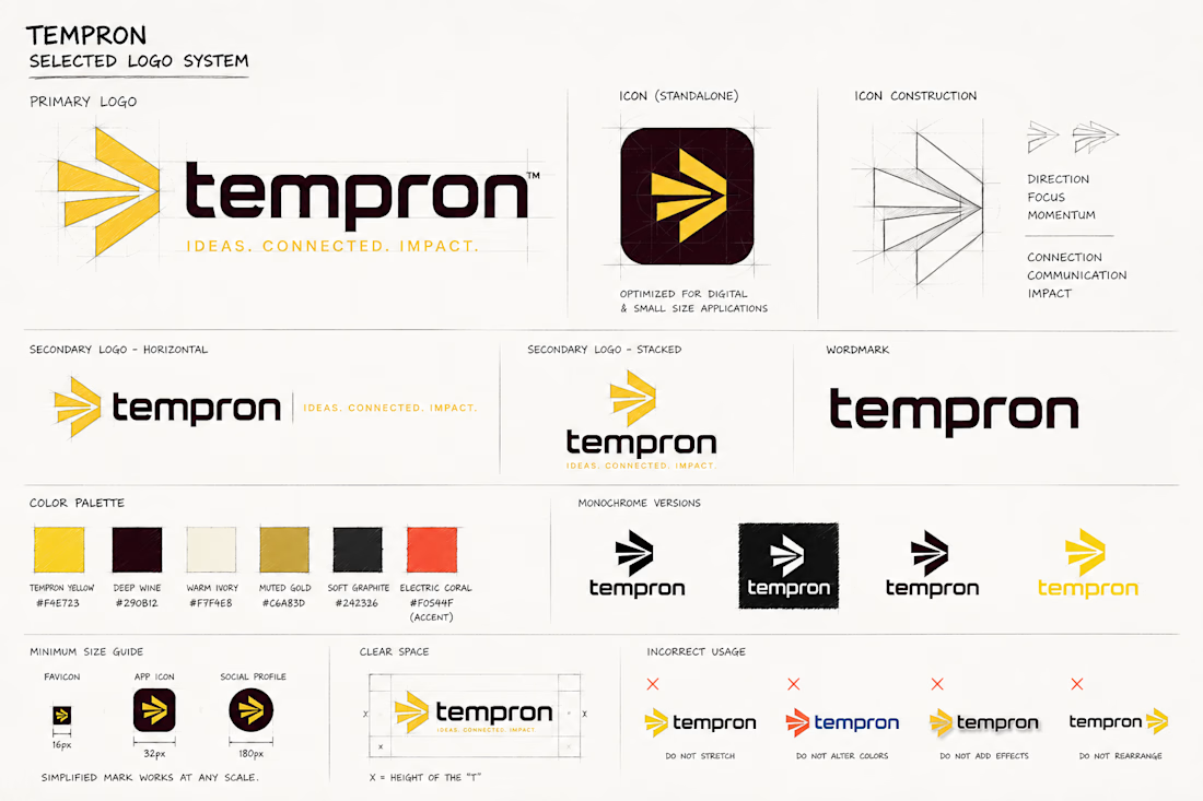
Tempron is a mid-sized advertising company looking to modernize its brand identity with a stronger, more consistent digital presence. The goal was to refresh the logo while keeping the existing yellow and deep burgundy color foundation, then expand the system with complementary colors that improve contrast and flexibility.
The final direction focuses on a bold, recognizable symbol that can work independently across social media profiles, app icons, digital advertising, and other small-format applications. I also developed multiple logo configurations and brand applications to show how the identity can stay consistent across both digital and physical touchpoints.
The overall approach is clean, modern, and strategic, taking inspiration from the simplicity and confidence seen in leading advertising brands while giving Tempron a distinct identity of its own.

The network for creativity
Join 1.25M professional creatives like you
Connect with clients, get discovered, and run your business 100% commission-free
Creatives on Contra have earned over $150M and we are just getting started








Related posts


For Vetti, a pet-health startup, our team made orange the signature colour and kept it out of the product’s data states.
Orange could carry the brand in a campaign. Inside the product, the colour attached to a score needed its own meaning. Using the same colour for recognition and an alert would ask someone to work out which job it was doing.
So the guidelines gave the data palette a separate role. Scores came with plain-language states, and the alert-copy rule was to state the observation, then give the next step.
Those decisions belong together. A calm sentence can be undermined by a colour treatment that suggests urgency.
If you’re reviewing an identity for a product, put a marketing layout beside a screen that communicates status. Ask what each colour means in each place.


This is beautiful work, and the orange colour choice was a good one, it really ties it all together ♥️

Bland is a choice.
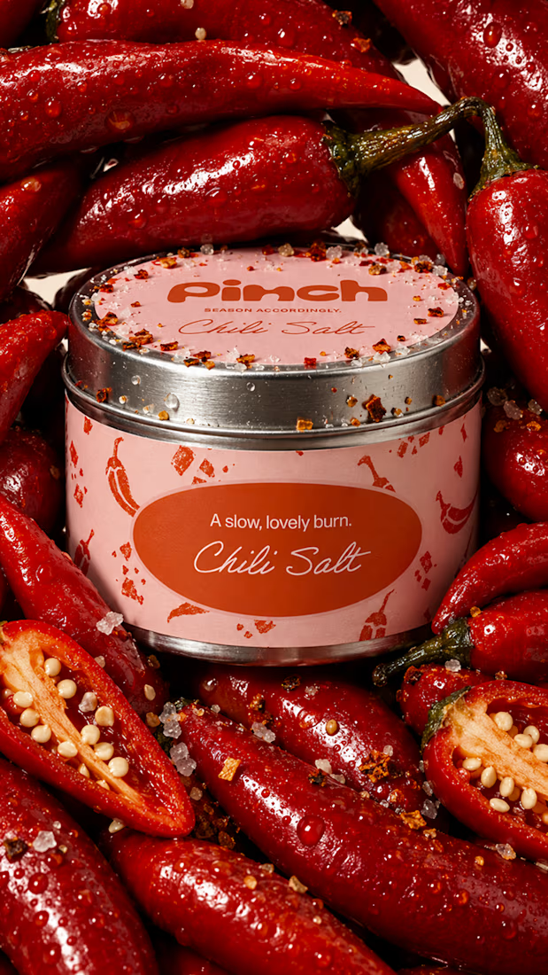
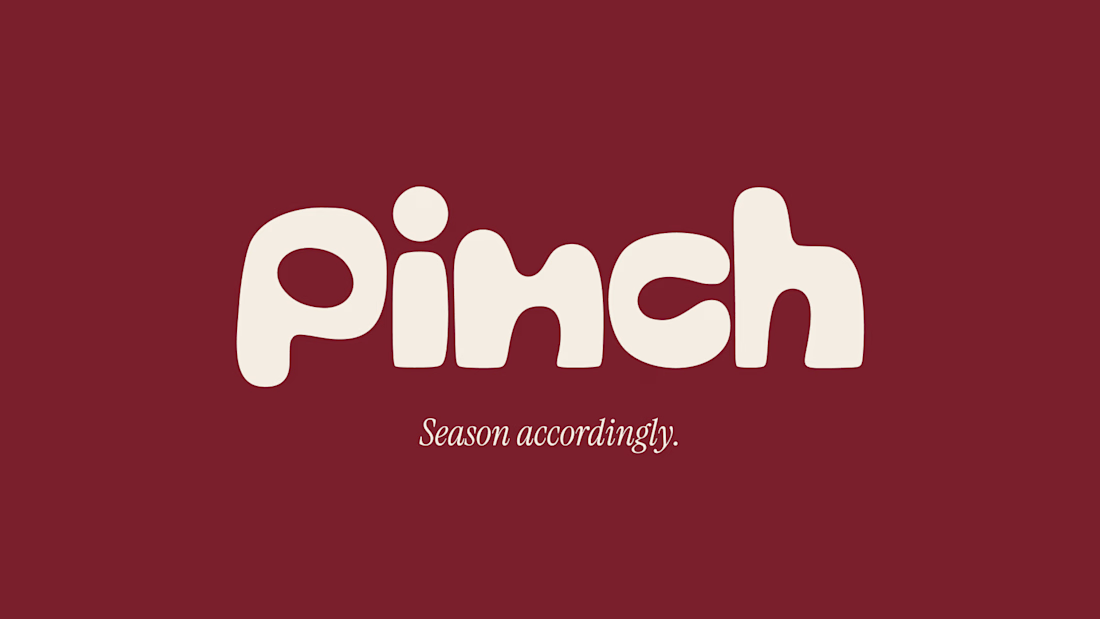
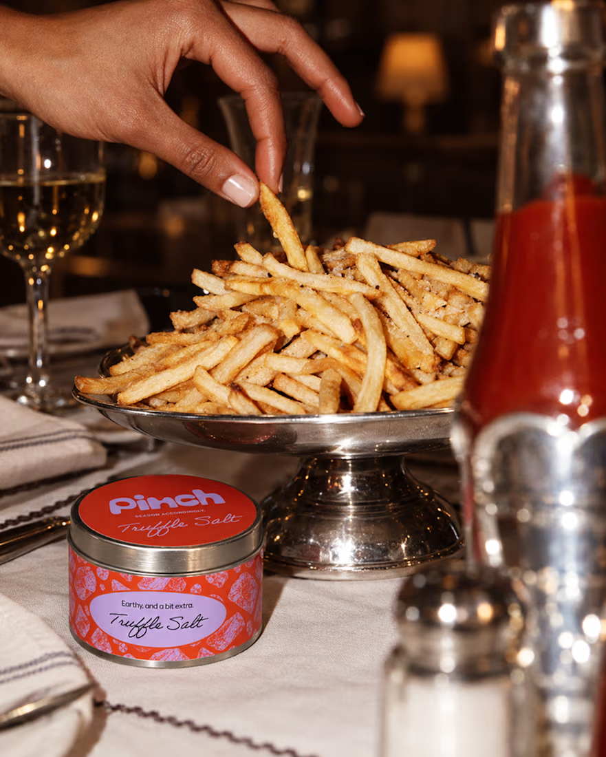
Pinch is a concept brand for a mid-high salt line made to live on the counter, not in the cupboard. Five flavors, five two-color tins, one refillable keepsake people leave next to the bar cart.
I built the full identity: wordmark, lid lockups, hand-stamped pattern system, tone of voice, and art direction.
More from the system coming soon.



Cool work 🔥

I’m happy to share a new logo redesign! ✦
I had the opportunity to redesign this logo for a client from Cambodia, and the entire redesign was completed within a day.
What do you think of the new direction? Share your thoughts in the comments! 👇
10 voted
91%

1 voted
9%

11 votes
Closed

After is more professional ❤️