Freelance Interaction Designers in United Kingdom
Sign Up
Post a job
Sign Up
Log In
Filters
2
Projects
People
Afeez Yunus
pro
United Kingdom
Innovative Product Designer. Rive Expert. Framer Expert
$25k+
Earned
4x
Hired
4.8
Rating
102
Followers
Top
expert
Follow
Message
Innovative Product Designer. Rive Expert. Framer Expert
0
Quickbook
0
24
2
The Hub
2
35
1
Fixchores
1
52
29
DataQ
29
518
Interaction Designer
(4)
Follow
Message
Hakeem Framer
max
East Sussex, UK
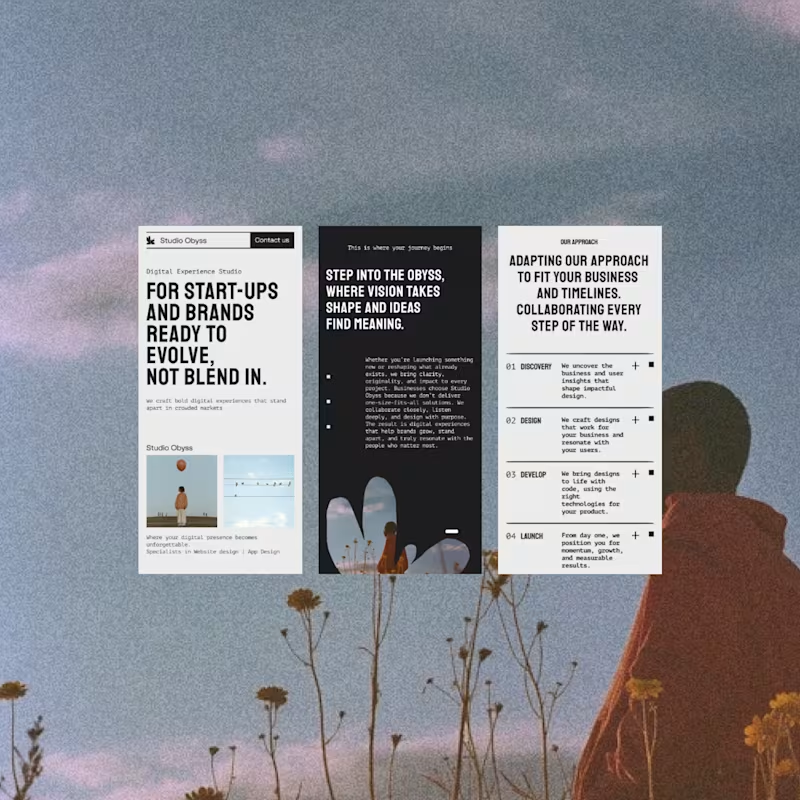
Brand and website design for startups that need to stand out
$100k+
Earned
88x
Hired
4.8
Rating
2.6K
Followers
Top
expert
+11
Follow
Message
Brand and website design for startups that need to stand out
28
Kinetic Canvas: The Art of Motion Design
1
28
524
7
Santis Textiles | Figma to Framer Website Development
7
198
42
Jitter Animation Projects
42
761
46
The Lucra Brandbook The brandbook is the least glamorous deliverable and the most important one. It's the document that makes every future decision faster, the one a new hire, a freelancer, or an internal marketing team can open and immediately know how the brand should look, sound, and behave. Good brand work isn't just a nice logo. It's a system someone else can run without you in the room. A look inside a recent brandbook. PoW - https://contra.com/studioduo (https://contra.com/studioduo)Let's talk about your brand identity and Website design needs Schedule a 15min Discovery call here https://cal.com/digitalforus/15min?overlayCalendar=true
8
46
1.9K
Interaction Designer
(3)
Follow
Message
Ashley Best
pro
Bristol, UK
Interactive / Animation / Web Development / Sound Design
$10k+
Earned
8x
Hired
5.0
Rating
254
Followers
expert
Follow
Message
Interactive / Animation / Web Development / Sound Design
199
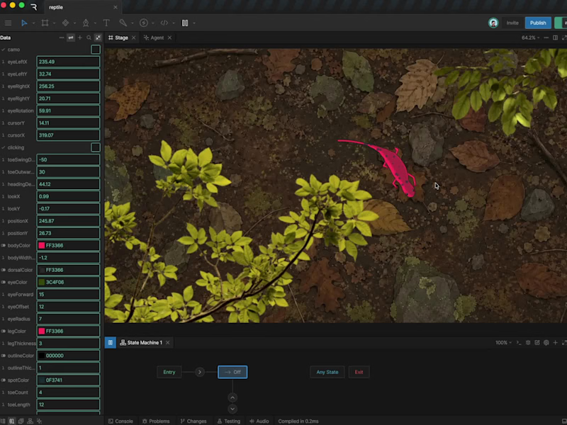
I've been locked-in on a big project, so I'm a late comer to this challenge, but I managed to carve out some time to create my entry! Introducing: 'Luma', an inquisitive reptile who follows me around inside Rive! 🦎 Entirely script driven, she follows your cursor and can even change colour when she settles on her favourite rock. It feels like the beginning of a little game I might have to keep developing! Where should Luma go next?
60
199
8.2K
2
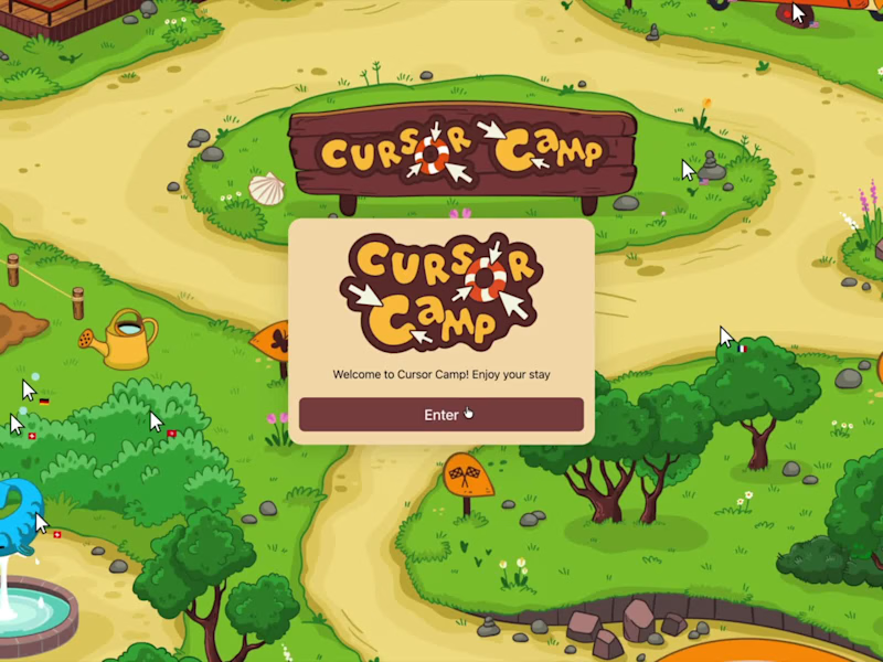
Cursor Camp game for neal.fun
2
18
103
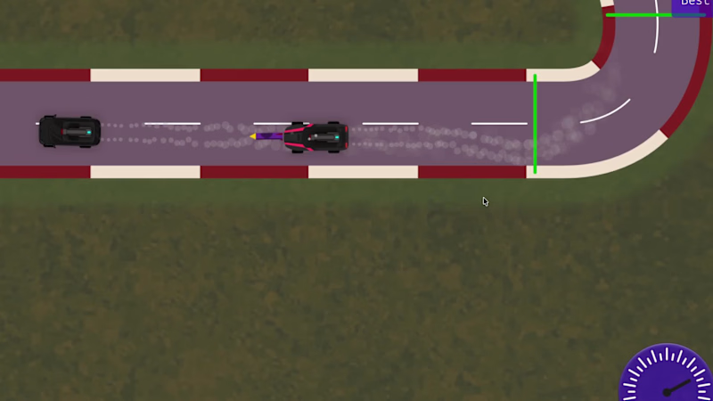
DRIVE & SURVIVE! 🚀🚗💨 My driving game just levelled up! Rockets are now in play. Collect ammo as you navigate the twists and turns of the track, then unleash chaos on your opponents in this fast-paced top-down racer built entirely in @Rive
36
103
3.4K
4
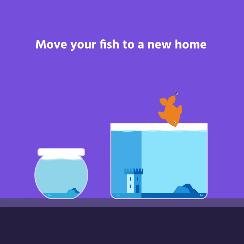
New tank, who dis? 👉🏻🐟 Give Mr Finley a tank upgrade in this smooth drag-and-drop interaction. Another fun interactive animation example built with Rive. Link in comments!
1
4
999
Interaction Designer
(10)
Follow
Message
Mikey Itua
Manchester, UK
I create websites and MVPS to help ambitious businesses grow
$5k+
Earned
2x
Hired
72
Followers
expert
Expert
+2
Follow
Message
I create websites and MVPS to help ambitious businesses grow
$2K+ earned
1
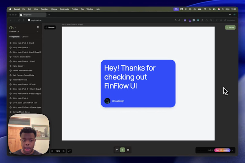
FinFlow UI - MagicPath Component Library
1
66
3
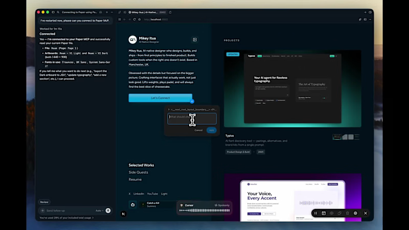
For this challenge, I used several tools connected to Paper and Paper's Canvas to build Roam - a restaurant, eatery, and activity finder for Manchester. I wanted to create it because, coming back from uni with time to finally explore the city, I needed a way to visualise places I'd been meaning to visit on a map. I started by using Claude Code in the terminal to pull a button from my portfolio repo, then rebuilt and redesigned it in the Paper canvas for this project. From there, I used Claude Code and Gemini CLI to generate screens and variants via Paper MCP, picked my favourite, and brought it to life as a functional design in the new Lovable Desktop app using Paper MCP connection. I then synced the project to Cursor via GitHub and continued iterating - adding advanced features like maps, a light/dark mode using colour styles from my Paper Canvas, and a chatbot, both designed with Claude Code and Paper MCP. I finally powered the chatbot using Lovable AI and used the Paper metal shader for the chatbot button. Check out my post on X where I also have a longer version of the process video: https://x.com/ituadesign/status/2044547467488772264?s=20
3
471
29
Creating brand & marketing images for Fanta using lovart.ai (https://lovart.ai) (concept). Using highly detailed and crafted prompts fed into Nano Banana Pro and Lovart's features such as web search and edit text. This level of visual quality comes down to how detailed your prompt is.
2
29
450
29
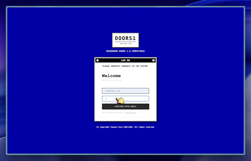
Meet Macrohard Doors 1 - my YouWare Challenge submission. A retro desktop OS experience featuring classic apps like Paint, Calculator, Snake, Minesweeper, Music, Terminal, and more. I built this purely for fun - something different from the sea of wellbeing apps and purple gradients. This is about nostalgia, play, and the charm of old-school operating systems. Step back in time and experience the look and feel of early desktop interfaces and retro OS design. Built with @YouWare and powered by Youbase for user profile login/authentication and state storage. 👉 Check it out: https://doors1.youware.app/
2
29
751
Interaction Designer
(1)
Follow
Message
Manuele Capacci
pro
London, UK
Developing ideas into products that work and look just right
5.0
Rating
5
Followers
Follow
Message
Developing ideas into products that work and look just right
0
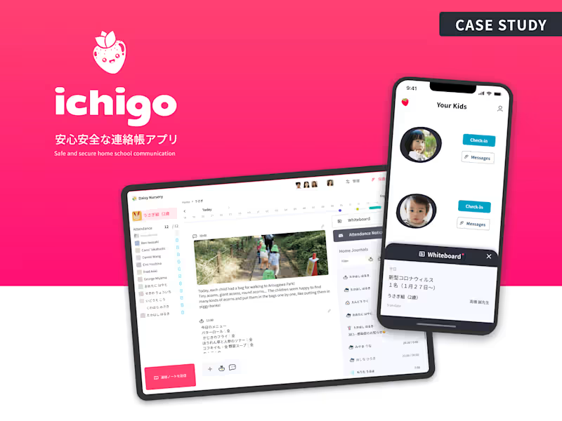
Ichigo - From Prototype Directly to the Market
0
28
0
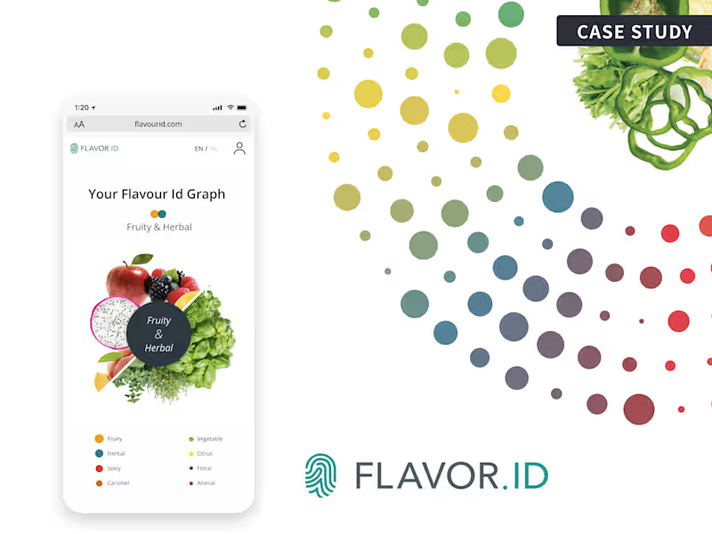
Flavor ID - Turning Food Science into a Personal Experience
0
58
0
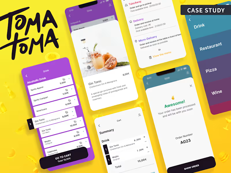
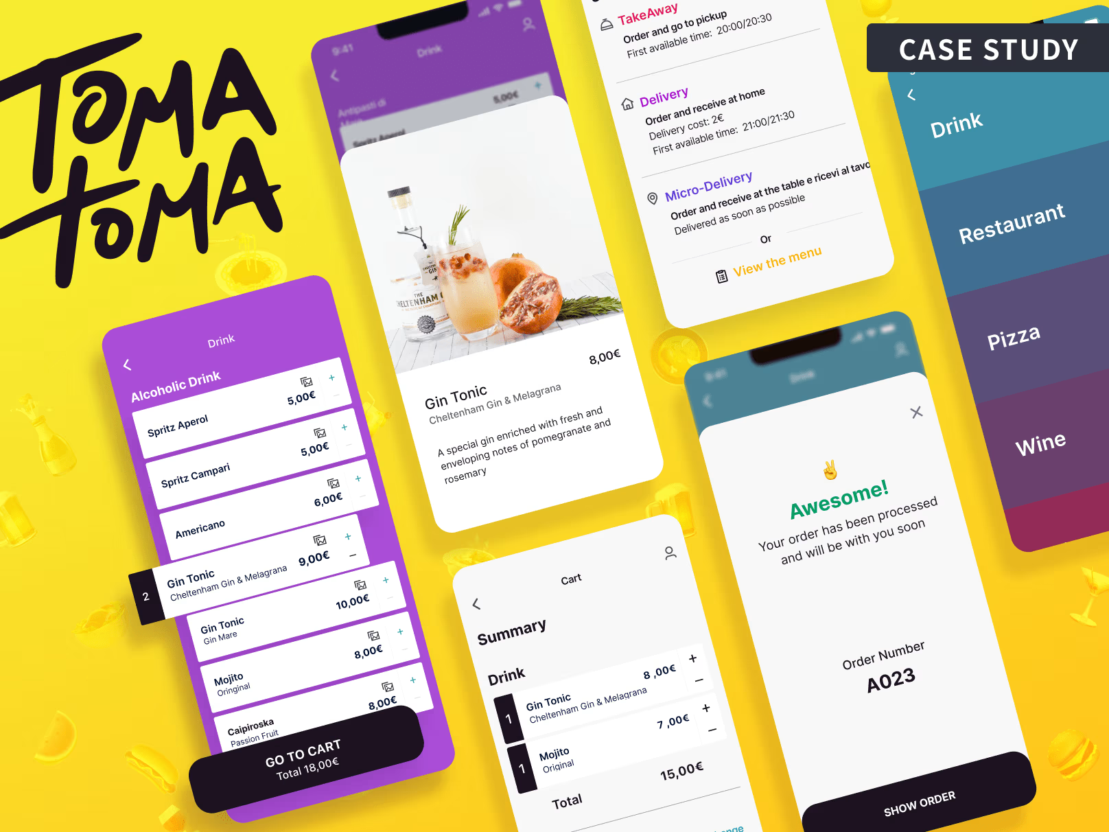
Tomatoma - Building a Restaurant Platform from Scratch
0
38
View more →
Interaction Designer
(2)
Follow
Message
Florencia Solari
United Kingdom
Creative Technologist | AR/VR, WebXR, 3D & AI
8
Followers
Follow
Message
Creative Technologist | AR/VR, WebXR, 3D & AI
0
Express Your e.l.f.
0
1
0
Glass Shader Woman: A Cinematic 3D Scene
0
3
0
Organic Shader Lab
0
8
0
Royal Canadian Mint Virtual Museum
0
4
Interaction Designer
(6)
Follow
Message
Jasmine Gordon
Greenford, UK
Designing websites and apps that are impossible to forget.
Follow
Message
Designing websites and apps that are impossible to forget.
32
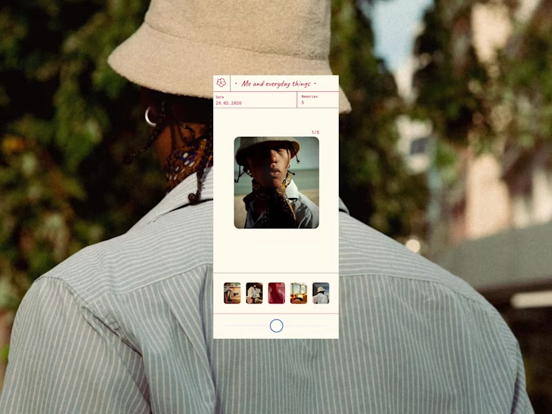
A photo viewer inspired by the classic 3D View‑Master. I wanted to rethink how we look back at our memories on our phones, and bring back that slow, nostalgic feeling instead of the usual quick swipe through. So I attempted to mimic the View‑Master lever, you press and pull the circle in either direction to switch images. Drag it right to move forward, drag it left to go back. I added the ability to move backwards (which you can’t do on the real thing) because it just felt more natural to give people that freedom. For the UI, I designed it to be clear and simple whilst allowing the image the user is viewing to be the main focus. Designed by me in Figma, then built in Figma Make. Play around with it here: https://unify-board-60898759.figma.site
6
32
654
2
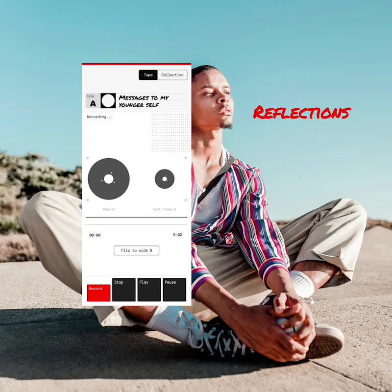
My last submission is voice notes reimagined for spoken journals and daily reflections, taking inspiration from dictaphones and cassette players for both the interactions and UI design. The goal of this concept was to explore how I could emulate the aesthetics and functionality of old school technology and bring it into the digital world, while staying true to its original purpose. When the user presses record, the film, represented as wheels, starts to spin. The user can rewind by pressing and dragging the left wheel in an anticlockwise circular motion. To fast-forward, they can do the same with the right wheel, this time moving in a clockwise circular motion. Designed by me in Figma, then built in Figma Make. Play around with it here: https://rover-linen-15186179.figma.site
2
2
137
1
Website design and build
1
7
0
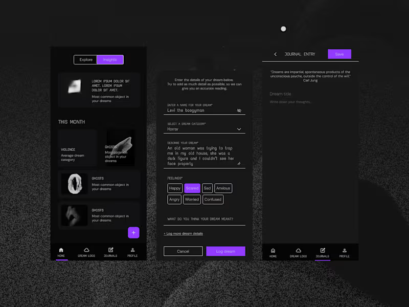
Rethinking dream apps - UI/UX design
0
6
Interaction Designer
(2)
Follow
Message
Monodeep Samanta
pro
London, UK
Web and Mobile App UX/UI Designer 🇬🇧
Follow
Message
Web and Mobile App UX/UI Designer 🇬🇧
1
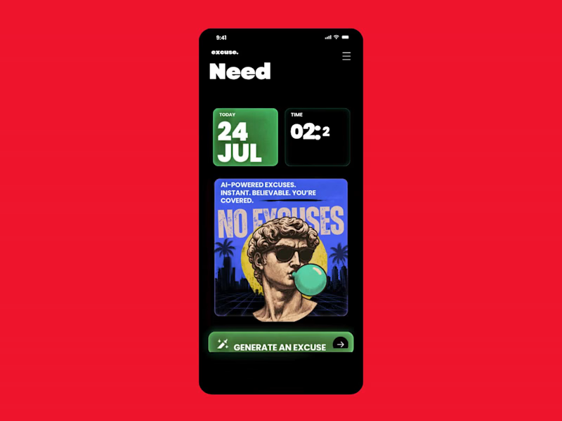
Monday Survival Kit: AI Excuse Generator We've all had that Monday morning where getting out of bed feels like the hardest task of the week. This is a fun UI concept for an AI-powered Excuse Generator that creates believable, dramatic, or completely ridiculous excuses in seconds. It's designed as a parody app that doesn't take itself too seriously, while exploring bold typography, playful illustrations, and a retro-inspired visual style. Sometimes the best product ideas aren't built to solve a huge business problem. They're built to make people laugh, start conversations, and remind us that great UX can also entertain. A few favourites: "My motivation is currently buffering." "My alarm resigned this morning." "I'm attending an emergency meeting with my pillow." "My coffee requested a delayed start." Would you download it for Monday mornings?
1
79
23
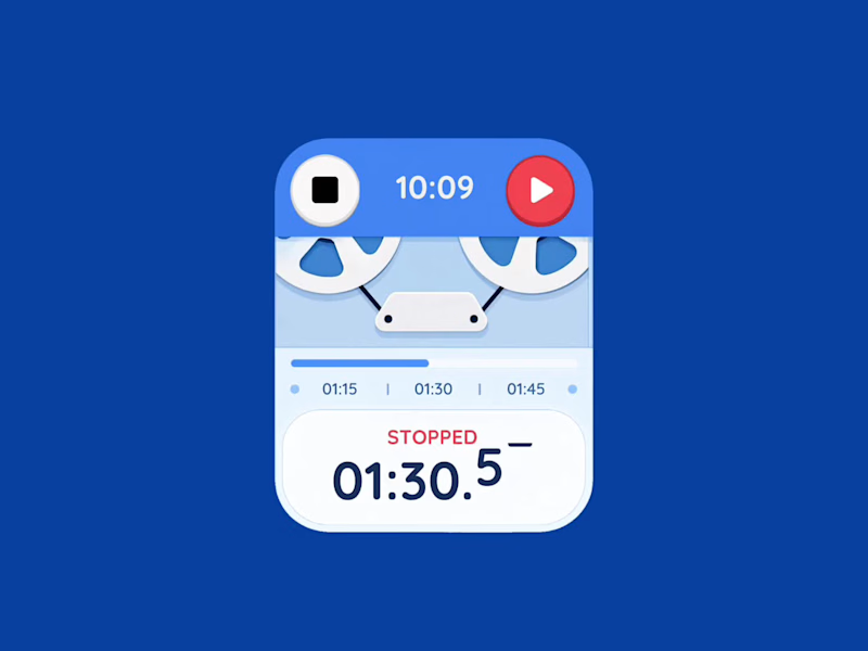
Retro Reel Timer — Minimal Cartoon UI A playful reinterpretation of a classic reel-to-reel timer, redesigned with a softer colour palette, simplified shapes and a clean cartoon-inspired visual style. The interface keeps the nostalgic character of analogue recording equipment while presenting the controls in a modern, friendly and easy-to-understand layout. The design focuses on strong visual hierarchy, balanced spacing and clear interaction states. Bold timer typography, rounded controls and subtle depth help the interface feel approachable without becoming visually cluttered, creating a distinctive concept suitable for a mobile timer, audio recorder or productivity application.
2
23
1.3K
1
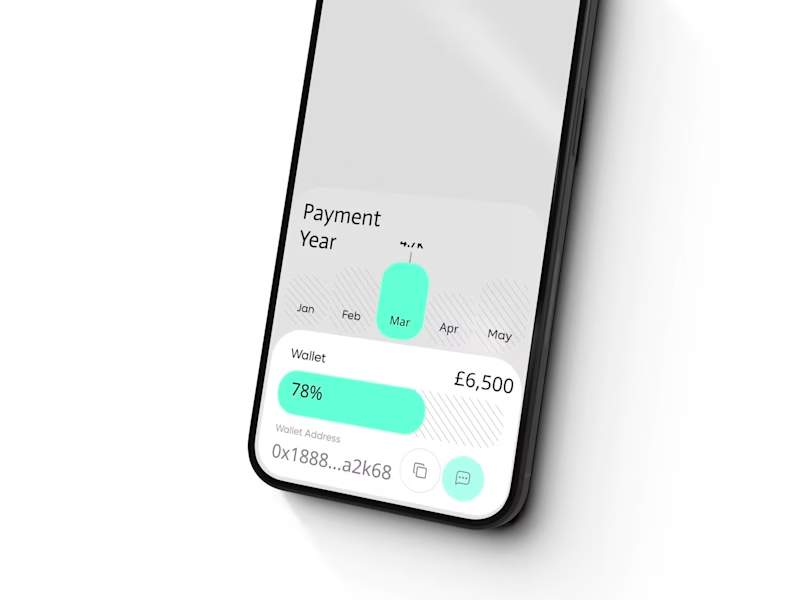
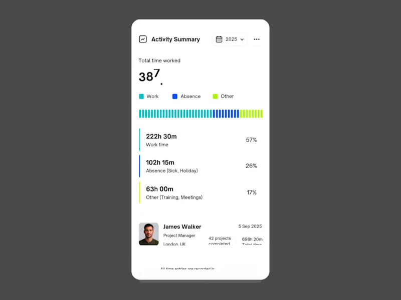
Workforce Activity Overview – Mobile Dashboard Widget This mobile activity widget was designed to help employees and managers understand yearly work patterns without opening a full dashboard. It brings together total logged hours, annual leave, sickness, training and project activity in one clear view, using strong hierarchy and restrained corporate colours to make the information easy to scan. The simplified layout could reduce the time needed to review an employee’s activity from several minutes to under 30 seconds. Managers can identify unusual absence levels, check workload distribution and prepare performance reviews faster, while employees gain a clearer understanding of how their recorded time has been allocated.
1
103
2
A simple pricing upgrade flow designed to make a complex decision feel effortless. The animation moves from plan selection to successful activation, using clear hierarchy, subtle motion, and focused interaction. The goal was to reduce friction, highlight the important information, and give users confidence before upgrading. Designed for a UK-based SaaS product with local pricing, secure UK data hosting, and a clean subscription experience. Would you keep this interaction minimal, or add more product details before the final confirmation?
2
157
Interaction Designer
(4)
Follow
Message
Explore people