
pro
Monodeep Samanta
Web and Mobile App UX/UI Designer 🇬🇧
Ready for work
Monodeep is ready for their next project!

Behind the design: a SaaS meeting scheduling and contact management flow.
In this UX/UI design walkthrough, I explain the journey from selecting a contact to booking a meeting, choosing an event type and picking a calendar date. I point out the interface details that keep meeting history, duration, host information and preparation notes visible throughout the booking process.
My focus was interaction design, clear navigation and a booking experience that feels easy to follow. A closer look at my thinking behind dashboard UI design and meeting scheduling UX.
0
31
I’ve been working on a concept called Respira, focused on making breathing and recovery data feel easier to understand and less clinical.
The main challenge was not the visuals. It was deciding what the user should understand first. So I structured the experience around three things: current recovery, supporting health signals, and the next action. Recovery stays central, secondary metrics remain easy to scan, and the guided breathing session is always close enough to act on.
The interface and motion were created in Figma, with a lot of attention on hierarchy, data visualisation, component behaviour and micro-interactions. The goal was to make the product feel calm, responsive and useful, not just visually polished.
I’m sharing a short video of the interaction here. Would be interested to know which part of the experience stands out to you most.
#UXDesign #UIDesign #ProductDesign #Figma #InteractionDesign #HealthTech #DashboardDesign #UXUI
1
2
87
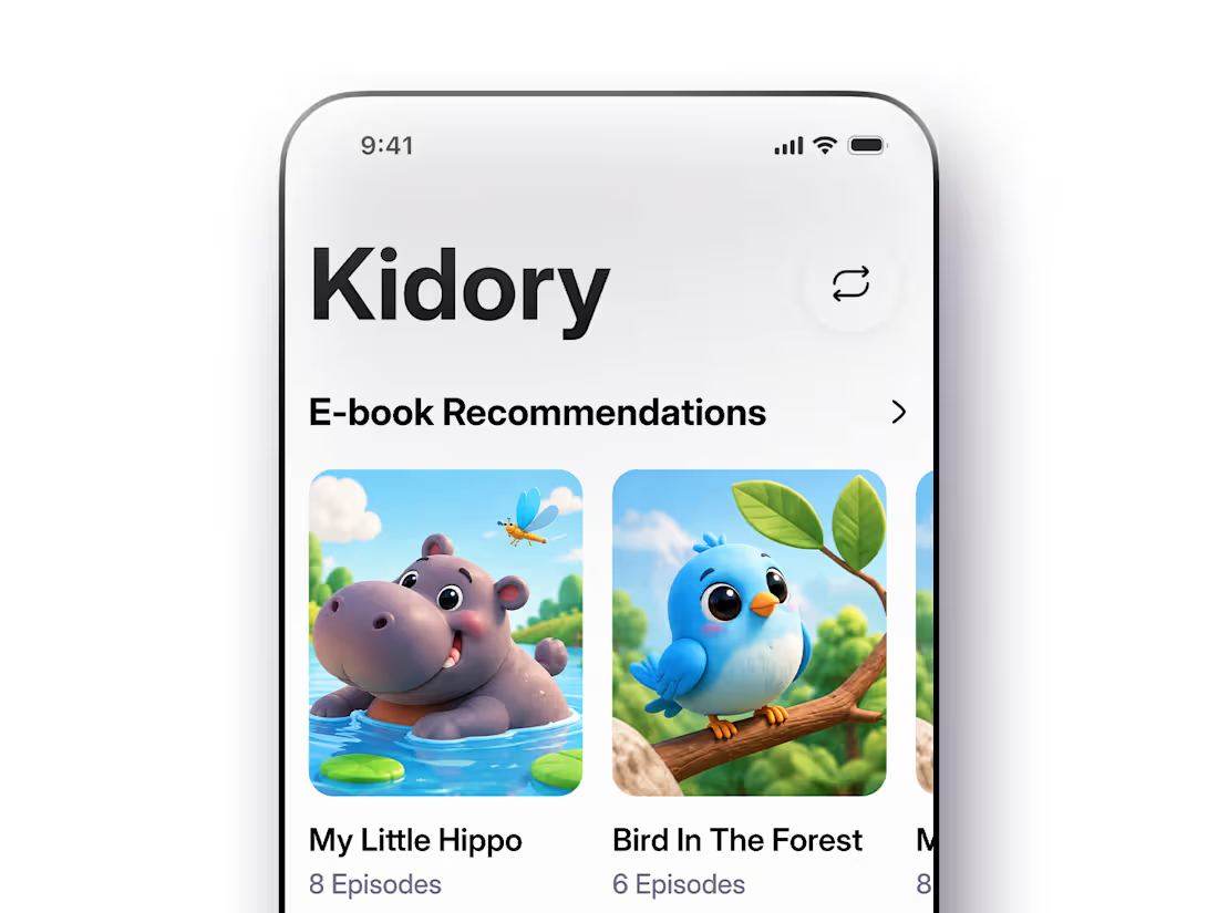
Kidory demonstrates how a children’s reading product can feel friendly, modern and expressive without becoming visually overwhelming.
The final experience creates a clear progression:
Discover → Choose → Understand → Read/Listen → Personalise
Every screen has a specific purpose, helping young readers spend less time understanding the interface and more time experiencing the story.
0
68
Fintech Mobile App UI Animation
A clean fintech wallet experience designed around one goal: make money management feel simple, fast and trustworthy.
This interaction concept brings together account balance, multi-currency wallets, quick actions, payments, exchange and transaction history with subtle motion to guide the user without making the interface feel busy.
For fintech founders and development teams, the focus is not just visual polish. The UI is structured to be clear, component-driven and realistic to build in production.
Designed in Figma | Fintech UX/UI | Mobile Banking | Digital Wallet | UI Motion | Product Design
#Fintech #FintechDesign #MobileAppDesign #DigitalWallet #BankingApp #UIUX #Figma #ProductDesign #UIAnimation
0
88