Built with Framer
Slater Marketing Website Design and Development

Hakeem Framer
Verified


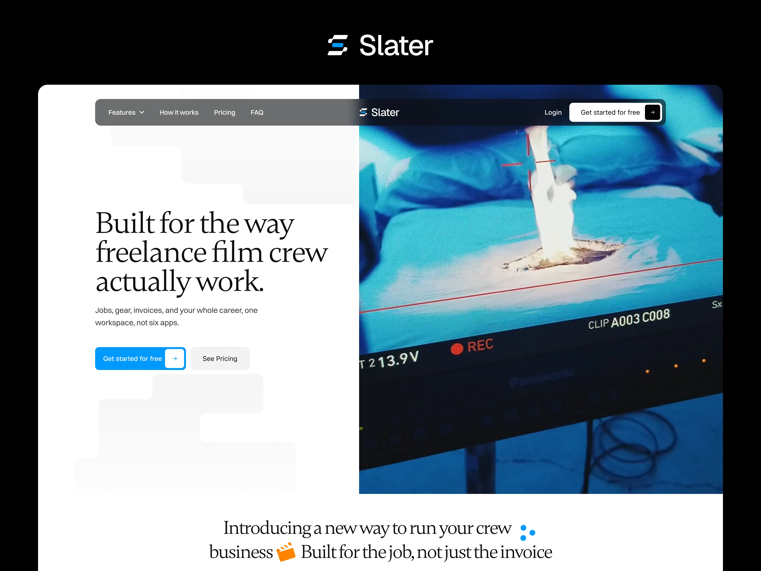
Slater: A website for freelance film crew who are tired of running their careers across six apps
Role: Sole designer and developer (art direction, UI/UX, Figma prototyping, full Framer build)
Timeline: 4 weeks
Tools: Figma, Framer
Live: useslater.com
Overview
Slater is a workspace for freelance film and TV crew (grips, gaffers, ACs, DITs, DPs) that puts jobs, gear, invoices, and work history in one place. It started as a tool a working grip built to run his own jobs. I designed and built the marketing website that introduces it to the people it was made for.
The challenge
Slater is an unusually deep product: gear inventory, day-rate packages, a full invoice editor, Stripe payments, availability links, and analytics. The challenge was making it feel simple to a crew member deciding in a few seconds whether it was for them.
Two things made that harder:
It could easily read as generic invoicing software. Plenty of tools invoice freelancers. Almost none hold a gear inventory, price a rental by the day, and put labour and gear on one document. That was the real differentiator, and it needed to lead.
The audience is skeptical of SaaS. Crew works in a world of call sheets, rental houses, and text-message bookings. Polished but generic startup marketing would feel like it was written for someone else.
Process
The first direction was a full dark-mode page with 3D graphics and product animations. The story worked, and the client loved the interactive UI demos. But the 3D felt disconnected from the world the crew actually works in, and the all-dark canvas made sections blend.

The client's feedback pointed to a refinement, not a rethink, so I focused on four things:
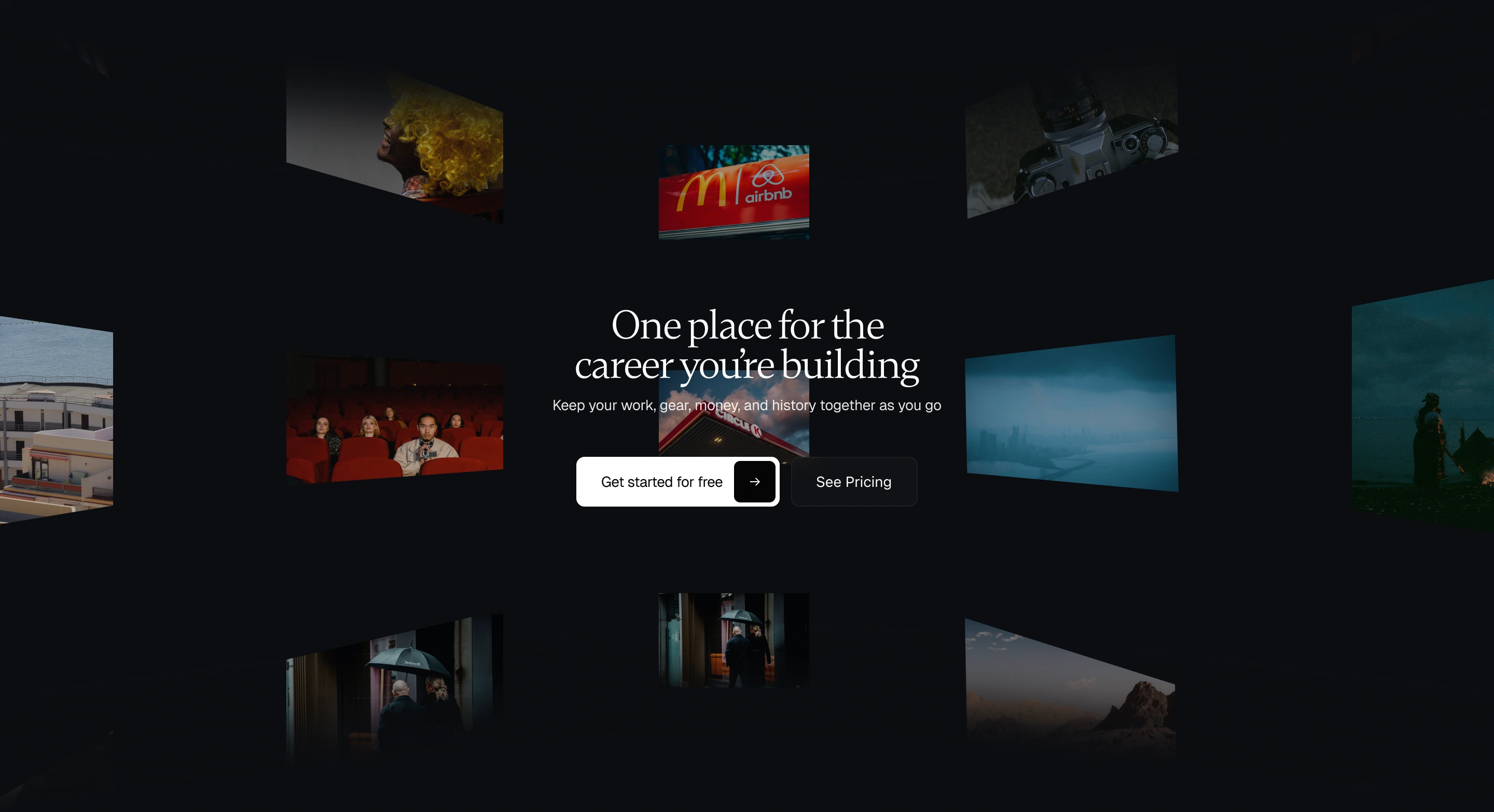
A second visual language. I replaced the 3D with grainy, documentary-style photography and film stills, grounded in real production work, alongside the clean product UI. The site also echoes the abstract shapes from the brand throughout.
Clearer hierarchy. I used shifts in background, scale, and spacing to separate the chapters, so you always know where you are in the story. A white horizontal-scroll section carries the feature story, and dark sections are reserved for the moments with the most impact.
A lighter canvas. I moved from full dark mode to a light base with selective dark sections, which lets the UI, photography, and blue accents stand out.
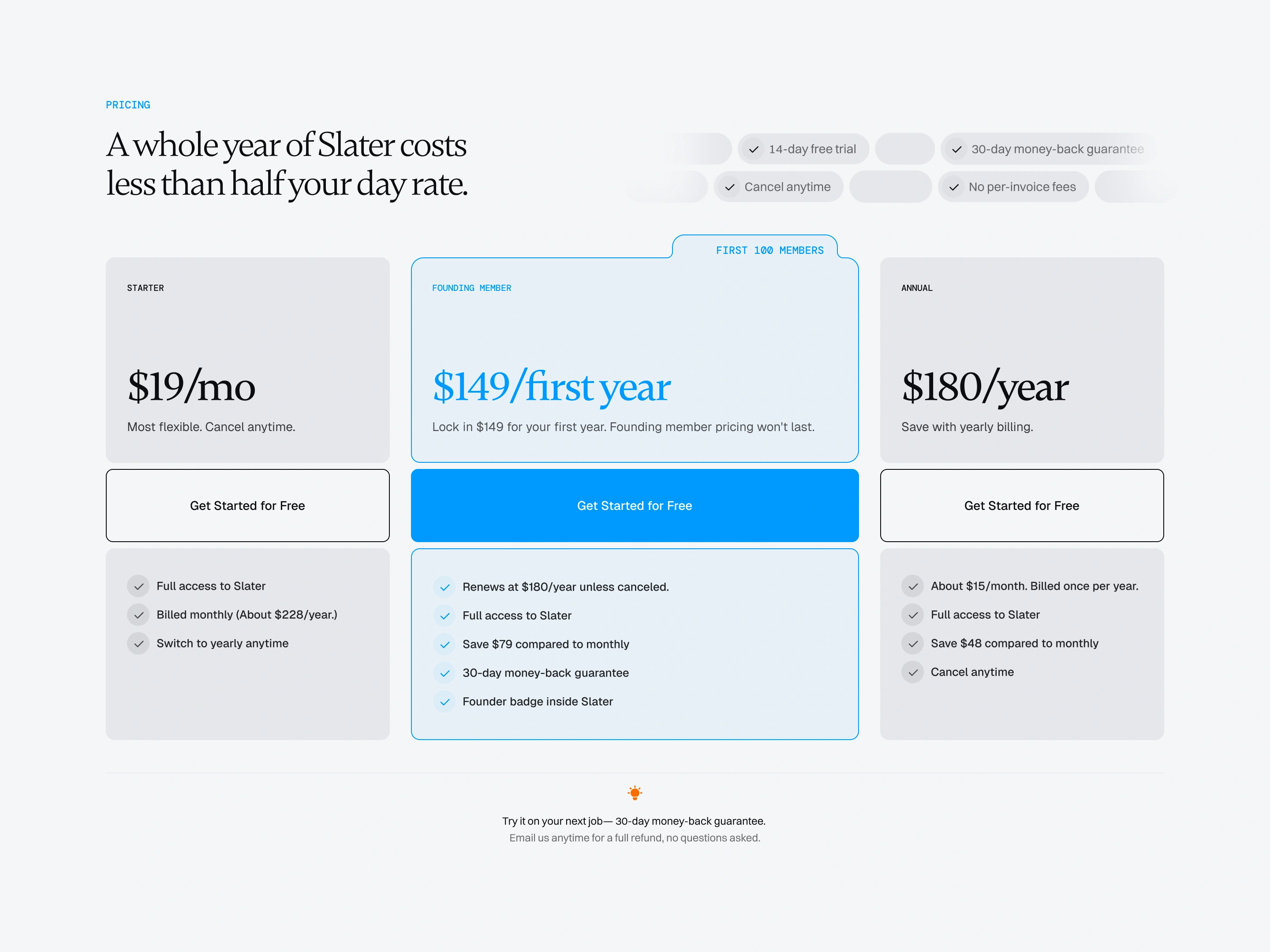
Less copy, more specific. We cut the paragraphs that re-explained what the product demos already showed. I rewrote what remained around how crew actually work, with lines like "Your whole freelance film career, connected" and "A whole year of Slater costs less than half a day rate."

The solution
A hero that says who it's for. "Slater is built for the way freelance film crew actually work" opens the page, with a single primary CTA and the product front and center.
Interactive product demos. Tabbed walkthroughs of gear management, packages, invoicing, and jobs show the product doing the work, so the copy doesn't have to.
A "Getting started" flow. The client said setup friction was stopping people from trying Slater. So, this section shows that you can import your history and gear from a spreadsheet, PDF, or Google Sheet and add your next job in minutes, without rebuilding anything.
Real proof. Testimonials from working key grips, a DP, a lighting tech, and a grip across the US and Europe, placed just before the FAQ.
An FAQ that answers real objections. It covers "How is this different from Wave or QuickBooks?" and "I get paid through Cast & Crew; do I still need this?" in plain crew language.
One consistent CTA. "Get started for free" replaced three different variations across the page.
Because I designed and built it, nothing got lost between mockup and launch. The scroll-driven sections, which looked static in Figma, went live as designed. I also kept the animations restrained: the client's one concern was that they shouldn't compete for attention, so they're staggered and only one thing leads at a time as you scroll.
Outcome
The site launched at useslater.com.
Client Recommendation after project handoff
Hakeem was great to work with. He presented multiple design directions, took feedback well, and worked through several iterations until we found the right fit. He was responsive, collaborative, and brought a strong eye to the project.
What I'd highlight
The main lesson was that showing the product does more work than describing it. Once the demos carried the explanation, most of the copy could go, and what stayed could be specific enough that a grip reads a line and thinks, "yep, that's exactly what I deal with."
Handling both design and build meant I could adjust the pacing and motion in the browser as I went, instead of specifying it in a handoff and hoping it survived. That mattered most for the animations and the scroll sections, where timing is everything.
Like this project
What the client had to say
Hakeem was great to work with. He presented multiple design directions, took feedback well, and worked through several iterations until we found the right fit. He was responsive, collaborative, and brought a strong eye to the project.

Brendan Riel, Brendan Riel
Sep 30, 2026, Client
Posted Sep 30, 2026
Designed and built a site that makes a deep, six-tool product feel simple to freelance film crew, now live at useslater.com. Stack - Figma + Framer + Jitter
Likes
4
Views
137
Timeline
Aug 12, 2026 - Sep 30, 2026
Clients
Brendan Riel