Wayward Marketing Site Redesign
Approve request to show earnings
View
Hakeem Framer
Verified
Client: Wayward
Timeline: Apr 13 – May 1, 2026
Stack: Figma → Webflow
Pages: Homepage · Wayward Boost · Wayward Connect · Creators + Global Nav/Footer
The Pitch
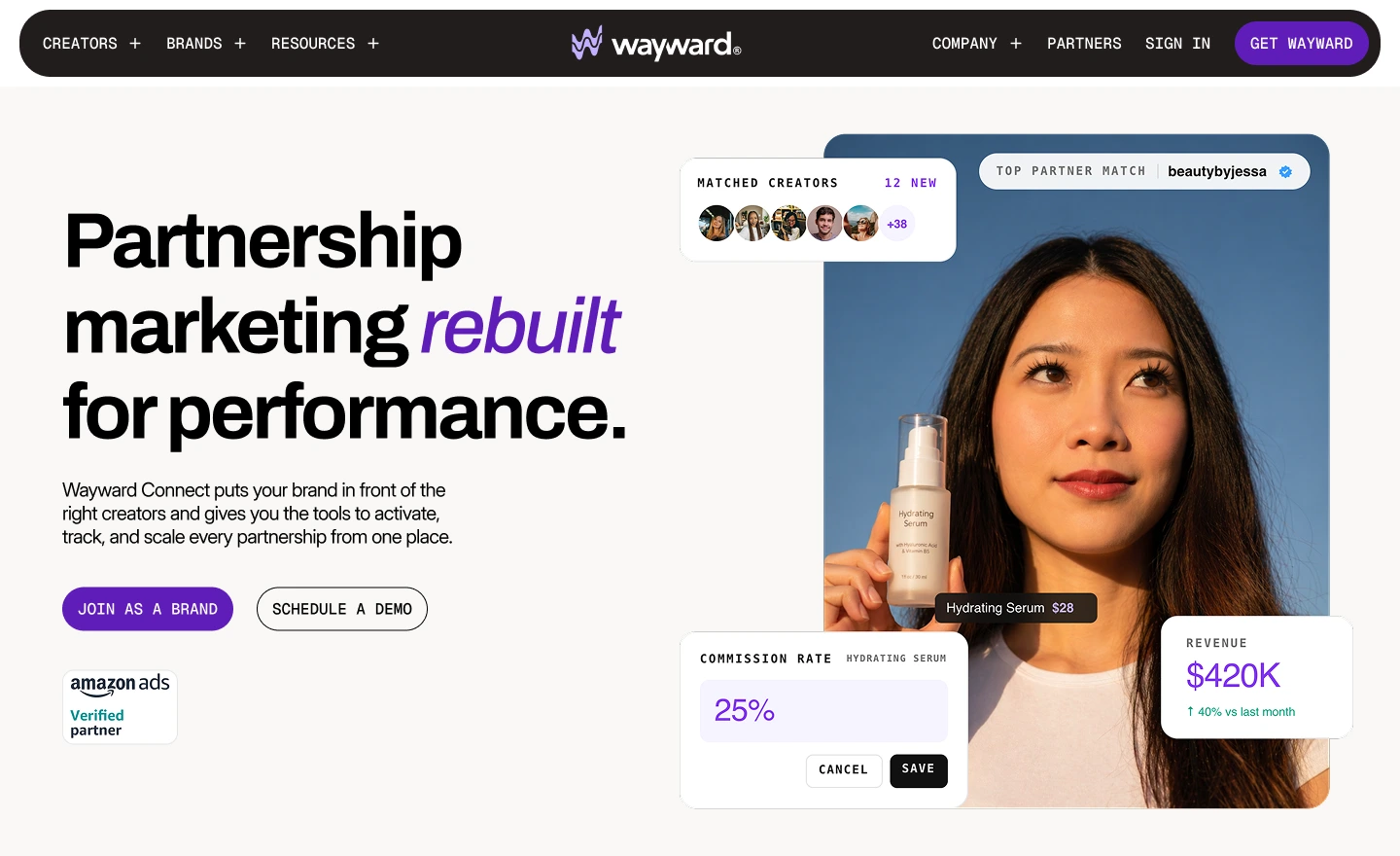
Wayward doesn't want to be another influencer marketing platform. It wants to be the one ecommerce founders point to when they talk about measurable growth — the platform that treats creator partnerships like a performance channel, not a vibe. The site had to argue that case before a single demo gets booked.
Where We Started
Three problems sitting on top of each other:
The existing site read lifestyle when the product is performance. Two distinct offerings — Boost and Connect — were blurring into each other. And the platform screenshots, while honest, made the product look less considered than it actually is. Add a creator audience that needs a completely different tone, and the brief was effectively four conversations on one site.
The Reference Point
Later. Not to copy — to calibrate. The benchmark was a site that takes itself seriously, uses motion with restraint, and lets typography do real work. From there, we mapped where Wayward should diverge: sharper conversion focus, a clearer split between brand and creator narratives, and custom product visuals instead of raw screenshots.
How We Built It
Week 1 — System first, pages second.
Before designing a single page, we locked the tokens: type scale, spacing rhythm, motion principles, and a component library that every page would pull from. This is the part that keeps four pages feeling like one site instead of four moods.
Week 2 — Pages in parallel, not in sequence.
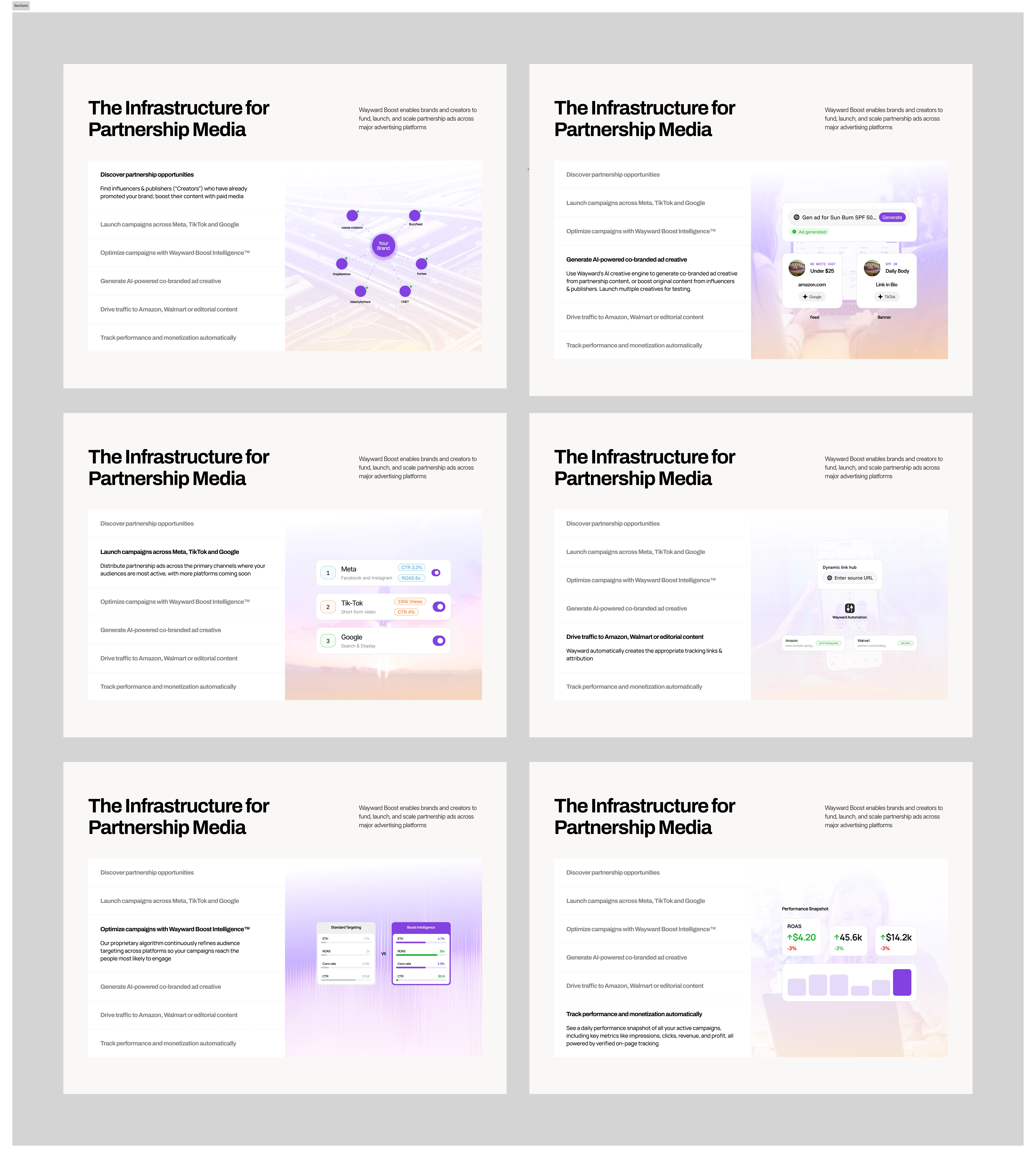
Homepage was designed against the conversion goal, not the brand goal — every section earning its place
Boost and Connect were designed side by side so the differentiation was deliberate, not accidental
The Creators page broke tone on purpose, kept the system intact
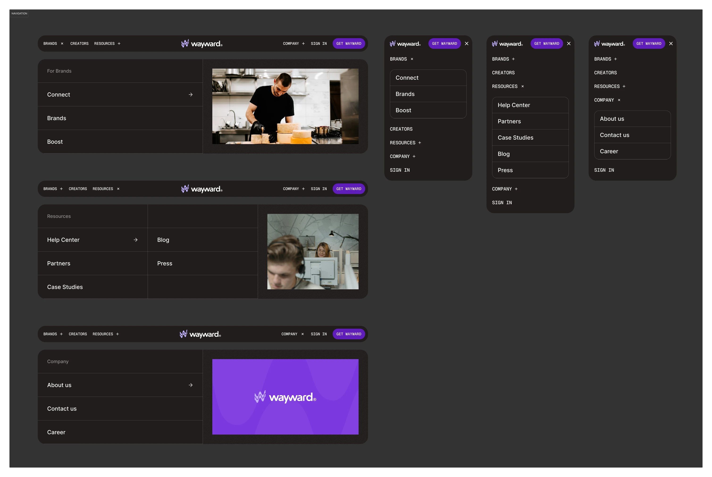
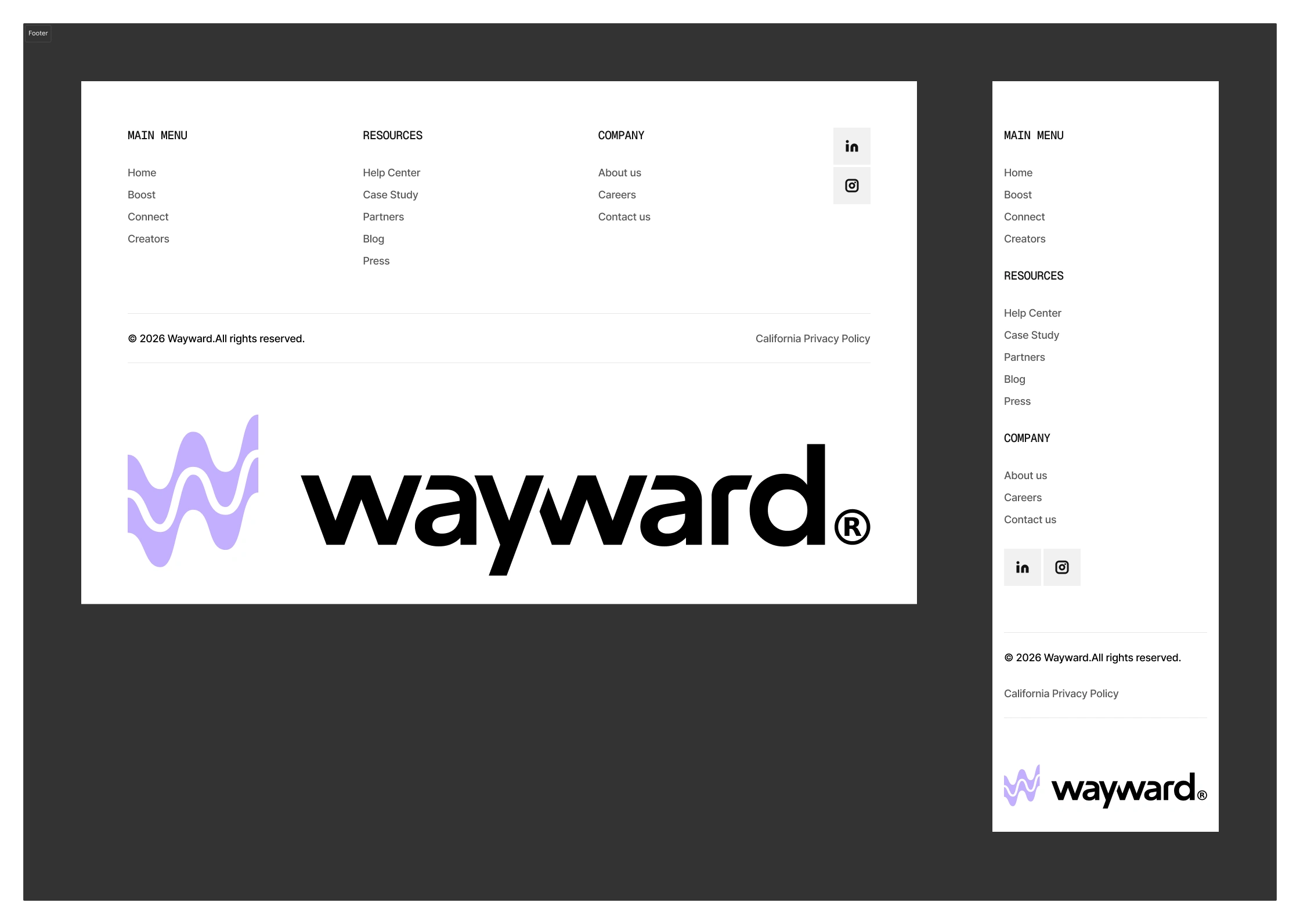
Nav and footer got rebuilt as global elements, lifting every existing page on the way
Week 3 — Webflow build with motion baked in.
Interactions were specced during design and built into the implementation, not retrofitted. Responsive coverage was treated as native at every breakpoint. SEO foundations, QA across devices, and performance tuning before launch.
What Shipped
DesignBuild4 fully responsive page designsWebflow implementation of all 4 pagesCustom UI mockups (no raw screenshots)Animations + scroll interactionsMotion direction for developmentGlobal nav + footer rolled site-wideGlobal nav + footer systemSEO foundations + pre-launch QA
The Sharp Edges
Custom mockups over screenshots. The product visuals are illustrations of what Wayward does, not photos of where it currently is. Easier to update, sharper to look at, on-brand by default.
Two product pages, one identity. Boost and Connect read as siblings, not strangers — same system, different stories.
Motion as hierarchy. Animations reveal structure on scroll instead of decorating it.
Global lift. Nav and footer changes carried polish into pages that weren't even part of the redesign scope.
The Result
A marketing site that finally argues Wayward's case the way Wayward argues it in a pitch — performance-first, ecommerce-fluent, and visually in the same room as the SaaS brands its buyers already trust. Built in Webflow so the team can keep moving without a designer in the loop.
Like this project
Posted Jun 23, 2026
Redesigned Wayward's marketing site to focus on performance and clear brand messaging, enhancing user conversion and engagement.
Likes
3
Views
78
Timeline
Apr 13, 2026 - May 7, 2026
Clients
Wayward