Built with Framer
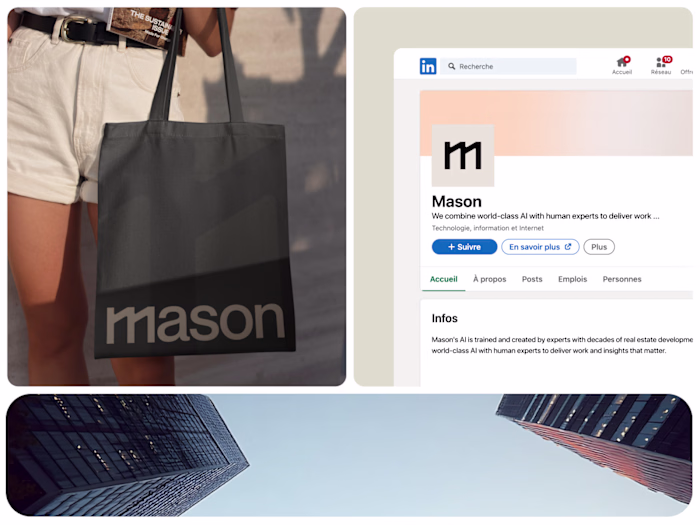
AI-First Website Redesign for Mason
Hakeem Framer
Verified
Client: Mason
Scope: 4 Pages (Homepage, Platform, Security, Company) · Desktop + Mobile Responsive
Deliverables: Figma Design + Framer Development
Role: Web Designer & Framer Developer
Overview
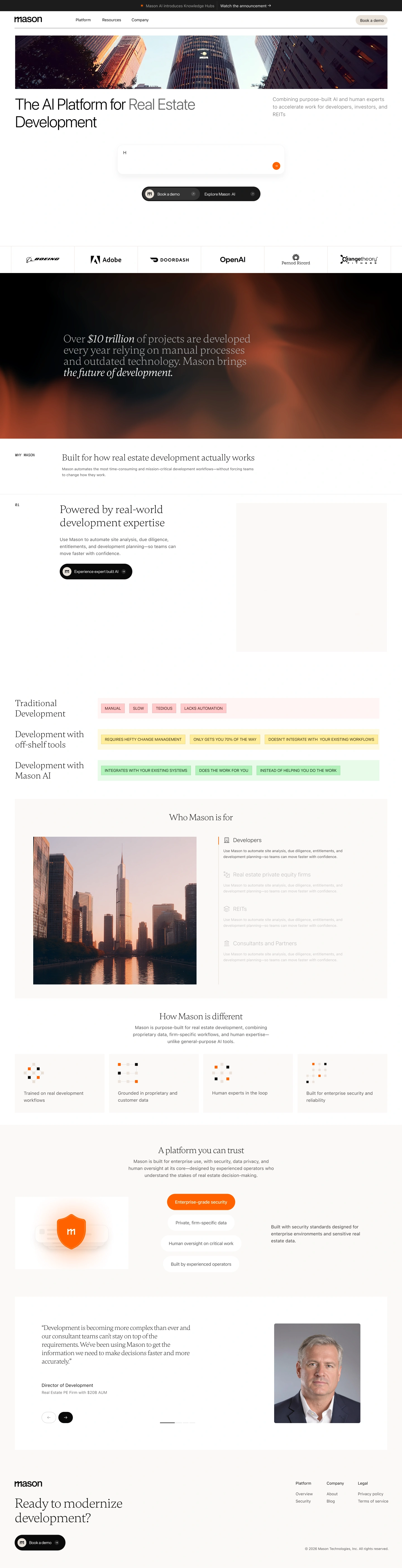
Mason needed a website that matched the ambition of its product — an AI-first platform positioned alongside category leaders like Rogo and Harvey. The existing site didn't carry the clarity, motion, or polish those benchmarks set. Our job was to close that gap across four core pages and ship a site that feels credible the moment it loads.
The Challenge
AI-first companies live or die by perceived sophistication. A weak hero, generic layouts, or stiff interactions instantly undercut the product story — even when the underlying tech is strong. Mason's challenge was twofold: communicate a sharp value proposition without over-explaining, and translate that into a visual system that feels as considered as the tools enterprise buyers compare it against.
Approach
We structured the engagement around the four pages, with shared foundations built first.
Foundations. Audited Rogo, Harvey, and adjacent AI-native sites to map the visual language buyers in this space now expect — motion patterns, typographic restraint, density of proof, and how product screens are framed. Defined Mason's design tokens, type scale, and motion principles up front so every page pulled from the same system.
Page-by-page design in Figma.
Homepage — a focused hero, a clear product narrative, and proof sections that build credibility without clutter
Platform — broken into scannable capability blocks with product visuals doing the heavy lifting
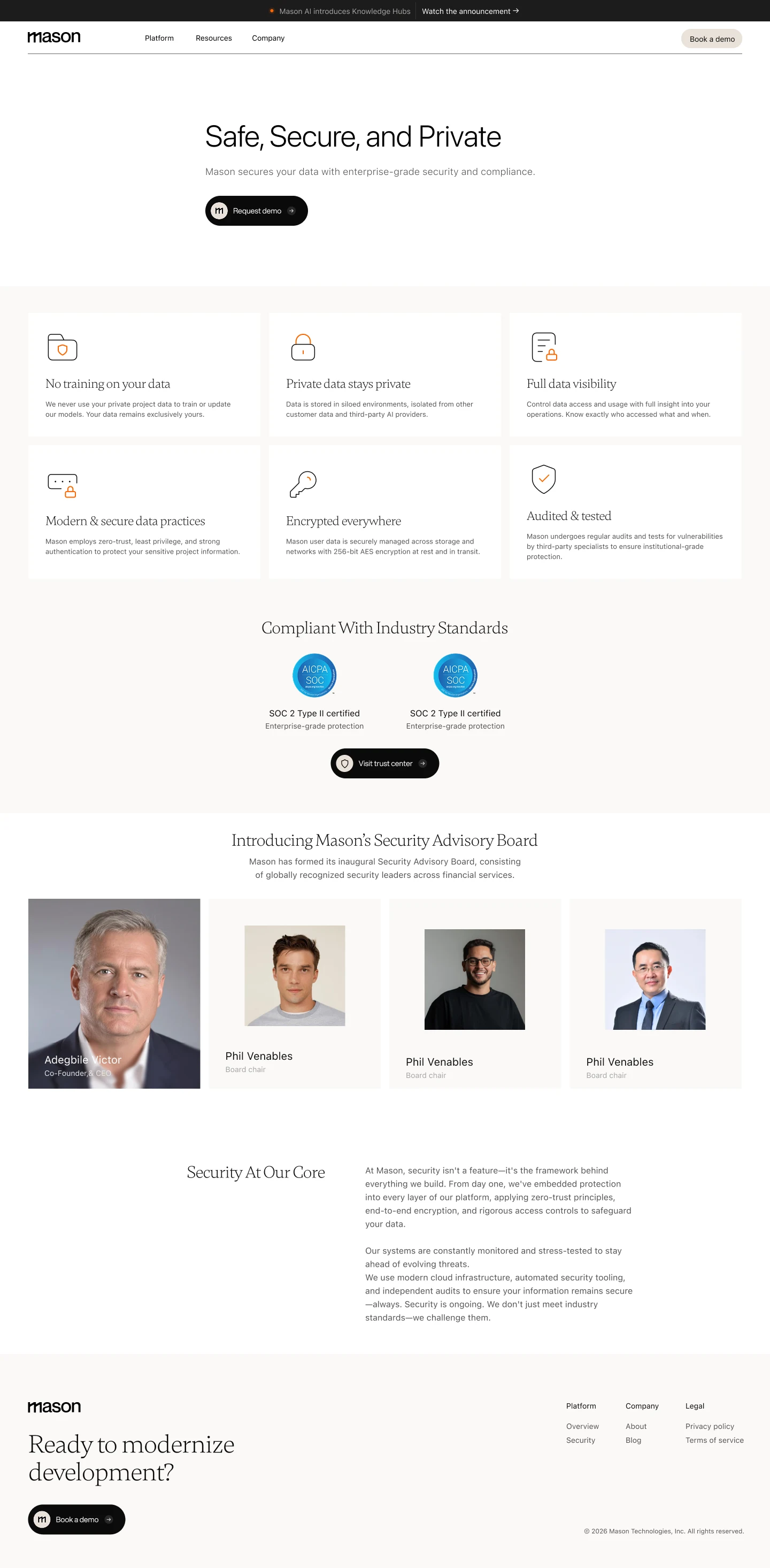
Security — structured for trust signals: certifications, architecture, and policies presented with hierarchy, not walls of text
Company — a human counterweight to the product pages, anchoring the brand in people and mission
Framer build. Implemented each page with scroll-driven motion, responsive breakpoints, and reusable components so the Mason team can extend the system without rebuilding it. Optimized for performance so the polish doesn't cost load time.
Solution Highlights
Refined type and spacing system calibrated against AI-native benchmarks
Motion used purposefully — to reveal hierarchy, not decorate it
Product visuals framed as evidence, not ornament
Security page restructured for fast trust assessment by enterprise buyers
Fully responsive across desktop, tablet, and mobile
Editable Framer build handed off to Mason's team
Outcome
A four-page site that holds its own next to the references Mason set — modern, credible, and unmistakably AI-first. The system gives Mason a foundation to extend into future pages without losing coherence, and a launchpad that reflects the product they're actually building.
Like this project
Posted Jun 23, 2026
Redesigned Mason's website with a modern AI-first approach using Framer. The system gives Mason a launchpad that reflects the product they're actually building.
Likes
7
Views
118
Timeline
Jan 6, 2026 - Feb 10, 2026
Clients
Mason