
Graphic Designer – visual identities, music artwork & social
- 45
- Followers
Graphic Designer – visual identities, music artwork & social


Brand Identity Designer


Creative Director, Sr. Strategic Brand Designer
New to Contra
Creative Director, Sr. Strategic Brand Designer




Have your personal all in-house studio at your fingertips.


Have your personal all in-house studio at your fingertips.



Freelance Full Stack Design Partner, Developer

Hello Contra 👋 - I spent the past year collaborating with Dynaplus, a fastener brand, to improve consistency, messaging and visual identity across their brand. The result is a wide range of print- and digital works!
To go into detail, the previous system relied on decorative elements that distracted from the information. We stripped those away and replaced them with brand photography, showing the product in use instead of scattering complex shapes around each design. This made it a far more coherent visual style!
Heading into 2026 we're working on redesigning all the packaging used for products which will lead to less plastic use and more sturdy packaging.
15
415

Building something new in Framer! Racket Club is a bold and colorful template for local sports clubs, aimed at building a community of beginners and skilled players.
I've been really enjoying the process of bringing this idea together and I feel like it's really getting there!
2
1
102


Graphic Design – Turning ideas into brands people remember!
- 8
- Followers
Graphic Design – Turning ideas into brands people remember!
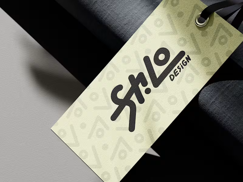
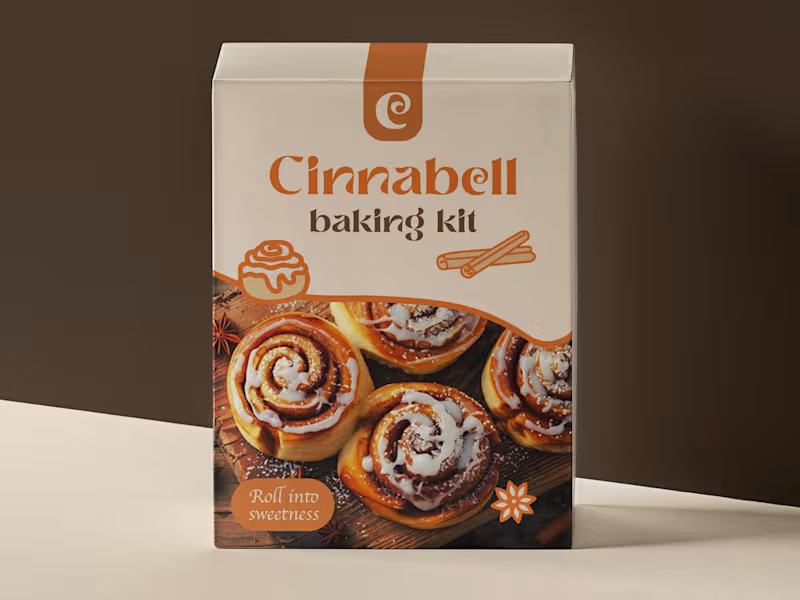
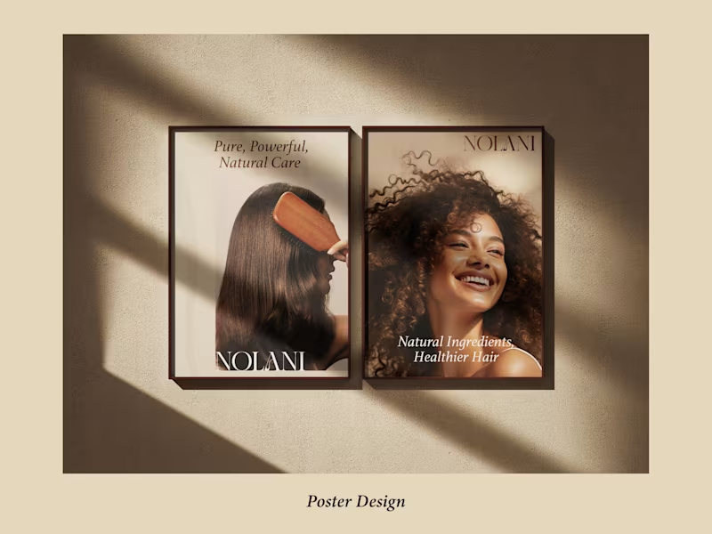

Creating Unique & Impactful Digital Designs
Creating Unique & Impactful Digital Designs


